Now that front-end pages are becoming more and more effective, the default input component style obviously does not meet the design requirements.In the past few years, development projects happened to meet the related requirements, and this is a special way to modify the radio, CheckBox style.
Principle: The general principle is to use a native checkbox or input tag followed by an associated label element.Set the <input>element to be transparent, and then let the user see the <label>element by positioning it, use the native properties of css to judge the user's actions, and set the selected label style, input[type=checkbox]:checked+label{}
Style modification using css3 pseudo elements
html code
web front-end development learning Q-q-u-n:731771211, share learning methods and small details that need attention, keep updating the latest teaching and learning methods (detailed front-end project real-time teaching video, PDF)
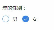
<p>Your gender: </p>
<div class="radio-sex">
<input type="radio" id="sex1" name="sex">
<label for="sex1"></label>
<span>man</span>
</div>
<div class="radio-sex">
<input type="radio" id="sex2" name="sex">
<label for="sex2"></label>female
</div>css styles
.radio-sex {
    position: relative;
    display: inline-block;
    margin-right: 12px;
}

.radio-sex input {
    vertical-align: middle;
    margin-top: -2px;
    margin-bottom: 1px;
    /* The first three lines of code are to align the radio radio buttons with the text */
    width: 20px;
    height: 20px;
    appearance: none;/*Clear default style*/
    -webkit-appearance: none;
    opacity: 0;
    outline: none;
    /* Note that cannot be set to display:none*/
}

.radio-sex label {
    position: absolute;
    left: 0;
    top: 0;
    z-index: -1;
    /*Note the hierarchical relationship, if you do not set the label hierarchy to the lowest, the input will be obscured and the radio will not be selected*/
    width: 20px;
    height: 20px;
    border: 1px solid #3582E9;
    border-radius: 100%;
}

.radio-sex input:checked+label {
    background: #3582E9;
}

.radio-sex input:checked+label::after {
    content: "";
    position: absolute;
    left: 8px;
    top: 2px;
    width: 5px;
    height: 12px;
    border-right: 1px solid #fff;
    border-bottom: 1px solid #fff;
    transform: rotate(45deg);
}
Advantages: Take full advantage of CSS3, no js and pictures are needed, just pure CSS3 will do it
Disadvantages: poor compatibility, support IE9+only
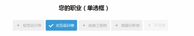
Case:
Style modification using pictures
Ideas for implementation
1. Set the input property hidden to hide the input
<input type="radio" name="type" id="adviceRadio1" value="1" checked hidden/>
2. Bind input by id with label for tag, so when you click label, you actually click input
<input type="radio" name="type" id="adviceRadio1" value="1" checked hidden/>
                <label for="adviceRadio1" class="advice"></label>
3. Define the style of the label and set the background image of the unchecked state
web Front End Development Learning Q-q-u-n:  731771211,Share learning methods and small details you need to be aware of, and keep updating the latest tutorials and learning methods (detailed front-end project hands-on instructional videos, PDF)

.advice{
                    height: 12px;
                    width: 12px;
                    display: inline-block;
                    background-image: url('https://caiyunupload.b0.upaiyun.com/newweb/imgs/icon-unchecked.png');
                    background-repeat: no-repeat;
                    background-position: center;
                    vertical-align: middle;
                    margin-top: -4px;
                }
4. Style the label of the selected state using the adjacent selector
input[type="radio"]:checked + .advice{
                    background-image: url('https://caiyunupload.b0.upaiyun.com/newweb/imgs/icon-checked.png');
                }
The above is the implementation code for the radio radio radio radio radio box, and checkbox is similar to defining input type as checkbox
Using plug-ins to implement
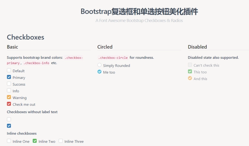
awesome-bootstrap-checkbox plugin
awesome-bootstrap-checkbox is a plug-in that beautifies the Bootstrap check boxes and radio buttons.It is written in pure CSS without any javascript files.It beautifies beautifully by making small changes to the native Bootstrap components.
Plug-in download: https://www.bootcdn.cn/awesom...
Note: awesome-bootstrap-checkbox.css, font-awesome.css and font awesome font files need to be introduced
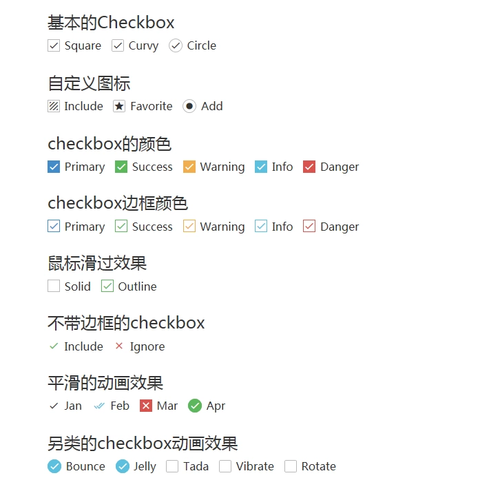
pretty.css
pretty.css is a beautiful checkbox and radio beautification of pure css3.pretty.css can be used in conjunction with several font icons to beautify native checkboxes and radios, and to animate button clicks.
Plug-in download: https://www.bootcdn.cn/pretty...
The methods you know are described here. If you have a better way, you can leave a message to discuss.