The code is already associated with github: Link address I think it's good. You can click star. Here you will continue to share your development experience (:
As we all know, JSX is an extension of JS syntax and adds support for HTML syntax. It is only one CSS syntax support away from all in js. At present, 60 + libraries are well-known to realize this function. Those interested can view it themselves: css-in-js.
The following is one of them styled-components.
brief introduction
Styled components should be the most popular library of CSS in JS. So far, the number of star s in github has exceeded 34k.
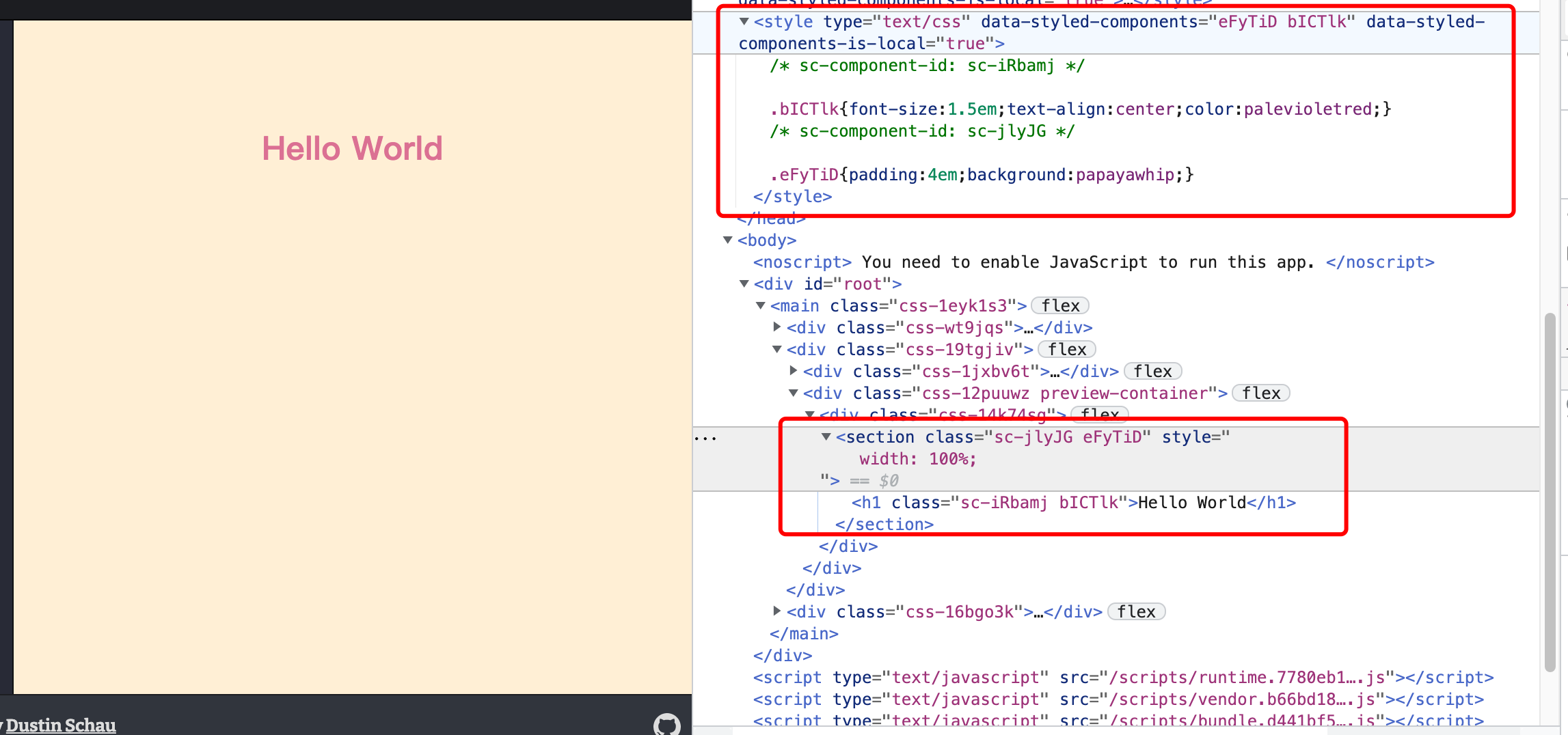
Through styled components, you can use ES6 Label template string Syntax defines a series of CSS properties in the Component. When the JS code of the Component is parsed and executed, the styled components will dynamically generate a CSS selector and insert the corresponding CSS style into the head tag in the form of style tag.
The dynamically generated CSS selector will have a small hash value to ensure global uniqueness and avoid style conflicts.
Hello World
Let's briefly understand its writing:
const Title = styled.h1`
  font-size: 1.5em;
  text-align: center;
  color: palevioletred;
`;


const Wrapper = styled.section`
  padding: 4em;
  background: papayawhip;
`;

render(<Wrapper>
    <Title>Hello World</Title>
  </Wrapper>
}
After compilation:
What are its characteristics?
- Equivalent to defining an empty component
- Each segment style must be bound to a component
- The syntax is exactly the same as CSS
- Template string writing
- ...
principle
Based on the code of version 5.3.1, its principle is briefly explained below.
Grammatical interpretation
From its writing analysis, the code can be disassembled into styled.xx and the following template string.
The former can be understood as a function defined by styled components, eg:
const styled = (tag) => {
	//...
};

domElements.forEach(domElement => {
  styled[domElement] = styled(domElement);
});
How does the function parse the template string? This is a function of the template string Tagged template string , this function can use the function to parse the template string, eg:
function tag(strings,...keys){
  console.log('strings:', strings)
  console.log('keys:',keys)
}

tag`
	color:red;
	background:${props => props.bgcolor};
`

//strings: ["\n\tcolor:red;\n\tbackground:", ";\n", raw:["\n\tcolor:red;\n\tbackground:", ";\n"]]
//keys: [props => props.bgcolor]
Get the original string and placeholder data, so that you can assemble the css template and render according to the incoming value when rendering.
Component creation process
- Generate unique id
Generated according to parameters and parent components, such as SC jlyjg compiled above.
const styledComponentId = generateId(options.displayName, options.parentComponentId)
- Parse the template string to get the style, insert a style node in the head, inject the style, and return the className, such as the previously compiled eFyTid. This process is briefly described below:
// Construct className
const generatedClassName = generateName(cssStatic >>> 0);

//Construct the style node and obtain
const style = document.createElement('style');
style.setAttribute(SC_ATTR, SC_ATTR_ACTIVE);
style.setAttribute(SC_ATTR_VERSION, SC_VERSION);
//... omit the previous style label position lookup
// Avoid Edge bug where empty style elements don't create sheets
style.appendChild(document.createTextNode(''));
//Get the sheet according to the incoming node
this.sheet = style.sheet //getSheet(style)

//Finally, insert css
this.sheet.insertRule(rule, index);
- Parse other props and attr of the component to get the new element parameter propsForElement
  const computedProps = attrs !== props ? { ...props, ...attrs } : props;
  const propsForElement = {};

  for (const key in computedProps) {
    if (
      shouldForwardProp
        ? shouldForwardProp(key, validAttr, elementToBeCreated)
        : isTargetTag
        ? validAttr(key)
        : true
    ) {
      // Don't pass through non HTML tags through to HTML elements
      propsForElement[key] = computedProps[key];
    }
  }
- Finally, generate components according to propsForElement and className
propsForElement.className = Array.prototype
  .concat(
  styledComponentId,
  generatedClassName !== styledComponentId ? generatedClassName : null,
  props.className,
  attrs.className
)
  .filter(Boolean)
  .join(' ');

// The elementToBeCreated generation process is omitted. The parameter is an element label or a react component
return createElement(elementToBeCreated, propsForElement);
Basic use guide
Style based on Props
The components defined by styled can accept props parameters and set styles according to different parameters.
const Button = styled.button`
  background: ${props => props.primary ? "palevioletred" : "white"};
  color: ${props => props.primary ? "white" : "palevioletred"};

  font-size: 1em;
  margin: 1em;
  padding: 0.25em 1em;
  border: 2px solid palevioletred;
  border-radius: 3px;
`;

render(
  <div>
    <Button>Normal</Button>
    <Button primary>Primary</Button>
  </div>
);
Inherit style
You can generate a new component based on inheriting an existing component, and you can overwrite and add styles.
const Button = styled.button`
  background: white;
  color: palevioletred;
  font-size: 1em;
  margin: 1em;
  padding: 0.25em 1em;
  border: 2px solid palevioletred;
  border-radius: 3px;
`;

const PrimaryButton = styled(Button)`
	background: palevioletred;
  color: white;
`

render(
  <div>
    <Button>Normal</Button>
    <PrimaryButton>Primary</Button>
  </div>
);
Pass HTML attributes
We all know that html elements have many attributes, such as input type, readonly and onChange.
const Input = styled.input`
  padding: 0.5em;
  margin: 0.5em;
  background: papayawhip;
  border: none;
`;

const handleChanged = (e) => {
	console.log('input changed:',e.target.value)
}

render(
  <Input defaultValue="default val" type="email" onChange={handleChanged}/>
)
Maintain other HTML attributes in the component
Styled components also supports passing in other attributes of html elements for components, such as specifying a type attribute for input elements, which can be implemented using the attrs keyword.
During use, we can use static attributes or props parameter settings:
const Password = styled.input.attrs({
  type: 'password',
  placeholder:${props=>props.placeholder?props.placeholder:''}
})`
  color: palevioletred;
  font-size: 1em;
  border: 2px solid palevioletred;
  border-radius: 3px;
`;
In actual development, this method is also useful to reference the css style of the third-party class library:
const Input = styled.input.attrs({
  className: 'my-input',
})`
  color: palevioletred;
  font-size: 1em;
  border: 2px solid palevioletred;
  border-radius: 3px;
`;
Use with className and css framework
It can be used with the className of the component, provided that the className is not confused
const Wrapper = styled.section`
  padding: 4em;
  background: papayawhip;
	& > .my-h1{
		font-size: 1.5em;
    text-align: center;
    color: palevioletred;
	}
`;

render(
   <Wrapper>
    <h1 className={'my-h1'}>My H1</h1>
  </Wrapper>
)
It is also compatible with css frameworks such as less.
import * as styles from './index.less'

const Wrapper = styled.section`
  padding: 4em;
  background: papayawhip;
`;

render(
   <Wrapper>
    <h1 className={styles['my-h1']}>My H1</h1>
  </Wrapper>
)
&Keywords
Similar to less, & represents its own selector in the syntax, which we used in the previous section.
const Wrapper = styled.section`
  padding: 4em;
  background: papayawhip;
	& > .my-h1{
		font-size: 1.5em;
    text-align: center;
    color: palevioletred;
	}
`;
In addition to this usage, it can also be used to increase the weight of the style
const Example = styled.li`
    color: red;
    & {
        color:blue;
    }

    && {
        color: green;
    }
`;
animation
Styled components also supports @ keyframe in css animation.
const rotate = styled.keyframes`
from {
transform: rotate(0deg);
}
to {
transform: rotate(360deg);
}
`;
const styles = styled.css`
animation: ${rotate} 2s linear infinite;
`
const Rotate = styled.div`
${styles};
display: inline-block;
padding: 2rem 1rem;
font-size: 1.2rem;
`;
render(
<Rotate>< 💅🏾 ></Rotate>
);
ref
By passing the ref attribute, you can get the element node of the component.
const Input = styled.input.attrs({
  className: 'my-input',
})`
  color: palevioletred;
  font-size: 1em;
  border: 2px solid palevioletred;
  border-radius: 3px;
`;

const inputRef = React.useRef();
render(
  <Input ref={inputRef}/>
);
Component nested selector usage
If the scopes defined by two components are consistent, selectors can be nested directly.
const Wrapper = styled.section`
  padding: 4em;
  background: papayawhip;
`;
const Title = styled.h1`
  font-size: 1.5em;
  text-align: center;
  color: palevioletred;
`;
const SubTitle = styled.span`
  text-align: center;
	color: grey;

	${Title}:hover &{
			color: red;
	}
`
render(
  <>
  <Wrapper>
    <Title>
  		Hello World
  		<SubTitle> yes!</SubTitle>
  	</Title>
  </Wrapper>
  <SubTitle> no...</SubTitle>
  </>
}
Object style definition
If all styles are of one object type, you can also discard the template string and define the style directly by object definition.
const Box = styled.div({
  background: 'palevioletred',
  height: '50px',
  width: '50px'
});

const PropsBox = styled.div(props => ({
  background: props.background,
  height: '50px',
  width: '50px'
}));

render(
  <div>
    <Box />
    <PropsBox background="blue" />
  </div>
);
other
- Support ts
- support Single test
- Syntax detection
- Syntax highlighting
Pros and cons
advantage
- Standard CSS syntax
- Auto inject CSS
Styled components automatically inject their styles according to the components presented on the page to reduce the introduction of redundant code.
- Unique class name
Styled components generates unique class names for your style without worrying about repetition or spelling errors.
- Setting dynamic styles is simple
Adjusting the style of the component according to its props or global theme is simple and intuitive without manually managing dozens of classes.
- Simple maintenance
You don't have to look for styles that affect components in different files.
- Automatically add browser prefix
We only need to write css once, and sc automatically adds prefixes for us according to the browser when rendering.
inferiority
- The learning cost is high. It is suitable for people who have certain development experience
- Poor code readability. The dynamically generated unique class name is difficult to read and cannot be written z. If it is necessary to open the class component library, the applicability is poor.
- High redundancy. When using props to dynamically generate styles, styles generated by different props values will always exist.
- performance
- Generate css dynamically at run time
- Up to 15.4kb packet at runtime
reference resources
Official website
The good and bad of CSS in JS
Operation principle of styled components