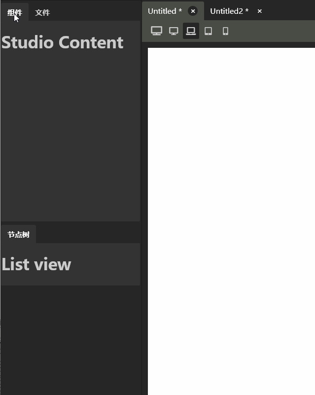
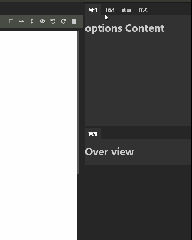
Yesterday's tabs window was very satisfactory. Today, we have made it possible to change the display style according to its size. When its width is too small, the tab page can float and dock on one side. Specific effect:
Left
Right
Always like simple and clear things, so want to achieve a little more simple, but reality does not allow ah, the function is really a lost complex. I worked hard all afternoon and finally finished it.
The left and right windows should use the same control to increase the reusability of the code as much as possible. There are many states of the control: normal display (ordinary tabs window), list (display icon and title, pop up tab page when clicking), mini list (only display icon, pop up tab page when clicking).
When the control is on the left side of the interface, the tab page pops up on the right side. On the contrary, when the control is on the right side of the interface, the tab page will pop up on the left side.
From normal tabs to list display, all tabs are not activated. To zoom in from the list to the normal tabs, a tab is selected by default.
With so many state requirements, the code is easy to mess up. But fortunately, there is a design pattern called "state pattern", which can solve this problem very well. The disadvantage is that the initial amount of code is a little large, and the advantage is convenient for later management.
Yesterday, I made two tabs controls, one is widget tabs, the other is page tabs. Now the latter can meet our needs, just modify the widget tabs.
Some of the code that was implemented yesterday was deleted. First, rewrite the template and write the script code according to the template, which can make the script code more practical. Just like in test driven development, write the test first and then write the code, which is one of the reasons.
By the way, I almost forgot. In yesterday's code, all style styles were put in the style.css file, which was introduced globally by the later vue. As more and more controls are written, the file will become more and more bloated and inconvenient to manage. This time, take the style code related to widget tabs to the vue component.
First look at the template code:
<template>
  <div class="widget-tabs" :class="stateClass" ref="widget">
    <ul  class="heads">
      <li v-for="tab in tabs" class="item" :class="{ 'active': tab.isShow }"
        @click="click(tab)">
        <div v-show="showIcon" class="tab-icon"><i :class="tab.icon"></i></div>
        <span v-show="showTitle"> {{ tab.name }}</span>
      </li>
    </ul>
    <div v-show="showTabBody" class="tab-body" :class="dockLeft?'dock-left':''">
      <div v-show="showTabTitle" class="tab-title">
        <div>{{selectedTab ? selectedTab.name : ''}}</div>
        <div class="tab-close" @click="close">×</div>
      </div>
      <slot></slot>
    </div>
  </div>
</template>
The top-level DIV is the shell of our control. class corresponds to three CSS classes in three states:
1. Default state, empty string
2. List status, middle size
3. Mini list status, mini size
According to this css class, the css code displays its sub elements in different ways to achieve normal display or pop-up display.
ref is equivalent to setting a unique ID for this DIV. we can get the corresponding dom elements in the code through this ID, so as to determine the current control size, and adjust the display style of the control according to this size.
ul element displays the navigation label part of the tabs control. It determines whether the label is activated according to the display or hiding of each tab page. It also has the function of accepting mouse click events and passing them to the control script. The template basically has no logic, mainly displaying and receiving events.
Whether to display the icon is determined according to the showIcon calculation property.
Whether to display the title is determined according to the showTitle calculation property.
Whether the whole tab body is displayed is determined according to the showTabBody calculation property. Because the tab body is sometimes docked on the left side of the control and sometimes on the right side of the control. The docking method is determined by the property dockLeft. If the tab body is docked on the left, it is true, otherwise it is false.
tabTitle is the title area displayed when docked:
Determine whether to display according to the calculation property showTabTitle. The close button is responsible for receiving the click event and passing it to the controller script. No matter how it is implemented, the control script can only meet the requirements of the template. It is equivalent to that the interface is defined, and the implementation mode is designed according to the interface.
We have determined to use the state mode to implement, and designed three state classes according to the state:
NormalState, MiddleState, MiniState. The latter two classes have some common operations, such as pop-up hidden tab, etc., which can inherit the common base class: ListState. The three State classes also have some functional intersections, and they can have the common base class State. The class diagram is as follows (I haven't used UML tools for many years, but I can make do with Excel):
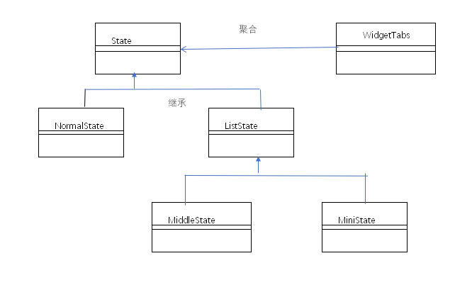
If you don't look carefully, I don't know which high-end UML tool did you think this drawing was actually drawn by Excel.
Code corresponding to status class:
class State{
  constructor(context){
    this.context = context
  }

  widthChange(width){
    if(width <=90){
      this.toState(this.context.miniState)
    }
    else if(width <=160){
      this.toState(this.context.middleState)
    }
    else{
      this.toState(this.context.normalState)
    }
  }

  showTabBody(){
    return true
  }

  showTabTitle(){
    return false
  }

  showIcon(){
    return false
  }

  showTitle(){
    return true
  }

  close(){}

  toState(state){
    if(this.context.state !== state){
      if(this.context.state === this.context.normalState){
        this.context.selectedTab.isShow = false
        console.log('dddd')
      }
      if(state === this.context.normalState){
        this.context.selectedTab.isShow = true
      }
      this.context.state = state
    }
  }

  stateClass(){
    return ''
  }

}
class NormalState extends State{
  constructor(context){
    super(context)
  }

  clickTab(clickedTab){
    this.context.tabs.forEach(tab => {
      tab.isShow = (tab.name == clickedTab.name)
        this.context.selectedTab = clickedTab
    });
  }
}

//Pop up label content required
class ListState extends State{
  constructor(context){
    super(context)
  }

  showTabBody(){
    return this.context.selectedTab.isShow
  }

  showTabTitle(){
    return true
  }

  showIcon(){
    return true
  }

  showTitle(){
    return true
  }

  close(){
    this.context.selectedTab.isShow = false
  }

  clickTab(clickedTab){
    this.context.tabs.forEach(tab => {
      if(tab === clickedTab){
        tab.isShow = !tab.isShow
        this.context.selectedTab = clickedTab
      }
      else{
        tab.isShow = false
      }
    });
  }
}

//This status shows the icon and title
class MiddleState extends ListState{
  constructor(context){
    super(context)
  }

  stateClass(){
    return 'middle-size'
  }
}

//This status only shows icons
class MiniState extends ListState{
  constructor(context){
    super(context)
  }

  showTitle(){
    return false
  }

  stateClass(){
    return 'mini-size'
  }
}
Control script code:
export default {
  name: 'WidgetTabs',
  data() {
    return {
      tabs: [],
      state: null,
      selectedTab :null,
      dockLeft:false,
    }
  },

  created() {
    this.tabs = this.$children;
    this.normalState = new NormalState(this)
    this.middleState = new MiddleState(this)
    this.miniState = new MiniState(this)
    this.state = this.normalState
  },

  computed: {
    stateClass(){
      return this.state.stateClass()
    },

    showIcon(){
      return this.state.showIcon()
    },

    showTitle(){
      return this.state.showTitle()
    },

    showTabBody(){
      return this.state.showTabBody()
    },
    showTabTitle(){
      return this.state.showTabTitle()
    },
  },

  methods: {
    click(clickTab) {
      this.state.clickTab(clickTab)
    },

    mouseMove(){
      if(this.$refs.widget){
        this.dockLeft = this.$refs.widget.offsetLeft < 50
        this.state.widthChange(this.$refs.widget.offsetWidth)
      }
    },

    mouseDown(event){
      document.addEventListener('mousemove', this.mouseMove)
    },

    mouseUp(event){
      document.removeEventListener('mousemove', this.mouseMove)
    },

    close(){
      this.state.close()
    }
  },


  mounted () {
    document.addEventListener('mousedown', this.mouseDown)
    document.addEventListener('mouseup', this.mouseUp)
    this.tabs.forEach(tab => {
      if(tab.isShow){
        this.selectedTab = tab
      }
    });
  },

  beforeDestroyed() {
    document.removeEventListener('mousedown', this.mouseDown)
    document.removeEventListener('mouseup', this.mouseUp)
  },
}
Initializes various states when a component is created. It should be noted that the control width needs to be obtained dynamically when the window changes to determine which state the control is in. There is no resize event for DIV in JS, which can be replaced by mouse event. Our window size is achieved by mouse drag, so we track mouse drag events, dynamically query control size, and then distribute events.
This control has been completed so far. The event of writing this article takes longer than the time of writing code. I am a programmer by nature, not a writer.
The code of the whole project in this historical node can be found on my Github: https://github.com/vularsoft/studio-ui
To find this history node:
RXEditor is a visual editing tool for bootstrap code. This series records the development process of the software. If you have any questions, please leave me a message on ithub.