background
In the last article Skillfully use filter to realize high-level full text flash switching effect In, we mentioned a very interesting animation effect of the text displayed by apple before.
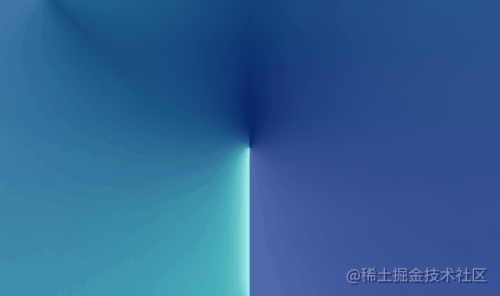
This article will bring another interesting effect, skillfully using gradient to realize high-level background light animation. This effect applies to Apple official website iPhone 13 Pro On the introduction page:

realization
This effect is difficult to copy completely using CSS. The light effect shadow simulated by CSS will be relatively Low, which can only be restored as much as possible.
In fact, each group of light is basically the same, so we only need to realize one group, and we can almost achieve the whole effect.
Observe this effect:
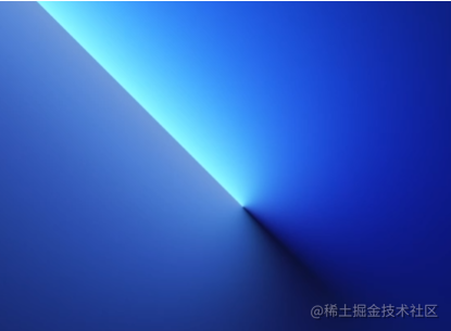
Its core is actually angular gradient -- conic gradient (). With angular gradient, we can roughly achieve such an effect:
<div></div>
div {
    width: 1000px;
    height: 600px;
    background:
        conic-gradient(
            from -45deg at 400px 300px,
            hsla(170deg, 100%, 70%, .7),
            transparent 50%,
            transparent),
            linear-gradient(-45deg, #060d5e, #002268);
}
See the effect:

That's A little interesting. Of course, careful observation shows that the color of the gradient does not end from one color to transparency, but color A - transparency - color B. in this way, the other half of the light source will not be so stiff. The modified CSS code:
div {
    width: 1000px;
    height: 600px;
    background:
        conic-gradient(
            from -45deg at 400px 300px,
            hsla(170deg, 100%, 70%, .7),
            transparent 50%,
            hsla(219deg, 90%, 80%, .5) 100%),
            linear-gradient(-45deg, #060d5e, #002268);
}
We added an additional color at the end of the angular gradient to get a better effect:

emm, here, we will find that only angular gradient () is not enough. It can not simulate the effect of light source shadow, so we must use other attributes to realize the effect of light source shadow.
Here, we will naturally think of box shadow. Here is a trick to use multiple box shadows to achieve the effect of Neon lights.
We add a div to realize light source shadow:
<div class="shadow"></div>
.shadow {
    width: 200px;
    height: 200px;
    background: #fff;
    box-shadow:
        0px 0 .5px hsla(170deg, 95%, 80%, 1),
        0px 0 1px hsla(170deg, 91%, 80%, .95),
        0px 0 2px hsla(171deg, 91%, 80%, .95),
        0px 0 3px hsla(171deg, 91%, 80%, .95),
        0px 0 4px hsla(171deg, 91%, 82%, .9),
        0px 0 5px hsla(172deg, 91%, 82%, .9),
        0px 0 10px hsla(173deg, 91%, 84%, .9),
        0px 0 20px hsla(174deg, 91%, 86%, .85),
        0px 0 40px hsla(175deg, 91%, 86%, .85),
        0px 0 60px hsla(175deg, 91%, 86%, .85);
}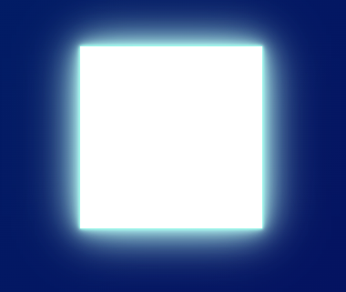
OK, there is light, but the problem is that we only need one side of the light. What should we do? There are many ways to cut. Here, I introduce a method to cut any space of elements by using clip path:
.shadow {
    width: 200px;
    height: 200px;
    background: #fff;
    box-shadow: .....;
    clip-path: polygon(-100% 100%, 200% 100%, 200% 500%, -100% 500%);
}
The principle is as follows:
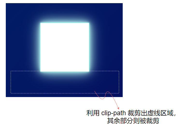
In this way, we get the light on one side:

Here, in fact, CSS also has a way to realize one-sided shadow( CSS shading techniques and details you don't know )However, the actual effect is not good, and finally adopted the above scheme.
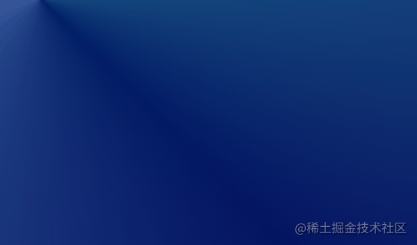
Next, we use positioning, rotation and other methods to overlap the above unilateral light and angular gradient, and we can get such an effect:

This meeting is already very similar. The next thing to do is to make the whole pattern move. There are many skills here. The core is to use CSS @Property to realize the animation of angular gradient, and make the light animation and angular gradient overlap.
We need to use CSS @Property to transform the code gradient. The core code is as follows:
<div class="wrap">
    <div class="shadow"></div>
</div>
@property --xPoint {
syntax: '<length>';
inherits: false;
initial-value: 400px;
}
@property --yPoint {
syntax: '<length>';
inherits: false;
initial-value: 300px;
}
.wrap {
position: relative;
margin: auto;
width: 1000px;
height: 600px;
background:
conic-gradient(
from -45deg at var(--xPoint) var(--yPoint),
hsla(170deg, 100%, 70%, .7),
transparent 50%,
hsla(219deg, 90%, 80%, .5) 100%),
linear-gradient(-45deg, #060d5e, #002268);
animation: pointMove 2.5s infinite alternate linear;
}
.shadow {
position: absolute;
top: -300px;
left: -330px;
width: 430px;
height: 300px;
background: #fff;
transform-origin: 100% 100%;
transform: rotate(225deg);
clip-path: polygon(-100% 100%, 200% 100%, 200% 500%, -100% 500%);
box-shadow: ... A large number of shadow codes are omitted here;
animation: scale 2.5s infinite alternate linear;
}
@keyframes scale {
50%,
100% {
transform: rotate(225deg) scale(0);
}
}
@keyframes pointMove {
100% {
--xPoint: 100px;
--yPoint: 0;
}
}In this way, we have realized a complete animation of light:
Let's re sort out the steps to realize such an animation:
- The basic framework is built by using the angular gradient conic gradient, and multiple gradients are also used here. Behind the angular gradient is a dark background color;
- Use multiple box shadows to achieve the effect of light and shadow (also known as Neon effect)
- Clip path is used to cut any area of elements
- Using CSS @Property to realize the animation effect of gradient
The rest of the work is to repeat the above steps, supplement other gradients and light sources, and debug the animation. Finally, we can get such a simple simulation effect:
Because the original effect is. mp4, we can't get the accurate color and shadow parameters. The color is directly obtained from the color palette, and the shadow is simulated at will. If the active file and accurate parameters are available, the simulation can be more realistic.
The complete code you can stamp here: CodePen -- iPhone 13 Pro Gradient
last
This article is more about figure 1 music. In practice, there must be a more elegant solution for making the above effects, and there should be a better method by using CSS simulation. Here I just throw a brick to attract jade. Some of the 1, 2, 3 and 4 skills in the process are still worth learning from.
Well, this article ends here. I hope this article will help you 😃
If you have any questions or suggestions, you can communicate more. The original articles have limited writing style and shallow talents. If there is anything wrong in the article, please let me know.