Rotation is also a common display effect on various websites. Here I will write about some simple ways to realize it.
// I don't know why the system ate the img tag in the code. Do the big guys have a solution?
1. Native js rotation
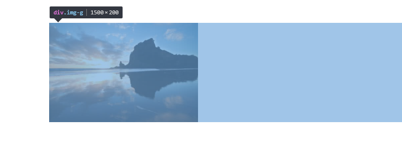
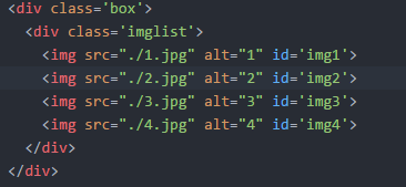
Native rotation effect, here the principle of implementation: there is a block-level element to place the list of pictures, all pictures, I use a horizontal list here; his parent element is a display block, width and height of a picture, using overflow:hidden attributes, each time only show a picture, hide other pictures, and then use js to control the timing or the list of pictures. Simple rotation can be achieved by moving left and right in other ways. The picture below is the parent element of overflow:hidden and the list of images is 1500*200.
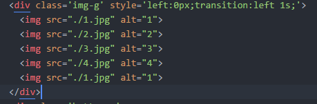
To make the rotation more smooth, insert the first picture after the last picture.
.box{
  width:300px;
  height:200px;
  margin:100px auto;
  overflow: hidden;
}
.img-g{
  width:1500px;
  height:200px;
}
.img-g img{
  width:300px;
  height:200px;
}
Setting the image list position to relative allows you to move the image by using the offset. For convenience, the left attribute is inlined into img-g.
If the left is - 100px
Then get the style.left of the picture list with js, and use the timer to control his offset, you can achieve a simple rotation.
let p=document.getElementsByClassName('img-g')[0];
let timer=setInterval(move,2000);
function move(){
  if(parseInt(p.style.left)>-1200){
    p.style.left=parseInt(p.style.left)-300+'px'
    console.log(p.style.left)
  }else{
    p.style.left='-300px'
  }
}
But moving pictures alone is not enough. In order to make image switching more natural, we can add the transition of css3 to left.
However, the transition from the last one to the first one is the opposite, so js is still used to control the transition properties.
The transition from the last picture to the first one is slightly more troublesome. I finally use a timer to slide the picture to the last one. After the transition animation is completed, cancel the transition animation and switch to the first one before starting the animation. This part of the code is as follows
let p=document.getElementsByClassName('img-g')[0];
let timer=setInterval(move,2000);
function move(){
  if(parseInt(p.style.left)>-1200){
    p.style.left=parseInt(p.style.left)-300+'px'
    p.style.transition='left 1s';
    if(parseInt(p.style.left)<=-1200){
        console.log('t')
        setTimeout(function(){
          p.style.left='0px'
          p.style.transition='left 0s';
        },1000)
    }
  }else{
    p.style.left='0px'
    p.style.transition='left 0s';
  }
}
At this point, the function of rotation has been realized, and several dots can be added to it to control the picture that is being played by rotation.
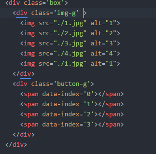
Dot html
<div class='button-g'>
      <span data-index='0' ></span>
      <span data-index='1'></span>
      <span data-index='2'></span>
      <span data-index='3'></span>
    </div>
.button-g{
  position:relative;
  top:-20px;
  text-align:center;
}
.button-g span{
  display:inline-block;
  position:relative;
  z-index:10;
  width:10px;
  height:10px;
  margin:0 5px;
  border-radius:100%;
}
When the dot is clicked, the picture slides to the image corresponding to the dot, and the dot changes when the picture slides. I add data-attribute to each dot attribute, which can be acquired by js.
To add an event to a small dot, the corresponding offset is slipped when clicked. let is used here, and closure is also used to achieve the same effect.
for(let i=0;i<button.length;i++){
  button[i].onclick=function(){
    p.style.left=-300*this.getAttribute('data-index')+'px'
    tog(this.getAttribute('data-index'))
  }
}

function tog(index){
  if(index>3){tog(0);return;}
  for(let i=0;i<button.length;i++){
    button[i].style.backgroundColor='#eee'
  }
  button[index].style.backgroundColor='rgb(215, 81, 15)';
}
Another common effect of rotation is to pause the rotation when the mouse is only on the picture, and continue to rotate when the mouse leaves.
In this way, it is easy to achieve the desired effect.
p.onmouseover=function(){
  clearInterval(window.timer)
}
p.onmouseout=function(){
  window.timer=setInterval(move,3000);
}
The actual effect can be seen in the following links:
https://zkhchris.github.io/FE_basic/hc/Carousel/carousel_pure_js.html
2.css3 rotation
css3 animation is used to achieve a gradual fading effect. absolute positioning is used to overlay the pictures in the picture list. z-index and transparency are controlled by animation to achieve gradual fading.
The absolute element is not the parent element of static relative to the first location, so the element is superimposed on a display block.
Then use the css3 animation to change their transparency and z-index according to the time cycle, and then complete the simple rotation effect.
Here each picture takes up 4 seconds of animation time, the total animation time is 16 seconds. Fade-in and fade-out are 1 s, occupying about 6% of the total time, 3 s at the top, occupying 18.7% of the total time; set the keyframe according to this ratio
.imglist img{
  width:300px;
  height:200px;
  position:absolute;
  animation: show 16s infinite;
}
@keyframes show{
  0%{
    opacity:0;
    z-index:2;
  }
  6%,25%{
    opacity:1;
    z-index: 1;
  }
  31%,100%{
    opacity:0;
    z-index:0;
  }
}
At this time, the pictures can appear in time cycle, but now they appear at the same time, disappear at the same time, add delay to the picture to complete the effect.
#img2{
    animation-delay: 0s;
}
#img2{
    animation-delay: 4s;
}
#img3{
    animation-delay: 8s;
}
#img4{
    animation-delay: 12s;
}
css3 round-seeding can achieve the effect of round-seeding, but there is no way to control which picture to broadcast now, so try to use js to control the effect of round-seeding.
https://zkhchris.github.io/FE_basic/hc/Carousel/css3carousel.html
3.vue rotation
With vue rotation, you can use list rendering to dynamically add images you want to rotate, and use the list transition with vue to achieve the effect of rotation.
In this paper, we use the parent element and the child element of the non-positioned rotatable frame as absolute picture to achieve the rotatable effect with v-show.
List Rendering Pictures
<template>
    <div id='swiper_img_box'>
    <ul class='swiper_img_ul'>

    </ul>
        <ul class='buttonG'>
        <span v-for='(img,index) in imgs' :key='index' ></span>
        </ul>
    </div>
</template>

<style>
  .swiper_img_ul{
    height:300px;
  }
  .swiper_img_ul img{
    position:absolute;
  }
  #swiper_img_box{
    position:relative;
    width:300px;
    height:300px;
    overflow:hidden;
  }
  .buttonG{
    position:absolute;
    bottom:0;
  }
  .circle{
    display:inline-block;
    width:15px;
    height:15px;
    border-radius:100%;
    margin-left:10px;
  }
</style>
Use v-show to control whether the pictures are displayed or not. Use timer to modify the pictures currently displayed. The timer is hung on mounted.

  mounted:function(){
    this.timer=setInterval(this.changeIndex,2000)
    },
  methods:{
    changeIndex(){
      if(this.showIndex>=this.imgs.length-1){
        this.showIndex=0
      }else{
        this.showIndex++
      }
    }

  data () {
    return {
      imgs:[
            {
            src:'../../dist/7.gif',
            alt:'1'
            },{
            src:'../../dist/home_06.gif',
            alt:'2'
            },{
            src:'../../dist/home_08.gif',
            alt:'3'
            },{
            src:'../../dist/home_12.gif',
            alt:'4'
            }
          ],
          showIndex:0
    }
    },
In this way, through the timer, you can control the rotation of pictures, but there is no transitional effect, the rotation is very abrupt, plus the transitional effect.
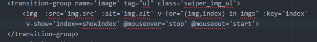
<transition-group name='image' tag="ul" class='swiper_img_ul'>

  .image-enter-active {
            transform: translateX(0);
            transition: all 1s ease;
        }

  .image-leave-active {
            transform: translateX(-100%);
            transition: all 1s ease;
        }

  .image-enter {
            transform: translateX(100%)
        }

  .image-leave {
            transform: translateX(0)
                }
With the usual mouse mouseover pause, mouseout continues and clicks the button to rotate to the image corresponding to the button clicked.
<transition-group name='image' tag="ul" class='swiper_img_ul'>
        <img  ...... @mouseover='stop' @mouseout='start'>
    </transition-group>
        <ul class='buttonG'>
        <span ...... @click='goto(index)'></span>
       </ul>

  methods:{
    changeIndex(){
      if(this.showIndex>=this.imgs.length-1){
        this.showIndex=0
      }else{
        this.showIndex++
      }
    },
    stop(){
      console.log('1')
      clearInterval(this.timer)
    },
    start(){
      this.timer=setInterval(this.changeIndex,2000)
    },
    goto(i){
      this.showIndex=i
      this.stop()
      this.start()
    }
  }
At this time, the effect of rotation is almost achieved, but this vue rotation I wrote as a single file component form, can not preview, just paste the code below.
Thank you for reading. I hope you guys can give more advice.
swiper.vue
<template>
    <div id='swiper_img_box'>
        <ul class='buttonG'>
        <span v-for='(img,index) in imgs' :key='index' :class="[index==showIndex ? 'color' : 'white', 'circle']" @click='goto(index)'></span>
        </ul>
    </div>
</template>
<script>
export default{
  name:'swiper',
  data () {
    return {
      imgs:[
            {
            src:'../../dist/7.gif',
            alt:'1'
            },{
            src:'../../dist/home_06.gif',
            alt:'2'
            },{
            src:'../../dist/home_08.gif',
            alt:'3'
            },{
            src:'../../dist/home_12.gif',
            alt:'4'
            }
          ],
          showIndex:0
    }
    },
  mounted:function(){
    this.timer=setInterval(this.changeIndex,2000)
    }
,
  methods:{
    changeIndex(){
      if(this.showIndex>=this.imgs.length-1){
        this.showIndex=0
      }else{
        this.showIndex++
      }
    },
    stop(){
      clearInterval(this.timer)
    },
    start(){
      this.timer=setInterval(this.changeIndex,2000)
    },
    goto(i){
      this.showIndex=i
      this.stop()
      this.start()
    }
  }
}
</script>
<style>
  .swiper_img_ul{
    height:300px;
  }
  .swiper_img_ul img{
    position:absolute;
  }
  #swiper_img_box{
    position:relative;
    width:300px;
    height:300px;
    overflow:hidden;
  }
  .buttonG{
    position:absolute;
    bottom:0;
  }
  .circle{
    display:inline-block;
    width:15px;
    height:15px;
    border-radius:100%;
    margin-left:10px;
  }
  .white{
    background-color:#fff;
  }
  .color{
    background-color:#f00;
  }
  .image-enter-active {
            transform: translateX(0);
            transition: all 1s ease;
        }

  .image-leave-active {
            transform: translateX(-100%);
            transition: all 1s ease;
        }

  .image-enter {
            transform: translateX(100%)
        }

  .image-leave {
            transform: translateX(0)
                }
</style>