In the layout, the problem of horizontal and vertical centering is often encountered, so I collected several commonly used methods of horizontal and vertical centering ~convenient for myself to find the answer, but also convenient for everyone to find!
1. Making use of margin negative value
Main CSS code:
position: absolute
left: 50%;
top: 50%;
width: (width)px;
height: (height)px;
margin-left: -(width/2)px; /*Half the width*/
margin-top: -(height/2)px; /*Half the height*/
Implementation examples:
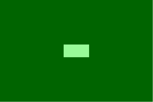
Complete HTML code:
<!DOCTYPE html>
<html lang="en">
<head>
    <meta charset="UTF-8">
    <title>Horizontal and Vertical Centralization</title>
    <style>
        .container {
            position: relative;
            background: #006400;
            width: 600px;
            height: 400px;
        }
        .center {
            position: absolute;
            left: 50%;
            top: 50%;
            margin-left: -50px;
            margin-top: -25px;
            width: 100px;
            height: 50px;
            background: #98FB98;
        }
    </style>
</head>
<body>
    <div class="container">
        <div class="center"></div>
    </div>
</body>
</html>
This method must know the width and height of the element in order to set the horizontal and vertical center, and the margin-left value is half of the width, and the margin-top value is half of the height.
If you don't know the width and height of the element, and you want to use absolute positioning method, you can use transform to achieve.
Advantages of using transform:
1. You may not know the width and height.
2. Less code
Disadvantages:
1. IE8 does not support
2. May interfere with other transform s
Main CSS code:
transform: translate(-50%, -50%); /*50%For half its size*/The results are as follows:

Complete HTML code:
<!DOCTYPE html>
<html lang="en">
<head>
    <meta charset="UTF-8">
    <title>Horizontal and Vertical Centralization</title>
    <style>
        .container {
            position: relative;
            background: #006400;
            width: 600px;
            height: 400px;
        }
        .center {
            position: absolute;
            left: 50%;
            top: 50%;
            transform: translate(-50%, -50%);
            background: #98FB98;
        }
    </style>
</head>
<body>
    <div class="container">
        <div class="center">Ha ha ha</div>
    </div>
</body>
</html>
2. Using margin: auto to center absolutely positioned elements
The point here is:
1. Locate to 0 from top to bottom
2. Use margin: auto
Main CSS code:
position: absolute;
left: 0;
top: 0;
right: 0;
bottom: 0;
margin: auto;    /* With this, it's automatically in the middle. */
Implementation examples: 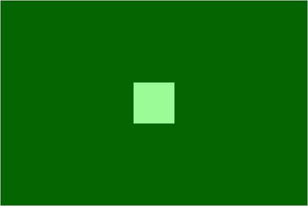
Complete HTML code:
<!DOCTYPE html>
<html lang="en">
<head>
    <meta charset="UTF-8">
    <title>Horizontal and Vertical Centralization</title>
    <style>
        .container {
            position: relative;
            background: #006400;
            width: 600px;
            height: 400px;
        }
        .center {
            position: absolute;
            left: 0;
            top: 0;
            bottom: 0;
            right: 0;
            margin: auto;
            width: 80px;
            height: 80px;
            background: #98FB98;
        }
    </style>
</head>
<body>
    <div class="container">
        <div class="center"></div>
    </div>
</body>
</html>
3. Set display: table-cell
Advantage:
1. Variable height
2. Content overflow will push the parent element apart.
3. Good compatibility across browsers.
Disadvantages:
Need additional HTML code
<!DOCTYPE html>
<html lang="en">
<head>
    <meta charset="UTF-8">
    <title>Horizontal and Vertical Centralization</title>
    <style>
        .container {
            background: #006400;
            width: 600px;
            height: 400px;
            display: table;
        }
        .wrap {
            text-align: center;
            display: table-cell;
            vertical-align: middle;
        }
        .center {
            background: #98FB98;
            width: 20%;
            height: 20%;
            margin: auto;
        }
    </style>
</head>
<body>
    <div class="container">
        <div class="wrap">
            <div class="center"></div>
        </div>
    </div>
</body>
</html>
4. Using inline-block
Set div to inline-block, and then process it vertically in the middle of the picture.
Main CSS code:
.container {
    display: table-cell;
    vertical-align: middle;
    text-align: center;
}
.center {
    display: inline-block;
}
Complete HTML code:
<!DOCTYPE html>
<html lang="en">
<head>
    <meta charset="UTF-8">
    <title>Horizontal and Vertical Centralization</title>
    <style>
        .container {
            background: #006400;
            width: 600px;
            height: 400px;
            display: table-cell;
            vertical-align: middle;
            text-align: center;
        }
        .center {
            display: inline-block;
            background: #98FB98;
        }
    </style>
</head>
<body>
    <div class="container">
        <div class="center">Ha ha ha</div>
    </div>
</body>
</html>
5. Use flexbox
flexbox is a new attribute of CSS3, designed to solve common layout problems such as vertical centering.
Main CSS code:
display: flex;
justify-content: center;
align-items: center;
Complete HTML code:
<!DOCTYPE html>
<html lang="en">
<head>
    <meta charset="UTF-8">
    <title>Horizontal and Vertical Centralization</title>
    <style>
        .container {
            background: #006400;
            width: 600px;
            height: 400px;
            display: flex;
            justify-content: center;
            align-items: center;
        }
        .center {
            background: #98FB98;
        }
    </style>
</head>
<body>
    <div class="container">
        <div class="center">Ha ha ha</div>
    </div>
</body>
</html>