1. Control Analysis
The following menu effects are often encountered in "My" or "Settings" interfaces:
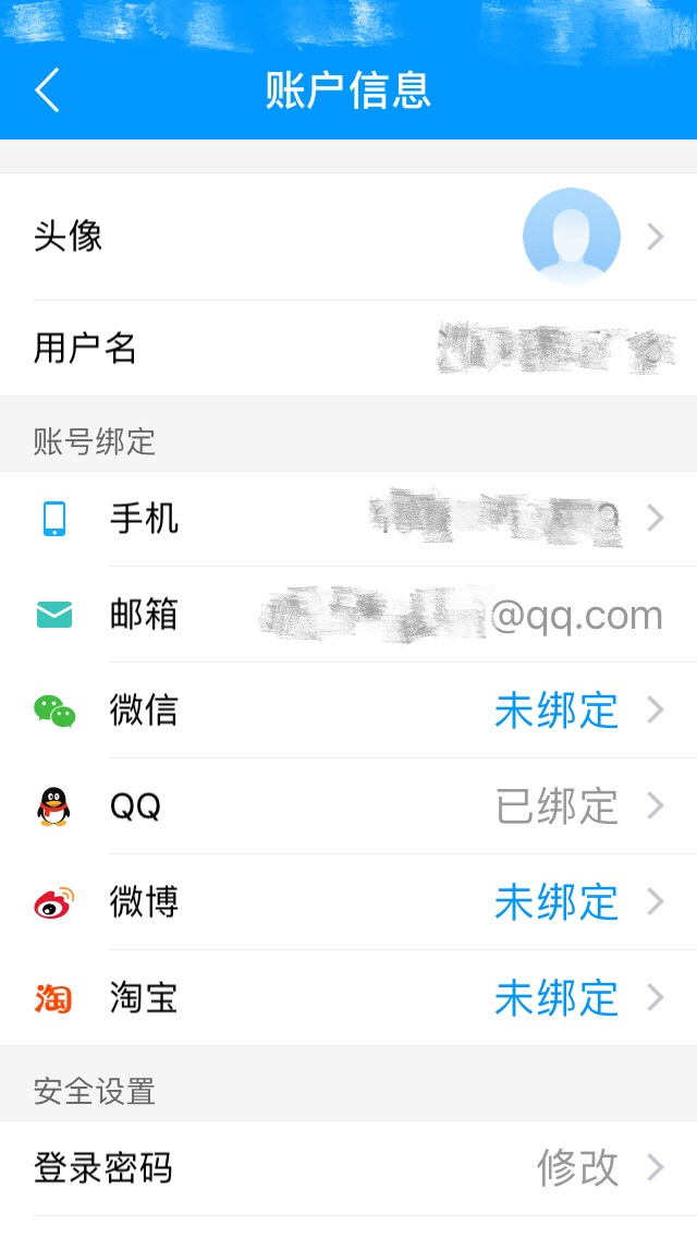
If it is a novice, Xiaobai, for this interface may be directly in the layout, but it must be inefficient writing.
In fact, this effect can be achieved with ListView, but if there are more such interfaces, we will write more adapter s.
For myself, in order to learn the custom View control, I want to use it as an introduction, temporarily called it. SettingBar.
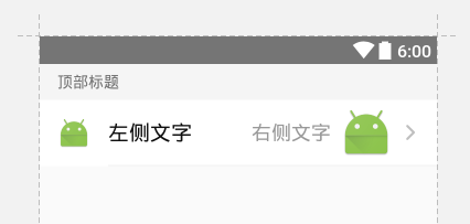
First of all, we take out a separate one for analysis and make it generalized.
Key elements:
- Top header text (hidden by default)
- Left icon (default no, 30dp*30dp)
- Left side text
- Right icon (default arrow, 16dp*16dp)
- Right ImageView (default no, 48dp*48dp)
- Right side text
- Bottom Secant (aligned with the left border of the left text, displayed by default)
Other extensions:
- Click events
- All text can be coloured and numbered.
- All pictures can be set round, round corner, size, picture resources src
Through the analysis, we can make a single complete layout, the effect is as follows:
2. Custom Properties
We create a new attr.xml in the value directory to write the attributes of our custom controls:
<?xml version="1.0" encoding="utf-8"?>
<resources>

    <declare-styleable name="SettingBar">
        <attr name="topTitle" format="string"></attr>
        <attr name="topTitleSize" format="dimension"></attr>
        <attr name="topTitleColor" format="color"></attr>
        <attr name="topTitleBackgroundColor" format="color"></attr>
        <attr name="topTitleVisibility" format="boolean"></attr>

        <attr name="leftIcon" format="reference"></attr>
        <attr name="leftIconVisibility" format="boolean"></attr>

        <attr name="leftText" format="string"></attr>
        <attr name="leftTextSize" format="dimension"></attr>
        <attr name="leftTextColor" format="color"></attr>

        <attr name="rightText" format="string"></attr>
        <attr name="rightTextSize" format="dimension"></attr>
        <attr name="rightTextColor" format="color"></attr>

        <attr name="rightImage" format="reference"></attr>
        <attr name="rightImageVisibility" format="boolean"></attr>

        <attr name="rightIcon" format="reference"></attr>
        <attr name="rightIconVisibility" format="boolean"></attr>

        <attr name="bottomDividerVisibility" format="boolean"/>
        <attr name="bottomDividerColor" format="color"/>
        <attr name="bottomDividerHeight" format="dimension"/>

        <attr name="tag" format="string"/>

    </declare-styleable>

</resources>
See that there is a tag attribute at the end, this is to facilitate later in a large number of controls to find specific controls.
3. Control Implementation
Since this is a simple composite control and does not require special drawing and calculation, we directly inherit LinearLayout for implementation.
Rewrite the construction method:
public class SettingBar extends LinearLayout implements View.OnClickListener {

    ......

    public SettingBar(Context context) {
         this(context, null);
     }

     public SettingBar(Context context, AttributeSet attrs) {
         this(context, attrs, 0);
     }

     public SettingBar(Context context, AttributeSet attrs, int defStyleAttr) {
         super(context, attrs, defStyleAttr);
         initViews(context);
         obtainStyledAttrs(attrs);
     }

    ......
}
In the construction method, one thing we need to do is to introduce the previously written layout and sub-controls.
private void initViews(Context context) {

    LayoutInflater.from(context).inflate(R.layout.layout_setting_bar, this);

    this.topTitleView = (TextView) findViewById(R.id.top_title);
    this.leftTextView = (TextView) findViewById(R.id.left_text);
    this.rightTextView = (TextView) findViewById(R.id.right_text);
    this.leftIconView = (ImageView) findViewById(R.id.left_icon);
    this.rightImageView = (ImageView) findViewById(R.id.right_image);
    this.rightIconView = (ImageView) findViewById(R.id.right_icon);
    this.bottomDividerView = findViewById(R.id.bottom_divider);
    this.bodyLayout = (LinearLayout) findViewById(R.id.body_layout);

    this.bodyLayout.setOnClickListener(this);
}
The second is to get custom attributes from XML and set default values and values from xml.
/**
 * Get custom properties
 * @param attrs
 */
private void obtainStyledAttrs(AttributeSet attrs) {
    TypedArray ta = getContext().obtainStyledAttributes(attrs, R.styleable.SettingBar);

    mTag = ta.getString(R.styleable.SettingBar_tag);
    mTopTitle = ta.getString(R.styleable.SettingBar_topTitle);
    mLeftText = ta.getString(R.styleable.SettingBar_leftText);
    mRightText = ta.getString(R.styleable.SettingBar_rightText);

    mTopTitleSize = (int) ta.getDimension(R.styleable.SettingBar_topTitleSize, DEFAULT_TOP_TITLE_SIZE);
    mLeftTextSize = (int) ta.getDimension(R.styleable.SettingBar_leftTextSize, DEFAULT_LEFT_TEXT_SIZE);
    mRightTextSize = (int) ta.getDimension(R.styleable.SettingBar_rightTextSize, DEFAULT_RIGHT_TEXT_SIZE);

    mTopTitleVisible = ta.getBoolean(R.styleable.SettingBar_topTitleVisibility, false);
    mBottomDividerVisible = ta.getBoolean(R.styleable.SettingBar_bottomDividerVisibility, true);

    // Set the acquired properties
    setTag(mTag == null ? "" : mTag);
    setTopTitle(mTopTitle == null ? "" : mTopTitle);
    setLeftText(mLeftText == null ? "" : mLeftText);
    setRightText(mRightText == null ? "" : mRightText);
    setTopTitleSize(mTopTitleSize);
    setLeftTextSize(mLeftTextSize);
    setRightTextSize(mRightTextSize);
    setTopTitleVisibility(mTopTitleVisible);
    setBottomDividerVisibility(mBottomDividerVisible);

    ta.recycle();
}
Finally, don't forget to call recycle() to release the instance.
In addition, we need to leave an interface to handle some click operations.
public interface OnBarClickListener {
    void onBarClick();
}

private OnBarClickListener mListener;

public void setOnBarClickListener(OnBarClickListener listener) {
    this.mListener = listener;
}

@Override
public void onClick(View view) {
    if (mListener != null) {
        mListener.onBarClick();
    }
}
See GitHub for other get/set methods Project source: https://github.com/Yiiip/SettingBar.
4. Adding Model Entity Classes
When using Activity, in addition to setting attribute values directly in xml, it is also essential to set values dynamically in java.
In addition to some getXXX and setXXX methods that we exposed in SettingBar, we can also add entity classes to assist them and use them together. Their internal attributes can be added as needed:
public class SettingBarModel {

    private String topTitle;
    private String leftText;
    private String rightText;
    private String rightTextColorString;
    private int rightTextColorRes;
    private int leftIconRes;
    private int rightIconRes;
    private int rightImageRes;

    //... construction method

    //... get, set method
}
With entity classes, we have an additional means of assignment when we use them in Activity. Is it a bit familiar when we write adapter, but we don't design it that way. get and set methods are enough.
5. Use case and actual effect
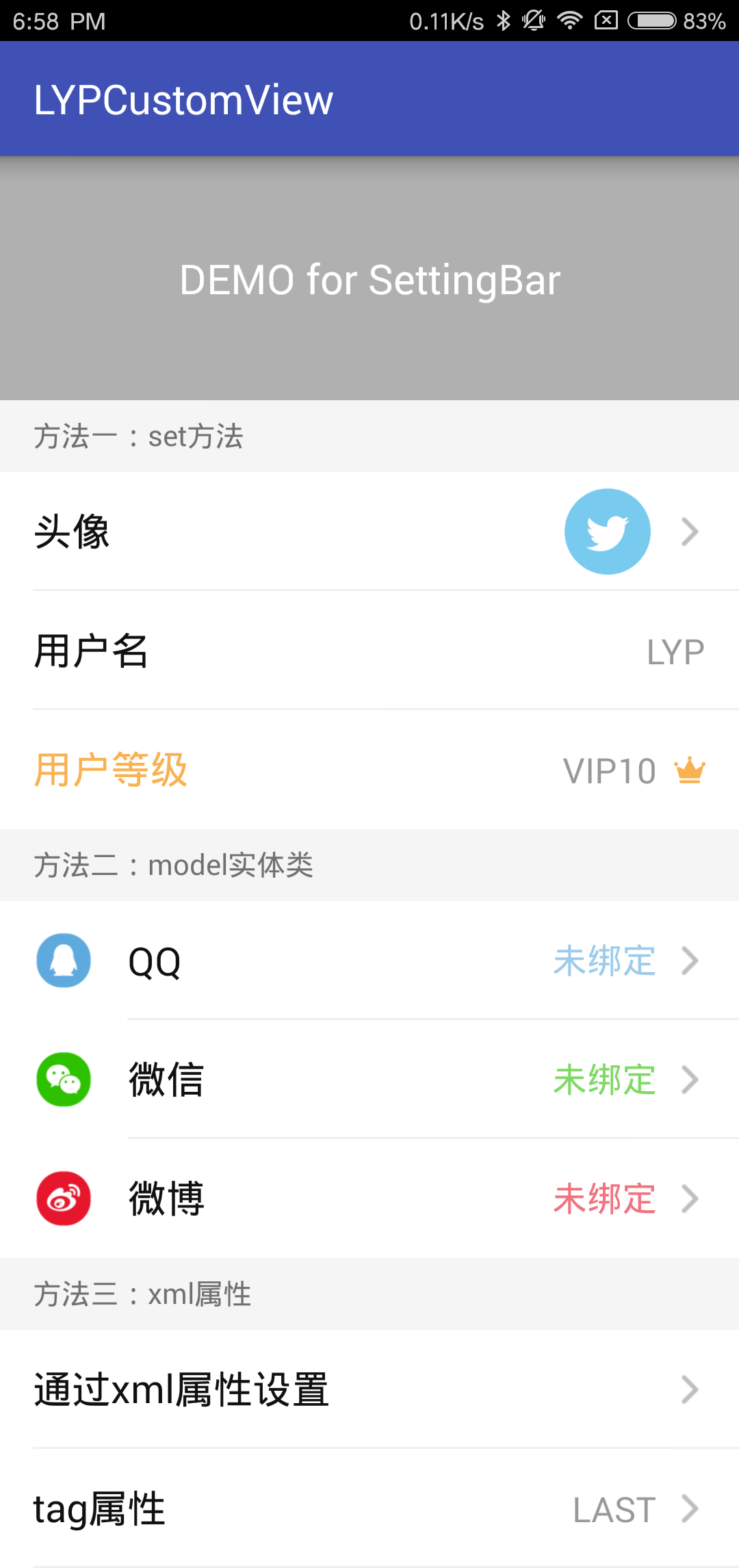
MainActivity.java
public class MainActivity extends AppCompatActivity {

    private LinearLayout container;
    private List<SettingBar> views;
    private List<SettingBarModel> models;

    private int[] leftIcons = {R.drawable.ic_qq, R.drawable.ic_wechat, R.drawable.ic_weibo};
    private String[] leftTexts = {"QQ", "WeChat", "micro-blog"};
    private String[] rightTextColors = {"#995EAADE", "#992DC100", "#99E6162D"};
    private String[] titles = {"Method 1: set Method", "Method two: model Entity class", "Method three: xml attribute"};

    @Override
    protected void onCreate(Bundle savedInstanceState) {
        super.onCreate(savedInstanceState);
        setContentView(R.layout.activity_main);

        container = (LinearLayout) findViewById(R.id.container);

        views = new ArrayList<>();
        for (int i = 0; i < container.getChildCount(); i++) {
            views.add((SettingBar) container.getChildAt(i));
        }

        models = new ArrayList<>();
        for (int i = 0; i < leftTexts.length; i++) {
            models.add(new SettingBarModel(leftTexts[i], leftIcons[i], "Unbound", rightTextColors[i]));
        }


        for (int i = 0; i < views.size(); i++) {
            final SettingBar view = views.get(i);

            if (i%3 == 0) {
                view.setTopTitle(titles[i/3]);
            }
            if (i%3 == 2) {
                view.setBottomDividerHeight(0);
                // Or view. setBottom Divider Visibility (false);
            }

            if (i == 0) {
                view.setLeftIconVisibility(false);
                view.setLeftText("Head portrait");
                view.setRightImage(R.drawable.ic_icon_twitter);
            }

            if (i == 1) {
                view.setLeftText("User name");
                view.setRightText("LYP");
                view.setRightIconVisibility(false);
            }

            if (i == 2) {
                view.setLeftText("User level");
                view.setLeftTextColorString("#F8B250");
                view.setRightIcon(R.drawable.ic_level);
                view.setRightText("VIP10");
            }

            if (i/3 == 1) {
                view.setupModel(models.get(i%3));
            }

            if (view.getTag() != null && view.getTag().equals("LAST")) {
                view.setRightText("LAST");
            }

            final int index = i;
            view.setOnBarClickListener(new SettingBar.OnBarClickListener() {
                @Override
                public void onBarClick() {
                    Toast.makeText(MainActivity.this, "Click. "+ view.getLeftText(), Toast.LENGTH_SHORT).show();
                }
            });
        }
    }
}
activity_main.xml
<?xml version="1.0" encoding="utf-8"?>
<LinearLayout xmlns:android="http://schemas.android.com/apk/res/android"
    xmlns:tools="http://schemas.android.com/tools"
    xmlns:app="http://schemas.android.com/apk/res-auto"
    android:id="@+id/activity_main"
    android:layout_width="match_parent"
    android:layout_height="match_parent"
    android:orientation="vertical"
    android:background="#F5F5F5"
    tools:context="com.lyp.lypcustomview.MainActivity">

    <TextView
        android:layout_width="match_parent"
        android:layout_height="wrap_content"
        android:gravity="center"
        android:padding="46dp"
        android:background="#B0B0B0"
        android:text="DEMO for SettingBar"
        android:textSize="20sp"
        android:textColor="#FFF"/>

    <ScrollView
        android:layout_width="match_parent"
        android:layout_height="match_parent">

        <LinearLayout
            android:id="@+id/container"
            android:layout_width="match_parent"
            android:layout_height="match_parent"
            android:orientation="vertical">

            <com.lyp.settingbar.SettingBar
                android:layout_width="match_parent"
                android:layout_height="wrap_content"/>

            <com.lyp.settingbar.SettingBar
                android:layout_width="match_parent"
                android:layout_height="wrap_content"/>

            <com.lyp.settingbar.SettingBar
                android:layout_width="match_parent"
                android:layout_height="wrap_content"/>

            <com.lyp.settingbar.SettingBar
                android:layout_width="match_parent"
                android:layout_height="wrap_content"/>

            <com.lyp.settingbar.SettingBar
                android:layout_width="match_parent"
                android:layout_height="wrap_content"/>

            <com.lyp.settingbar.SettingBar
                android:layout_width="match_parent"
                android:layout_height="wrap_content"/>

            <com.lyp.settingbar.SettingBar
                app:leftText="adopt xml Property settings"
                android:layout_width="match_parent"
                android:layout_height="wrap_content"
                app:leftIcon="@drawable/ic_twitter"/>

            <com.lyp.settingbar.SettingBar
                android:layout_width="match_parent"
                android:layout_height="wrap_content"
                app:leftText="tag attribute"
                app:tag="LAST"/>

        </LinearLayout>

    </ScrollView>
</LinearLayout>
At present, there are still some shortcomings, but custom controls still need to be learned. Please give me more advice.
Project source: https://github.com/Yiiip/SettingBar
Note: Reprinted please follow CC-BY-NC-ND Agreement.