The linkbutton is a button component in the easyui framework and is the parent of other button components in various forms, such as MenuButton.linkbutton is created from <a>tag in html. Users can add icons and text to the button. It is a very common component. 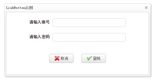
The Cancel and Logon buttons in the image above are the link buttons.Take a look at the code.
linkbuttonDemo.php
<html>
    <head>
        <meta http-equiv="Content-Type" content="text/html; charset=UTF-8">
        <link rel="stylesheet" type="text/css" href="easyui/themes/bootstrap/easyui.css" />
        <link rel="stylesheet" type="text/css" href="easyui/themes/icon.css" />
        <script type="text/javascript" src="easyui/jquery.min.js"></script>
        <script type="text/javascript" src="easyui/jquery.easyui.min.js"></script>
        <title>linkbuttonDemo</title>
        <style>
            .container {
                text-align: center;
                width: 100%;
            }
            .inputContainer {
                width:400px;
                margin: auto;
                margin-top: 20px;
            }
            .inputLabel {
                font-size: 13px;
                padding-right: 10px;
                font-weight: bold;
            }
            .inputButton {
                margin-top: 40px;
            }
        </style>
    </head>
    <body>
        <div class="easyui-window" id="winButton">
            <div class="container">
                <div class="inputContainer">
                    <label class="inputLabel">Please enter an account</label>
                    <input class="easyui-textbox" data-options="height:28,width:240">
                </div>
                <div class="inputContainer">
                    <label class="inputLabel">Please input a password</label>
                    <input class="easyui-textbox" type="password" data-options="height:28,width:240">
                </div>
                <a id="btnCancel" class="easyui-linkbutton inputButton" href="javascript:void(0)"></a>
                <a id="btnLogin" class="easyui-linkbutton inputButton" href="javascript:void(0)" style="margin-left: 20px"></a>
            </div>
        </div>
        <script>
            $("#winButton").window({
                title:'LinkButton Example',
                width:480,
                height:240,
                collapsible:false,
                minimizable:false,
                maximizable:false
            });

            $("#btnCancel").linkbutton({
                iconCls:'icon-cancel',
                width:80,
                height:30,
                text:'cancel',
                onClick:function() {
                    $('#winButton').window('close');
                }
            });

            $("#btnLogin").linkbutton({
                iconCls:'icon-ok',
                width:80,
                height:30,
                text:'Land'
            });
        </script>
    </body>
</html>
In the above example code, we only do event handling for Cancel button, click Cancel button, hide the whole dialog box (window component), but do not do any processing for Logon button. User can write corresponding code according to actual project.
linkbutton component properties
| Property Name | Attribute value type | Property Default | describe |
|---|---|---|---|
| width | numerical value | null | Component width. |
| height | numerical value | null | Component height. |
| id | Character string | null | Component id. |
| disabled | Boolean Value | false | Whether components are disabled. |
| toggle | Boolean Value | false | A value of true sets the button to be checked or unchecked. Version 1.3.3 and above is supported. |
| selected | Boolean Value | false | If the value is true, the user can set the button to the selected state. Version 1.3.3 and above is supported. |
| group | Character string | null | Group buttons by setting a group name. |
| plain | Boolean Value | false | The button does not appear raised when the value is true. |
| text | Character string | " | Button title. |
| iconCls | Character string | null | Button icon style. |
| iconAlign | Character string | 'left' | Button icon position. There are four values:'left','right','top','bottom'. Version 1.3.2 and above is supported. |
| size | Character string | 'small' | Button size.There are four values,'small','large'. Version 1.3.6 and above is supported. |
The disabled property determines whether the button is disabled or not. Once the button is disabled, the button cannot be clicked and related events cannot be triggered.The following image shows the status of the login button when it is disabled. 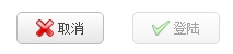
Let's look at the following illustration and a piece of code, then combine toggle, selected, group to tell. 
linkbuttonToggleDemo.php
<html>
    <head>
        <meta http-equiv="Content-Type" content="text/html; charset=UTF-8">
        <link rel="stylesheet" type="text/css" href="easyui/themes/bootstrap/easyui.css" />
        <link rel="stylesheet" type="text/css" href="easyui/themes/icon.css" />
        <script type="text/javascript" src="easyui/jquery.min.js"></script>
        <script type="text/javascript" src="easyui/jquery.easyui.min.js"></script>
        <title>linkbuttonToggleDemo</title>
    </head>
    <body>
        <div class="container">
            <a id="btn1" class="easyui-linkbutton" href="javascript:void(0)"></a>
            <a id="btn2" class="easyui-linkbutton" href="javascript:void(0)" style="margin-left: 20px"></a>
            <a id="btn3" class="easyui-linkbutton" href="javascript:void(0)" style="margin-left: 20px"></a>
            <a id="btn4" class="easyui-linkbutton" href="javascript:void(0)" style="margin-left: 20px"></a>
        </div>

        <script>
            $("#btn1").linkbutton({
                iconCls:'icon-ok',
                width:80,
                height:30,
                text:'Button 1',
                toggle:true,
                group:'g1'
            });

            $("#btn2").linkbutton({
                iconCls:'icon-add',
                width:80,
                height:30,
                text:'Button 2',
                toggle:true,
                group:'g1'
            });

            $("#btn3").linkbutton({
                iconCls:'icon-save',
                width:80,
                height:30,
                text:'Button 3',
                toggle:true,
                group:'g1'
            });

            $("#btn4").linkbutton({
                iconCls:'icon-cancel',
                width:80,
                height:30,
                text:'Button 4',
                toggle:true,
                group:'g1'
            });
        </script>
    </body>
</html>
linkbuttonToggleDemo.php is the implementation code shown above.You can see that button 2 is in the "selected" state (i.e. the pressed state), which is the effect of the "selected" property, which is the pressed state when the "selected" property of the button is set to true.
The function of the "toggle" property is to allow a button to be pushed. If true, when the user clicks the button, the button will be pushed and then clicked again to return to normal.
The group attribute groups buttons. The group name can be any name you want, in this case "g1", and the four buttons group attribute values are the same, all of which are "g1", indicating that the four buttons belong to the same group.Grouping attributes are generally used in conjunction with toggle attributes, where multiple buttons within the same grouping allow only one button to be in the "selected" state (i.e., pressed) at a time.In the picture above, button 2 is pressed. Once another button (such as button 1) is clicked, button 1 is pressed and button 2 is restored at the same time.
Plain specifies whether the appearance is convex or not.The left button plain property is true and the right button is false in the image below. 
The text property specifies the button text, such as Cancel, Logon.
iconCls specifies the icon style, which is provided by the easyui framework in this code.For easy viewing, we will organize the icon styles that come with the system and present them in a single article.
iconAlign specifies the icon position, defaulting to "left". The icons of buttons in this text effect are on the left.In addition, they can be "right", "top", "bottom" (right, top, bottom, respectively).
The size property specifies the button size with only two values, small and large, as shown below. 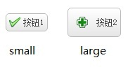
linkbutton component method
| Method Name | parameter | describe |
|---|---|---|
| options | nothing | Returns all properties. |
| resize | param | Adjust button size.Version 1.4 and above is supported. |
| disable | nothing | Disable the button. |
| enable | nothing | Enable button. |
| select | nothing | Keep the button selected.Version 1.3.3 and above is supported. |
| unselect | nothing | Cancel the selected state of the button.Version 1.3.3 and above is supported. |
The resize method parameter is a json object with width and height, described in the layout article.
(http://blog.csdn.net/redeg/article/details/65443712)
The other methods are simple and don't cover much.
linkbutton Component Event
| Event Name | parameter | describe |
|---|---|---|
| onClick | nothing | Triggered when the button is clicked.Version 1.3.6 and above is supported. |
This method is described in linkbuttonDemo.php and is not described here.In addition, users can also directly use the onclick event native to js in the <a> tag with the same effect.