I. Learning notes from numpy and matplotlib Libraries
(1) numpy Library
1, create an array from a range of values
1 numpy.arange(start, stop, step, dtype)#parameters are start, end, step and data type, respectively
2. Create an equally spaced one-bit array
1 np.linspace(start, stop, num=50, endpoint=True, retstep=False, dtype=None)#Parameters are start value, end value, number of data, whether to include stop value, whether to show spacing and data type, respectively.
3. Use the number 0 to surround a 5 x 5 2-D array of all 1
1 Z = np.ones((5,5)) 2 Z = np.pad(Z, pad_width=1, mode='constant', constant_values=0)
4. Create a two-dimensional array of 5x5 with values of 1, 2, 3, 4 falling below its diagonal Z = np.diag(1+np.arange(4),k=-1)
5. Create a two-dimensional array of 10x10 and place 1 and 0 diagonally spaced
1 Z = np.zeros((10,10),dtype=int)
2 Z[1::2,::2] = 1
3 Z[::2,1::2] = 1
6. Create a one-dimensional array of 0-10 and invert all numbers between (1, 9) into negative numbers
1 Z = np.arange(11)
2 Z[(1 < Z) & (Z <= 9)] *= -1
7. Find the same element in two one-dimensional arrays
1 Z1 = np.random.randint(0,10,10)
2 Z2 = np.random.randint(0,10,10)
3 print("Z1:", Z1)
4 print("Z2:", Z2)
5 np.intersect1d(Z1,Z2)
8. Return each row, column maximum
1 np.argmax(a, axis=0)#Row minimum is an argmin function
2 np.max(a, axis=0) #column maximum
9. Use NumPy to print the dates of yesterday, today and tomorrow
1 yesterday = np.datetime64('today', 'D') - np.timedelta64(1, 'D')
2 today     = np.datetime64('today', 'D')
3 tomorrow  = np.datetime64('today', 'D') + np.timedelta64(1, 'D')
4 print("yesterday: ", yesterday)
5 print("today: ", today)
6 print("tomorrow: ", tomorrow)
10. Several commonly used functions
 1 flat #Return
 2
 3 np.nonzero([1,0,2,0,1,0,4,0])#Returns the position index of non-zero elements in a one-dimensional array
 4
 5 np.dot(A, B)#matrix multiplication
 6
 7 np.power(x,4)#Yes x Each value of the array is fourth power
 8
 9 np.set_printoptions(precision=2)#For each element in a two-dimensional random array, keep its 2-digit decimal number
10
11 Z/1e3#Scientific notation output NumPy(Z) array
12
13 a.argsort()#Print the ascending index of each element in the array
14
15 a.real #Attributes, arrays a Real part
16 a.imag #Attributes, arrays a Imaginary part of
17
18 numpy.linalg.inv()# The function calculates the inverse multiplication matrix of the matrix.
19
20 numpy.linalg.solve() #The function gives the solution of a linear equation in matrix form.
21
22 umpy.matlib.eye() #The function returns a matrix with a diagonal element of 1 and zero elsewhere.
23
24 np.c_[M1, M2]#Join two arrays by column
25 np.r_[M1, M2]#Join two arrays by row
(2)matplotlib Library
The matplotlib library can be used to visualize data in Python. Here are some descriptions of the matpltlib library:
1. The matplotlib.pyplot module can draw a line graph, which is divided into two steps, pyplot.plot() and pyplot.show(), the former being responsible for drawing and the latter displaying the finished drawing.
2. pyplot.plot (Series1, Series2) uses Series1 as the horizontal coordinate and Series2 as the vertical coordinate to draw a polyline graph;
3. After executing the function in 2, you can use pyplot.xticks (rotation = 45) to rotate the x-axis coordinates 45 degrees counterclockwise, defaulting to 0 degrees, which is horizontal. Similarly, you can use pyplot.yticks (rotation = 45) to do the same for the y-axis coordinates.
4. You can use pyplot.xlabel (str) to name the x-axis as the value of str. Similarly, you can use pyplot.ylabel (str) to name the y-axis as the value of str.
5. You can use pyplot.title (str) to name the line drawing.
6. fig = pyplot.figure() indicates the default drawing interval.
7. fig.add_subplot (3, 2, 1) adds a subplot to the drawing interval at the first of six blocks that divide the drawing interval into three rows and two columns. The order of the numbers here is left to right, top to bottom, and according to this logic, (3, 2, 1) is at the leftmost position of the first row, (3, 2, 3) at the left of the second row, (3, 2, 6) at the third rowFarthest right.
8,pyplot.figure( figsize = ( 3 , 6 ) )
Specifies that the area to be drawn is 3 in length and 6 in width.
9, pyplot.plot( x , y , c = 'red' , label = ' 250 ' )
c Specifies that this line is red, where the English name of the color can be used, or the color code, which # is what;
label specifies that the name of this line is 250.
10, pyplot.legend( loc = 'best' )
loc can also be set to a different parameter by placing the name of all the lines in the most appropriate place with the line's frame.
11, ax = pyplot.subplots()
Build a pyplot subgraph object.
12, ax.bar( list1 , list2 , 0.5 )
list1 is the length of distant points from each bar in the bar graph, list2 is the height of the bar in the bar graph, and 0.5 is the width of the bar. The shape of the graph is determined from these three data.
13, ax.set_xticks( list )
Sets the coordinate length and label of the X-axis, and has a corresponding function for the y-axis.
14, ax.set_xticklabels( list )
Set the coordinate name of the x-axis, and for the y-axis there is a corresponding function to do this.
15,ax.set_xlabel( str )
Set the name of the x-axis, and for the y-axis there is a corresponding function to do this.
16, ax.set_title( str )
Set the name of the icon.
17, ax.barh( list1 , list2 , 0.5 )
Draw a horizontal column chart. Like other functions, the x- and y-axes are converted accordingly.
18, ax.scatter( list1 , list2 )
Draw scatterplots.
19, ax.hist( array , range ,bins )
Draw a column chart with the values in the array as the values on the horizontal axis, calculate the number of occurrences of the values on the vertical axis, range represents the range of values displayed, and bins represents the total number of columns displayed (control spacing).
20, ax.set_ylim( 0 , 50 )
Set the display range of the vertical axis from 0 to 50.
21, ax.boxplot( Series )
Picture box plots (I don't know what they are yet).
22, ax.boxplot( Series[ list ].value )
Draw several box plots.
23, ax.tick_params( bottom = False , top = False , left = False , right = False )
Set the four sides of the graphics box to show the scale.
24,
for key,spine in ax.spines.items():
spine.set_visible(False)
Hide the four border lines of the graphic box.
25, pyplot.legend()
Only the last drawing is valid, so if you want this for each subgraph, you have to call it before drawing the next one.
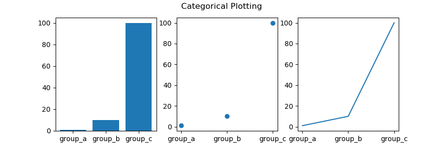
Classified Variable Mapping
 1 import matplotlib.pyplot as plt
 2 names = ['group_a', 'group_b', 'group_c']
 3 values = [1, 10, 100]
 4
 5 plt.figure(1, figsize=(9, 3))
 6
 7 plt.subplot(131)
 8 plt.bar(names, values)
 9 plt.subplot(132)
10 plt.scatter(names, values)
11 plt.subplot(133)
12 plt.plot(names, values)
13 plt.suptitle('Categorical Plotting')
14 plt.show()
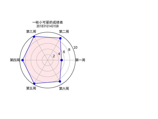
2. Radar Charts
Performance of Python123 job
 1 #-*- coding:utf-8 -*-
 2 '''
 3 Author: A cute little one
 4 Mail:3129663273@qq.com
 5
 6 '''
 7 import numpy as np
 8 import matplotlib.pyplot as plt
 9
10 #Label
11 labels = np.array(['First week','Week 2','Week 3','Week 4','Week 5','Week 6'])
12 #Number of data
13 dataLenth = 6
14 #data
15 data = np.array([5.0,9.1,9.8,9.0,9.7,8.8])
16
17 angles = np.linspace(0, 2*np.pi, dataLenth, endpoint=False)
18 data = np.concatenate((data, [data[0]])) # Close # #Combining data
19 angles = np.concatenate((angles, [angles[0]])) # Close
20
21 fig = plt.figure()
22 ax = fig.add_subplot(121, polar=True)# polar Parameters!!Represents drawing a circle!!!!
23 #111 Represents the position of the total number of rows and columns
24 ax.plot(angles, data, 'bo-', linewidth=1)# The four parameters for drawing lines are x,y,Markers and Colors, Free Width
25 ax.fill(angles, data, facecolor='r', alpha=0.1)# Fill color and transparency
26 ax.set_thetagrids(angles * 180/np.pi, labels, fontproperties="SimHei")
27 ax.set_title("A small cute report card\n2018310143108", va='baseline', fontproperties="SimHei")
28
29 ax.set_rlim(0,10)
30 ax.grid(True)
31 plt.show()
Show as follows:
3. Custom Freehand Style
 1 from PIL import Image
 2 #image yes PIL A class in the library that represents an image
 3 import numpy as np
 4
 5 #Open a picture " F:\PycharmProjects\cui.jpg" Is the picture position
 6 a = np.asarray(Image.open('D:\\My Files\\Python\\Wallpaper 4.jpg')
 7                .convert('L')).astype('float')
 8
 9
10 depth = 10.                    #Floating point number, preset depth value of 10
11 grad = np.gradient(a)          #Gray gradient value of image
12 grad_x,grad_y = grad           #Gradient values of horizontal and vertical images are taken separately
13 grad_x = grad_x*depth/100.     #Adjust Depth x and y Gradient value in direction
14 grad_y = grad_y*depth/100.
15 A = np.sqrt(grad_x**2 + grad_y**2 +1.)      #structure x and y 3-D Normalized Unit Coordinate System for Axis Gradients
16 uni_x = grad_x/A
17 uni_y = grad_y/A
18 uni_z = 1./A
19
20 vec_el = np.pi/2.2                       #Light source's angle of view, radian value
21 vec_az = np.pi/4.                        #Azimuth angle, radian value of light source
22 dx = np.cos(vec_el)*np.cos(vec_az)       #Light source pair x The effect of the axis, np.cos(vec_el)Is the length of the projection of a unit light on the ground surface
23 dy = np.cos(vec_el)*np.sin(vec_az)       #Light source pair y Influence of axes
24 dz = np.sin(vec_el)                      #Light source pair z Influence of axes
25
26 b = 255*(dx*uni_x + dy*uni_y + dz*uni_z)    #Gradients interact with light sources to convert gradients to grayscale
27 b = b.clip(0,255)                          #To avoid data out of bounds, clip the resulting gray value to 0‐255 Section
28
29 im = Image.fromarray(b.astype('uint8'))     #Reconstruct Image
30 im.save("D:\\My Files\\Python\\Wallpaper 9.jpg")      #Address to save the picture
Contrast before and after:


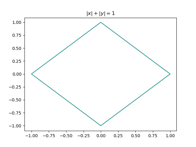
4. Mathematical Law
Title: |x| + |y| = 1
 1 import numpy as np
 2 import matplotlib.pyplot as plt
 3
 4 x = np.arange(-1.1, 1.1, .01)
 5 y = np.arange(-1.1, 1.1, .01)
 6 x, y = np.meshgrid(x, y)
 7
 8 f = np.abs(x) + np.abs(y) - 1
 9 plt.figure()
10 plt.contour(x, y, f, 0,)
11 plt.title(r'$\left|x\right|+\left|y\right|=1$')
12 plt.show()
The figure is as follows: