Task description
Task: please write code to draw bar chart of average selling price of all kinds of commercial housing.
Relevant knowledge
In order to complete this task, you need to master the drawing of stacked (parallel) histogram.
Draw stacked bar
The bar function is called as follows:
matplotlib.pyplot.bar(x, height, width=0.8, bottom=None, *, align='center', data=None, **kwargs)
To draw a stacked bar graph, you can set the value of the first parameter x to make the column dislocation display. Each element of X represents the middle position of the column. The example code is as follows:
import numpy as np
import matplotlib.pyplot as plt
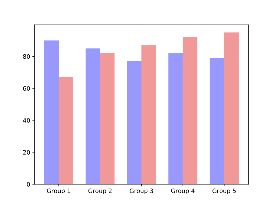
# Bar chart of average scores of five groups in computer programming class A
A_means_score = np.array([90, 85, 77, 82, 79])
# Bar chart of the average scores of five groups in computer programming class B
B_means_score = np.array([67, 82, 87, 92, 95])
index = np.arange(5)
bar_width = 0.35
plt.bar(index, A_means_score, bar_width, # The starting position of x-axis data of shift A is index sequence
alpha=0.4, color='b')
plt.bar(index+bar_width, B_means_score, bar_width, #Start position of x-axis of shift B is staggered with data of shift A
alpha=0.4, color='r')
x_labels = ['Group 1', 'Group 2', 'Group 3', 'Group 4', 'Group 5']
plt.xticks(index+bar_width/2, x_labels) # index+bar_width/2 center the label
plt.show()
The output image is as follows:
If there are multiple groups of data, the drawing control can be carried out by combining the list and the circular structure. ,,
Programming requirements
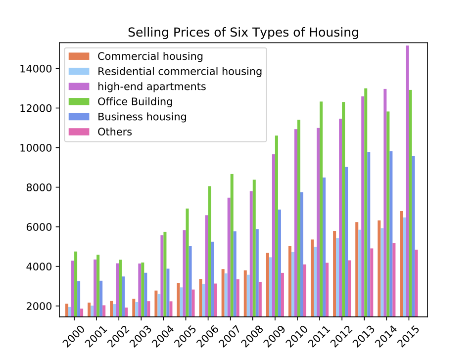
The average sales price of commercial housing calculated by the National Bureau of statistics is as follows:
Please write a code to draw the histogram of average selling price of six types of commercial housing. The specific programming requirements are as follows:
- The column width of the histogram is set to 0.8, and the color is the corresponding RGB value in the list colors;
- The range of the horizontal axis is [- 1,98], and the column starting position of the first group of data is 1,7,13,... 91, with an interval of 6.
- The horizontal axis label is year, from 2000 to 2015, the rotation angle is 45 degrees, and the label position is in the middle of 6 sets of data;
- The range of vertical axis is [1450, 15300], the axis scale is 20004000,... 14000, and the scale interval is 2000;
- Add legend, and label legend as shown in the list legend_ As shown in labels, the position is in the upper left corner;
- Add title 'Selling Prices of Six Types of Housing'
- The output image is stored, and the image name is picture/step2/fig2.png;
The completed drawing shall be as follows:
Test instructions
The platform will run the user completed code file, and compare the stored picture/step2/fig2.png image with the standard answer image, and then judge whether the user wrote the code correctly.
If the drawing is correct, the test set will output: Congratulations! The picture is consistent with the expected output; otherwise, the test set will output: the picture is inconsistent with the expected output, please continue to work hard!.
# -*- coding: utf-8 -*-
import matplotlib
import re
matplotlib.use("Agg")

import matplotlib.pyplot as plt
import numpy as np


xstring = '2015 2014 2013 2012 2011     \
           2010 2009 2008 2007 2006     \
           2005 2004 2003 2002 2001    2000' #x-axis label

n = 6
ystring = ['']*n #Six sets of data corresponding to y-axis
ystring[0] = '6793    6324    6237    5790.99    5357.1    5032    4681    3800    3863.9    3366.79    3167.66    2778    2359    2250    2170    2112'
ystring[1] = '6473    5933    5850    5429.93    4993.17    4725    4459    3576    3645.18    3119.25    2936.96    2608    2197    2092    2017    1948'
ystring[2] = '15157    12965    12591    11460.19    10993.92    10934    9662    7801    7471.25    6584.93    5833.95    5576    4145    4154    4348    4288'
ystring[3] = '12914    11826    12997    12306.41    12327.28    11406    10608    8378    8667.02    8052.78    6922.52    5744    4196    4336    4588    4751'
ystring[4] = '9566    9817    9777    9020.91    8488.21    7747    6871    5886    5773.83    5246.62    5021.75    3884    3675.14    3488.57    3273.53    3260.38'
ystring[5] = '4845    5177    4907    4305.73    4182.11    4099    3671    3219    3351.44    3131.31    2829.35    2235    2240.74    1918.83    2033.08    1864.37'

labels = ['Commercial housing', 'Residential commercial housing',
          'high-end apartments', 'Office Building', 'Business housing', 'Others'] #Legend Label
colors = ['#ff7f50', '#87cefa', '#DA70D6', '#32CD32', '#6495ED', '#FF69B4'] #Specify color


#  Please add the implementation code here  #
# ********** Begin *********#
x_labels=re.findall(r'\b\d+\b',xstring)[::-1]
ylist=[]
for y in ystring:
    ylist.append(list(map(float,re.findall(r'[0-9]+\.?[0-9]*',y)))[::-1]) #Or use y.split()

bar_width = 0.8
xindex=np.arange(1,92,6)

fig, ax = plt.subplots()
for i in range(6):
    ax.bar(xindex+bar_width*i, ylist[i], bar_width ,color=colors[i])

ax.set_xlim(-1,98) #Closed interval
plt.xticks(xindex+bar_width*2.5,x_labels,rotation=45)
ax.set_ylim(1450,15300)
plt.yticks(np.arange(2000,16000,2000))
plt.legend(labels,loc='upper left')
plt.title('Selling Prices of Six Types of Housing')


plt.savefig('picture/step2/fig2.png')

# ********** End **********#