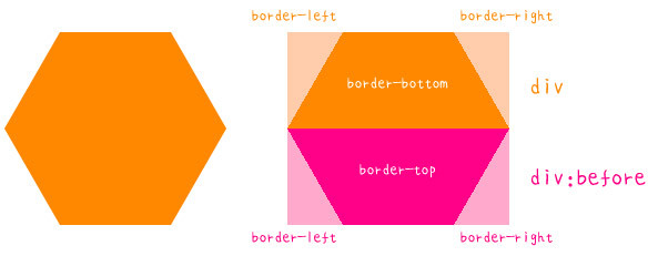
In the previous article, we introduced how to use before and after pseudo elements to make Material Design style buttons. The key technology is to make use of the border width and div body width. So one additional effect of this article is to simply use CSS to make a "single" div change from a regular triangle to an octagon (a single div can only do a regular octagon at most), and finally to make a match.The effect of animation changes into a transformation animation of a regular polygon, which also requires a lot of trigonometric functions to calculate. For convenience, the uniform edges of the regular polygon are set to 100px here.
Regular Triangle
A regular triangle doesn't need pseudo elements, it just needs to set the border width of the div itself. First, look at the length of the regular triangle and its midline. If the edge length is 100px, the midline is rounded to 87px (100x sin(60)= 87).
So if we set the div to zero in length and width, then we can make a beautiful triangle by setting the bottom border to 87px in width and about 50px in width (color to transparent).
width:0;
height:0;
border-width:0 50px 87px ;
border-style:solid;
border-color:transparent transparent #095;

Square
Squares should be the simplest, as long as the length and width are set to the same value, but there are two other ways. The first way is to set the length and width to 0, the border around the top and bottom to 50 px, the second way is to set the height to 0, the width to 100 px, and then one side width to 100.
.a{
width:100px;
height:100px;
background:#c00;
}
.b{
width:0;
height:0;
border-width:50px;
border-style:solid;
border-color:#095;
}
.c{
width:100px;
height:0;
border-width:0 0 100px;
border-style:solid;
border-color:#069;
}

Regular pentagon
The regular pentagon needs to enter the basic field of trigonometric function. Let's first decompose the regular pentagon, use the original div as the upper triangle, and then make the lower trapezoid with a pseudo element. Because the angle between each side of the regular pentagon is 108 degrees, we can use the trigonometric function to calculate the height of the upper triangle is 59 PX (100 x cos(54)) and the width is 192 PX (100x).Sin(54)x 2), the height of the lower trapezoid is 95px(100 x sin(72)), and the width of the long side is 192px as the upper triangle.
Once you know the principle, you can use pseudo elements to make rales!
.a{
      position:relative;
  width:0;
  height:0;
  border-width:0 81px 59px;
      border-style:solid;
  border-color:transparent transparent #069;
}
.a:before{
  position:absolute;
  content:"";
  top:59px;
  left:-81px;
  width:100px;
  height:0;
  background:none;
  border-width:95px 31px 0;
  border-style:solid;
  border-color:#069 transparent transparent;
    }

Regular hexagon
Each angle of a regular hexagon is 120 degrees. If you look in the direction of pure CSS, you can make a regular hexagon by changing the triangle above the regular pentagon, which is a combination of the upper and lower trapezoids. The long side of the trapezoid is 200 PX (100 x cos (60) x 2 + 100), and the height of the trapezoid is 87px (100 x sin (60).
So you can make a regular hexagon by modifying the CSS of a regular pentagon a little.
.a{
      position:relative;
    width:100px;
    height:0;
    border-width:0 50px 87px;
      border-style:solid;
    border-color:transparent transparent #f80;
}
.a:before{
  position:absolute;
  content:"";
    top:87px;
    left:-50px;
    width:100px;
    height:0;
  background:none;
    border-width:87px 50px 0;
  border-style:solid;
    border-color:#f80 transparent transparent;
    }

Regular heptagon
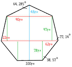
The regular heptagon must begin with the after pseudo-element, because it must be broken down into three memory blocks, one using the original div as the top triangle, one pseudo-element as the middle trapezoid, and the other as the bottom trapezoid. The angle of the regular heptagon is not an integer, but 128,4/7 degrees, roughly to the second decimal.The bit is 128.57, so the result of the calculation is shown in the figure below. The key is to have a clear idea of the length and width.
Once you have the width and length, start writing in CSS!
.a{
      position:relative;
    width:0;
    height:0;
    border-width:0 90px 43px;
      border-style:solid;
    border-color:transparent transparent #09c;
}
.a:before{
  position:absolute;
  content:"";
    top:140px;
    left:-112px;
    width:100px;
    height:0;
    border-width:78px 62px 0;
  border-style:solid;
    border-color:#09c transparent transparent;
    }
  .a:after{
    position:absolute;
    content:"";
    top:43px;
    left:-112px;
    width:180px;
    height:0;
    border-width:0 22px 97px;
    background:none;
    border-style:solid;
    border-color:transparent transparent #09c;
  }

regular octagon
The regular octagon actually transforms the triangle above the regular heptagon into a trapezoid, and then the middle trapezoid into a rectangle. The angle between the regular octagon and the octagon is 135 degrees. The calculated area lengths and widths are as follows.
With the same understanding, CSS is a lot easier to do!
.a{
      position:relative;
    width:100px;
      height:0;
      border-width:0 71px 71px;
      border-style:solid;
    border-color:transparent transparent  #f69;
}
.a:before{
  position:absolute;
  content:"";
    top:171px;
      left:-71px;
      width:100px;
      height:0;
      border-width:71px 71px 0;
  border-style:solid;
      border-color: #f69 transparent transparent;
    }
  .a:after{
      position:absolute;
      content:"";
      top:71px;
      left:-71px;
      width:242px;
      height:0;
      border-width:0 0 100px;
      background:none;
      border-style:solid;
      border-color:transparent transparent #f69;
  }

Summary
These are just regular polygon transformations of a single div made purely using CSS. If you are skilled, in fact, with the animation effect, you can make a transformation animation like the example below!However, the following example has another div package outside to make large and small transformation animation, to avoid the size changes caused by the joint not close, you can refer to see!
