This time I'm going to talk about a wide range of things. I'll talk about as many details as I can.
Other articles on the topic:
Preface to "Material Design Initial Learning Notes"
Animation (including demo)
Material Design Initial Learning Notes and AppCompat Activity (with demo)
demo download
RecyclerView
Layout file
<LinearLayout xmlns:android="http://schemas.android.com/apk/res/android"
              android:orientation="vertical"
              android:layout_width="match_parent"
              android:layout_height="match_parent">
    <include layout="@layout/toolbar_test"/>
    <android.support.v7.widget.RecyclerView
        android:layout_width="match_parent"
        android:id="@+id/recycler"
        android:layout_height="match_parent"></android.support.v7.widget.RecyclerView>
</LinearLayout>
As you can see from the layout file above, RecyclerView is something in v7, so it's natural to rely on v7. Secondly, the layout of include is toolbar as mentioned in the previous section.
Adapter
RecyclerView, like ListView, also needs an Adapter, except that the Adapter is somewhat different. The Adapter of RecyclerView has its own performance optimization mechanism, including ViewHolder.
public class CardListAdapter  extends RecyclerView.Adapter<CardListAdapter.MyViewHolder>{
private Context context;
private ArrayList<String> list ;
    private IcardViewChanger icardViewChanger;
public CardListAdapter(Context context,ArrayList<String> list){
    this.context = context;
    this.list = list;
    }
@Override
public MyViewHolder onCreateViewHolder(ViewGroup parent, int viewType) {
    MyViewHolder holder = new MyViewHolder(LayoutInflater.from(
    context).inflate(R.layout.item_cardview, parent,
    false));
    return holder;
    }

@Override
public void onBindViewHolder(MyViewHolder holder, int position) {
    holder.tv.setText(list.get(position));
    if (icardViewChanger!=null){
        icardViewChanger.changeCardView(holder.cardView);
    }

    }


    @Override
public int getItemCount() {
    return list.size();
    }
class MyViewHolder extends RecyclerView.ViewHolder
{

    TextView tv;
    CardView cardView;
    public MyViewHolder(View view)
    {
        super(view);
        tv = (TextView) view.findViewById(R.id.text);
        cardView = (CardView) view.findViewById(R.id.cardView);
    }
}
}
I won't say much about the construction method. onCreateViewHolder is comparable to View construction in BaseAdapter's getView. The Adapter of ListView needs to manually determine whether the view is empty, and then decide whether to establish it. Now just write the view construction in the onCreateViewHolder method.
onBindViewHolder is used to process interface logic, which is equivalent to the interface processing logic in getView of BaseAdapter. This method is called passively every time the interface is refreshed.
getItemCount is the number of Items returned.
Then there's the construction of ViewHolder. Note that this inherits RecyclerView.ViewHolder
For the layout files used here, CardView will be explained below.
Then you set up RecyclerView.
   recyclerView = (RecyclerView)findViewById(R.id.recycler);
        recyclerView.setAdapter(adapter);
        recyclerView.setLayoutManager(new LinearLayoutManager(this));
        recyclerView.setItemAnimator(new DefaultItemAnimator());
RecyclerView.LayoutManager. This is an abstract class. Fortunately, the system provides three implementation classes:
- Linear Layout Manager's current manager supports both horizontal and vertical.
- GridLayout Manager Grid Layout Manager
-
Staggered Grid Layout Manager Falls Placement Manager
setItemAnimator is a deleted animation.
We can add the partition line mRecyclerView.addItemDecoration()
With regard to animation and splitting lines, they can be set to the desired effect by inheritance. I won't go into details here.CardView
CardView supports a variety of effects, and we can make all Item s in RecyclerView use CardView.
rely on
If you need to use CardView, you need to rely on:
compile 'com.android.support:cardview-v7:25.3.1'Now go back to CardListAdapter and take a look at the layout file item_cardview.
<?xml version="1.0" encoding="utf-8"?>
<LinearLayout xmlns:android="http://schemas.android.com/apk/res/android"
            xmlns:app="http://schemas.android.com/apk/res-auto"
            android:orientation="vertical"
            android:layout_width="match_parent"

            android:layout_height="wrap_content">
<android.support.v7.widget.CardView
  android:layout_width="wrap_content"
  android:layout_height="wrap_content"
  android:background="#558b2f"
  android:layout_margin="10dp"
  app:cardBackgroundColor="#558b2f"
  android:id="@+id/cardView">
  <RelativeLayout
      android:layout_width="match_parent"
      android:layout_height="wrap_content">
      <ImageView
          android:layout_width="wrap_content"
          android:layout_height="wrap_content"
          android:layout_alignParentLeft="true"
          android:src="@mipmap/ic_launcher_round"
          android:id="@+id/logo"/>
      <TextView
          android:layout_width="wrap_content"
          android:layout_height="wrap_content"
          android:text=""
          android:layout_alignParentRight="true"
          android:id="@+id/text"/>
  </RelativeLayout>
</android.support.v7.widget.CardView>
</LinearLayout>
CardView has some basic attributes:
app:cardBackgroundColor This is setting the background color
App: card Corner Radius This is to set the rounded corner size
App: card Elevation This is the shadow of setting the z axis
App: cardMax Elevation This is the maximum height of the z axis.
App: cardUse CompatPadding or not
App: card Prevent Corner Overlap whether to use Prevent Corner Overlap
app:contentPadding Sets the content padding
App: content Padding Left sets the left padding of content
app:contentPaddingTop Sets Upper padding of Content
App: ContentPadding Right Sets the Right padding of Content
app:contentPaddingBottom sets the bottom padding of the content
So far, the properties of CardView have been introduced. Then we will set several CardViews according to the attribute values and compare them.
Expand
First, we add an interface.
public interface IcardViewChanger {
    public void changeCardView(CardView cardView);
}
To set up CardView with this interface, first add a method in CardListAdapter:
   public void setIcardViewChanger(IcardViewChanger icardViewChanger) {
        this.icardViewChanger = icardViewChanger;
    }
Modify onBindViewHolder:
@Override
public void onBindViewHolder(MyViewHolder holder, int position) {
    holder.tv.setText(list.get(position));
    if (icardViewChanger!=null){
        icardViewChanger.changeCardView(holder.cardView);
    }
    Log.e("xxxxxx" ,"onBindViewHolder");
    }
Then we set up the call in Activeness using RecyclerView:
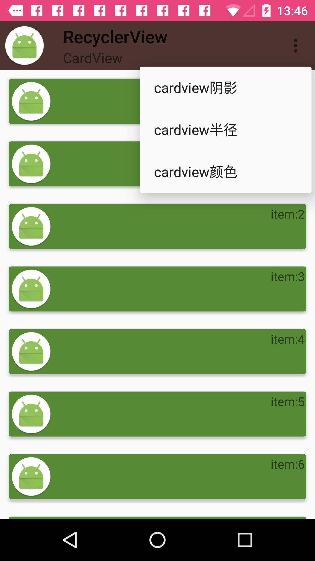
  @Override
    public boolean onCreateOptionsMenu(Menu menu) {
        getMenuInflater().inflate(R.menu.menu_card,menu);
        return  true;
    }
    @Override
    public boolean onOptionsItemSelected(MenuItem item) {
        switch (item.getItemId()) {
            case R.id.btn_changeElevation:
               adapter.setIcardViewChanger(new IcardViewChanger() {
                   @Override
                   public void changeCardView(CardView cardView) {
                       cardView.setCardElevation(80);
                   }
               });
                adapter.notifyDataSetChanged();
                break;
            case R.id.btn_changeRadius:
                adapter.setIcardViewChanger(new IcardViewChanger() {
                    @Override
                    public void changeCardView(CardView cardView) {
                        cardView.setRadius(80);
                    }
                });
                adapter.notifyDataSetChanged();
                break;
            case R.id.btn_changeColor:
                adapter.setIcardViewChanger(new IcardViewChanger() {
                    @Override
                    public void changeCardView(CardView cardView) {
                        cardView.setCardBackgroundColor(getResources().getColor(R.color.cardBackground));
                    }
                });
                adapter.notifyDataSetChanged();
                break;
        }

        return super.onOptionsItemSelected(item);
    }
At last, I will show you a picture.
summary
RecyclerView and CardView don't have to be used together. If you need to, you can use them separately. I'm here to show them together for demo.
For more settings of RecyclerView and CardView, you can modify the experiment on the basis of my demo.
With these two components, Android's many interfaces are much simpler to handle, not only because the interfaces are set up more, but also because the operations are decoupled, such as animation and splitter ViewHolder.
If you have any questions, leave a message for me, or pay attention to my public number.