Let's make a simple 3d cube today
First look at the renderings! See this. You can see some online 3d albums
1, Let's get our html code ready
<!DOCTYPE html>
<html lang="zh-CN">
    <head>
        <title>3d Cube cube</title>
        <meta charset="UTF-8">
    </head>
    <body>
    	<div class="top"></div> 		<!--upper -->
    	<div class="bottom"></div>		<!--lower -->
    	<div class="left"></div>		<!--Left -->
    	<div class="right"></div>		<!--right -->
    	<div class="after"></div>		<!--after -->
    	<div class="before"></div>		<!--Front -->
    </body>
</html>
OK, we are ready to finish the html code. First of all, we need to have a 3d thinking. In the brain, we can see what the magic cube looks like, which is composed of six faces.
2, Add css Style
1,
*{
    margin:0; 							    /* Default style without margins */
    padding:0;
}
div{										 /* div General style setting height and width*/
    width: 300px;
    height: 300px;
    opacity:0.5;							/*Transparency and translucency*/
}
.top{									 /* Set the color through the class name, and set the color below*/
    background-color:brown;
}
.bottom{
    background-color:blueviolet;
}
.left{
    background-color:blanchedalmond;
}
.right{
    background-color:cadetblue;
}
.after{
    background-color:chocolate;
}
.before{
    background-color:cyan;
}
Well, at this point, it's like setting up the foundation. We're starting to build buildings

What you see must be this effect. Notice that I have shrunk down here. You should also be next to each other like me, like a pillar. Now we're going to start putting them together like pieces of paper.
2. Make div s overlap
div{
    width: 300px;
    height: 300px;
    position: absolute;		/*Add absolute positioning to the general style of div*/
}
body{						/*The next step is to center all the div s on the screen*/
    height: 100vh;
    width: 100vw;
    display: flex;
    justify-content: center;
    align-items: center;
}

Now what you see is this effect. It's clear how there is only one of the six squares. In fact, it's not that. It's just that the other divs are behind the divs. The front divs block our vision, so we can't see them.
3, Open 3d space
}
body{
    transform-style: preserve-3d;   /*Only this code is needed to open 3d space*/
    height: 100vh;
    width: 100vw;
    display: flex;
    justify-content: center;
    align-items: center;
}
Putting the div s together
.top{
    background-color:brown;
    transform:rotateX(90deg) translateZ(150px);   /*Rotate first at offset*/
}
.bottom{
    background-color:blueviolet;
    transform:rotateX(-90deg) translateZ(150px);
}
.left{
    background-color:blanchedalmond;
    transform:rotateY(-90deg) translateZ(150px);
}
.right{
    background-color:cadetblue;
    transform:rotateY(90deg) translateZ(150px);
}
.after{
    background-color:chocolate;
    transform:rotateY(180deg) translateZ(150px);
}
.before{
    background-color:cyan;
    transform:rotateY(0deg) translateZ(150px);
}

What you should see is the same. In fact, we have finished the splicing of the magic cube, but we can't see that the magic cube is lying flat, so it's ok to make an animation and rotate it. It's easier to see if you add a little text to a div
4, Animation rotation
<!DOCTYPE html>
<html lang="zh-CN">
    <head>
        <title>3d Cube cube</title>
        <meta charset="UTF-8">
        <style type="text/css">
*{
    margin:0;
    /* Default style without margins */
    padding:0;
}
div{
    width: 300px;
    height: 300px;
    position: absolute;
    opacity: 0.5;
    text-align: center;
    line-height: 300px;
}
body{
    transform-style: preserve-3d;
    height: 100vh;
    animation: fram1 10s ease;    				/*Citing animation*/
    width: 100vw;
    display: flex;
    justify-content: center;
    align-items: center;
}

.top{
    background-color:brown;
    transform:rotateX(90deg) translateZ(150px);

}
.bottom{
    background-color:blueviolet;
    transform:rotateX(-90deg) translateZ(150px);
}
.left{
    background-color:blanchedalmond;
    transform:rotateY(-90deg) translateZ(150px);
}
.right{
    background-color:cadetblue;
    transform:rotateY(90deg) translateZ(150px);

}
.after{
    background-color:chocolate;
    transform:rotateY(180deg) translateZ(150px);
}
.before{
    background-color:cyan;
    transform:rotateY(0deg) translateZ(150px);
}
@keyframes fram1{		/*Animation rotation X and Y*/
    0%,100%{
        transform: rotateY(0deg) rotateX(0deg);
    }
    50%{
        transform: rotateY(180deg) rotateX(180deg);

    }
}
        </style>
    </head>
    <body>							<!--Add words to make your vision clearer-->
    	<div class="top">1</div>
    	<div class="bottom">2</div>
    	<div class="left">3</div>
    	<div class="right">4</div>
    	<div class="after">5</div>
    	<div class="before">6</div>
    </body>
</html>
OK, all the code is here. I've finished it with you. If you want to make a 3d album, just add the background image to the div and replace the background color with the background image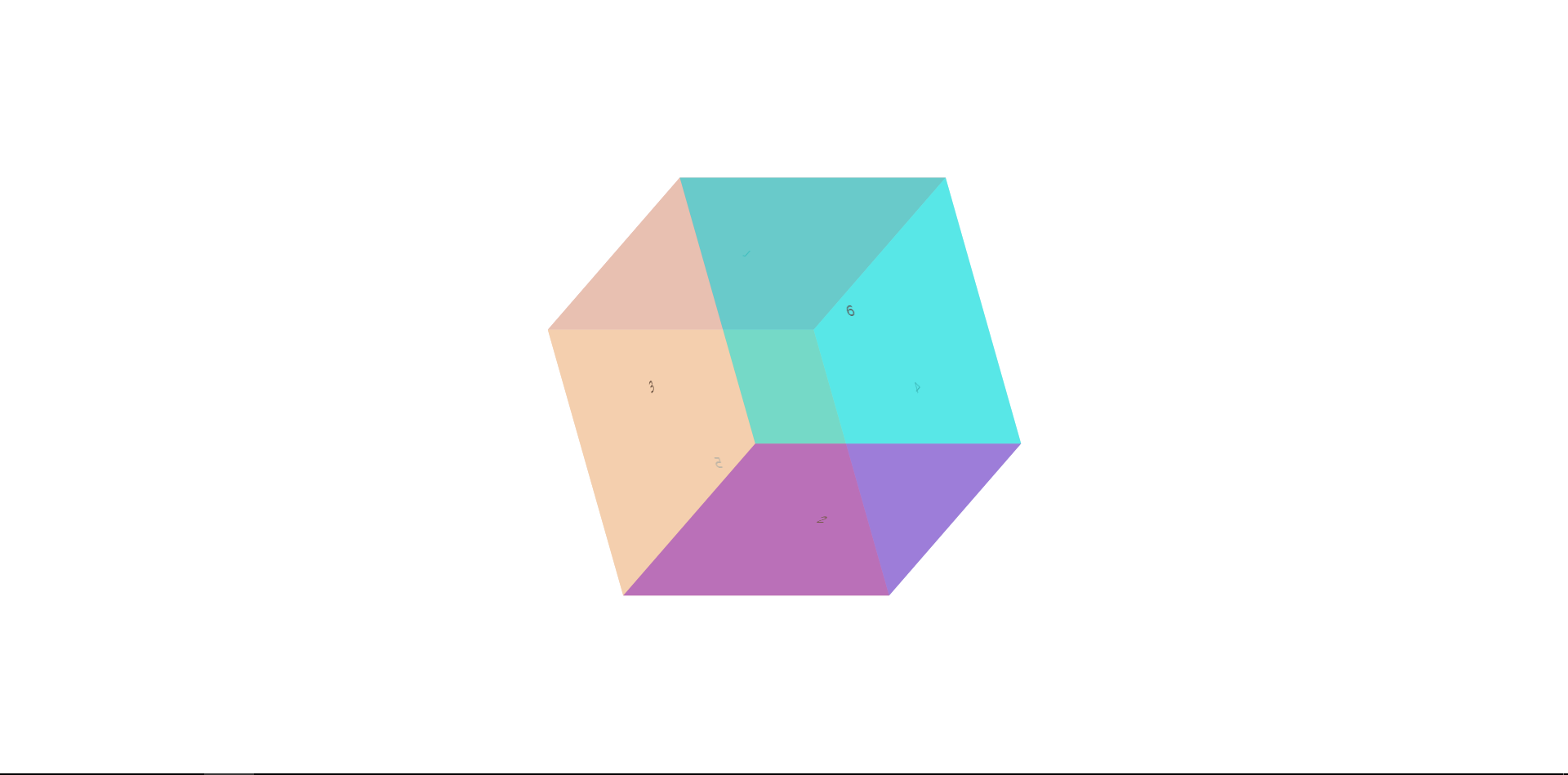
Five, summary
Let's talk about the details. I hope you can see that when we let this be the final thing. In the process of splicing, you only see the code. First, we made six div s with width:300px and height:300px. We made them superposed together through position:absolute. You just need to remember that absolute positioning will make the hierarchy overlap. Z-ind: you can control his hierarchy and get to the most important place. transform:rotateX(90deg) translateZ(150px); why do I Is rotation at offset first?
In a word, you turn right and move forward, which is not the same as you turn right and you get there
That's how it works. If you understand that even if you are a beginner, 3d still has a lot of fun. Waiting for you to fumble slowly.

