Preorder
Throughout every high-quality project, whether on the web side or in the development of native applications, pop-up windows are an indispensable part, which can directly determine the user experience to a large extent. For example, there is a very mature set of window UI display scenes in ios.
Recently, I have been addicted to the research of react-native development. I find it difficult to learn without imagination, but I have also mined many pits. In view of the previous experience of developing custom bullet windows based on h5 and small program technology, I want to use react-native technology to implement msg information box | alert prompt box | confirm confirmation box | toast weak prompt / loading | imitation ios, android bullet windows, there is the RN version of this rnPop bullet window component.
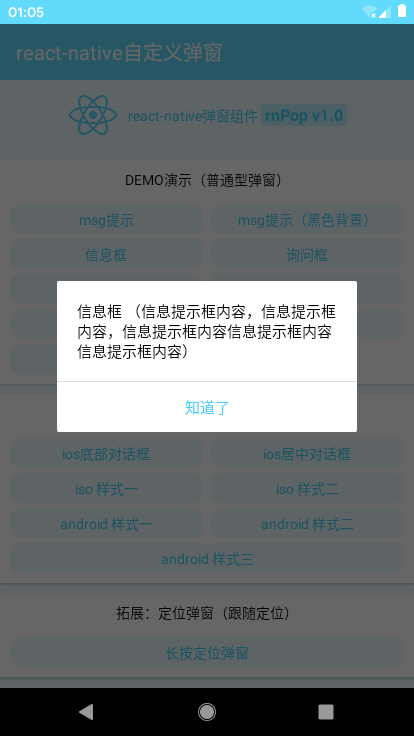
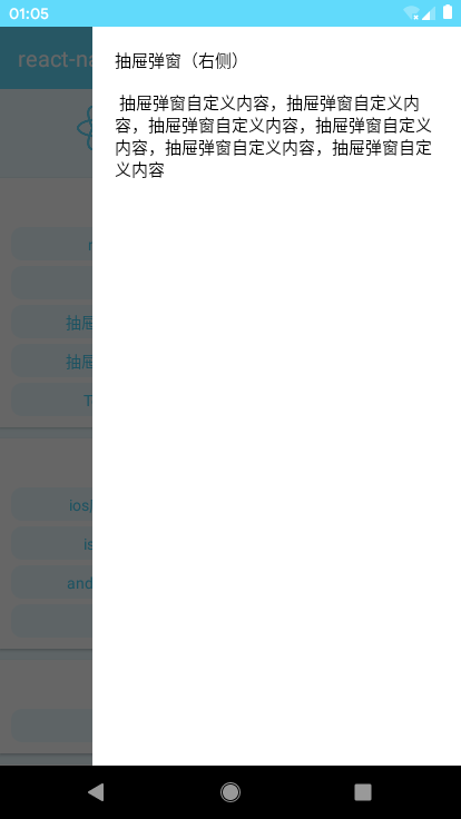
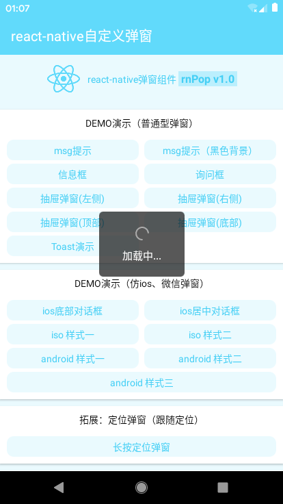
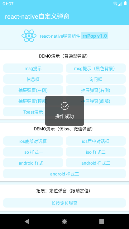
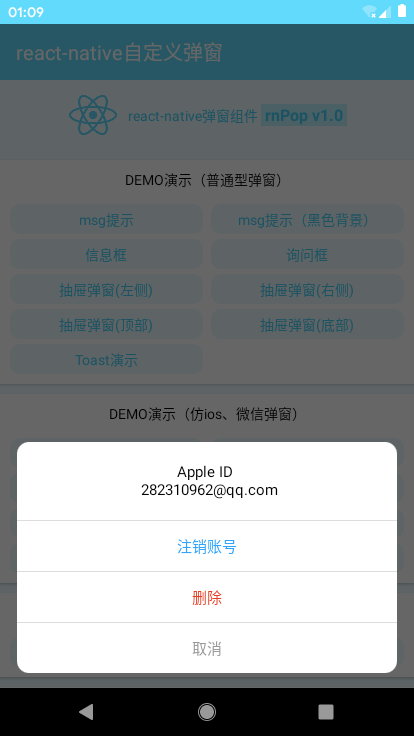
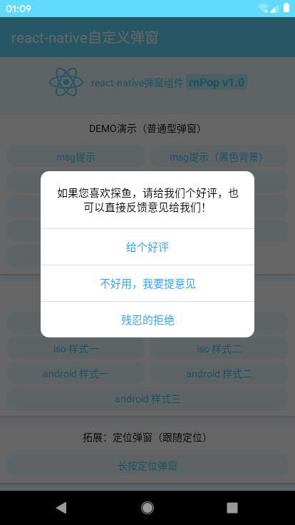
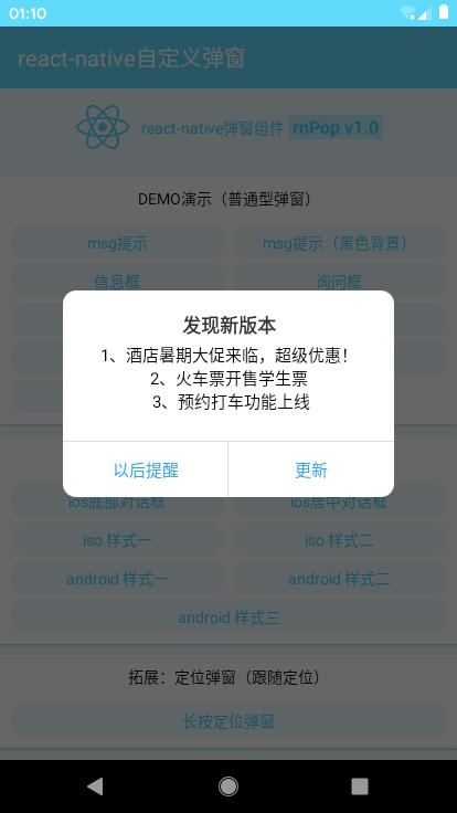
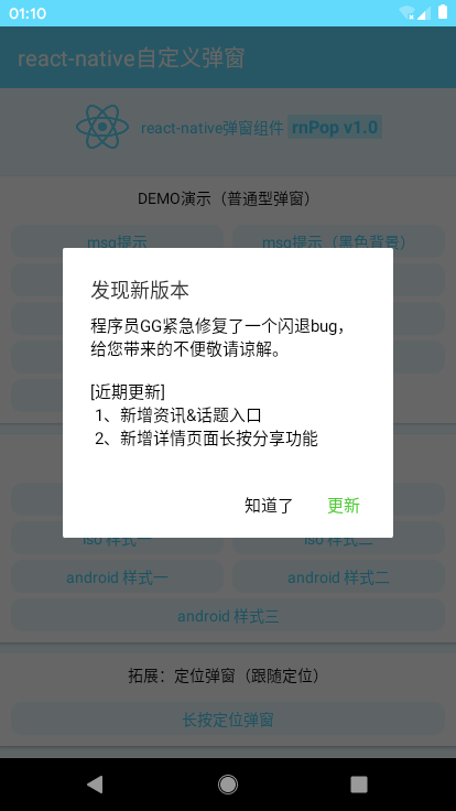
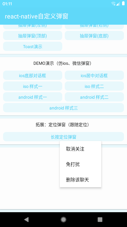
Design sketch
The quality of the simulation simulator is several times better than that of the real machine, which can be neglected.
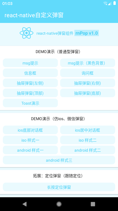
Looking at the picture above, do you think there are still many ways to call? Yes, there are plenty of application scenarios.
rnPop Bullet Window Component Directory Structure

_Introduction and Call
import RNPop from '../utils/rnPop/rnPop.js'
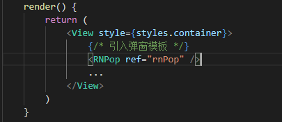
/**
 * --------- react-native Demonstration of Bullet Window
 */
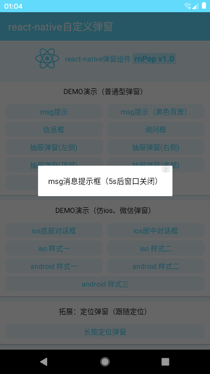
//msg Tips
handlePress01 = ()=> {
    let rnPop = this.refs.rnPop
    rnPop.show({
        anim: 'fadeIn',
        content: 'msg Message prompt box (5) s Back window closed)',
        shade: true,
        shadeClose: false,
        time: 5,
        xtime: true,
    });
}

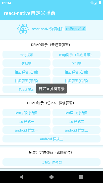
//msg Tips(Black background)
handlePress02 = ()=> {
    let rnPop = this.refs.rnPop
    rnPop.show({
        content: 'Custom Bullet Window Background',
        shade: false,
        style: {backgroundColor: 'rgba(17,17,17,.7)', borderRadius: 6},
        contentStyle: {color: '#fff', padding: 10},
        time: 2
    });
}
toast weak prompt can customize four icons of loading | success | info | error
//Toast Demonstration
handlePress15 = ()=> {
    let rnPop = this.refs.rnPop
    rnPop.show({
        skin: 'toast',
        content: 'Successful operation',
        icon: 'success', //success | info | error | loading
        shade: false,
        time: 3
    });
}
//ios Center dialog box
handlePress17 = ()=> {
    let rnPop = this.refs.rnPop
    rnPop.show({
        skin: 'footer',
        position: 'center',
        content: 'If you like to fish, please give us a good opinion or give us direct feedback.',
        shadeClose: true,

        btns: [
            {
                text: 'Give me a good review.',
                style: {color: '#30a4fc'},
                onPress() {
                    console.log('You clicked to give a good comment!');

                    //Callback function
                    rnPop.show({
                        anim: 'fadeIn',
                        content: 'Thank you for your good comments, we will continue to work hard!',
                        shade: true,
                        time: 3
                    });
                }
            },
            {
                text: 'It's not working well. I'd like to make some comments.',
                style: {color: '#30a4fc'},
                onPress() {
                    // ...
                }
            },
            {
                text: 'Cruel refusal',
                style: {color: '#30a4fc'},
                onPress() {
                    rnPop.close();
                }
            }
        ]
    });
}



/**
 * @Title         react-native Bullet Window Plug-in rnPop-v1.0 beta (UTF-8)
 * @Author        andy
 * @Create        2019/07/30 10:00:50 GMT+0800 (China standard time
 * @AboutMe    Q: 282310962  wx: xy190310
 */

'use strict'

import React, {Component} from 'react'
import {
    StyleSheet, Dimensions, PixelRatio, TouchableHighlight, Modal, View, Text, Image, ActivityIndicator, Alert
} from 'react-native'

const pixel = PixelRatio.get()
const {width, height} = Dimensions.get('window')

export default class RNPop extends Component{
    /**************************
     *    Bullet Window Configuration Parameters
     */
    static defaultProps = {
        isVisible: false,       //Pop-up display

        id: 'rnPop',            //Popup id Identification
        title: '',              //Title
        content: '',            //content
        style: null,            //Custom Bullet Window Style {object}
        contentStyle: null,     //Content style
        skin: '',               //Custom Bullet Window Style
        icon: '',               //Custom Bullet Window Icon

        shade: true,            //mask
        shadeClose: true,       //Click on the mask to close
        opacity: '',            //Shield layer transparency
        xclose: false,          //Custom Close Button
        time: 0,                //Number of seconds for automatic closure of bullet window
        xtime: false,           //Display the number of closing seconds

        anim: 'scaleIn',        //Pop-up animation
        follow: null,            //Following positioning (for long positioning window)
        position: '',           //Pop-up position
        zIndex: 9999,           //Stack level

        btns: null,             //Bullet window button (no button is displayed without setting)[{...options}, {...options}]
    }

    constructor(props){
        super(props)
        this.state = { ...this.props }
        this.timer = null
    }

    render(){
        let opt = this.state

        // custom toast Icon
        let slotImg = {
            success: require('./skin/success.png'),
            error: require('./skin/error.png'),
            info: require('./skin/info.png'),
        }

        ...

    }

    /**************************
     *    Show Bullet Window Events (Handling Passwords)
     */
    show = (args) => {
        this.setState({
            ...this.props, ...args, isVisible: true
        })
    }

    /**************************
     *    Closing Bullet Window Event
     */
    close = () => {
        console.log('Close')
        this.setState({
            ...this.props
        })
        this.timer && clearTimeout(this.timer)
        delete this.timer
    }
}
_react-native custom pop-window template
<Modal transparent={true} visible={opt.isVisible} onRequestClose={this.close}>
    <View style={styles.rnpop__ui_panel}>
        {/* Mask */}
        { opt.shade && <View style={styles.rnpop__ui_mask} onTouchEnd={opt.shadeClose ? this.close : null} /> }
        {/* forms */}
        <View style={styles.rnpop__ui_main}>
            <View style={styles.rnpop__ui_child}>
                {/* Title */}
                { opt.title ? <View style={[styles.rnpop__ui_tit]}><Text style={[styles.rnpop__ui_titxt]}>{opt.title}</Text></View> : null }
                {/* content */}
                { opt.content ? <View style={[styles.rnpop__ui_cnt]}>
                    ...
                    <Text style={[styles.rnpop__ui_cntxt, opt.contentStyle]}>{opt.content}</Text>
                </View> : null }
                {/* Button */}
                <View style={[styles.rnpop__ui_btnwrap]}>
                ...
                </View>
            </View>
        </View>
    </View>
</Modal>
Attach the previous h5 and applet window
h5 mobile terminal pop-up: https://www.cnblogs.com/xiaoyan2017/p/8695783.html
Homepage version bullet window: https://www.cnblogs.com/xiaoyan2017/p/10227798.html
Small Program Bullet Window: https://www.cnblogs.com/xiaoyan2017/p/9976897.html