Learning objectives
- target
- Master common statistical charts and their significance
- Plot scatter and histogram
- application
- Explore the relationship between different variables
Matplotlib can draw line chart, scatter chart, histogram, pie chart.
We need to know the meaning of different statistical charts to decide which statistical chart to choose to present our data.
1 Types and significance of common graphics
-
Line chart: a statistical chart showing the increase or decrease of statistical quantity with the rise or fall of line
Features: it can display the change trend of data and reflect the change of things. (change)
api: plt.plot(x, y)
-
Scatter diagram: use two groups of data to form multiple coordinate points, investigate the distribution of coordinate points, judge whether there is some correlation between the two variables, or summarize the distribution mode of coordinate points.
Features: judge whether there is quantitative correlation trend between variables and display outliers (distribution law)
api: plt.scatter(x, y)
-
Histogram: data arranged in columns or rows of a worksheet can be drawn into a histogram.
Features: draw continuous discrete data, can see the size of each data at a glance, and compare the differences between data. (Statistics / comparison)
api: plt.bar(x, width, align='center', **kwargs)
-
Histogram: a series of longitudinal stripes or line segments with different heights represent the data distribution. Generally, the horizontal axis represents the data range and the vertical axis represents the distribution.
Features: draw continuous data to show the distribution of one or more groups of data (Statistics)
api: matplotlib.pyplot.hist(x, bins=None)
-
Pie chart: used to show the proportion of different classifications, and compare various classifications by radian size.
Features: proportion of classified data (proportion)
api: plt.pie(x, labels=,autopct=,colors)
x:Quantity, auto calculate percentage
labels:Name of each part
autopct:Proportion display specification%1.2f%%
colors:Color of each part
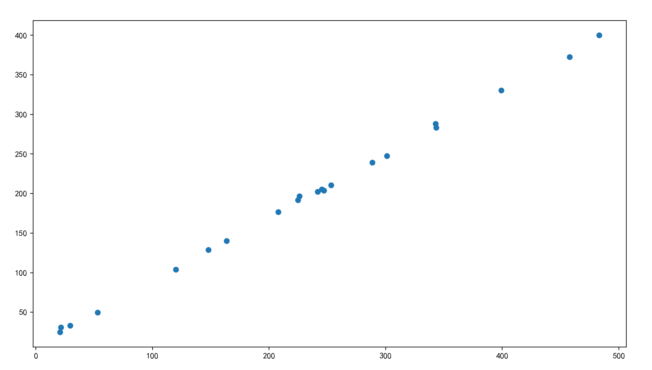
2 scatter plot drawing
Demand: explore the relationship between house area and house price
Housing area data:
x = [225.98, 247.07, 253.14, 457.85, 241.58, 301.01,  20.67, 288.64,
       163.56, 120.06, 207.83, 342.75, 147.9 ,  53.06, 224.72,  29.51,
        21.61, 483.21, 245.25, 399.25, 343.35]
House price data:
y = [196.63, 203.88, 210.75, 372.74, 202.41, 247.61,  24.9 , 239.34,
       140.32, 104.15, 176.84, 288.23, 128.79,  49.64, 191.74,  33.1 ,
        30.74, 400.02, 205.35, 330.64, 283.45]
code:
# 0. Prepare data
x = [225.98, 247.07, 253.14, 457.85, 241.58, 301.01,  20.67, 288.64,
       163.56, 120.06, 207.83, 342.75, 147.9 ,  53.06, 224.72,  29.51,
        21.61, 483.21, 245.25, 399.25, 343.35]
y = [196.63, 203.88, 210.75, 372.74, 202.41, 247.61,  24.9 , 239.34,
       140.32, 104.15, 176.84, 288.23, 128.79,  49.64, 191.74,  33.1 ,
        30.74, 400.02, 205.35, 330.64, 283.45]

# 1. Create canvas
plt.figure(figsize=(20, 8), dpi=100)

# 2. Draw scatter diagram
plt.scatter(x, y)

# 3. Display image
plt.show()
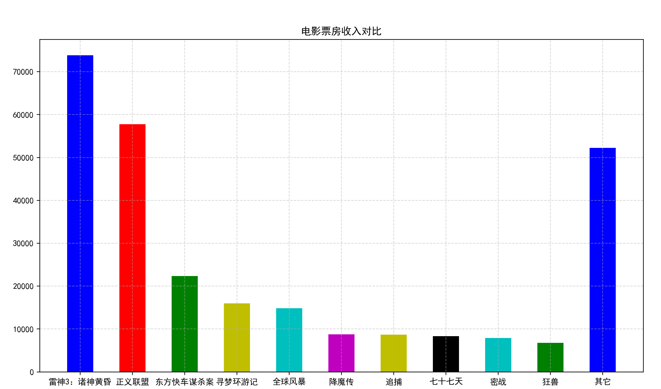
3 histogram drawing
Demand - compare the box office revenue of each film
The movie data is shown in the figure below:
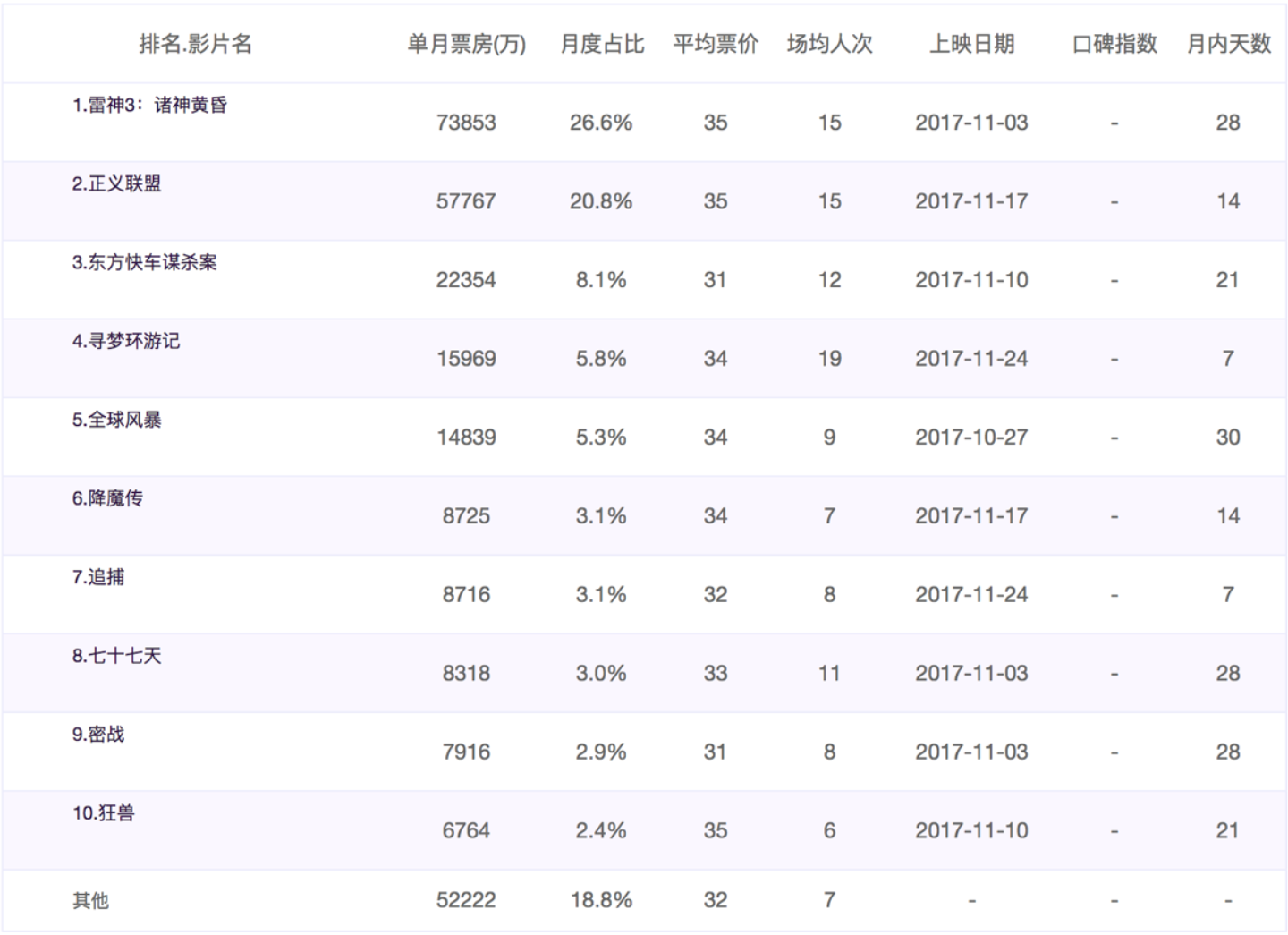
1 prepare data
['Thor 3: Twilight of the gods','Justice League: Injustice for All','Oriental Express murder','Dream seeking travel notes','Global Storm', 'Demon subduing biography','chase','Seventy seven days','Secret War','Mad beast','other']
[73853,57767,22354,15969,14839,8725,8716,8318,7916,6764,52222]
2 draw
- matplotlib.pyplot.bar(x, width, align='center', **kwargs)
Draw histogram
code:
# 0. Prepare data
# Movie name
movie_name = ['Thor 3: Twilight of the gods','Justice League: Injustice for All','Oriental Express murder','Dream seeking travel notes','Global Storm','Demon subduing biography','chase','Seventy seven days','Secret War','Mad beast','other']
# Abscissa
x = range(len(movie_name))
# Box office data
y = [73853,57767,22354,15969,14839,8725,8716,8318,7916,6764,52222]

# 1. Create canvas
plt.figure(figsize=(20, 8), dpi=100)

# 2. Draw histogram
plt.bar(x, y, width=0.5, color=['b','r','g','y','c','m','y','k','c','g','b'])

# 2.1b modify the scale display of x-axis
plt.xticks(x, movie_name)

# 2.2 add grid display
plt.grid(linestyle="--", alpha=0.5)

# 2.3 add title
plt.title("Comparison of film box office revenue")

# 3. Display image
plt.show()
Reference link:
Matplotlib — Visualization with Python
4 Summary
- Line chart
- It can display the change trend of data and reflect the change of things. (change)
- plt.plot()
- Scatter diagram
- Judge whether there is quantitative correlation trend between variables and display outliers (distribution law)
- plt.scatter()
- Histogram
- Drawing continuous discrete data can see the size of each data at a glance and compare the differences between data. (Statistics / comparison)
- plt.bar(x, width, align="center")
- histogram
- Draw continuous data to show the distribution of one or more groups of data (Statistics)
- plt.hist(x, bins)
- Pie chart
- It is used to represent the proportion of different classifications and compare various classifications by radian size
- plt.pie(x, labels, autopct, colors)