Preface
The text and pictures of the article are from the Internet, only for learning and communication, and do not have any commercial use. The copyright belongs to the original author. If you have any questions, please contact us in time for handling.
Author: cold city of Yishui
PS: if you need Python learning materials, you can click the link below to get them by yourself
http://note.youdao.com/noteshare?id=3054cce4add8a909e784ad934f956cef
In the field of machine learning and data mining, data exploration is a very important part of the work for people who come into contact with data processing and analysis, and data visualization will become a powerful tool for data analysis engineers to complete data exploration. This paper mainly introduces Yellowbrick, a visualization tool that I use more in my daily life. It is a more advanced visualization tool based on sklearn+matplotlib module, which can more easily complete a lot of data exploration, segmentation and display work.
The best way to learn to use a module is to learn the API it provides. Here are some good reference addresses:
1) official document address (English)
https://www.scikit-yb.org/en/latest/
2) official document address (Chinese)
http://www.scikit-yb.org/zh/latest/
Yellowbrick is a set of visual diagnostic tools called "Visualizers", which is extended from the scikit learn API and guides the model selection process. In a word, yellowbrick combines scikit learn and Matplotlib and best inherits scikit learn documents to visualize your model!
To understand yellowbrick, we must first understand the Visualizers, which are the objects that the estimators learn from the data. Its main task is to generate views that can have a deeper understanding of the model selection process. From the perspective of scikit learn, when visualizing data space or encapsulating a model estimator, it is similar to the transformer, just like the working principle of "model CV" (such as RidgeCV,LassoCV). Yellowbrick's main goal is to create a meaningful API similar to scikit learn.
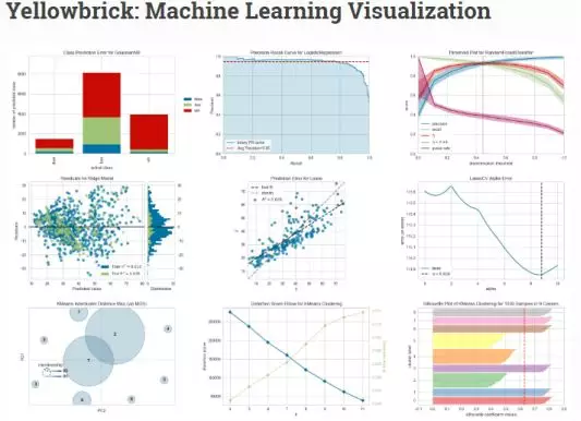
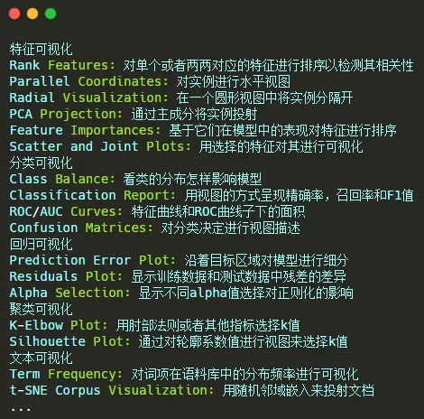
The most popular visualizers in Yellowbrick include:
Such a powerful visualization tool can be installed in a simple way. Use the following command:
pip install yellowbrick
If you need to upgrade the latest version of, you can use the following command:
pip install –u yellowbrick
After the installation, we can use it. This module provides several commonly used datasets for experiment, as follows:
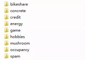
When entering the corresponding dataset folder, there will be three files. For bikeshare, they are as follows:
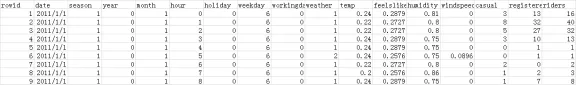
Where: bikeshare.csv is the data set file, such as:
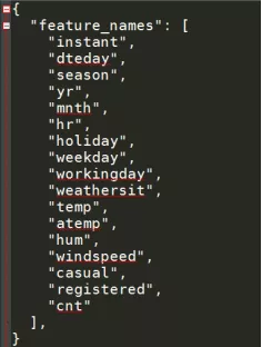
Meta.json is the field meta information file, such as:
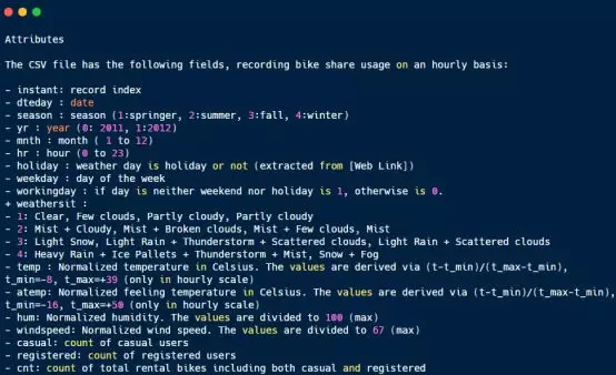
README.md is an introduction document, such as:
Based on the shared single vehicle data set, the simple data analysis work is realized as follows:
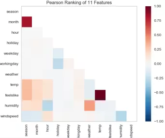
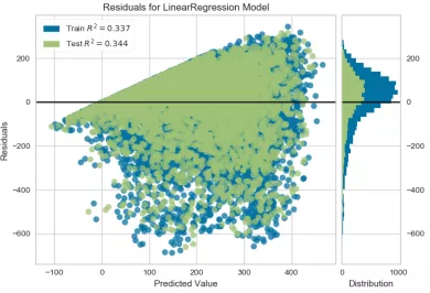
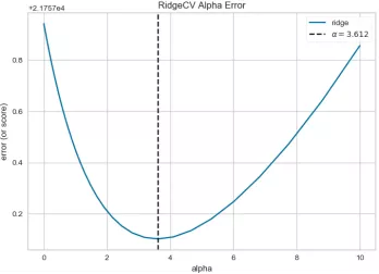
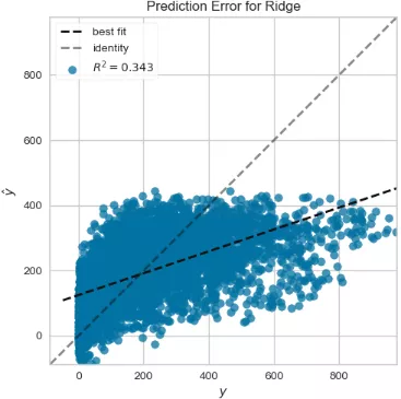
1 def testFunc5(savepath='Results/bikeshare_Rank2D.png'): 2 ''' 3 Shared single vehicle dataset prediction 4 ''' 5 data=pd.read_csv('bikeshare/bikeshare.csv') 6 X=data[["season", "month", "hour", "holiday", "weekday", "workingday", 7 "weather", "temp", "feelslike", "humidity", "windspeed" 8 ]] 9 y=data["riders"] 10 visualizer=Rank2D(algorithm="pearson") 11 visualizer.fit_transform(X) 12 visualizer.poof(outpath=savepath) 13 14 15 def testFunc6(savepath='Results/bikeshare_temperate_feelslike_relation.png'): 16 ''' 17 Further examination of relevance 18 ''' 19 data=pd.read_csv('bikeshare/bikeshare.csv') 20 X=data[["season", "month", "hour", "holiday", "weekday", "workingday", 21 "weather", "temp", "feelslike", "humidity", "windspeed"]] 22 y=data["riders"] 23 visualizer=JointPlotVisualizer(feature='temp', target='feelslike') 24 visualizer.fit(X['temp'], X['feelslike']) 25 visualizer.poof(outpath=savepath) 26 27 28 def testFunc7(savepath='Results/bikeshare_LinearRegression_ResidualsPlot.png'): 29 ''' 30 Prediction using linear regression model based on shared single vehicle data 31 ''' 32 data = pd.read_csv('bikeshare/bikeshare.csv') 33 X=data[["season", "month", "hour", "holiday", "weekday", "workingday", 34 "weather", "temp", "feelslike", "humidity", "windspeed"]] 35 y=data["riders"] 36 X_train,X_test,y_train,y_test=train_test_split(X,y,test_size=0.3) 37 visualizer=ResidualsPlot(LinearRegression()) 38 visualizer.fit(X_train, y_train) 39 visualizer.score(X_test, y_test) 40 visualizer.poof(outpath=savepath) 41 42 43 def testFunc8(savepath='Results/bikeshare_RidgeCV_AlphaSelection.png'): 44 ''' 45 Based on the use of shared single vehicle data AlphaSelection 46 ''' 47 data=pd.read_csv('bikeshare/bikeshare.csv') 48 X=data[["season", "month", "hour", "holiday", "weekday", "workingday", 49 "weather", "temp", "feelslike", "humidity", "windspeed"]] 50 y=data["riders"] 51 alphas=np.logspace(-10, 1, 200) 52 visualizer=AlphaSelection(RidgeCV(alphas=alphas)) 53 visualizer.fit(X, y) 54 visualizer.poof(outpath=savepath) 55 56 57 def testFunc9(savepath='Results/bikeshare_Ridge_PredictionError.png'): 58 ''' 59 Drawing prediction error map based on shared single vehicle data 60 ''' 61 data=pd.read_csv('bikeshare/bikeshare.csv') 62 X=data[["season", "month", "hour", "holiday", "weekday", "workingday", 63 "weather", "temp", "feelslike", "humidity", "windspeed"]] 64 y=data["riders"] 65 X_train,X_test,y_train,y_test=train_test_split(X,y,test_size=0.3) 66 visualizer=PredictionError(Ridge(alpha=3.181)) 67 visualizer.fit(X_train, y_train) 68 visualizer.score(X_test, y_test) 69 visualizer.poof(outpath=savepath)
Correlation calculation of features in bikeshare? Rank2d.png
Bikeshare? Linearregression? Residualsplot.png use linear regression model to predict
Bikeshare? Ridgecv? AlphaSelection.png use AlphaSelection feature selection
Bikeshare? Ridge? Predictionerror.png
In addition to analyzing and displaying the data directly, Yellowbrick can also process and analyze the text data. Here is a simple description based on the hobby data set. The specific code implementation is as follows:
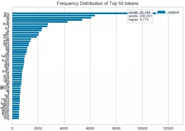
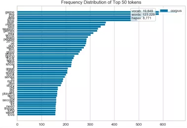
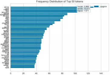
1 def hobbiesFreqDistVisualizer(): 2 ''' 3 Text visualization 4 Token Frequency distribution: how often tokens are drawn in Corpus 5 t-SNE Corpus visualization: drawing similar documents closer to discovery clustering 6 ''' 7 corpus=load_corpus("data/hobbies") 8 vectorizer = CountVectorizer() 9 docs = vectorizer.fit_transform(corpus.data) 10 features = vectorizer.get_feature_names() 11 visualizer = FreqDistVisualizer(features=features) 12 visualizer.fit(docs) 13 visualizer.poof(outpath='text_hobbies_FreqDistVisualizer.png') 14 #Go to stop words 15 vectorizer = CountVectorizer(stop_words='english') 16 docs = vectorizer.fit_transform(corpus.data) 17 features = vectorizer.get_feature_names() 18 visualizer = FreqDistVisualizer(features=features) 19 visualizer.fit(docs) 20 visualizer.poof(outpath='text_hobbies_FreqDistVisualizer_stop_words.png') 21 22 23 def hobbiesFreqDistVisualizer2(): 24 ''' 25 Explore the frequency distribution of cooking and games 26 (Error reporting: no label,Should be corpus.target) 27 ''' 28 corpus=load_corpus("data/hobbies") 29 #Distribution statistics of cooking hobby frequency 30 hobbies=defaultdict(list) 31 for text,label in zip(corpus.data,corpus.target): 32 hobbies[label].append(text) 33 vectorizer = CountVectorizer(stop_words='english') 34 docs = vectorizer.fit_transform(text for text in hobbies['cooking']) 35 features = vectorizer.get_feature_names() 36 visualizer = FreqDistVisualizer(features=features) 37 visualizer.fit(docs) 38 visualizer.poof(outpath='text_hobbies_cooking_FreqDistVisualizer.png') 39 #Statistical chart of Game Hobby frequency distribution 40 hobbies=defaultdict(list) 41 for text,label in zip(corpus.data, corpus.target): 42 hobbies[label].append(text) 43 vectorizer = CountVectorizer(stop_words='english') 44 docs = vectorizer.fit_transform(text for text in hobbies['gaming']) 45 features = vectorizer.get_feature_names() 46 visualizer = FreqDistVisualizer(features=features) 47 visualizer.fit(docs) 48 visualizer.poof(outpath='text_hobbies_gaming_FreqDistVisualizer.png') 49 50 51 def hobbiesTSNEVisualizer(): 52 ''' 53 t-SNE Corpus visualization 54 T Distributed random neighborhood embedding, t-SNE. Scikit-Learn Implement this decomposition method as sklearn.manifold.TSNE Converter. 55 High dimensional document vectors are decomposed into two dimensions by using different distributions from the original dimension and the decomposed dimension By decomposing into two or three dimensions, 56 You can use scatter plots to display documents. 57 ''' 58 corpus=load_corpus("data/hobbies") 59 tfidf = TfidfVectorizer() 60 docs = tfidf.fit_transform(corpus.data) 61 labels = corpus.target 62 tsne = TSNEVisualizer() 63 tsne.fit(docs, labels) 64 tsne.poof(outpath='text_hobbies_TSNEVisualizer.png') 65 #Don't color points with their classes 66 tsne = TSNEVisualizer(labels=["documents"]) 67 tsne.fit(docs) 68 tsne.poof(outpath='text_hobbies_TSNEVisualizer_nocolor.png') 69 70 71 def hobbiesClusterTSNEVisualizer(): 72 ''' 73 Clustering Application 74 ''' 75 corpus=load_corpus("data/hobbies") 76 tfidf = TfidfVectorizer() 77 docs = tfidf.fit_transform(corpus.data) 78 clusters=KMeans(n_clusters=5) 79 clusters.fit(docs) 80 tsne=TSNEVisualizer() 81 tsne.fit(docs,["c{}".format(c) for c in clusters.labels_]) 82 tsne.poof(outpath='text_hobbies_cluster_TSNEVisualizer.png')
text_hobbies_FreqDistVisualizer.png
text_hobbies_FreqDistVisualizer_stop_words.png
text_hobbies_cooking_FreqDistVisualizer.png
 .
.