1 Overview
In the process of visualization, the default cartographic effect is often unsatisfactory and various settings are expected to be personalized.
This article introduces personalization in seaborn visualization through a simple example.Include common settings such as:
- Set Chart Display Color
- Set chart title including display position, font size, color, etc.
- Set x- and y-axis titles, including color and font size
- Set x- and y-axis scale contents, including color, font size, font orientation, etc.
- Reverse the x- and y-axis contents
- Set x- or y-axis display position
The environment in which this article runs:
- windows 7
- python 3.5
- jupyter notebook
- seaborn 0.7.1
- matplotlib 2.0.2
2 Unpersonalized scenarios
The data in this article comes from the UCI dataset sonar, which reads the data directly from pandas.The following:
import pandas as pd
import matplotlib.pyplot as plt
import seaborn as sns
% matplotlib inline

target_url = 'http://archive.ics.uci.edu/ml/machine-learning-databases/undocumented/connectionist-bench/sonar/sonar.all-data'
df = pd.read_csv(target_url, header=None, prefix='V')
corr = df.corr()
First, let's see how it looks without personalization, as follows:
f, ax= plt.subplots(figsize = (14, 10))

sns.heatmap(corr,cmap='RdBu', linewidths = 0.05, ax = ax)

# Set the title of Axes
ax.set_title('Correlation between features')

f.savefig('sns_style_origin.jpg', dpi=100, bbox_inches='tight')
The picture displays as follows:
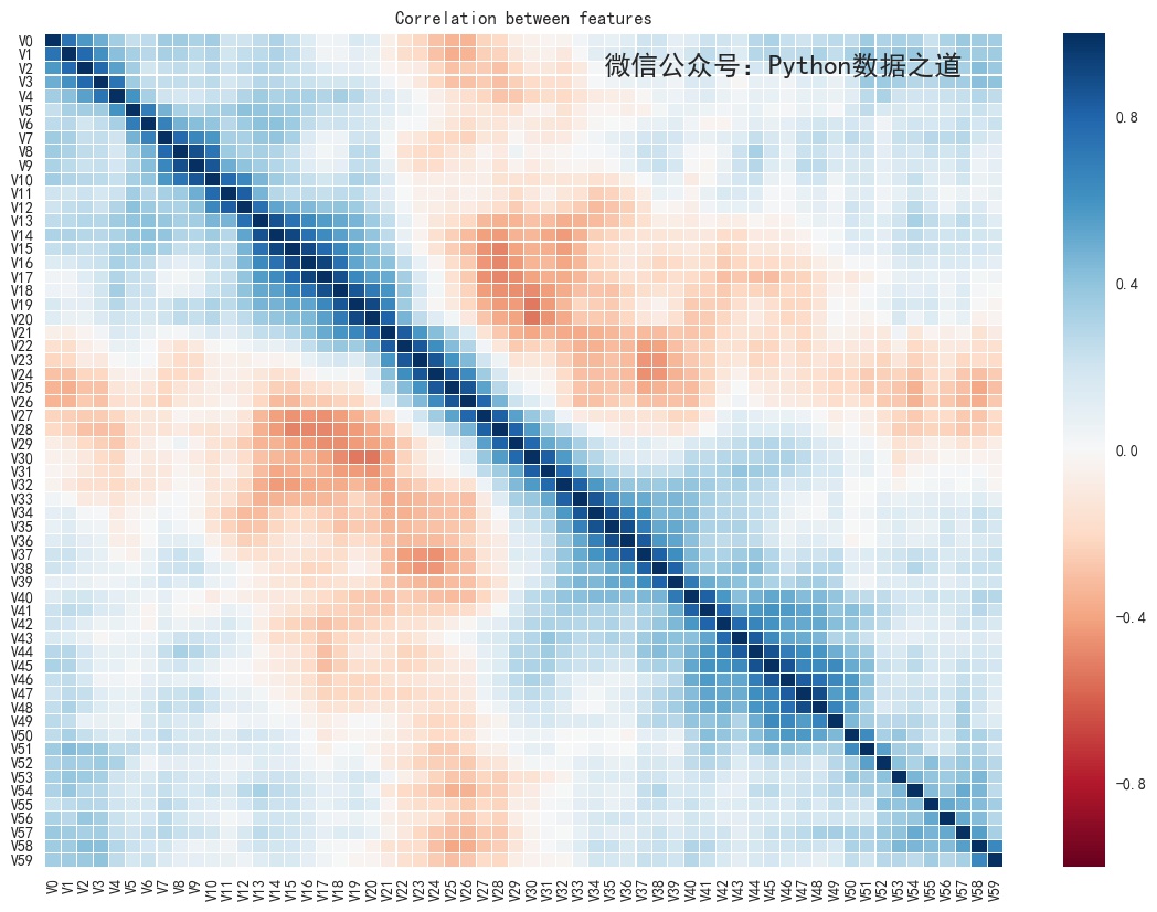
The default effect of seaborn mapping is actually good.
3 Personalize settings
For the above figure, the y-axis may be displayed from bottom to top, starting with v0, so that the diagonal line displayed may be more in line with our visual display.
This uses a reversible display of the y-axis content, with the following code involved:
# Reverse the y- or x-axis
ax.invert_yaxis()
# ax.invert_xaxis()
Other personalization settings include:
Several ways to place the x-axis scale on top
# Several ways to place the x-axis scale on top
# ax.xaxis.set_ticks_position('top')
ax.xaxis.tick_top()
# ax.tick_params(axis='x',labelsize=6, colors='b', labeltop=True, labelbottom=False) # x-axis
Set the axis scale parameters. When "axis" is not written, the default is to adjust the x- and y-axis parameters simultaneously.
# Set Font Size for Axis Scale
# matplotlib.axes.Axes.tick_params
ax.tick_params(axis='y',labelsize=8) # y-axis
Two methods of text direction on scale of rotation axis
# Two methods of text direction on scale of rotation axis
ax.set_xticklabels(ax.get_xticklabels(), rotation=-90)
# ax.set_xticklabels(corr.index, rotation=90)
Save the picture, set bbox_inches='tight', and the saved picture will not show part of the content incompletely.
f.savefig('sns_style_update.jpg', dpi=100, bbox_inches='tight')
The integrated code is as follows, you can run to try the effect.
f, ax = plt.subplots(figsize = (14, 10))

# Set Colors
cmap = sns.cubehelix_palette(start = 1, rot = 3, gamma=0.8, as_cmap = True)

# color: https://matplotlib.org/users/colormaps.html
sns.heatmap(corr,cmap='RdBu', linewidths = 0.05, ax = ax)

# Set the title of Axes
ax.set_title('Correlation between features', fontsize=18, position=(0.5,1.05))

# Reverse the y- or x-axis
ax.invert_yaxis()
# ax.invert_xaxis()

ax.set_xlabel('X Label',fontsize=10)

# Set the font size and color for Y-axis labels
ax.set_ylabel('Y Label',fontsize=15, color='r')

# Set Font Size for Axis Scale
# matplotlib.axes.Axes.tick_params
ax.tick_params(axis='y',labelsize=8) # y-axis
# ax.tick_params(axis='x',labelsize=6, colors='b', labeltop=True, labelbottom=False) # x-axis

# Several ways to place the x-axis scale on top
# ax.xaxis.set_ticks_position('top')
ax.xaxis.tick_top()
# ax.tick_params(axis='x',labelsize=6, colors='b', labeltop=True, labelbottom=False) # x-axis

# Modify tick font color
# ax.tick_params(axis='x', colors='b') # x-axis

# Two methods of text direction on scale of rotation axis
ax.set_xticklabels(ax.get_xticklabels(), rotation=-90)
# ax.set_xticklabels(corr.index, rotation=90)

# Set the font size and orientation of y- or x-axis scales separately
# ax.set_yticklabels(ax.get_yticklabels(),fontsize=6)
# ax.set_xticklabels(ax.get_xticklabels(), rotation=-90)

f.savefig('sns_style_update.jpg', dpi=100, bbox_inches='tight')
The graphics display as follows:
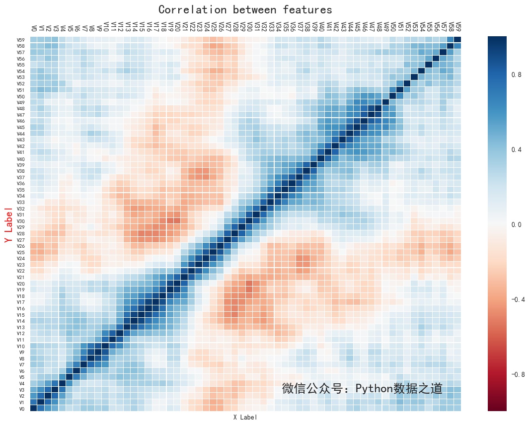
These personalized settings, in fact, are mostly the content of matplotlib, seaborn is derived from matplotlib, so it can be used with matplotlib.
Of course, not every time you need to customize, specific can be set according to your own needs.
If you like my article, please follow the WeChat public number "Python Data Road"