Review review
In previous issues, we learned about the matplotlib module. For the commonly used broken line chart reflecting data changes, we compared the histogram of data type differences and the histogram reflecting data frequency distribution.
Quick view of content
Super detailed Python matplotlib drawing histogram_ Simple programming blog-
Such detailed Python matplotlib drawing graphics are not collected yet_ Simple programming blog
Analysis of the underlying principle of Python matplotlib in such detail_ Simple programming blog-
In the data statistics chart, there is a chart that the hash points are distributed in the coordinates to reflect the trend of the data with the independent variables.
In this issue, we will learn in detail about the attributes related to plotting scatter charts with matplotlib, let's go~
1. Overview of scatter diagram
-
What is a scatter chart?
- The scatter chart is used to draw data points on the horizontal and vertical axes, and the data is distributed in the left standard system in a point shape
- The scatter chart shows the general trend of the dependent variable with the independent variable
- The scatter chart is composed of multiple left coordinate points. It examines the distribution of coordinate points and determines whether there is a certain correlation or distribution pattern
- Points of different categories are represented by markers of different shapes or colors in the chart
- Scatter diagram is mainly divided into scatter diagram matrix, 3D scatter diagram and ArcGIS scatter diagram
-
Scatter chart usage scenario
- Scatter charts are used to compare aggregated data across categories
- Scatter chart is used to analyze the linear and polynomial trend of data
- Scatter chart for four quadrant analysis
- Scatter charts are used to find data trend formulas
- The scatter chart can be used as an aid for later accurate icons
-
To draw a scatter chart
- Import the matplotlib.pyplot module
- To prepare the data, you can use numpy/pandas to organize the data
- Call pyplot.scatter() to draw a scatter chart
-
Case display
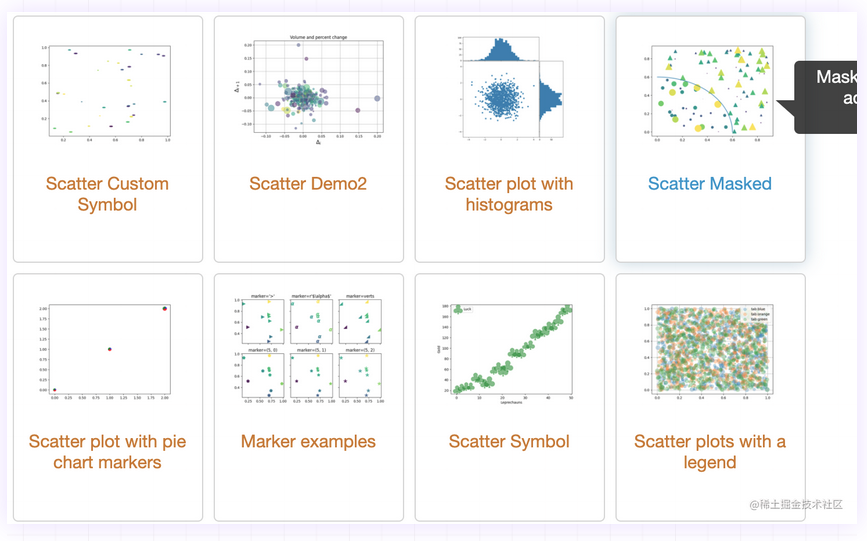
In this case, we will analyze the sales distribution of a product with different pricing
-
Two sets of data x-axis and y-axis shall be prepared for the case, and the data volume of x-axis and y-axis shall be consistent
x_value = np.random.randint(50,100,50)
y_value = np.random.randint(500,1000,50)
Copy code
-
Draw scatter
import matplotlib.pyplot as plt
import numpy as np

plt.rcParams["font.sans-serif"]=['SimHei'] plt.rcParams["axes.unicode_minus"]=False

x_value = np.random.randint(50,100,50)
y_value = np.random.randint(500,1000,50)

plt.scatter(x_value,y_value)

plt.title("data analyze")
plt.xlabel("selling price")
plt.ylabel("sales volume")

plt.show()
2. Scatter chart attributes
-
Set scatter size
- Keywords: s
- The incoming data type is list or number. The default value is 20
-
Set scatter color
- Key words: c
- The default color is blue
- Value range
- English words indicating color: such as red "red"
- Abbreviations of color words, such as red "r" and yellow "y"
- RGB format: hexadecimal format, such as "#88c999";(r,g,b) tuple form
- You can also pass in a color list
-
Set scatter style
- Keywords: marker
- The system defaults to 'o' small circle
- Values can also be: ('O ',' V ',' ^ ',' < '' > ','8','s', 'p', '*','h ',' H ','d','d ',' p ',' x ')
-
Set transparency
- Keyword: alpha
- Value range: 0 ~ 1
-
Set scatter border
- Keywords: edgecolor
- The default is face
- Value options:
- "face"|"none"
- English word, abbreviation or rgb for color
-
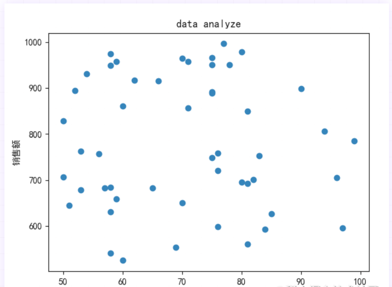
Based on the case in the previous section, we set the scatter size. The scatter border is pink and the scatter color is #88c999
size = (20*np.random.rand(50))**2
plt.scatter(x_value,y_value,s=area,c="#88c999",edgecolors="pink"
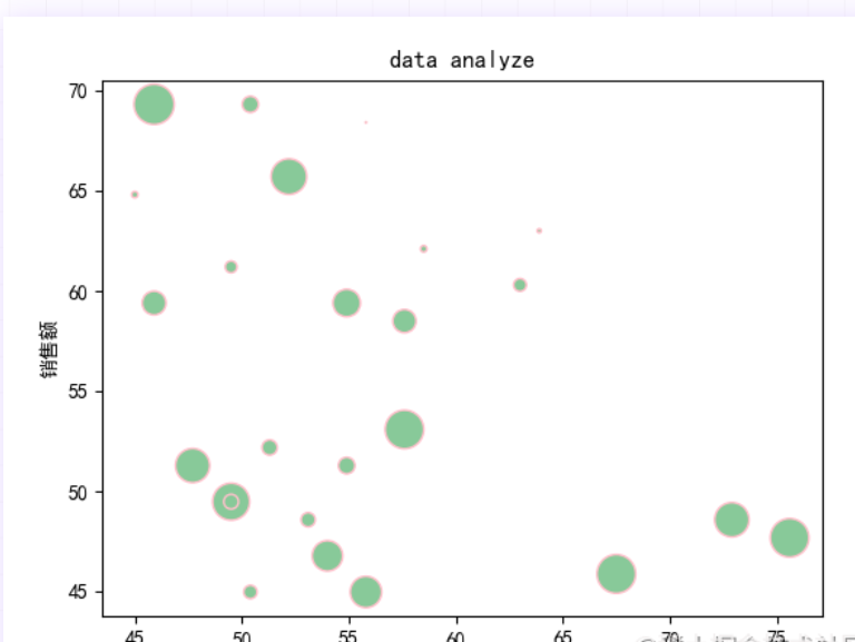
3. Add line scatter chart
When viewing the scatter chart, we sometimes use the line chart to assist the analysis. We continue to analyze the data in the first section.
-
We use np.random.rand() to generate 100 random data
x_value = 100*np.random.rand(100)
y_value = 100*np.random.rand(100)
Copy code
-
We need to use our high school math company, such as sin\cos function, etc. (high school math is returned to the teacher)
-
Use the pyplot.plot() method to plot the graph
r0 = 80
plt.scatter(x_value,y_value,c="hotpink",edgecolors="blue")
the =  np.arange(0,np.pi/2, 0.01)
plt.plot(r0*np.cos(the),r0*np.sin(the))
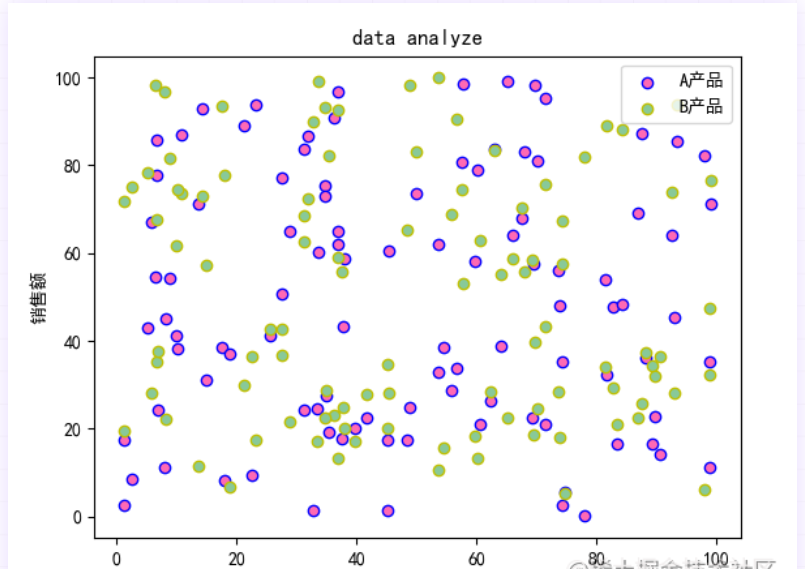
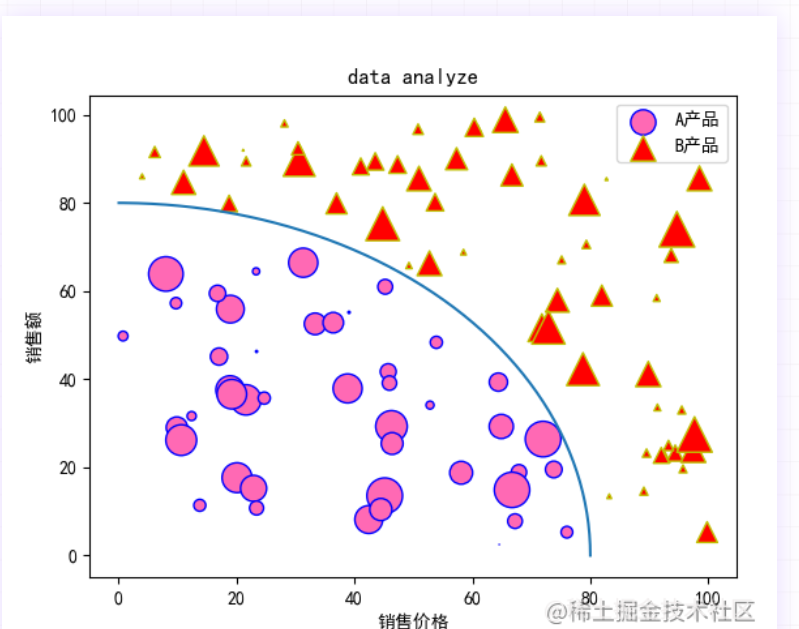
4. Multi type scatter diagram
When we observe data, we will compare multiple types of data at the same time, so we can distinguish the representation by color or scatter style
-
Method 1: when using color to distinguish different categories, we need to add new data and scatter methods
x_value = 100*np.random.rand(100)
y_value = 100*np.random.rand(100)
y1_value = 100*np.random.rand(100)

plt.scatter(x_value,y_value, c="hotpink",edgecolors="blue",label="A product")

plt.scatter(x_value,y1_value, c="#88c999", edgecolors="y",label="B product ")
Method 2: we can use marker to mark different types. For example, we use the case in the previous section to add a scatter()
r0 = 80

size = (20*np.random.rand(100))**2

r = np.sqrt(x_value**2+y_value**2)
area = np.ma.masked_where(r > r0,size)
area1 = np.ma.masked_where(r <= r0, size)

plt.scatter(x_value,y_value,s=area,c="hotpink",edgecolors="blue",label="A product")

plt.scatter(x_value, y_value, s=area1, c="red", edgecolors="y",marker="^",label="B product")

the =  np.arange(0,np.pi/2, 0.01)
plt.plot(r0*np.cos(the),r0*np.sin(the))
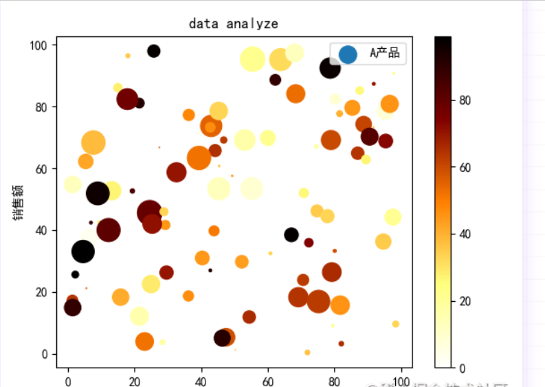
5. Color bar scatter diagram
In the scatter chart, in order to represent the color depth of each point, we can add it with the help of cmap color bar
- Color bar display keyword: cmap
- The default value is viridis. Optional values such as accent_r,blues_r,brbg_r,greens_r, and so on
- Represents a value from 0 to 100 for each color
When we want to display the color list, we need to call pyplot.colorbar()
For example, we add a red color list to the scatter chart
size = (20*np.random.rand(100))**2
color = np.random.randint(0,100,100)
plt.scatter(x_value,y_value, s=size, c=color,label="A product",cmap="afmhot_r")
plt.colorbar()
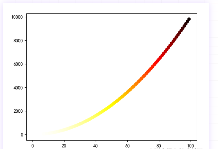
6. Curve scatter diagram
Scatter diagrams are composed of coordinate points. When these points have certain laws, we can use scatter diagrams to draw curves.
We use scatter() to plot a power function to the power of 2
x_value = list(range(1, 100))
y_value = [x ** 2 for x in x_value]

plt.scatter(x_value,y_value,c=y_value,cmap="hot_r",edgecolors="none",s=50)

plt.show()
Copy code
summary
In this issue, we will learn in detail the scatter method and related attributes of matplotlib.pyplot. For data that has not found a regular pattern for the time being, using the scattergram can quickly find the distribution of the data