
pyecharts visualization
Above, we used Excel visualization to draw a pseudo "The Economist" chart. To some extent, this method solved the shortcomings of pandas: not beautiful, not powerful. But its operation is complicated, and the Handicapped Party says it dislikes it the most.
So this section explains a Python third-party library (pyecharts), which can solve these problems perfectly. Nowadays, many pictures of data analysis articles of public numbers are drawn with them. The main reason is that:
- Simple operation
- Graphic beauty
- Various types of charts
This is the Chinese document of pyecharts.( http://pyecharts.org/#/zh-cn/ This section will outline the use of pyecharts, and refer to the official documentation for details (remember to install this library). Still on the outline:
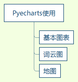
Basic chart usage
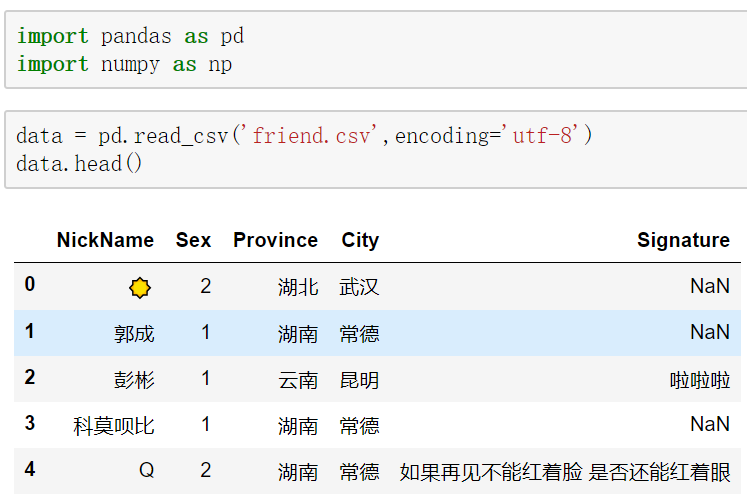
We take Weixin Friends Information as an example (data download is provided at the end of the article).
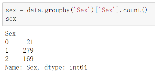
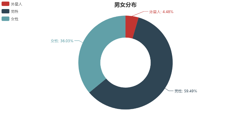
We look at the gender distribution through the groupby function.
sex = data.groupby('Sex')['Sex'].count()
We use pie charts here. We open Chinese documents and find pie charts. Here are detailed parameter settings and cases. We just need to follow the case and change it into our own data.
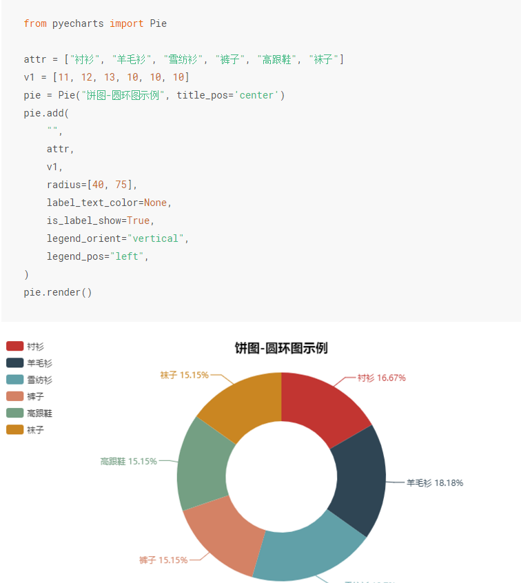
As you can see, we just need to modify attr and v1, where attr is changed to list(sex.index) (data is list structure), V1 to list(sex), but sex.index is 0, 1, 2. So we can define attr manually.
from pyecharts import Pie

pie = Pie("Distribution between male and female", title_pos='center')
pie.add(
    "",
    ['Alien','Male','Female sex'],
    list(sex),
    radius=[40, 75],
    label_text_color=None,
    is_label_show=True,
    legend_orient="vertical",
    legend_pos="left",
)
pie
Word cloud diagram
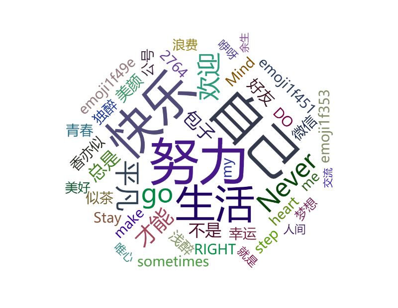
Word cloud mapping is also very simple, but we need to do word segmentation statistics on the text, here we need to use the jieba library.
First of all, we stitched together the text in the column of personalized signatures.
str_data = ''
for i in range(new_data.shape[0]):
    str_data = str_data + new_data.iloc[i,4]
Then we use jieba (which also needs to be installed) participle statistics to get the data.
import jieba.analyse
tags = jieba.analyse.extract_tags(str_data, topK=50, withWeight=True)

label = []
attr = []
for item in tags:
    print(item[0]+'\t'+str(int(item[1]*1000)))
    label.append(item[0])
    attr.append(int(item[1]*1000))
Finally, the drawing can be done.
from pyecharts import WordCloud

wordcloud = WordCloud(width=800, height=620)
wordcloud.add("", label[4:], attr[4:], word_size_range=[20, 100])
wordcloud
Map rendering
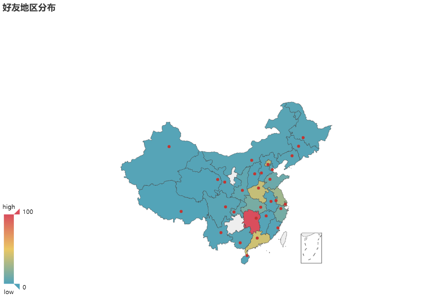
Mapping is also very simple, that is, pyecharts does not provide a map file package, we must first install through the following code, so that we can display the map.
pip install echarts-countries-pypkg
pip install echarts-china-provinces-pypkg
pip install echarts-china-cities-pypkg
pip install echarts-china-counties-pypkg
pip install echarts-china-misc-pypkg
We still use the groupby function to process data.
province = data.groupby('Province')['Province'].count()
Finally, visualize the map.
from pyecharts import Map

value = list(province)
attr = list(province.index)
map = Map("Distribution of Friends", width=1200, height=600)
map.add(
    "",
    attr,
    value,
    maptype="china",
    is_visualmap=True,
    visual_text_color="#000",
)
map
Today's interaction
Code download: https://github.com/panluoluo/crawler-analysis Download the complete data and code.
Message Carding: First impression of pyecharts visualization. The public responded back-stage, joined the card learning group, and worked together in 2019.