Video Explanation:
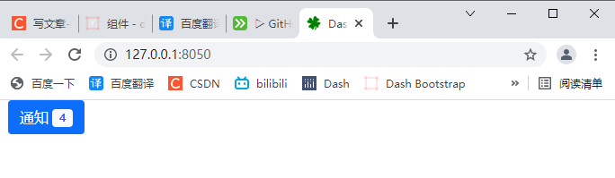
1, DBC code template
# 1. Import Dash
import dash
import dash_bootstrap_components as dbc

# 2. Create a dash instance object
app = dash.Dash(external_stylesheets=[dbc.themes.BOOTSTRAP])

# 3. Add DBC component
badge = dbc.Button(
    ["notice",dbc.Badge("4", color="light", text_color="primary", className="ms-1"),],
    color="primary",
)

# 4. Merge code snippets into the layout
app.layout = dbc.Container(badge, fluid=True)

# 5. Start Dash server
if __name__ == "__main__":
    app.run_server()
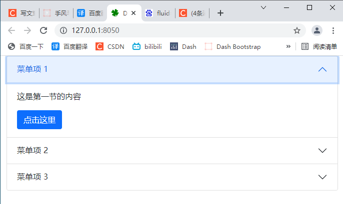
2, Collapse menu dbc.Accordion()
2.1 basic folding menu
# 1. Import Dash
import dash
import dash_bootstrap_components as dbc
from dash import html
# 2. Create a dash instance object
app = dash.Dash(external_stylesheets=[dbc.themes.BOOTSTRAP])
# 3. Add Accordion component
accordion = html.Div(
# Collapsible menu
dbc.Accordion(
[
dbc.AccordionItem(
[
html.P("This is the content of the first section"),
dbc.Button("click here ", color="primary"),
],
title="Menu item 1",
),
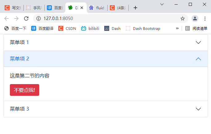
dbc.AccordionItem(
[
html.P("This is the second section"),
dbc.Button("Don't order me!", color="danger"),
],
title="Menu item 2",
),
dbc.AccordionItem(
"This is the content of section 3",
title="Menu item 3",
),
],
)
)
# 4. Merge code snippets into the layout
# fluid=True follows the size of the outer container and the width of the outer container
app.layout = dbc.Container(accordion, fluid=True)
# 5. Start Dash server
if __name__ == "__main__":
app.run_server()
2.2 set the items opened at the first startup
You can use this active_ The item property sets which project to open on first startup.
If not defined, the first item opens by default. If you do not want to open any projects at startup, you can specify start_collapsed=True.
# 1. Import Dash
import dash
import dash_bootstrap_components as dbc
from dash import html


# 2. Create a dash instance object
app = dash.Dash(external_stylesheets=[dbc.themes.BOOTSTRAP])

# 3. Add Accordion component
accordion = html.Div(
    # Collapsible menu
    dbc.Accordion(
        [
            dbc.AccordionItem(
                [
                    html.P("This is the content of the first section"),
                    dbc.Button("click here ", color="primary"),
                ],
                title="Menu item 1", item_id='item-1',
            ),
            dbc.AccordionItem(
                [
                    html.P("This is the second section"),
                    dbc.Button("Don't order me!", color="danger"),
                ],
                title="Menu item 2",item_id='item-2',
            ),
            dbc.AccordionItem(
                "This is the content of section 3",
                title="Menu item 3", item_id='item-3',
            ),
        ],
        # Page load, collapse all menus
        # start_collapsed=True,
        # When the page loads, open the menu item first
        active_item='item-2',
    )
)

# 4. Merge code snippets into the layout
# fluid=True follows the size of the outer container and the width of the outer container
app.layout = dbc.Container(accordion, fluid=True)

# 5. Start Dash server
if __name__ == "__main__":
    app.run_server()
2.3 align with parent container flush=True
fluid=True follows the size of the outer container and the width of the outer container
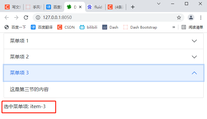
2.4 callback
Each menu item in dbc.Accordion() can be assigned a specific item_id active_ The item attribute is used to determine which part is open.
If item is not specified_ ID, these parts will be continuously marked as item-0, item-1. This can be used in callbacks to determine which parts are already open.
# 1. Import Dash
import dash
import dash_bootstrap_components as dbc
from dash import html
from dash.dependencies import Output, Input, State


# 2. Create a dash instance object
app = dash.Dash(external_stylesheets=[dbc.themes.BOOTSTRAP])

# 3. Add Accordion component
accordion = html.Div(
    [
        # Collapsible menu
        dbc.Accordion(
            [
                dbc.AccordionItem(
                    [
                        html.P("This is the content of the first section"),
                        dbc.Button("click here ", color="primary"),
                    ],
                    title="Menu item 1", item_id='item-1',
                ),
                dbc.AccordionItem(
                    [
                        html.P("This is the second section"),
                        dbc.Button("Don't order me!", color="danger"),
                    ],
                    title="Menu item 2",item_id='item-2',
                ),
                dbc.AccordionItem(
                    "This is the content of section 3",
                    title="Menu item 3", item_id='item-3',
                ),
            ],
            id="accordion",
            # Page load, collapse all menus
            # start_collapsed=True,
            # When the page loads, open the menu item first
            active_item='item-2',
        ),
        html.Div(id="accordion-contents", className="mt-3")
    ]
)

# 4. Merge code snippets into the layout
# fluid=True follows the size of the outer container and the width of the outer container
app.layout = dbc.Container(accordion, fluid=True)


@app.callback(
    Output("accordion-contents", "children"),
    [Input("accordion", "active_item")],
)
def change_item(item):
    return f"Select the menu item: {item}"


# 5. Start Dash server
if __name__ == "__main__":
    app.run_server()
2.5 keyword parameters of folding menu Accordion
-
children (a list or a single dash component, string or number; optional): a child component of this component.
-
ID (string; optional): the ID of the component, which is used to identify the dash component in the callback. The ID needs to be unique among all components in the application.
-
active_item (string; optional): the item of the current active project_ id. If item has not been specified for the active project_ ID, the default is item-i, where I is the index of the item (starting from 0).
className (string, optional): class is not recommended_ Name instead. It is often used with CSS to style elements with common properties. -
class_ Name (string; optional): usually used with CSS to style elements with common attributes.
-
flush (boolean; optional): renders the accordion edge to edge using its parent container.
-
key (string; optional): the unique identifier of the component, which is used to improve the performance of React.js when rendering the component. See https://reactjs.org/docs/lists-and-keys.html Learn more.
-
loading_ State (dict; optional): an object that holds the load state object from dash renderer.
- loading_state is a dictionary with keys:
- component_name (string; optional): saves the name of the component being loaded.
- is_loading (boolean; optional): determines whether the component is loading.
- prop_name (string; optional): saves the attribute being loaded.
- loading_state is a dictionary with keys:
-
persisted_props (list of values equal to: 'active_item's; default ['active_item']): attribute that user interaction will persist after refreshing the component or page. Since onlyvalue is allowed, this prop can usually be ignored.
-
Persistence (Boolean | string | number; optional): used to allow user interaction in the component to be preserved when the component or page is refreshed. If persisted is true and does not change its previous value, the value a that the user changed when using the application will keep the change as long as the new value value also matches the value originally given. Use persistence with_ type.
-
persistence_type (the value is equal to 'local', 'session', 'memory'; default 'local'): the location where persistent user changes will be stored: memory: only kept in memory and reset when the page is refreshed. Local: window.localStorage. The data is retained after the browser exits. Session: window.sessionStorage. The data will be cleared after the browser exits.
-
start_ Collapsed (Boolean; default false): set to True for all items to be collapsed.
-
Style (dict; optional): defines the CSS style that will override the previously set style.
2.6 keyword parameters of menu item AccordionItem
-
children (a list or a single dash component, string or number; optional): a child component of this component.
-
ID (string; optional): the ID of the component, which is used to identify the dash component in the callback. The ID needs to be unique among all components in the application.
-
className (string, optional): not recommended, usage class_name instead. It is often used with CSS to style elements with common properties.
-
class_ Name (string; optional): usually used with CSS to style elements with common attributes.
-
item_id (string; optional): if not specified, the optional identifier of the item used to determine which item is visible, and the Accordion item is being used in the Accordion component, itemId will be set to "item-i", where I is the item in the list item whose (zero index) position is passed to the Accordion component.
-
loading_ State (dict; optional): an object that holds the load state object from dash renderer.
-
loading_state is a dictionary with keys:
-
component_name (string; optional): saves the name of the component being loaded.
-
is_loading (boolean; optional): determines whether the component is loading.
-
prop_name (string; optional): saves the attribute being loaded.
-
-
-
Style (dict; optional): defines the CSS style that will override the previously set style.
-
Title (string; optional): the title displayed in the folded accordion item.
3, Prompt warning (DBC. Alert)
3.1 basic tips and warnings
# 1. Import Dash
import dash
import dash_bootstrap_components as dbc
from dash import html
from dash.dependencies import Output, Input, State
# 2. Create a dash instance object
app = dash.Dash(external_stylesheets=[dbc.themes.BOOTSTRAP])
# 3. Add Alert component
alerts = html.Div(
[
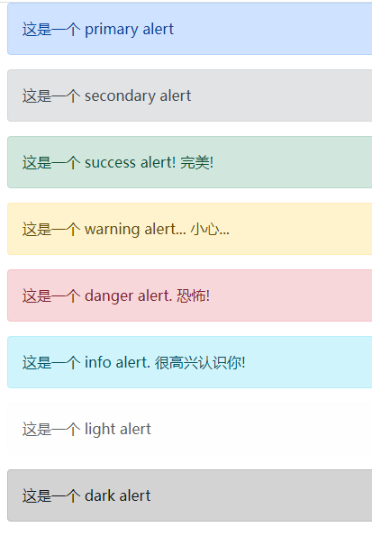
dbc.Alert("This is a dbc.themes.BOOTSTRAP Under the theme primary alert", color="primary"),
dbc.Alert("This is a secondary alert", color="secondary"),
dbc.Alert("This is a success alert! perfect!", color="success"),
dbc.Alert("This is a warning alert... look out...", color="warning"),
dbc.Alert("This is a danger alert. terror!", color="danger"),
dbc.Alert("This is a info alert. nice to meet you!", color="info"),
dbc.Alert("This is a light alert", color="light"),
dbc.Alert("This is a dark alert", color="dark"),
]
)
# 4. Merge code snippets into the layout
# fluid=True follows the size of the outer container and the width of the outer container
app.layout = dbc.Container(alerts, fluid=True)
# 5. Start Dash server
if __name__ == "__main__":
app.run_server()
3.2 link color
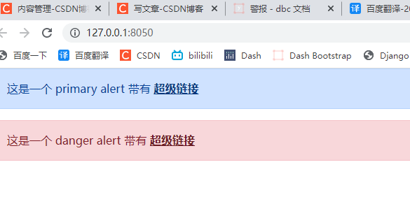
The alert link class of Bootstrap can be used to color match the link within the alarm with the color of the alarm.
# 1. Import Dash
import dash
import dash_bootstrap_components as dbc
from dash import html
from dash.dependencies import Output, Input, State


# 2. Create a dash instance object
app = dash.Dash(external_stylesheets=[dbc.themes.BOOTSTRAP])

# 3. Add Alert component
alerts = html.Div(
    [
        dbc.Alert(
            [
                "This is a primary alert have ",
                html.A("Hyperlinks", href="#", className="alert-link"),
            ],
            color="primary",
        ),
        dbc.Alert(
            [
                "This is a danger alert have ",
                html.A("Hyperlinks", href="#", className="alert-link"),
            ],
            color="danger",
        ),
    ]
)

# 4. Merge code snippets into the layout
# fluid=True follows the size of the outer container and the width of the outer container
app.layout = dbc.Container(alerts, fluid=True)


# 5. Start Dash server
if __name__ == "__main__":
    app.run_server()
3.3 additional content
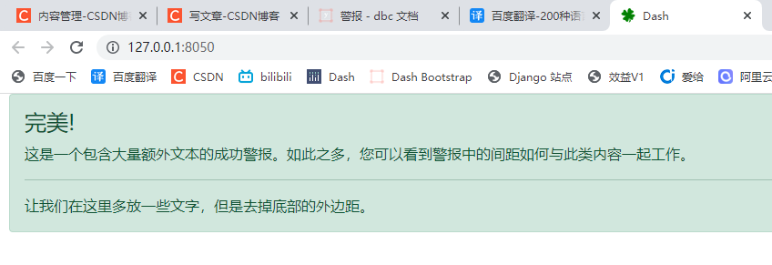
alert can contain additional HTML elements, such as headings, paragraphs, and separators.
# 1. Import Dash
import dash
import dash_bootstrap_components as dbc
from dash import html
from dash.dependencies import Output, Input, State


# 2. Create a dash instance object
app = dash.Dash(external_stylesheets=[dbc.themes.BOOTSTRAP])

# 3. Add Alert component
alert = dbc.Alert(
    [
        html.H4("perfect!", className="alert-heading"),
        html.P(
            "This is a successful alert with a large amount of additional text."
            "With so much, you can see how gaps in alerts work with such content."
        ),
        html.Hr(),
        html.P(
            "Let's put more text here, but remove the outer margin at the bottom.",
            className="mb-0",
        ),
    ]
)

# 4. Merge code snippets into the layout
# fluid=True follows the size of the outer container and the width of the outer container
app.layout = dbc.Container(alert, fluid=True)


# 5. Start Dash server
if __name__ == "__main__":
    app.run_server()
3.4 exit mode
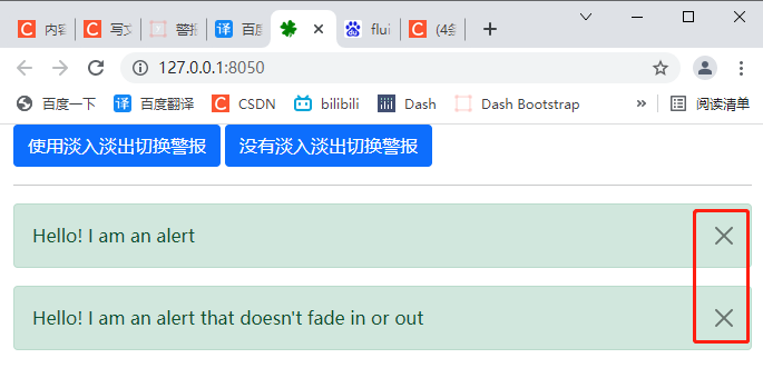
Set disassable = true to add a close button for the alert, and close the alert when clicked.
You can also use is in callbacks_ Open property to show or hide alerts. By default, alerts appear and disappear with the fade in and fade out animation. To disable this feature, simply set fade=False
# 1. Import Dash
import dash
import dash_bootstrap_components as dbc
from dash import html
from dash.dependencies import Output, Input, State


# 2. Create a dash instance object
app = dash.Dash(external_stylesheets=[dbc.themes.BOOTSTRAP])

# 3. Add Alert component
alert = html.Div(
    [
        dbc.Button(
            "Toggle alerts using fade in and fade out",
            id="alert-toggle-fade",
            className="me-1",
            n_clicks=0,
        ),
        dbc.Button(
            "No fade in or fade out switching alerts", id="alert-toggle-no-fade", n_clicks=0
        ),
        html.Hr(),
        dbc.Alert(
            "Hello! I am an alert",
            id="alert-fade",
            dismissable=True,   # Show close button
            is_open=True,       # Display alerts
        ),
        dbc.Alert(
            "Hello! I am an alert that doesn't fade in or out",
            id="alert-no-fade",
            dismissable=True,   # Show close button
            fade=False,         # Turn off fade in and fade out effects
            is_open=True,       # Display alerts
        ),
    ]
)

# 4. Merge code snippets into the layout
# fluid=True follows the size of the outer container and the width of the outer container
app.layout = dbc.Container(alert, fluid=True)

@app.callback(
    Output("alert-fade", "is_open"),
    [Input("alert-toggle-fade", "n_clicks")],
    [State("alert-fade", "is_open")],
)
def toggle_alert(n, is_open):
    if n:
        return not is_open
    return is_open


@app.callback(
    Output("alert-no-fade", "is_open"),
    [Input("alert-toggle-no-fade", "n_clicks")],
    [State("alert-no-fade", "is_open")],
)
def toggle_alert_no_fade(n, is_open):
    if n:
        return not is_open
    return is_open

# 5. Start Dash server
if __name__ == "__main__":
    app.run_server()
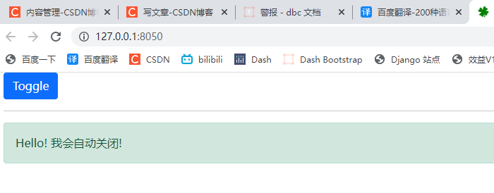
3.5 automatic shutdown
You can use the duration keyword parameter in Alert to shut down your component by itself.
Specify a duration (in milliseconds) to turn off automatically.
# 1. Import Dash
import dash
import dash_bootstrap_components as dbc
from dash import html
from dash.dependencies import Output, Input, State


# 2. Create a dash instance object
app = dash.Dash(external_stylesheets=[dbc.themes.BOOTSTRAP])

# 3. Add Alert component
alert = html.Div(
    [
        dbc.Button(
            "Toggle", id="alert-toggle-auto", className="me-1", n_clicks=0
        ),
        html.Hr(),
        dbc.Alert(
            "Hello! I'll turn it off automatically!",
            id="alert-auto",
            is_open=True,
            duration=4000,
        ),
    ]
)

# 4. Merge code snippets into the layout
# fluid=True follows the size of the outer container and the width of the outer container
app.layout = dbc.Container(alert, fluid=True)


@app.callback(
    Output("alert-auto", "is_open"),
    [Input("alert-toggle-auto", "n_clicks")],
    [State("alert-auto", "is_open")],
)
def toggle_alert(n, is_open):
    if n:
        return not is_open
    return is_open


# 5. Start Dash server
if __name__ == "__main__":
    app.run_server()
3.6 keyword parameters of alert
-
children (a list or a single dash component, string or number; optional): a child component of this component.
-
ID (string; optional): the ID of the component, which is used to identify the dash component in the callback. The ID needs to be unique among all components in the application.
-
className (string, optional): class is not recommended_ Name instead. It is often used with CSS to style elements with common properties.
-
class_ Name (string; optional): usually used with CSS to style elements with common attributes.
-
Color (string; default 'success'): alarm color, options: primary, secondary, success, information, warning, danger, link or any valid CSS color you choose (for example, hexadecimal code, decimal code or CSS color name). Default: secondary
-
Disassable (Boolean; optional): if True, a close button is added to allow the alarm to be closed.
-
Duration (numeric; optional): the duration (in milliseconds) before the alarm is automatically cleared.
-
Fade (Boolean; optional): if True, then in is_ The fade in and fade out animation is applied when the open switch is on. If False, the alarm will simply appear and disappear.
-
is_ Open (Boolean; default true): whether the alarm is turned on. Default: true.
-
key (string; optional): the unique identifier of the component, which is used to improve the performance of React.js when rendering the component. See https://reactjs.org/docs/lists-and-keys.html Learn more.
-
loading_ State (dict; optional): an object that holds the load state object from dash renderer.
-
loading_state is a dictionary with keys:
-
component_name (string; optional): saves the name of the component being loaded.
-
is_loading (boolean; optional): determines whether the component is loading.
-
prop_name (string; optional): saves the attribute being loaded.
-
-
-
Style (dict; optional): defines the CSS style that will override the previously set style.