Article directory
1. Preface
This article is about the learning and using of Matplotlib library, including the introduction, installation and drawing of Matplotlib. It can also be used as the manual of Matplotlib drawing, which can be viewed by browsing when necessary.
The original can also come to mine Personal blog See
2. Introduction to Matplotlib
Inspired by Matlab (drawing way is very similar), Matplotlib is composed of various visualization classes, and its internal structure is very complex. In order to facilitate the user's use, Matplotlib.pyplot is provided as a sub Library of python drawing, which provides commands for drawing all kinds of visualization graphics.
pyplot is equivalent to providing a shortcut to the underlying drawing, which calls complex modules in a simple way
In general, we import pyplot as follows
import matplotlib.pyplot as plt
Some of the figures drawn by Matplotlib are shown below:
3. installation
The installation of Matplotlib is very simple. As long as the python environment and pip installation tools are installed locally, you can install them with the following command:
pip install matplotlib
4. Drawing basis
4.1 plot() function
plot(x,y,format_string,**kwargs) is the basic function of pyplot plot plot. The meaning of each parameter is as follows:
- x:X-axis data, list or array (single curve optional)
- y:Y-axis data, list or array
- Format string: control the format string of the curve, which is used to fill in the curve information (optional), including color, style and mark three characters. The corresponding optional parameters are as follows:
| Character type | parameter | Explain |
| Color character | 'b' | blue |
| 'g' | green | |
| 'r' | Red | |
| 'c' | Cyan green | |
| 'm' | Magenta | |
| 'y' | yellow | |
| 'k' | black | |
| 'w' | white | |
| '#000000' | Color acquisition by RGB | |
| '0.6' | Gray value | |
| Style character | '-' | Solid line |
| '--' | Broken line | |
| '-.' | Dot marking | |
| ':' | Dotted line | |
| '' '' | Wireless bar | |
| Marked character | '.' | Dot marker |
| 'o' | Solid circle mark | |
| '^' | Upper triangle mark |
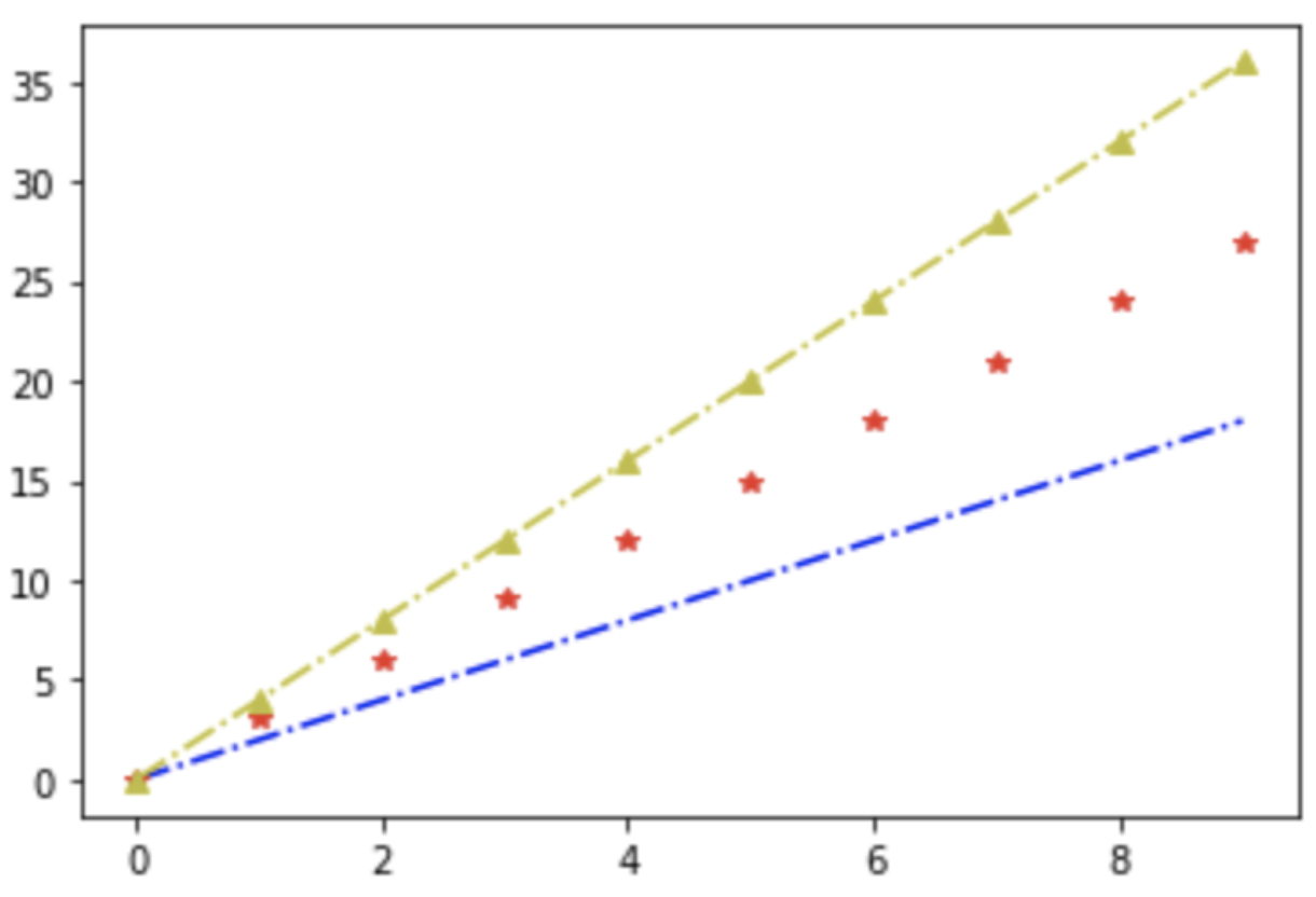
There are many types of marker characters, which are not listed here. Here are some curve examples:
import matplotlib.pyplot as plt
import numpy as np

x = np.arange(10)
plt.plot(x,x*2,'b-.',x,x*3,'r*',x,x*4,'y-.^')  # 1: Blue Solid dot mark, 2: Red ` * 'mark, 3: yellow dotted triangle mark
plt.show()
- **kwargs: more curve parameters (x,y,format_string)
4.1.1 Chinese display
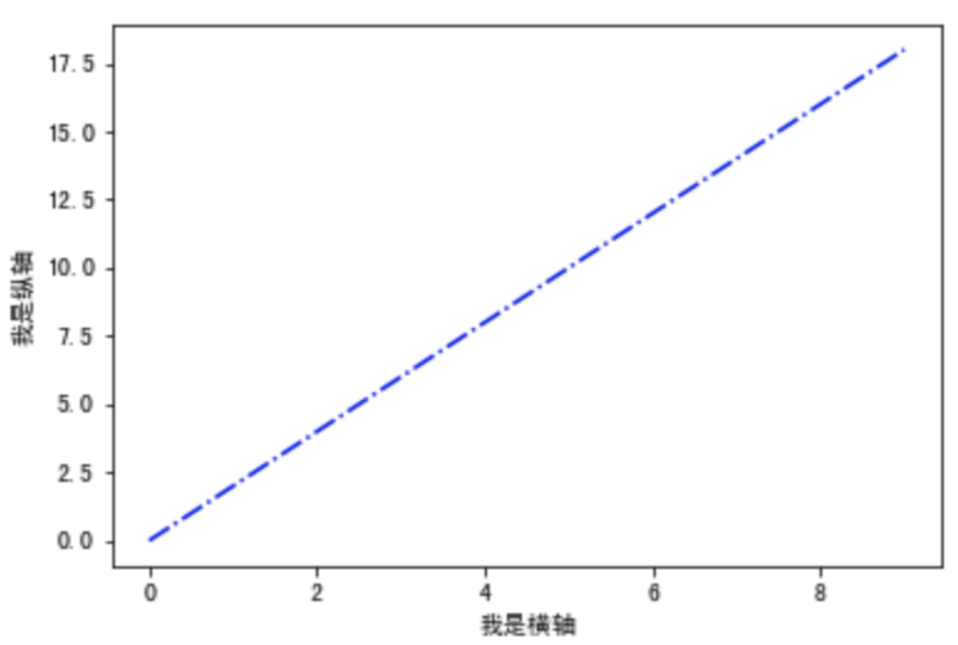
The pyplot label does not support Chinese fonts. You can modify the fonts by adding the fontproperties property to the label. fontsize sets the font size. First, you need to ensure that there is a corresponding font. If you are not prompted, you need to download and install it. For details, please refer to This article.
jupyter needs to restart the service display
The Chinese display example is as follows:
import matplotlib.pyplot as plt
import numpy as np

x = np.arange(10)
plt.xlabel('I am a horizontal axis.',fontproperties='Simhei',fontsize=10)
plt.ylabel('I am a vertical axis.',fontproperties='Simhei',fontsize=10)
plt.plot(x,x*2,'b-.')
plt.show()
The way to display Chinese labels is to modify the parameters of rcParams, but this way is a global modification, unifying all fonts and choosing according to their own needs. It is also easy to implement. Add the following code at the beginning of the program:
plt.rcParams['font.sans-serif'] = ['SimHei']
4.1.2 text display
In addition to drawing, we also need to make some explanatory text information for the image, generally including the following text display functions:
| function | Explain |
|---|---|
| plt.xlabel() | x axis text |
| plt.ylabel() | y axis text |
| plt.title() | Image title text |
| plt.text() | Add text anywhere |
| plt.annotate() | Add notes with arrows |
Here is a more detailed example:
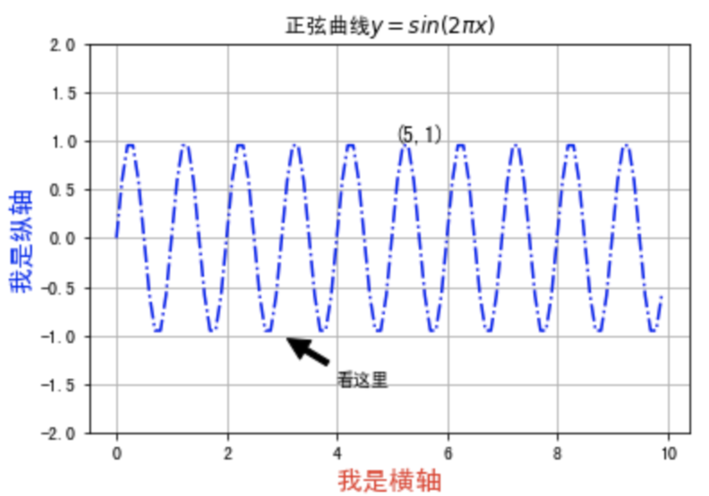
import numpy as np
import matplotlib.pyplot as plt

x = np.arange(0,10,0.1)
plt.xlabel('I am a horizontal axis.',fontsize=15,color='r')
plt.ylabel('I am a vertical axis.',fontsize=15,color='b')
plt.title('Sinusoidal curve $y=sin(2\pi x)$',fontsize=12)
plt.text(5,1,'(5,1)',fontsize=12)  # Add text information at (5,1)
plt.annotate('Look here',xy=(3,-1),xytext=(4,-1.5),
             arrowprops={'facecolor':'k','shrink':0.1,'width':1.5})  # Set indicator arrow
plt.ylim(-2,2)  # Set the upper and lower limit of y-axis

plt.plot(x,np.sin(2*np.pi*x),'b-.')
plt.grid(True)  # show grid
plt.show()
5. Drawing of common charts
The previous article has explained the general curve drawing, this chapter describes several other commonly used chart drawing methods, each chart will give a simple drawing example (for quick query drawing), and then explain the function parameter information in detail and give a richer drawing method and effect.
5.1 histogram
Applicable value comparison
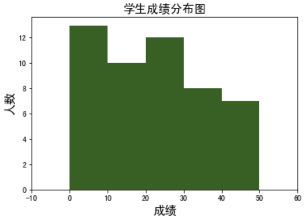
5.1.1 simple example
-
Effect
-
Code
import matplotlib.pyplot as plt
import numpy as np

x = np.random.randint(0,50,50)
bins = np.arange(0,51,10)  # Set histogram distribution interval [0-50], 10 as spacing

plt.hist(x,bins,color="darkgreen")
plt.title('Student achievement distribution chart',fontproperties='SimHei', fontsize=15)
plt.xlabel('achievement',fontproperties='SimHei', fontsize=15)
plt.ylabel('Number',fontproperties='SimHei', fontsize=15)
plt.xlim(-10,60)  # Set the range of x-axis, and make some space

plt.show()
5.1.2 function definition
The histogram drawing function in Matplotlib is plt.hist(), which is defined as follows:
def hist(x, bins=None, range=None, density=False, weights=None, cumulative=False, bottom=None, histtype='bar', align='mid', orientation='vertical', rwidth=None, log=False, color=None, label=None, stacked=False, *, data=None, **kwargs)[source]
| Parameter (bold is common parameter) | Meaning |
|---|---|
| x | Input data, accept array or list |
| bins | Interval distribution setting (set a total interval and interval length) |
| range | The upper and lower limits of bins, if not set, default to x.min(),x.max() |
| density | Display statistical frequency, default is False, if True, display frequency of y-axis |
| histtype | Histogram type, bar (default), barred, step (ladder), stepfilled |
| align | Control the horizontal distribution of histogram, left, mid (default), right |
Other parameters are basically unavailable, which can be consulted when necessary Official documents
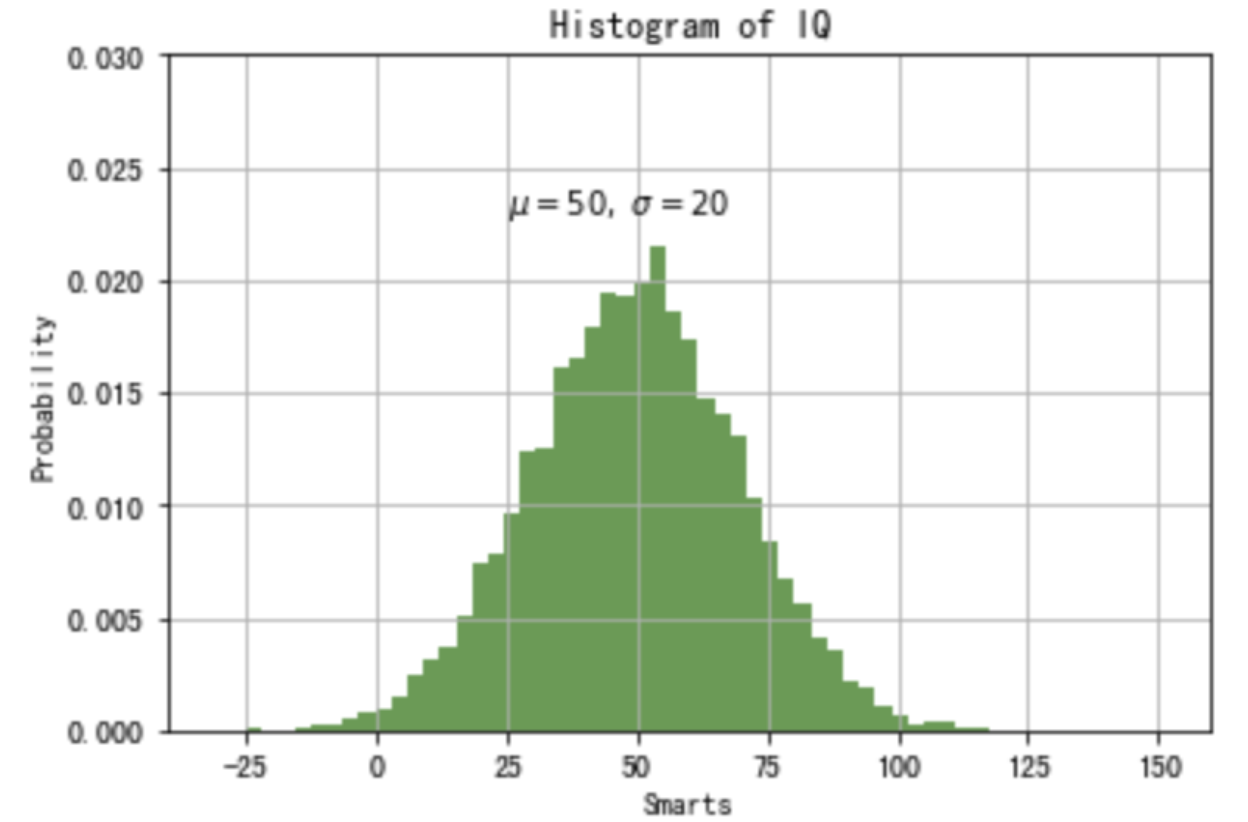
5.1.3 histogram of normal distribution
-
Effect
-
Code
import numpy as np
import matplotlib.pyplot as plt

# Fixing random state for reproducibility
np.random.seed(20200306)

mu, sigma = 50, 20  # Mean and variance
x = mu + sigma * np.random.randn(10000)

# the histogram of the data
plt.hist(x, 50, density=True, facecolor='g', alpha=0.75)

plt.xlabel('Smarts')
plt.ylabel('Probability')
plt.title('Histogram of IQ')
plt.text(25, .023, r'$\mu=50,\ \sigma=20$')
plt.xlim(-40, 160)
plt.ylim(0, 0.03)
plt.grid(True)
plt.show()
5.2 pie chart
Applicable proportion differentiation
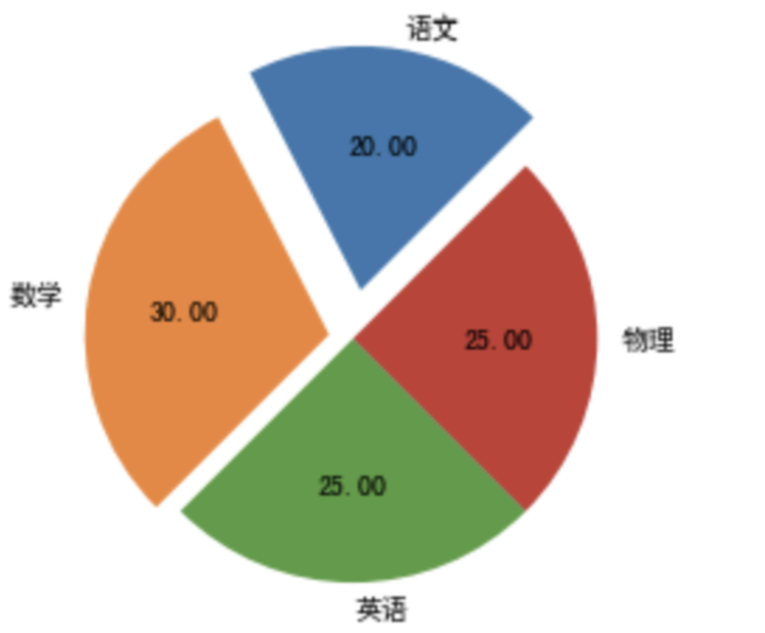
5.2.1 simple example
-
Effect
-
Code
import matplotlib.pyplot as plt

plt.rcParams['font.sans-serif'] = ['SimHei']
labels = ('Chinese','Mathematics','English?','Physics')
x = [20,30,25,25]  # 100% distribution
explode = (0.2,0.1,0,0)  # Distance from center

plt.pie(x,explode=explode,labels=labels,autopct='%.2f',
shadow = False, startangle=45)
plt.show()
5.2.2 function definition
The function to draw pie chart in Matplotlib is plt.pie(). The complete function definition and parameters are as follows:
def pie(x, explode=None, labels=None, colors=None, autopct=None,
pctdistance=0.6, shadow=False, labeldistance=1.1, startangle=None,
radius=None, counterclock=True, wedgeprops=None, textprops=None,
center=(0, 0), frame=False, rotatelabels=False, hold=None, data=None)
| Parameter (bold is common parameter) | Meaning |
|---|---|
| x | (each block), if sum(x) > 1, sum(x) normalization will be used |
| explode | Distance from center |
| labels | (each piece) explanatory text displayed on the outside of the pie chart |
| colors | Custom color, list, such as ['red', 'yellow'] |
| autopct | Control the percentage setting in pie chart. You can use format string or format function |
| pctdistance | Similar to labeldistance, specify the position scale of autopct, with the default value of 0.6 |
| shadow | Draw a shadow under the pie. Default: False, i.e. no shadow |
| labeldistance | The drawing position of the label mark, relative to the scale of the radius, is 1.1 by default. If < 1, it will be drawn on the inside of the pie chart |
| startangle | The starting drawing angle, the default drawing is from the positive direction of x-axis and counterclockwise, if set = 90, then from the positive direction of y-axis |
| radius | Control pie radius, default is 1 |
| counterclock | Specifies the pointer direction; Boolean value, optional parameter, default: True, i.e. counter clockwise. Change the value to False to clockwise |
| wedgeprops | Dictionary type, optional parameter, default value: None. The parameter dictionary is passed to the wedge object to draw a pie chart. For example: widget props = {'linewidth': 3} set widget linewidth to 3 |
| textprops | Format labels and scale text; dictionary type, optional parameter, default value: None. Dictionary parameter passed to the text object. |
| center | Floating point type list, optional parameter, default value: (0,0). Icon center position |
| frame | Boolean type, optional parameter, default: False. If true, draw the axis frame with the table. |
| rotatelabels | Boolean type, optional parameter, default: False. If True, rotate each label to the specified angle |
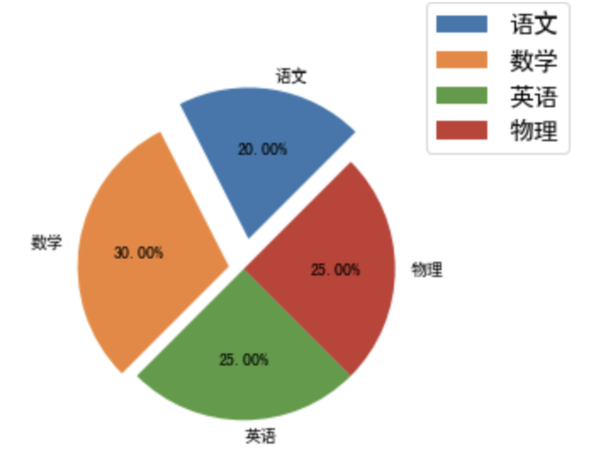
5.2.3 add legend
-
Effect
-
Code
import matplotlib.pyplot as plt

plt.rcParams['font.sans-serif'] = ['SimHei']
labels = ('Chinese','Mathematics','English?','Physics')
x = [20,30,25,25]  # 100% distribution
explode = (0.2,0.1,0,0)  # Distance from center

plt.pie(x,explode=explode,labels=labels,autopct='%.2f%%',  # Added percent sign
shadow = False, startangle=45)

plt.axis('equal')  # straighten
plt.legend(loc="upper right", fontsize = 15, bbox_to_anchor=(1.1,1.2),borderaxespad=0.3)
# LOC: 'upper right' in the upper right corner
# Bbox to anchor: top margin
# Borderexpad: inside margin of legend
plt.show()
Only the common pie drawing methods are given here, for more details, please refer to Knowledge point 11 of matplotlib: drawing pie chart
5.3 scatter diagram
Applicable data point distribution
When we classify a large number of data, we can intuitively feel that there are several types by using scatter diagram.
The scatter chart itself is also a collection of data points, so it can be implemented by using plot function or plt.scatter
5.3.1 simple example
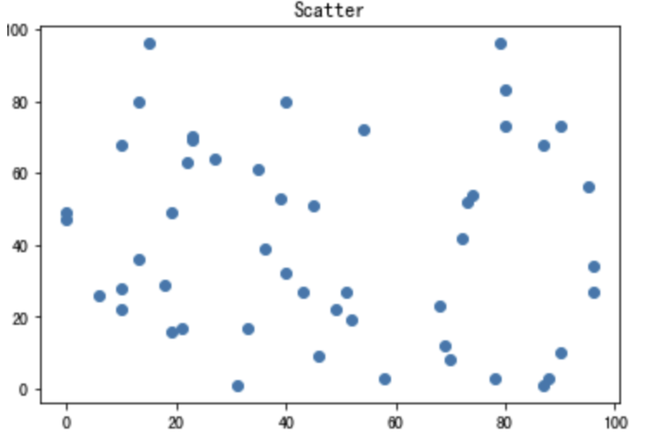
plot implementation
-
Effect
-
Code
import matplotlib.pyplot as plt
import numpy as np

plt.plot(np.random.randint(0,100,50),np.random.randint(0,100,50),'o')
plt.title('Scatter')

plt.show()
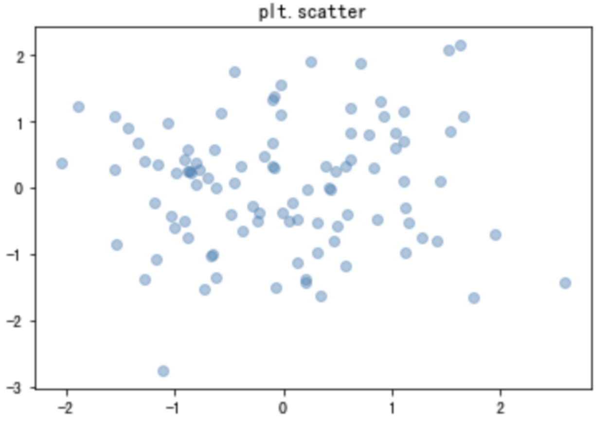
Implementation of plt.scatter
-
Effect
-
Code
import matplotlib.pyplot as plt
import numpy as np

x = np.random.randn(100)
y = np.random.randn(100)

plt.scatter(x,y, alpha=0.4)
plt.title('plt.scatter')

plt.show()
5.3.2 function definition
The plt.scatter() function is defined as follows:
def scatter(x, y, s=None, c=None, marker=None, cmap=None, norm=None, vmin=None, vmax=None,
alpha=None, linewidths=None, verts=None, edgecolors=None, hold=None, data=None, **kwargs)
| parameter | Meaning |
|---|---|
| x | Point abscissa |
| y | Point ordinate (size equal to x) |
| s | Tag size, specify the size of the point |
| c | Mark color (such as' red ',' r ') |
| maker | Marking style, such as' o 'for circle and' x 'for cross |
| alpha | transparency |
5.3.3 multiple point sets
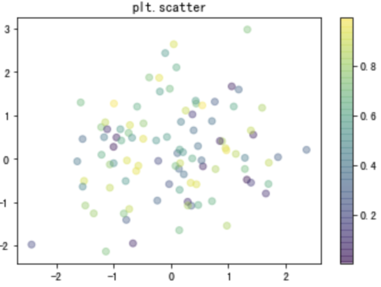
There may be two or more different types of points in the scatter diagram. We need to draw them and compare them. At this time, it is more convenient to use the plt.scatter() function.
-
Effect
-
Code
import matplotlib.pyplot as plt
import numpy as np

x = np.random.randn(100)
y = np.random.randn(100)
colors = np.random.rand(100)

plt.scatter(x,y,c = colors, alpha=0.4)
plt.title('plt.scatter')
plt.colorbar()

plt.show()
-
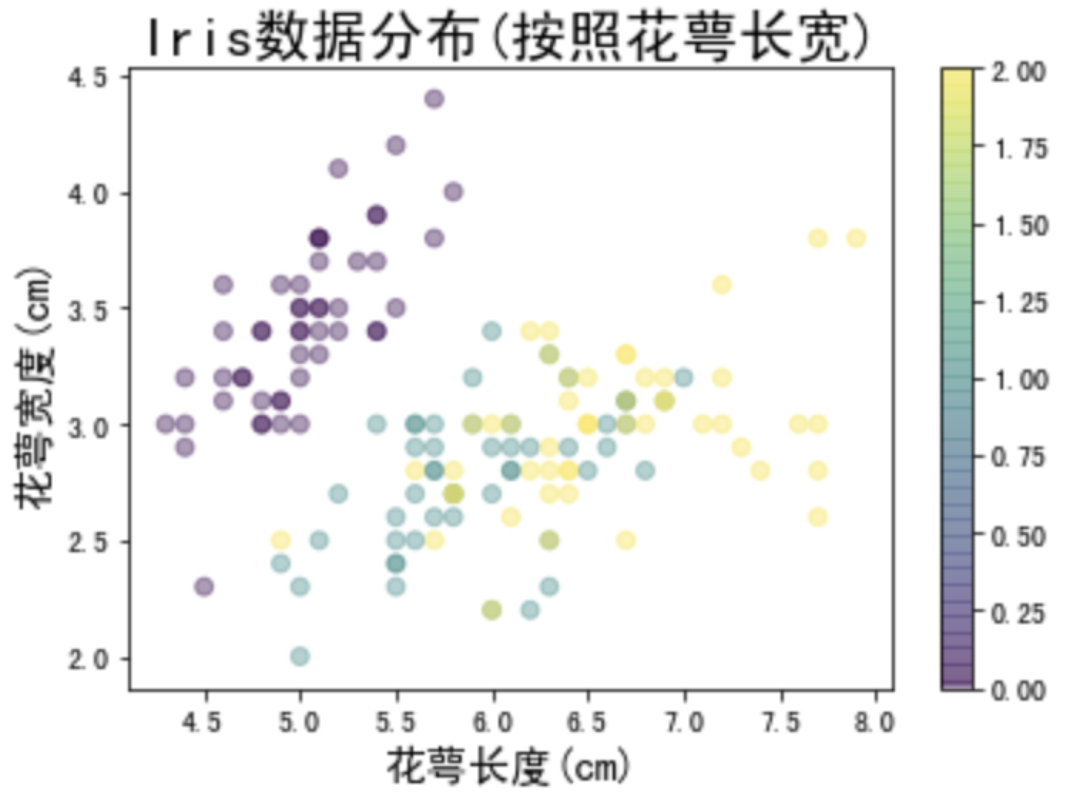
Iris data scatter
Iris is a common data used in machine learning classification problems, including 150 data, three categories, each data contains four attributes. Let's draw these three kinds of data with scatter diagram and see their distribution.-
Effect
-
Code
from sklearn.datasets import load_iris
iris = load_iris()
features = iris.data.T  # Transpose is used to obtain all features plt.scatter(features[0],features[1],alpha=0.4,c=iris.target) separately
plt.xlabel('Calyx length(cm)',fontproperties='SimHei',fontsize=15)
plt.ylabel('Calyx width(cm)',fontproperties='SimHei',fontsize=15)
plt.title('Iris data distribution(According to the length and width of calyx)',fontproperties='SimHei',fontsize=20)
plt.colorbar()
plt.show()
-
6. summary
This paper briefly describes the use of Matplotlib, as well as the drawing of some common graphs. More content will be updated in the later use.

