[Python data visualization] Matplotlib learning notes (1)
Introduction: Matplotlib is a Python 2D drawing library, which generates publishing quality graphics in various hard copy formats and cross platform interactive environments. With Matplotlib, developers can generate graphs, histograms, power spectra, bar graphs, error graphs, scatter graphs, etc. with just a few lines of code.
Programming environment: Python 3.8
pycharm 2017
Source code link: [Python data visualization] Matplotlib learning notes < source code >
Libraries to install: numpy, matplotlib
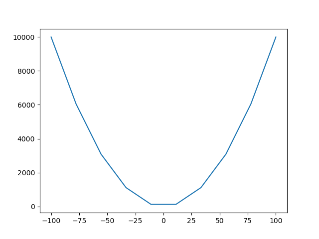
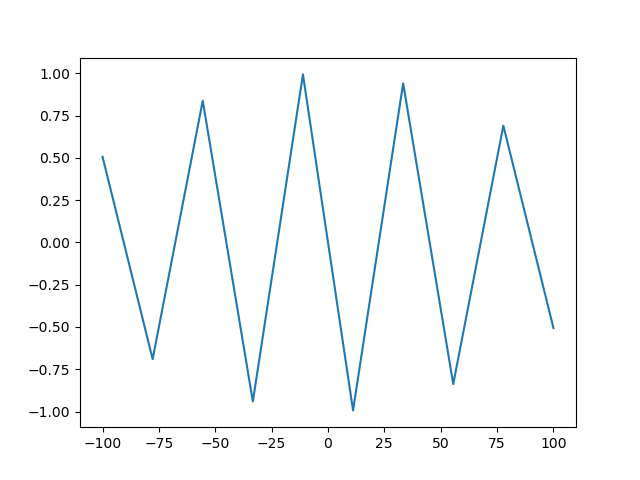
'''1.Broken line diagram'''
import numpy as np
import matplotlib.pyplot as plt

x=np.linspace(-100,100,10)#Equal interval divided into 100 numbers
y=x**2

plt.plot(x,y)
plt.show()

y1=np.sin(x)
plt.plot(x,y1)
plt.show()
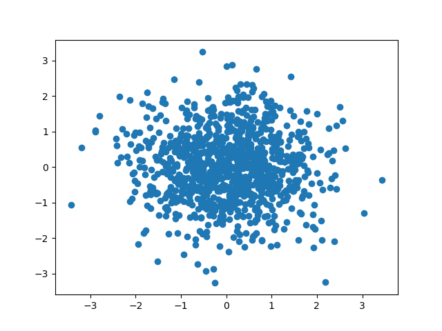
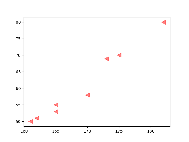
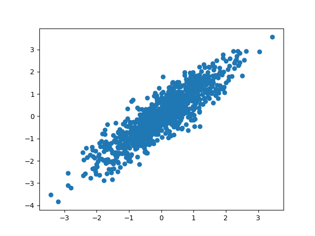
'''2.Scatter plot'''
import numpy as np
import matplotlib.pyplot as plt

height = [161,162,165,170,182,175,173,165]
weight = [50,51,53,58,80,70,69,55]

plt.scatter(height,weight,s=100,c='red',marker='<',alpha=0.5,)
plt.show()

N=1000
x=np.random.randn(N)
y=np.random.randn(N)

plt.scatter(x,y)
plt.show()

y1=x+np.random.randn(N)*0.5
plt.scatter(x,y1)
plt.show()
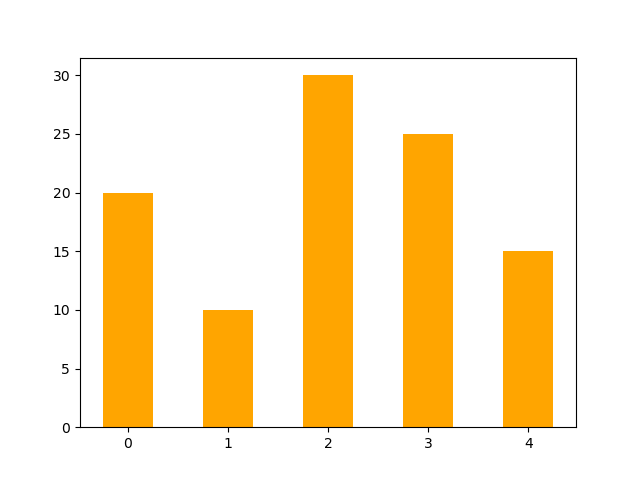
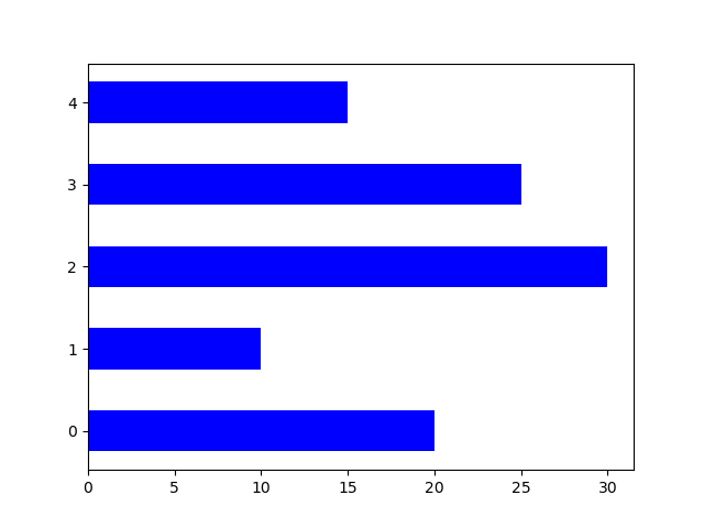
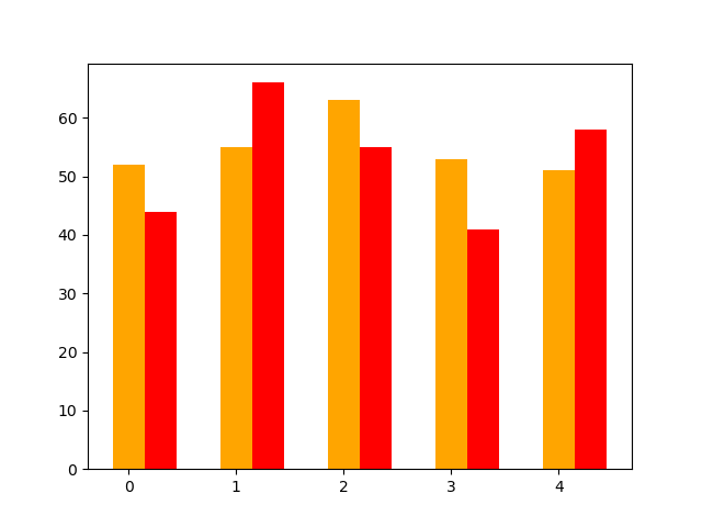
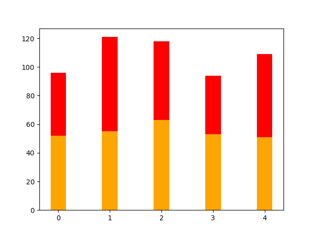
'''3.Bar chart'''
import numpy as np
import matplotlib.pyplot as plt

N=5
y=[20,10,30,25,15]
index=np.arange(N)

pl=plt.bar(x=index,height=y,width=0.5,color='orange')
plt.show()

pl=plt.bar(x=0,bottom=index,height=0.5,width=y,color='blue',orientation='horizontal')#Horizontal Bar Graph
plt.show()

salesBJ=[52,55,63,53,51]
salesSH=[44,66,55,41,58]
bar_width=0.3

plt.bar(index,salesBJ,bar_width,color='orange')
plt.bar(index+bar_width,salesSH,bar_width,color='red')
plt.show()
#Stacked graph
plt.bar(index,salesBJ,bar_width,color='orange')
plt.bar(index,salesSH,bar_width,color='red',bottom=salesBJ)
plt.show()
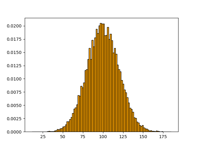
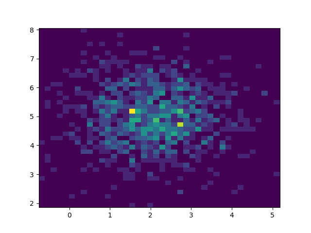
'''4.histogram'''
import numpy as np
import matplotlib.pyplot as plt

'''Difference from bar, continuous distribution of a variable'''
mu=100#mean value
sigma=20 # standard deviation
x=mu+sigma*np.random.randn(20000) #Generate 2000 data

'''normed Standardization   edgecolor Border color'''
plt.hist(x,bins=100,color='orange',edgecolor='k',normed=True)
plt.show()

'''Bivariate histogram'''
x1=np.random.randn(1000)+2
y1=np.random.randn(1000)+5

plt.hist2d(x1,y1,bins=40)#Color depth indicates frequency
plt.show()
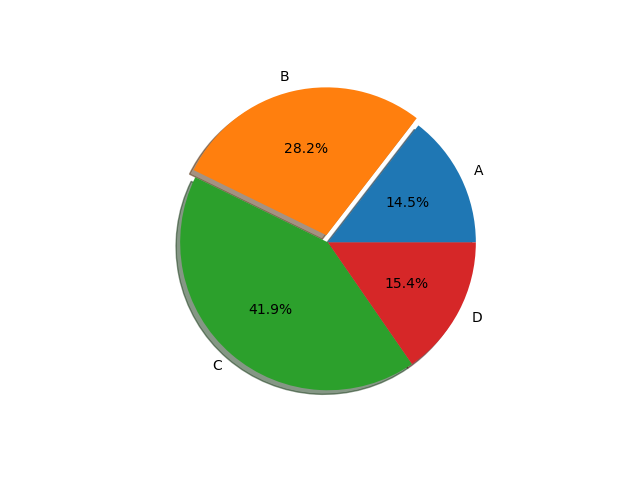
'''5.Pie chart'''
import numpy as np
import matplotlib.pyplot as plt

'''Proportion of each data to the total'''
labels='A','B','C','D'
fracs=[17,33,49,18]

explode=[0,0.05,0,0]
plt.pie(x=fracs,labels=labels,autopct='%1.1f%%',explode=explode,shadow=True)
plt.show()
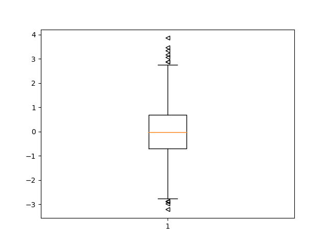
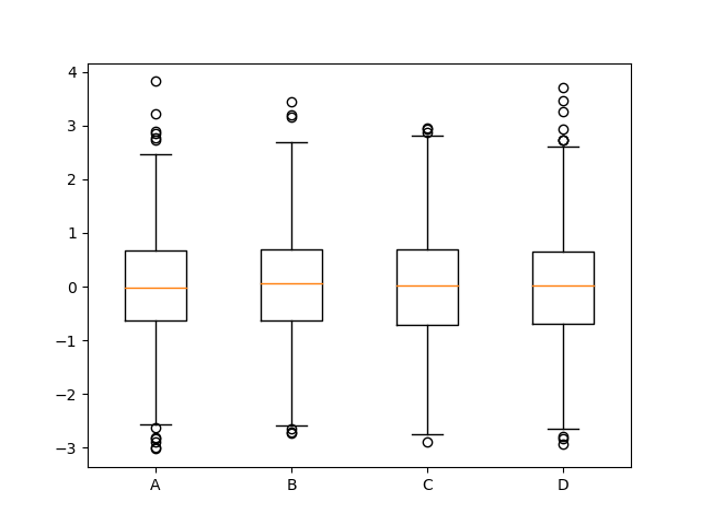
'''6.Box diagram'''
import numpy as np
import matplotlib.pyplot as plt

'''Box diagram, box diagram, box line diagram
   //A statistical chart showing the dispersion of a set of data
   //Parameters: upper edge, upper quartile, median, lower quartile, lower edge, outlier ''

np.random.seed(100)

data=np.random.normal(size=1000,loc=0,scale=1)
plt.boxplot(data,sym='<',whis=1.5)
plt.show()

data1=np.random.normal(size=(1000,4),loc=0,scale=1)
labels=['A','B','C','D']
plt.boxplot(data1,labels=labels)
plt.show()
'''7.Color and style'''
import numpy as np
import matplotlib.pyplot as plt
'''1.colour'''
'''Eight built-in default color abbreviations
blue:'b'
green:'g'
red:'r'
cyan:'c'
magenta:'m'
yellow:'y'
black:'k'
white:'w'
//Other color representations
//Gray shadow
HTML Hexadecimal
RGB tuple
'''
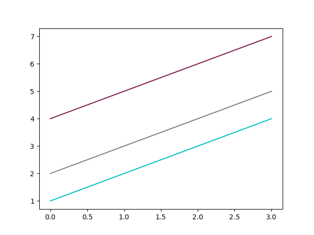
y=np.arange(1,5)
plt.plot(y,color='c')
plt.plot(y+1,color='0.5')
#plt.plot(y+2,color='#FFOOFF')
plt.plot(y+3,color=(0.5,0.1,0.3))
plt.show()
'''2.Style of point and line'''
'''23 Seed point shape. Note: different point shapes use different colors by default
'.'
','
'o'
'v'
'^'
'<'
'>'
'1'
'2'
'3'
'4'
'8'
's'
'p'
'*'
'h'
'H'
'+'
'x'
'D'
'd'
'|'
'_'
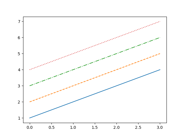
//Four kinds of Linetype
- Solid line
-- Dotted line
-. Dot marking
: Point line
'''
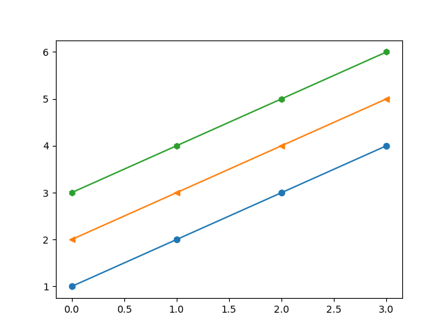
plt.plot(y,marker='o',)
plt.plot(y+1,marker='<')
plt.plot(y+2,marker='h')
plt.show()
plt.plot(y,'-',)
plt.plot(y+1,'--')
plt.plot(y+2,'-.')
plt.plot(y+3,':')
plt.show()
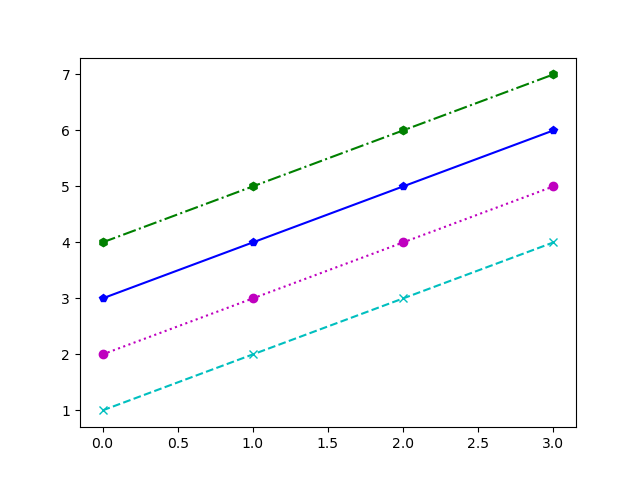
'''3.Style string
//Color, dot type and linetype can be written as a string, such as:
cx--
mo:
kp-
'''
plt.plot(y,'cx--',)
plt.plot(y+1,'mo:')
plt.plot(y+2,'bp-')
plt.plot(y+3,'gh-.')
plt.show()