Abstract
Over the past two years, OF has been paying attention to house prices. Putting aside some external factors such as policies and real estate speculation, what are the main factors affecting house prices for the house itself? OF selected several factors for analysis: house age, area, number OF floors (1 / 1.5 / 2 / 2.5 /...), number OF bedrooms and number OF toilets.
Firstly, OF downloaded a real estate data about a foreign city from Kaggle and processed the data. Next, we will focus on data visualization and analysis. The main purposes OF today's analysis are:
1. What are the main internal factors affecting house prices?
2. Establish a model to predict house prices.
Single factor distribution: histogram
This is not a big data and there are not many columns. Therefore, in the first step, you can draw a histogram to check the data distribution of each factor.
import pandas as pd
import seaborn as sns
df1 = pd.read_csv(r"./data/house_data.csv")
#histogram
df1.hist(bins=20,figsize=(13,13),xrot=-15)
Characteristics: linear regression
These factors affecting house prices are also called "characteristics". How do these characteristics affect house prices? Just like x and y, let's take a look at the relationship between various characteristics and house prices:
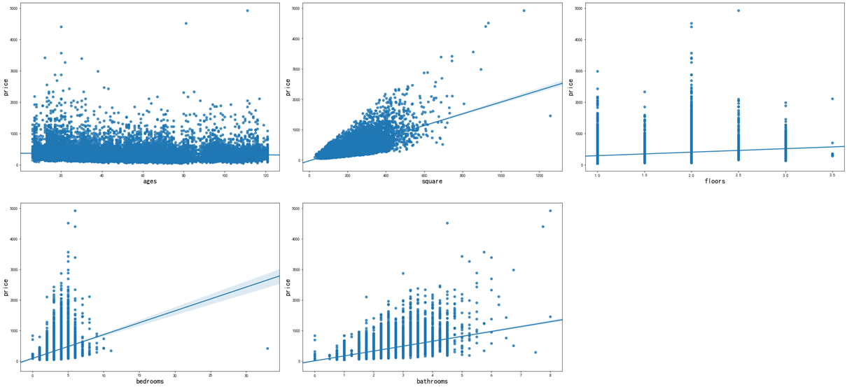
From these charts, the relationship between house age and house price is not obvious, the relationship between house area and house price is the most obvious, followed by the relationship between the number of toilets and house price.
import pandas as pd
import seaborn as sns
import matplotlib.pyplot as plt
house = pd.read_csv(r"./data/house_data.csv")
house = house.astype(float)
col1 = house.columns
# Generate chart
for col in col1:
    f, ax = plt.subplots(1, 1, figsize=(12, 8), sharex=True)
    sns.regplot(x=col, y='price', data=house, ax=ax)
    x = ax.get_xlabel()
    y = ax.get_ylabel()
    ax.set_xlabel(x, fontsize=18)
    ax.set_ylabel(y, fontsize=18)
Features: box diagram
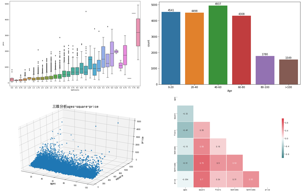
In order to determine the number OF bedrooms, the number OF toilets, the number OF floors and the price, OF prefers the box diagram because there are numbers, but they are not continuous, such as 1,2,... Bedrooms, 2.5, 3,... Floors (maybe 0.5 represents the attic).
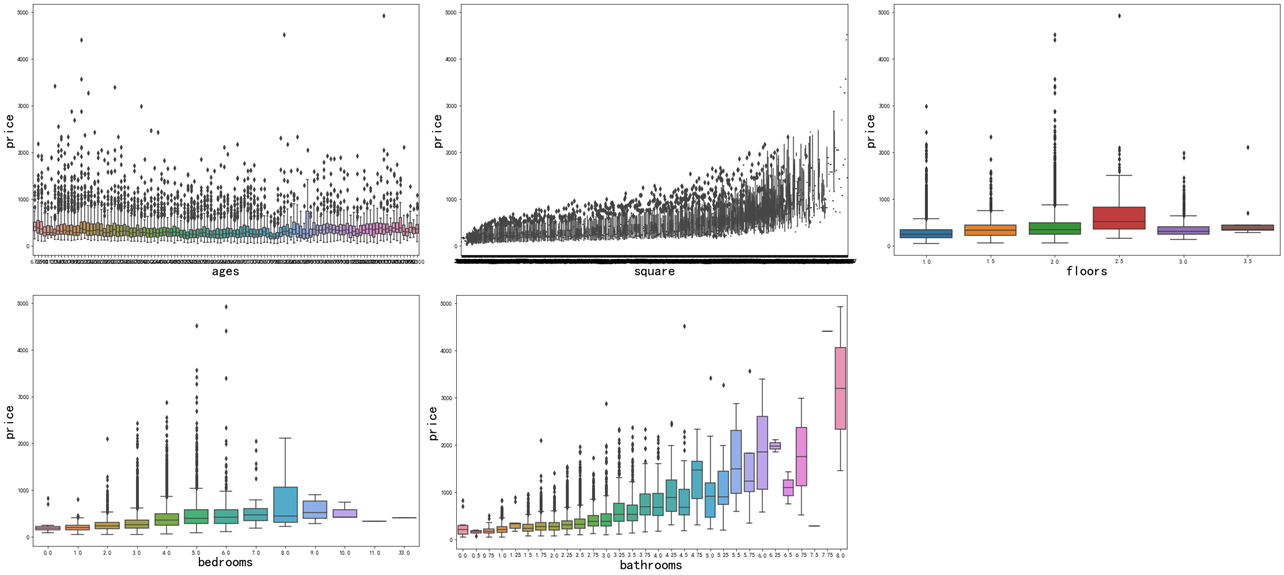
By removing the outliers of some black spots from the box chart, we can find that the curve rise is more obvious in the area of houses, the number of toilets, and the number of bedrooms. There is also a slight curve rise, so we can think that on the whole, the house price is related to these three characteristics.
import pandas as pd
import seaborn as sns
import matplotlib.pyplot as plt
house = pd.read_csv(r"./data/house_data.csv")
house = house.astype(float)
col1 = house.columns
# Generate chart
for col in col1:
    f, ax = plt.subplots(1, 1, figsize=(12, 8), sharex=True)
    sns.boxplot(x=house[col],y='price', data=house, ax=ax)
    x = ax.get_xlabel()
    y = ax.get_ylabel()
    ax.set_xlabel(x, fontsize=24)
    ax.set_ylabel(y, fontsize=24)
Characteristics: variable correlation
It is not always a good thing to have too many features in the model, because when we want to predict the values OF new data sets, it may lead to over fitting and worse results. If you want to see the relationship between variables at a glance, OF has to introduce Pearson correlation matrix to you and present it with heat map.
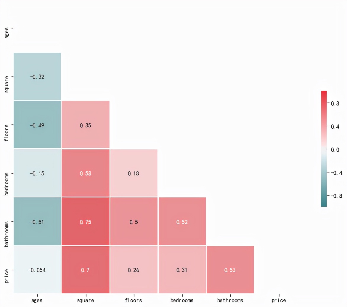
What do you think of this picture? Very simple, in the color bar on the right, the upward red deepening represents a positive correlation; The downward blue-green deepening represents a negative correlation (the greater the absolute value, the greater the correlation). Because we mainly analyze the relationship between variables and house prices, we compare the data in the bottom line.
square house area 0.7 > bathrooms quantity 0.53 > bedrooms 0.31 > floos 0.26
import numpy as np
import pandas as pd
import seaborn as sns
import matplotlib.pyplot as plt
house = pd.read_csv(r"./data/house_data.csv")
house = house.astype(float)
#Calculate the correlation of each variable
corr = house.corr()
#Generate mask for upper triangle
mask = np.triu(np.ones_like(corr, dtype=bool))
#Create matplotlib diagram
f, ax = plt.subplots(figsize=(11, 9))
#Generate custom color charts
cmap = sns.diverging_palette(200, 10, center='light',as_cmap=True)
#Heat map with mask and correct aspect ratio
sns.heatmap(corr, mask=mask, cmap=cmap, vmax=1,vmin=-1, center=0,square=True, linewidths=.5, cbar_kws={"shrink": .4}, annot=True)
Multifactor: 3D graph
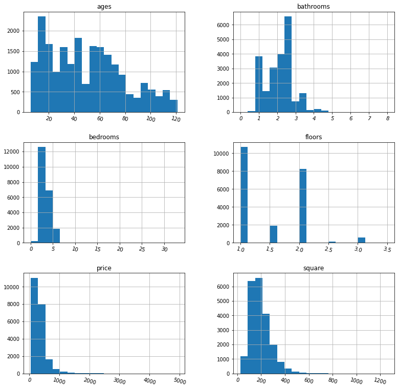
The above plots the comparison between house prices and other factors. It seems that there is no perfect linear relationship between prices and these factors. What is the relationship between the three variables? To illustrate this, I prefer 3D graphics.
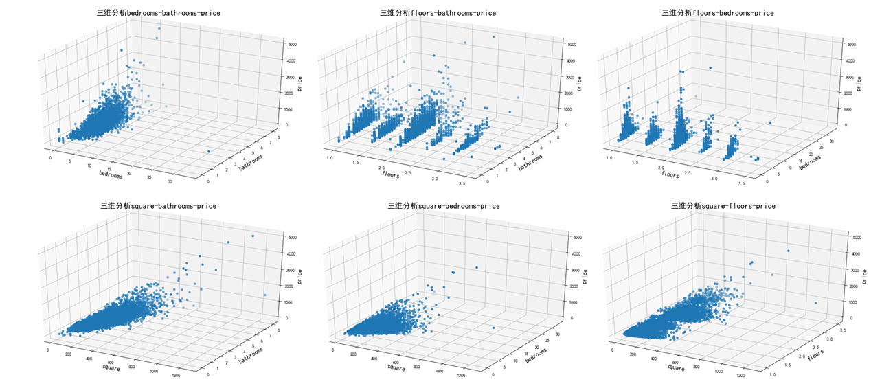
The above figure shows that when the house area increases, the bedroom or bathroom increases, and the house price also increases. However, the number of floors, bedrooms and bathrooms have no similar relationship with the house area.
import numpy as np
import pandas as pd
import seaborn as sns
import matplotlib.pyplot as plt
import itertools
from mpl_toolkits.mplot3d import Axes3D
plt.rcParams['font.sans-serif']=['SimHei'] #Show Chinese labels
plt.rcParams['axes.unicode_minus']=False   #These two lines need to be set manually
house = pd.read_csv(r"./data/house_data.csv")
house = house.astype(float)
hs2 = house.drop(['price'],axis=1)
col1 = house.columns
col2 = hs2.columns
combine = pd.DataFrame(itertools.combinations(col2, 2))
for i in range(len(combine)):
    fig = plt.figure(figsize=(10,6))
    ax = Axes3D(fig)
    x=house[combine[0][i]]
    y=house[combine[1][i]]
    z=house['price']
    ax.scatter(x,y,z)
    plt.title("Three dimensional analysis"+combine[0][i]+"-"+combine[1][i]+"-"+"price",fontsize=18)
    ax.set_xlabel(combine[0][i],fontsize=14)
    ax.set_ylabel(combine[1][i],fontsize=14)
    ax.set_zlabel('price',fontsize=14)
    plt.tick_params(labelsize=10)
    plt.show()
Conclusion
Through the analysis of linear regression, box chart, Pearson correlation matrix and 3D chart, it can be analyzed that there is a large relationship between house price and house area and the number of toilets. The next issue will involve some knowledge of machine learning to predict house prices. Please look forward to it!