1, Classified scatter diagram
1.stripplot
Function: seaborn.stripplot
Common parameters:
| x,y,hue | Receive the variable name in data to represent the selected drawing variable, hue pass in the classification variable to classify the color. |
| data | Receive DataFrame, array, list and series to represent the data set used for drawing. |
| order,order_hue | Receive a list of strings to specify the drawing classification level. |
| jitter | Receive float, True or 1, and add uniform random noise to optimize the graphic display. The default is True |
| dodge | bool, indicating whether to separate along the classification axis when using classification nesting. The default is False |
| orient | Receive v or h, indicating the direction of the graph. |
tips=sns.load_dataset('tips')
fig,ax=plt.subplots(1,2,figsize=(8,4))
#Add random noise
sns.stripplot(x='day',y='total_bill',data=tips,ax=ax[0])
#No random noise is added
sns.stripplot(x='day',y='total_bill',data=tips,jitter=False,ax=ax[1])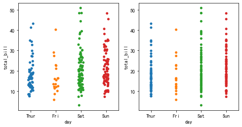
Use the multi classification function:
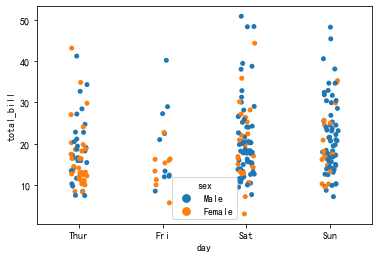
sns.stripplot(x='day',y='total_bill',hue='sex',data=tips)
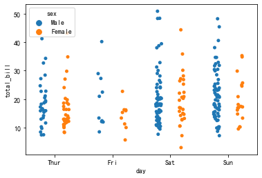
Modify the dodge parameter so that the variables are overlaid along the classification axis instead of overlapping:
sns.stripplot(x='day',y='total_bill',hue='sex',dodge=True,data=tips)
2.violinplot
Violin diagram is a combination of box diagram and kernel density estimation diagram. Compared with the box graph, it can not only display the statistical characteristics displayed on the graph, but also display the distribution of data.
Function: seaborn.violinplot
Common parameters:
| bw | Receive "scott", "silverman" and float, indicating the selected drawing variables. The default is "scott"“ |
| cut | Receive float, control the density of the violin chart shell extending beyond the internal extreme data points, and set it to 0 to limit the violin chart range to the range of observation data. The default is 2 |
| scale | Receive "area" "count""width", which is used to adjust the broadband of the graph. The default is "area"“ |
| scale_hue | bool, when the classification is nested, determines whether the scaling is at each level of the main grouping variable or at all levels on the graph. The default is True. |
| gridsize | int, indicating the number of points in the discrete mesh used for kernel density calculation. The default is 100 |
| inner | Receive "box", "quartile", "point","stick",None, indicating the form of data points in the graph. The default is "box" |
| split | bool, indicating whether to draw a violin for each level when two types are nested. The default is False. |
sns.set_style('whitegrid')
sns.violinplot(x="day",y="total_bill",data=tips)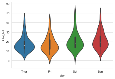
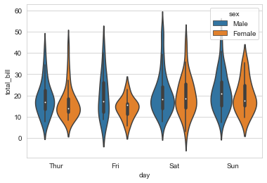
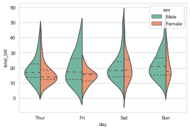
sns.violinplot(x="day",y="total_bill",hue="sex",data=tips)
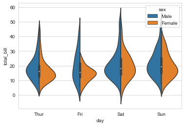
Pass in the split parameter to split the violin diagram:
sns.violinplot(x="day",y="total_bill",hue="sex",data=tips,split=True)
Adjust the width of violin chart and change the drawing method of quartile:
sns.violinplot(x="day",y="total_bill",hue="sex",data=tips,split=True,inner='quartile',scale='count',palette='Set2')
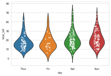
Combine the classified scatter diagram with the violin diagram:
sns.violinplot(x="day",y="total_bill",data=tips,inner=None)
sns.stripplot(x="day",y="total_bill",data=tips,color="w",alpha=0.5)
3.boxenplot
The enhanced boxplot provides more information about the distribution shape by drawing more quantiles Information about. It avoids the disadvantage that there is little information outside the quartile in the box diagram and a large number of extreme values will be displayed when the amount of data is large.
Function: seaborn.boxenplot
Special parameters:
| k_depth | "Proportion", "Tukey" and "trustworthy" indicate the expanded proportion of different boxes. |
| scale | "linear""exponential""area" indicates the method of displaying the box width. |
fig,ax=plt.subplots(1,2,figsize=(8,4))
sns.boxplot(x=tips["total_bill"],ax=ax[0])
sns.boxenplot(x=tips["total_bill"],ax=ax[1])
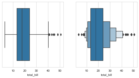
The enhanced box plot shows a wider quantile information and shows the corresponding distribution through the width, so as to accept more outlier information and reduce information loss.
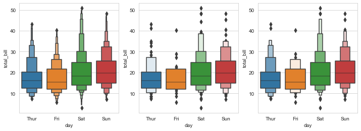
fig,axes=plt.subplots(1,3,figsize=(12,4))
sns.boxenplot(x="day",y="total_bill",data=tips,k_depth="proportion",ax=axes[0])
sns.boxenplot(x="day",y="total_bill",data=tips,k_depth="tukey",ax=axes[1])
sns.boxenplot(x="day",y="total_bill",data=tips,k_depth="trustworthy",ax=axes[2])
4.pointplot
The point graph plots the point estimates and confidence intervals. The point graph is used to gather the comparison between different levels of one or more classification variables. Using the degree of line inclination, it can well show the changes of the relationship between different levels of one classification variable in different levels of other classification variables.
Function: seaborn.pointplot
sns.set_style('darkgrid')
fig,axes=plt.subplots(1,2,figsize=(8,4))
sns.pointplot(x="time",y="total_bill",data=tips,ax=axes[0])
#Errwidth, cap size, receive float, indicating the thickness and width of the error bar cap.
sns.pointplot(x="time",y="total_bill",data=tips,errwidth=4,capsize=0.2,ax=axes[1])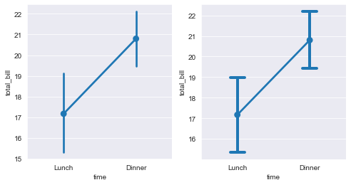
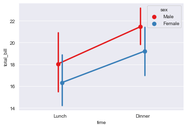
Draw nested group point diagram:
sns.pointplot(x="time",y="total_bill",hue="sex",data=tips,dodge=True,palette="Set1")
Set the join parameter to cancel the segment connecting two points:
sns.set_style('darkgrid')
fig,axes=plt.subplots(1,2,figsize=(8,4))
sns.pointplot(x="day",y="total_bill",data=tips,ax=axes[0])
#Errwidth, cap size, receive float, indicating the thickness and width of the error bar cap.
sns.pointplot(x="day",y="total_bill",data=tips,join=False,ax=axes[1]) 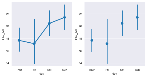
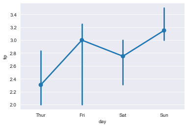
Change the centralized trend estimation method from average to median:
import numpy as np
sns.pointplot(x="day",y="tip",data=tips,estimator=np.median)
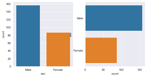
5.countplot
The count chart is used to display the number of observations per category. It can be considered as a histogram applied to categorical variables and comparing count differences between categories.
Function: seaborn.countlot
fig,axes=plt.subplots(1,2,figsize=(8,4))
sns.countplot(x="sex",data=tips,ax=axes[0])
sns.countplot(y="sex",data=tips,ax=axes[1])
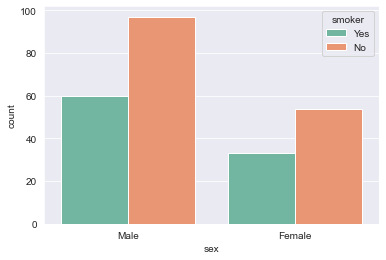
Multi category nested count chart:
sns.countplot(x="sex",hue="smoker",data=tips,palette="Set2")
6.catplot
Similar to relplot in the relational graph, it can access all functions in the classification graph uniformly.
Function: seaborn.catplot
Common parameters:
| x,y | |
| data | |
| row_wrap | int indicates the number of columns in the grid graph. The default value is None. |
| legend_out | bool, whether to draw the legend on the right side of the center. The default is True. |
| share{x,y} | bool, indicating whether to share the x or y axis across rows or columns. The default is True. |
| margin_titles | bool, indicating whether to draw the title of the row variable to the right of the last column. The default is False. |
| kind | Receive "strip" "swarm" "box" "Violin" "box" "point" "bar" "count", select the corresponding drawing function, and the default is "strip" |
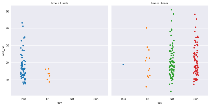
sns.catplot(x="day",y="total_bill",col="time",data=tips,jitter=True)
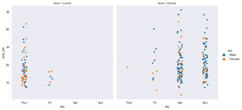
Add another variable:
sns.catplot(x="day",y="total_bill",hue="sex",col="time",data=tips,jitter=True)
Draw a violin diagram without sharing the y axis:
sns.set_style("whitegrid")
sns.catplot(x="day",y="total_bill",hue="sex",col="time",data=tips,kind="violin",split="True",sharey=False) 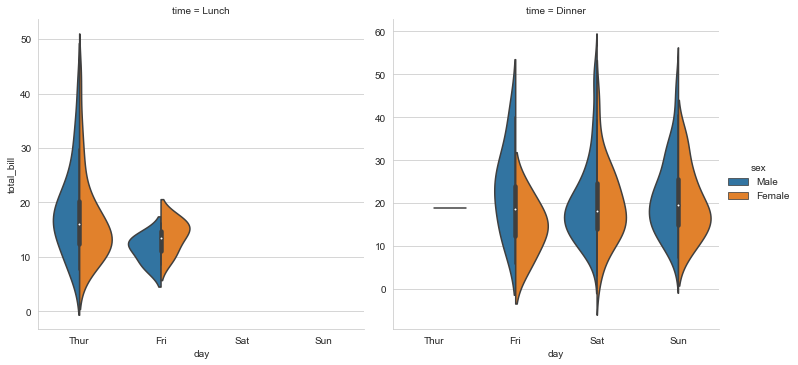
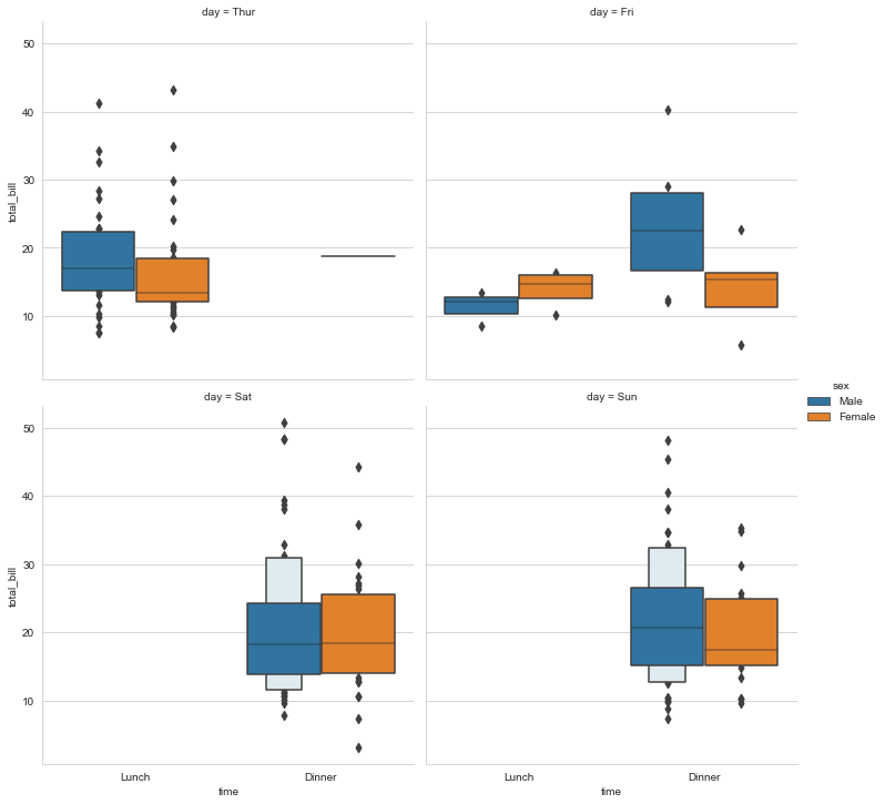
Draw the enhanced box diagram, change the grid width, and set that only two diagrams are displayed in each column.
sns.catplot(x="time",y="total_bill",hue="sex",col="day",data=tips,kind="boxen",col_wrap=2,margin_titles=True)
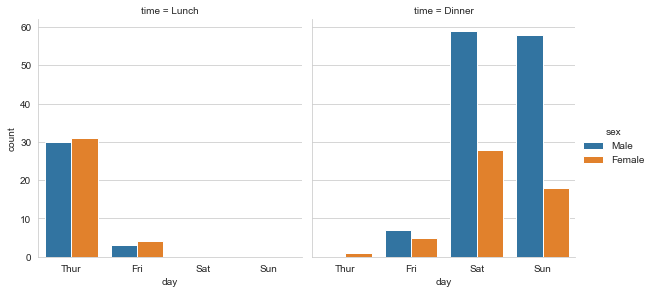
Draw the count chart and adjust the image size.
sns.catplot(x="day",hue="sex",col="time",data=tips,kind="count",height=4,aspect=1)