brief introduction
When editing CSDN, the picture is easy to be missing. You can pay attention to "lazy programming" to get a better reading experience.
Next, we use Matplotlib to visualize data. First, we continue to use Matplotlib to draw images. The official account can reply to data2 to get the code and data of this article.
Box plot
Boxplot is also known as box whisk plot. It uses five statistics in the data: minimum, first quartile, median, third quartile and maximum to describe the data, as shown in the following figure:
[failed to transfer the pictures in the external link. The source station may have anti-theft chain mechanism. It is recommended to save the pictures and upload them directly (img-vema9zoi-1582165641699)(https://raw.githubusercontent.com/ayuLiao/images/master/20190826100715.png))
1. Minimum and maximum are the minimum and maximum values in the data
2. Median: sort the data and find the number of intermediate positions, which is called median. If there are two numbers in the intermediate position, add them and divide them by 2. If there are numbers 1, 2, 4, 5, 7, 7, 8, 9, then the median is: (5 + 7) / 2 = 6
3.lower quartile, also known as the first quartile: it is the median of data on the left side of the median after data sorting. If there are numbers 1,2,4,5,7,7,8,9, then the first quartile is the median of 1,2,4, then it is 2
4.upper quartile, also known as the third quartile: it is the median of the data on the right side of the median after data sorting. If there is a median of 1,2,4,5,7,7,8,9 in the third quartile, it is 8
5.IQR(Inter Quartile Range), the data from the first quartile to the third quartile, estimates 50% of the data in the middle. The above figure does not show IQR
5.outlier, also known as outlier, if a value is less than (first quartile - 1.5*IQR) or greater than (third quartile + 1.5*IQR), it is called outlier
Using the box line graph, we can roughly judge whether the data has symmetry and the dispersion degree of data distribution. Let's draw it.
At the beginning, the data is still read and processed simply
exam_data = pd.read_csv('datasets/exams.csv')
# Extract only test score related information
exam_scores = exam_data[['math score', 'reading score', 'writing score']]
exam_scores.head()
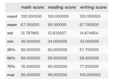
In order to draw boxplot conveniently, the data is converted to array type in numpy
exam_scores_array = np.array(exam_scores)
Drawing boxplot with matplotlib
colors = ['blue', 'grey', 'lawngreen']

bp = plt.boxplot(exam_scores_array,  # data
                 patch_artist=True, # If the patch ABCD artist is set to True, different colors can be set later
                 notch=True) # Show if there are grooves

for i in range(len(bp['boxes'])):
    bp['boxes'][i].set(facecolor=colors[i]) # Set the color if the patch [artist] is set to True
    bp['caps'][2*i + 1].set(color=colors[i])

plt.xticks([1, 2, 3], ['Math', 'Reading', 'Writing'])

plt.show()
[failed to transfer the pictures in the external chain. The source station may have anti-theft chain mechanism. It is recommended to save the pictures and upload them directly (img-4RhELmOp-1582165641701)(https://raw.githubusercontent.com/ayuLiao/images/master/20190826105404.png))
Violin plot (ViolinPlot)
Violin plot is used to display data distribution and probability density. It combines the characteristics of box plot and density plot.
The image is as follows:
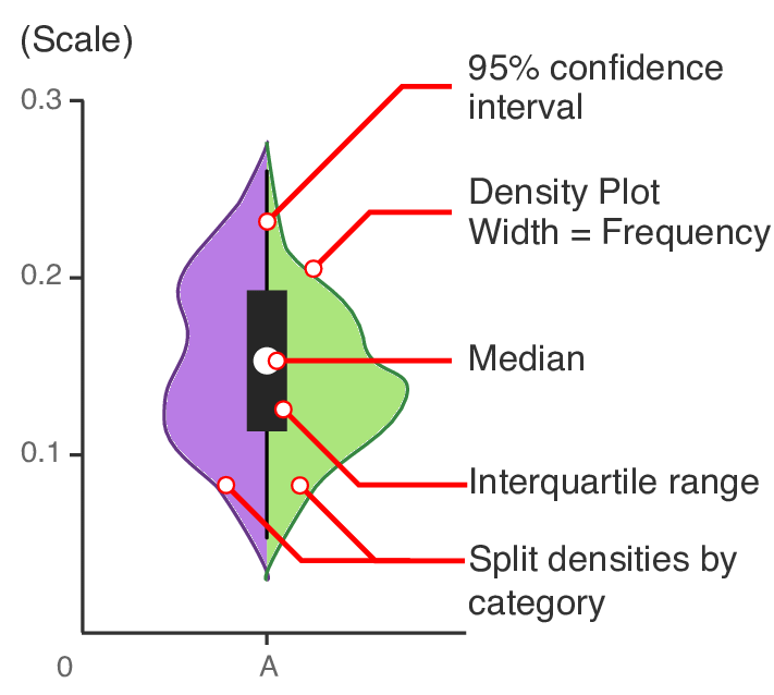
95% confidence interval(95% confidence interval) refers to the extended black thin line in the figure
Density plot
Median
Interquartile range
Split densities by category
Drawing violin diagram with data of drawing box line diagram
vp = plt.violinplot(exam_scores_array,
                    showmedians=True)

plt.xticks([1, 2, 3], ['Math', 'Reading', 'Writing'])

for i in range(len(vp['bodies'])):
    vp['bodies'][i].set(facecolor=colors[i])

plt.show()
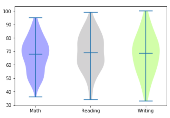
It can be seen from the figure that the data distribution density in the middle part of the violin figure is higher, which indicates that most of the students' scores are near the average level
Twinaxis plot
Biaxial graph, as the name implies, is a graph with two y axes. When our data use the same x axis, we can consider drawing a biaxial graph.
We can intuitively feel the correlation between the two kinds of data through the double axis graph. For example, the population data and GDP data are on the same time axis (x axis). At this time, we can use the double axis graph to judge whether there is correlation between the two changes.
Here, we use the weather data of Austin (the capital of Texas) town to draw a two-axis map, mainly using the two columns of data of average temperature and average wind speed to determine whether there is any connection between the two
First of all, it is still to read in the data and take the data needed
austin_weather = pd.read_csv('datasets/austin_weather.csv')
austin_weather.head()
# Data date
# TempAvgF average temperature, Fahrenheit
# WindAvgMPH average wind speed in MPH
austin_weather = austin_weather[['Date', 'TempAvgF', 'WindAvgMPH']].head(5)
pritn(austin_weather)
[failed to transfer and store the pictures in the external chain. The source station may have anti-theft chain mechanism. It is recommended to save the pictures and upload them directly (img-jNzdbgBB-1582165641711)(https://raw.githubusercontent.com/ayuLiao/images/master/20190826132919.png))
Use this data to draw a biaxial graph
 # Create subgraph
fig, ax_tempF = plt.subplots()

#fig=plt.figure(figsize=(12,6)) can achieve the same effect
fig.set_figwidth(12)
fig.set_figheight(6)

# Set x label
ax_tempF.set_xlabel('Date')

ax_tempF.tick_params(axis = 'x',
                    bottom=False, # Disable ticks
                    labelbottom=False # Disable x-axis labels
                    )

# Set left Y-axis label
ax_tempF.set_ylabel('Temp (F)',
                    color='red',
                    size='x-large')

# Set labelcolor and labelsize for the left Y-axis label
ax_tempF.tick_params(axis='y',
                     labelcolor='red',
                     labelsize='large')

# Draw AvgTemp on the left Y axis
ax_tempF.plot(austin_weather['Date'],
              austin_weather['TempAvgF'],
              color='red')

# Set the same x axis for two graphs
ax_precip = ax_tempF.twinx()

#Set right Y-axis label
ax_precip.set_ylabel('Avg Wind Speed (MPH)',
                     color='blue',
                     size='x-large')

# Set labelcolor and labelsize for the right Y-axis label
ax_precip.tick_params(axis='y',
                      labelcolor='blue',
                      labelsize='large')

# Draw WindAVg on the right Y axis
ax_precip.plot(austin_weather['Date'],
         austin_weather['WindAvgMPH'],
         color='blue')

fig.legend(loc=1, bbox_to_anchor=(1,1), bbox_transform=ax_tempF.transAxes)

plt.show()
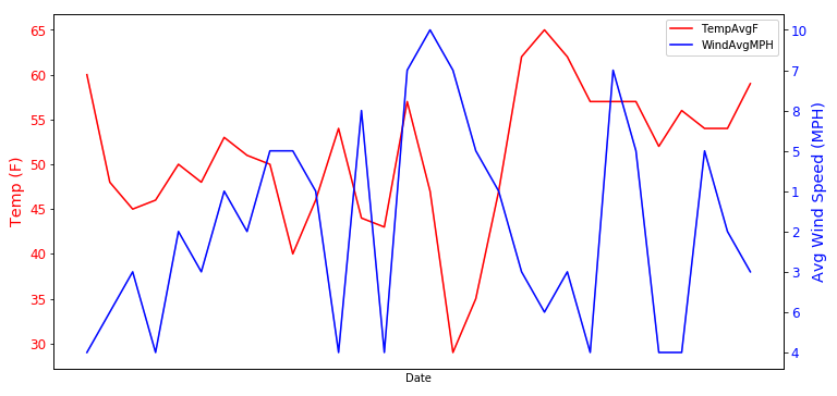
It can be seen from the figure that there is some relationship between the two, but the average temperature is not only affected by the average wind speed.
Stack plot
Stack graph is a special area graph, which can be used to compare multiple variables in an interval. Different from ordinary area graph, the starting point of drawing each data area of stack graph is based on the previous data area.
Here we use the data from the National Park to draw the stacking map
np_data= pd.read_csv('datasets/national_parks.csv')
print(np_data.head())
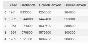
National Parks data include badlands, Grand Canyon and brycecanyons.
In order to draw the stacking map, we first need to integrate the land area data of Category 3 into a two-dimensional array. Here, we directly use numpy's vstack() method to achieve this effect. A simple example of the vstack() method is as follows:
import numpy as np
a=[1,2,3]
b=[4,5,6]
print(np.vstack((a,b)))

//Output:
[[1 2 3]
 [4 5 6]]
Then we use the national parks data to draw the stacking diagram
x = np_data['Year']
y = np.vstack([np_data['Badlands'],
               np_data['GrandCanyon'],
               np_data['BryceCanyon']])

# Label for each area area
labels = ['Badlands',
          'GrandCanyon',
          'BryceCanyon']

# Color of each area area
colors = ['sandybrown',
          'tomato',
          'skyblue']

# Similar to pandas's df.plot.area()
# stackplot() to create a stackplot
plt.stackplot(x, y,
              labels=labels,
              colors=colors,
              edgecolor='black')

# Drawing annotation
plt.legend(loc=2)

plt.show()
[failed to transfer the pictures in the external chain. The source station may have anti-theft chain mechanism. It is recommended to save the pictures and upload them directly (img-AO7gEKm9-1582165641719)(https://raw.githubusercontent.com/ayuLiao/images/master/20190826140727.png))
Percentage stack
The percentage stack graph is similar to the common stack graph, except that each data is converted to the corresponding percentage and then drawn into the graph. The national parks data is still used to draw the percentage stack graph
plt.figure(figsize=(10,7))

# divide function: only integer part is reserved in integer and floating-point division
data_perc = np_data.divide(np_data.sum(axis=1), axis=0)

plt.stackplot(x,
              data_perc["Badlands"],data_perc["GrandCanyon"],data_perc["BryceCanyon"],
              edgecolor='black',
              colors=colors,
              labels=labels)

plt.legend(loc='center left', bbox_to_anchor=(1, 0.5))

plt.show()
The effect is as follows:
[failed to transfer and save the pictures in the external chain. The source station may have anti-theft chain mechanism. It is recommended to save the pictures and upload them directly (img-uxdygxs-1582165641720) (https://raw.githubusercontent.com/ayuliao/images/master/20190826141312. PNG))
Ending
This article introduces part of the use of maplotlib visualization data, and the use of maplotlib to draw other graphs in the next article. Please pay attention to HackPython.