Preface
This paper includes the following contents:
- Popular walking routes in Hangzhou
- Gradient scatter
All are examples officially provided by eckarts. This article will implement them through Pyecharts.
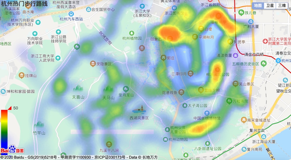
Popular walking routes in Hangzhou
- Because Baidu map needs to be called in the code, you need to go to Baidu to apply for a developer AK before you start: Baidu map open platform.
- Data source: https://echarts.baidu.com/examples/data/asset/data/hangzhou-tracks.json
Complete code
from pyecharts import options as opts
from pyecharts.charts import BMap
from pyecharts.globals import ChartType, SymbolType, ThemeType
import requests

# Get data through requests
r = requests.get('https://echarts.baidu.com/examples/data/asset/data/hangzhou-tracks.json')
data = r.json()

data_pair = []

# Create a new BMap object
bmap = BMap()

for i, item in enumerate([j for i in data for j in i ]):
    # New coordinate point
    bmap.add_coordinate(i, item['coord'][0], item['coord'][1])
    data_pair.append((i, 1))

bmap.add_schema(
    # Need to apply for an AK
    baidu_ak='VtTfLEPhrSmI34foXXozmE441uDOSA7V',
    # Map zoom
    zoom=14,
    # Show map center coordinate points
    center=[120.13066322374, 30.240018034923])

# Add data
bmap.add("Number of stores", data_pair,
         type_='heatmap')

# Data labels do not display
bmap.set_series_opts(label_opts=opts.LabelOpts(is_show=False))
bmap.set_global_opts(
    visualmap_opts=opts.VisualMapOpts(min_=0, max_=50,
                                      # Color effects borrow eckarts sample effects
                                      range_color=['blue', 'blue', 'green', 'yellow', 'red']),
    # Legend not shown
    legend_opts=opts.LegendOpts(is_show=False),
    title_opts=opts.TitleOpts(title="Popular walking routes in Hangzhou"))

# Rendering in notebook
# Other running environments use bmap.render()
bmap.render_notebook()
Realization effect
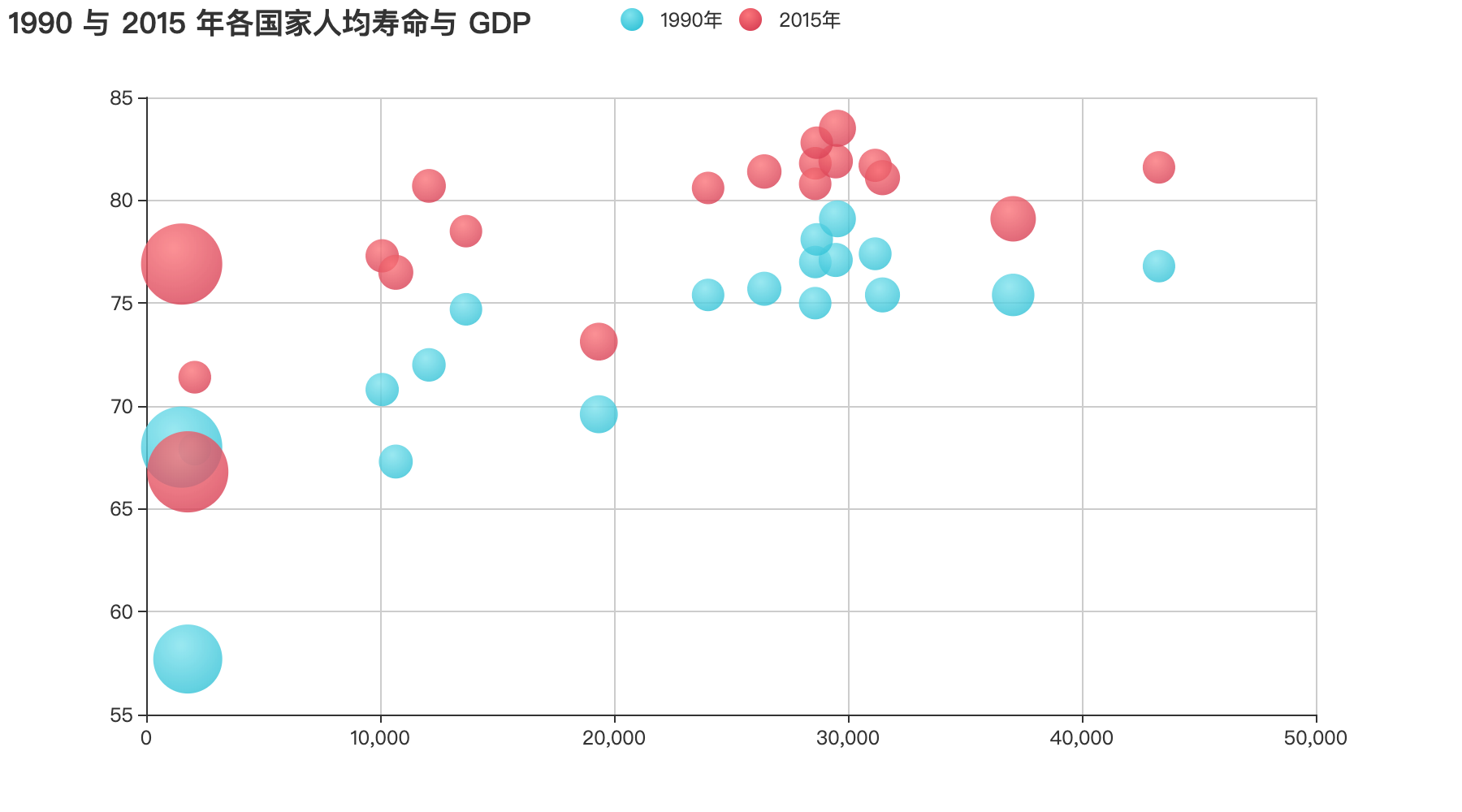
Gradient scatter
Complete code
from pyecharts import options as opts
from pyecharts.charts import Scatter
from pyecharts.globals import ThemeType
from pyecharts.commons.utils import JsCode

# Life expectancy in GDP
data = [[[28604,77,17096869,'Australia',1990],[31163,77.4,27662440,'Canada',1990],[1516,68,1154605773,'China',1990],[13670,74.7,10582082,'Cuba',1990],[28599,75,4986705,'Finland',1990],[29476,77.1,56943299,'France',1990],[31476,75.4,78958237,'Germany',1990],[28666,78.1,254830,'Iceland',1990],[1777,57.7,870601776,'India',1990],[29550,79.1,122249285,'Japan',1990],[2076,67.9,20194354,'North Korea',1990],[12087,72,42972254,'South Korea',1990],[24021,75.4,3397534,'New Zealand',1990],[43296,76.8,4240375,'Norway',1990],[10088,70.8,38195258,'Poland',1990],[19349,69.6,147568552,'Russia',1990],[10670,67.3,53994605,'Turkey',1990],[26424,75.7,57110117,'United Kingdom',1990],[37062,75.4,252847810,'United States',1990]],
    [[44056,81.8,23968973,'Australia',2015],[43294,81.7,35939927,'Canada',2015],[13334,76.9,1376048943,'China',2015],[21291,78.5,11389562,'Cuba',2015],[38923,80.8,5503457,'Finland',2015],[37599,81.9,64395345,'France',2015],[44053,81.1,80688545,'Germany',2015],[42182,82.8,329425,'Iceland',2015],[5903,66.8,1311050527,'India',2015],[36162,83.5,126573481,'Japan',2015],[1390,71.4,25155317,'North Korea',2015],[34644,80.7,50293439,'South Korea',2015],[34186,80.6,4528526,'New Zealand',2015],[64304,81.6,5210967,'Norway',2015],[24787,77.3,38611794,'Poland',2015],[23038,73.13,143456918,'Russia',2015],[19360,76.5,78665830,'Turkey',2015],[38225,81.4,64715810,'United Kingdom',2015],[53354,79.1,321773631,'United States',2015]]]

scatter = (Scatter()
           .add_xaxis([i[0] for i in data[0]])
           .add_yaxis("1990 year", [[i[1],i[3], i[2]] for i in data[0]],
                      # Gradient effect implementation part
                      color=JsCode("""new echarts.graphic.RadialGradient(0.4, 0.3, 1, [{
                                        offset: 0,
                                        color: 'rgb(251, 118, 123)'
                                    }, {
                                        offset: 1,
                                        color: 'rgb(204, 46, 72)'
                                    }])"""))
           .add_yaxis("2015 year", [[i[1],i[3], i[2]]  for i in data[1]],
                      # Gradient effect implementation part
                      color=JsCode("""new echarts.graphic.RadialGradient(0.4, 0.3, 1, [{
                                        offset: 0,
                                        color: 'rgb(129, 227, 238)'
                                    }, {
                                        offset: 1,
                                        color: 'rgb(25, 183, 207)'
                                    }])"""))
           .set_series_opts(label_opts=opts.LabelOpts(is_show=False))
           .set_global_opts(
               title_opts=opts.TitleOpts(title="1990 And the average life expectancy of each country in 2015 GDP"),
               tooltip_opts = opts.TooltipOpts(
                   # Display prompt as country by executing js code
                   formatter=JsCode("function (param) {return param.data[2];}")),
               xaxis_opts=opts.AxisOpts(
                   # Set axis to numerical type
                   type_="value",
                   # Show split lines
                   splitline_opts=opts.SplitLineOpts(is_show=True)),
               yaxis_opts=opts.AxisOpts(
                   # Set axis to numerical type
                   type_="value",
                   # The default is False, which means the starting point is 0
                   is_scale=True,
                   splitline_opts=opts.SplitLineOpts(is_show=True),),
               # The third measure in the data is shown by the size of the graph
               visualmap_opts=opts.VisualMapOpts(is_show=False, type_='size', min_=20194354, max_=1154605773)
    ))

scatter.render_notebook()
Realization effect