Introduction of plug-ins
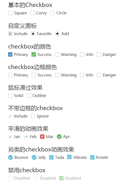
pretty.css is a beautiful checkbox and radio beautification effect of pure css3. pretty.css can be used in combination with a variety of font icons to beautify the original checkbox and radio, and can also make the animation effect when the button is clicked.

Browser compatibility

Course
pretty.css is a beautiful checkbox and radio beautification effect of pure css3. pretty.css can be used in combination with a variety of font icons to beautify the original checkbox and radio, and can also make the animation effect when the button is clicked.
The icon libraries supported by pretty.css are:
- FONT AWESOME
- BOOTSTRAP GLYPHICONS
- MATERIAL DESIGN ICONS (MDI)
- MATERIAL DESIGN ICONS (ZMDI)
- TYPICONS
- IONICONS
- GOOGLE MATERIAL DESIGN ICONS
install
You can use bower, npm, or yarn to install pretty.css.
bower install pretty-checkbox
npm install pretty-checkbox
yarn add pretty-checkbox
web Front end development learning Q-q-u-n:  731771211,Share learning methods and small details that need to be paid attention to, constantly update the latest tutorials and learning methods (detailed front-end project practical teaching video, PDF)
Usage method
Import the pretty.min.css file and the required font icon library file into the page
<link rel="stylesheet" href="../PATH/pretty-checkbox/src/pretty.min.css"/>
<link href="http://cdn.bootcss.com/bootstrap/3.3.7/css/bootstrap.min.css" rel="stylesheet">
<link href="http://cdn.bootcss.com/font-awesome/4.6.3/css/font-awesome.min.css" rel="stylesheet">
<link rel="stylesheet" href="https://cdn.materialdesignicons.com/1.8.36/css/materialdesignicons.min.css"/>
<link rel="stylesheet" href="https://cdnjs.cloudflare.com/ajax/libs/material-design-iconic-font/2.2.0/css/material-design-iconic-font.min.css"/>
<link rel="stylesheet" href="https://cdnjs.cloudflare.com/ajax/libs/typicons/2.0.7/typicons.min.css"/>
<link rel="stylesheet" href="https://cdnjs.cloudflare.com/ajax/libs/ionicons/2.0.1/css/ionicons.min.css"/>
HTML structure
The basic HTML structure of Checkbox is as follows:
<div class="pretty primary">
  <input type="checkbox"/>
  <label><i class="mdi mdi-check"></i> Primary</label>
</div>
The basic HTML structure of Radio is as follows:
<div class="pretty">
  <input type="radio" name="radio">
  <label><i class="mdi mdi-check"></i> Option 1</label>
</div>
<div class="pretty">
  <input type="radio" name="radio">
  <label><i class="mdi mdi-check"></i> Option 2</label>
</div>
Where mdi mdi - * is the material design icon. If you want to use fontawesome, you can change it to FA FA close
SCSS variable
The basic scss variable of pretty.css is set as follows:
$pretty--class-name: notsopretty;
/* <div class="notsopretty circle"> */

$pretty--border-radius: 0;

$pretty--color-primary: #428bca;
$pretty--color-success: #5cb85c;
$pretty--color-info: #5bc0de;
$pretty--color-warning: #f0ad4e;
$pretty--color-danger: #d9534f;
$pretty--color-border: #b9b9b9;
$pretty--color-radio: #b9b9b9;
$pretty--color-bg: #fff;

/* Google material design icons */
$pretty--gmdi-class-name:'g-mdi';
$pretty--gmdi-name:'Material Icons';
$pretty--gmdi-attr:'data-icon';
The github address of pretty.css is: https://lokesh-coder.github.i...
Note: more plugins about beautifying checkbox and radio are welcome to comment, thank you.