This is a pure CSS effect. The effect is an image processing principle. It is almost the same as that in Photoshop. It's just a layer and color plate, and one is CSS (div as layer thinking).
Start with PhotoShop
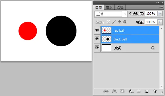
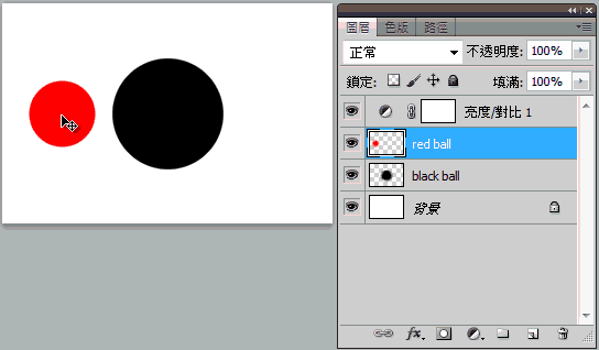
In the beginning, when we play Photoshop, it's easier to understand than writing CSS directly (it's OK for people who don't have Photoshop, and they will understand after reading the instructions). First, we add two new layers, one with a small red ball in it and the other with a big black ball in it.
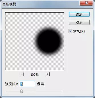
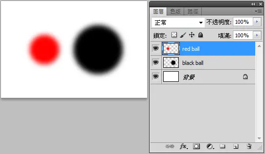
Then we use Gauss blur filter to blur small red ball and big black ball respectively.
Then we add a new "brightness and contrast" adjustment layer, check the old version, and then pull up the contrast value, you will see the magic phenomenon.
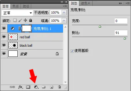
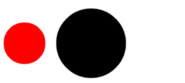
Pull to the edge no longer fuzzy, you can use the mouse to try to move the red ball, you will find that the red ball and the black ball junction place become sticky effect heart, this is what we want to do!
In this way, you already know how to use Photoshop to make. Similarly, CSS uses the same method, just changing the layer to div, which is so simple.
CSS effect
First of all, I put a div of class redball in HTML as a red ball, and a div of class blackball as a black ball. This is the two layers just in PhotoShop. Then I put a div of class effect on the periphery. This is our adjustment layer. After completion, the HTML code looks like this:
<div class="effect">
  <div class="blackball"></div>
  <div class="redball"></div>
</div>
As long as a fuzzy filter is added to blackball and redball, and a contrast filter is added to effect, the special effects in Photoshop can be achieved. The fuzzy filter must use filter:blur (numerical value), and the contrast must use filter:contrast (numerical value).
CSS looks like this:
web Front end development learning Q-q-u-n: 784783012 ,Share learning methods and small details that need attention, and keep updating the latest tutorials and learning methods
(Detailed front-end project practical teaching video, PDF)
.effect{
  width:100%;
  height:100%;
  padding-top:50px;
  filter:contrast(10);
  background:#fff;
}
.blackball{
  width:100px;
  height:100px;
  background:black;
  padding:10px;
  border-radius:50%;
  margin:0 auto;
  z-index:1;
  filter:blur(5px);
}
.redball{
  width:60px;
  height:60px;
  background:#f00;
  padding:10px;
  border-radius:50%;
  position:absolute;
  top:70px;
  left:50px;
  z-index:2;
  filter:blur(5px) ;
  animation:rball 6s infinite;
}
Ignore the positioning values in CSS. If the blur value is set to 5px and the contrast value is set to 10, you can see that the red and black spheres stick together. How can they move? To use the animation of CSS3, the procedure of the animation is as follows:
@keyframes rball{
  0%,100%{
    left:35px;
    width:60px;
    height:60px;
  }
  4%,54%{
    width:60px;
    height:60px;
  }
  10%,60%{
    width:50px;
    height:70px;
  }
  20%,70%{
    width:60px;
    height:60px;
  }
  34%,90%{
    width:70px;
    height:50px;
  }
  41%{
    width:60px;
    height:60px;
  }
  50%{
    left:calc(100% - 95px);
    width:60px;
    height:60px;
  }
}
The keyframe here has written a lot, because when the red ball enters the black ball, the horizontal direction will be compressed, and then when it leaves the black ball, the horizontal direction will be lengthened, so that it will be more like a sticky feeling. In order to test this effect, it really takes my pains! (however, there is a point to pay attention to here. Since the position will be calculated automatically, if you want to test, remember to set the width of the outermost effect to 320px.)
After finishing the red ball, it's the same principle to make the two blue balls join together and then separate. The CSS of the two blue balls is listed below. What's more important is that I make the blue balls bigger and longer when I separate them.
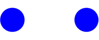
.blueball1{
  width:80px;
  height:80px;
  background:#00f;
  padding:10px;
  border-radius:50%;
  position:absolute;
  top:230px;
  left:0;
  z-index:2;
  filter:blur(8px) ;
  animation:bball1 6s infinite;
}
.blueball2{
  width:80px;
  height:80px;
  background:#00f;
  padding:10px;
  border-radius:50%;
  position:absolute;
  top:230px;
  left:240px;
  z-index:2;
  filter:blur(8px) ;
  animation:bball2 6s infinite;
}
@keyframes bball1{
  0%,100%{
    left:0;
    top:230px;
    width:80px;
    height:80px;
  }
  20%{
    top:230px;
    width:80px;
    height:80px;
  }
  85%{
    top:230px;
    left:75px;
    width:90px;
    height:70px;
  }
  90%{
    top:228px;
    width:75px;
    height:85px;
  }
  50%{
    top:215px;
    left:110px;
    width:110px;
    height:110px;
  }
}
@keyframes bball2{
  0%,100%{
    left:240px;
    top:230px;
    width:80px;
    height:80px;
  }
  20%{
    top:230px;
    width:80px;
    height:80px;
  }
  85%{
    top:230px;
    left:165px;
    width:90px;
    height:70px;
  }
  90%{
    top:228px;
    width:75px;
    height:85px;
  }
  50%{
    left:110px;
    top:215px;
    width:110px;
    height:110px;
  }
}
In this way, only using CSS can achieve a sticky effect. Frankly, I don't know where this effect can be used, but if it is used in the underwater world or some loading effects, it should be quite good!