If the UI draft is designed with a single line fixed width style, the content exceeding the length will generally be hidden and displayed with ellipsis
This is also the simplest and most commonly used processing method
However, in the actual demand, it is likely to require that the super long copy be displayed in a single line without changing the layout, and the information cannot be omitted
At this time, you can consider scrolling back and forth to achieve the above effect
1, Demand analysis
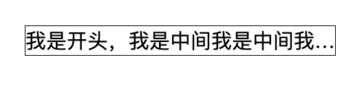
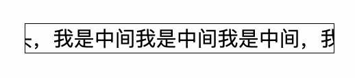
Look at the final effect first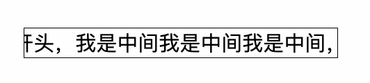
The copywriter scrolls back and forth horizontally in the designated area and stays at the head and tail for a period of time
At the same time, we consider making a general css, so we use fixed values as little as possible
2, Function realization
1. Foundation layout
First construct a basic style
- As any class that needs to contain the scroll component div, box should have personalized style s such as width and border set on the box
- Scroll wrap is a generic class for scrolling containers
Scroll item is a general class for scrolling content
// index.html

<!DOCTYPE html>
<html lang="en">

<head>
  <meta charset="UTF-8">
  <meta http-equiv="X-UA-Compatible" content="IE=edge">
  <meta name="viewport" content="width=device-width, initial-scale=1.0">
  <title>Document</title>
  <link rel="stylesheet" href="./style.css">
</head>

<body>
  <div class="box">
      <div class="scroll-wrap">
          <div class="scroll-item">
              I am the beginning, I am the middle, I am the middle, I am the middle, I am the end
          </div>
      </div>
  </div>
</body>

</html>
.box { max-width: 15em; border: 1px solid; } .scroll-wrap { overflow: hidden; white-space: nowrap; }

2. Dynamic effect analysis
How to achieve the effect of rolling back and forth?
In fact, as long as the two states of the content are realized, plus animation, the two states can be switched back and forth. If the implementation of both States uses the same attributes, the animation effect will be added naturally during the switching process
Two states:
- "I'm the beginning" is displayed on the left
- "I am the end" is displayed on the right
Let's start with the simple part. First, write an animation that switches states back and forth
.scroll-item {
    animation: scroll linear 4s alternate infinite;
}

@keyframes scroll {
    0% {
        background: red;
    }

    100% {
        background: yellow;
    }
}

Briefly explain the properties of the current animation
- Animation name: name of @ keyframes used scroll
- Animation timing function: the speed curve of animation. linear represents uniform speed
- Animation duration: Specifies that the time taken to complete the animation is 4s
- Animation direction: whether the animation should be played backwards in turn. alternate indicates that the animation will be played backwards even several times
- Animation iteration count: defines the number of times the animation is played. Infinite means infinite times
After the animation is defined, we start to implement the most critical part, the two states of head and tail side-by-side display
3. Head and tail position
If it's just a simple implementation, it's actually very simple. Directly use position: absolute, and then set left and right respectively
.scroll-wrap {
    overflow: hidden;
    white-space: nowrap;
    position: relative;
    height: 1.4em;

}

.scroll-item {
    animation: scroll linear 4s alternate infinite;
    position: absolute;
}

@keyframes scroll {
    0% {
        left: 0;
    }

    100% {
        right:0;
    }
}
However, since left and right are different attributes, there is no animation effect in the process of state change
So our next goal is: how to use left to achieve right: 0
Think about position: how absolute is centered. It is easy to think that we can achieve the desired effect through the transform attribute
@keyframes scroll {
    0% {
        left: 0;
        transform: translateX(0);
    }

    100% {
        left: 100%;
        transform: translateX(-100%);
    }
}

Then add two animation nodes to keyframes to make the copywriting stay at the beginning and end
@keyframes scroll {
    0% {
        left: 0;
        transform: translateX(0);
    }

    10% {
        left: 0;
        transform: translateX(0);
    }

      90% {
        left: 100%;
        transform: translateX(-100%);
    }

    100% {
        left: 100%;
        transform: translateX(-100%);
    }
}
Looks perfect already?
3, Code optimization
Review our initial goals
And consider making a general css, so use fixed values as little as possible
Because position: absolute is used, it is necessary to specify an additional height for the parent element. Our ideal state should be
- The content is highly natural
- Scrolling does not occur when the box width is greater than the content
- The box width is spread by the content
Using our ready-made scheme, it can be displayed normally only when the above three situations do not occur
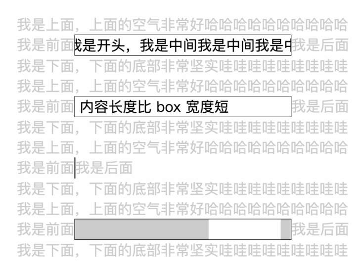
The reason why the width and height cannot be adaptive is mainly caused by position: absolute. So we consider another scheme to realize the two states.
However, it is too cumbersome to explain it step by step. Here is the final code directly. Some key attributes are also explained
// Personalized part ⬇️
.box {
    width: 15em;
    border: 1px solid;
}

// General code part ⬇️
.scroll-wrap {
    max-width: 100%;
    display: inline-block;
    vertical-align: top;
    overflow: hidden;
    white-space: nowrap;
}

.scroll-item {
    animation: scroll linear 4s alternate infinite;
    float: left;
}

@keyframes scroll {
    0% {
        margin-left: 0;
        transform: translateX(0);
    }

    10% {
        margin-left: 0;
        transform: translateX(0);
    }

    90% {
        margin-left: 100%;
        transform: translateX(-100%);
    }

    100% {
        margin-left: 100%;
        transform: translateX(-100%);
    }
}- Max width: 100%: ensure that its width does not exceed box
- Display: inline block: the purpose is to make the scroll wrap width adaptive and can be supported by child elements
- Vertical align: Top: after the above attributes are set, the inline will have a row height of 1.x, resulting in excessive height. Setting top can eliminate
- float: left: to make the subsequent margin left transform meet the expectations, you need to set float
- Margin left: equivalent to the left in the previous scheme
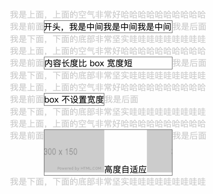
The effect is as expected. When you want to change the layout. Just modify the box (for example, the style of "box does not set width" defines width: auto)
So far, we have successfully realized the rolling playback of ultra long content with pure css~