This banner switch is implemented with pure css, which is perfect when the timer effect is abandoned and the sense of rolling parallax is added.
Effect preview
First of all, I will analyze:
What is parallax rolling?
Parallax Scrolling refers to the multi-layer background moving at different speeds, forming a three-dimensional motion effect, bringing a very excellent visual experience.
The structure of parallax rolling can be divided into background layer, content layer and suspension layer (mapping layer). The suspension layer and the background layer can be multi-layered, which can achieve a more delicate parallax. For the sake of clear structure, our current effect is one layer each.
Understanding parallax brings new problems:
How to effectively control picture switching and background animation without js?
The first thing you can think of when you can pass state without any js is the form element: you can use the checked selector to select the selected element. When you think about this, you start building structures. After all, ideas are often more important than code.
First put the complete structure code:
        <div class="vie_main">
            <input type="radio" name="i" class="page_1" id="p_1"  checked="checked"/>
            <input type="radio" name="i" class="page_2" id="p_2" />
            <input type="radio" name="i" class="page_3" id="p_3" />
            <label for="p_1" class="btn_b1"></label>
            <label for="p_2" class="btn_b2"></label>
            <label for="p_3" class="btn_b3"></label>
            <div class="vie_list">
                <div class="vie_bg"></div>
                <ul>
                    <li>
                        <img src="images/bn1.png" class="banner1"/>
                        <img src="images/bn1-1.png" class="bn bnbg1"/>
                    </li>
                    <li>
                        <img src="images/bn2.png" class="banner2"/>
                        <img src="images/bn2-2.png" class="bn bnbg2"/>
                    </li>
                    <li>
                        <img src="images/bn3.png" class="banner3" />
                        <img src="images/bn3-3.png" class="bn bnbg3"/>
                    </li>
                </ul>
            </div>
        </div>
Next, continue to analyze the control buttons.
            <input type="radio" name="i" class="page_1" id="p_1"  checked="checked"/>
            <input type="radio" name="i" class="page_2" id="p_2" />
            <input type="radio" name="i" class="page_3" id="p_3" />
            <label for="p_1" class="btn_b1"></label>
            <label for="p_2" class="btn_b2"></label>
            <label for="p_3" class="btn_b3"></label>
The for attribute under the label tag is named the same as the target form id, so the input tag is explicitly bound to control the input. When this piece is completed, the control of scrolling and background can be easily achieved through css.
Complete Css layout style
body,p,ul,li,ol,h1,h2,h3,h4,h5,h6,dl,dt,dd,form,iframe{margin:0;padding:0;}
ul,li,ol{list-style:none outside none;}

.vie_main{height: 650px; width: 100%;position: relative;}
.vie_main input{display: none;}
.vie_list{height: 100%; overflow: hidden;}
.vie_bg{width:100%;height:100%;background:url(../images/bg.jpg) no-repeat center center; position: absolute; top: 0; left: 0;overflow: hidden;}
.vie_list ul{position: relative; top: 0; height: 100%; -webkit-transition:top 1s ease-in;-moz-transition:top 1s ease-in;-ms-transition:top 1s ease-in;transition:top 1s ease-in;}
.vie_list ul li{ height:100%;opacity: 0; text-align: center;position: relative;}
.vie_list ul li>img{margin-top: -10px;}
.vie_list ul li .bn{margin-top:0;opacity:1;position: absolute; top: 0; left: 50%; transform: translateX(-50%);}
.vie_list ul li p{font-size: 40px;}
.vie_main label{display:none;width: 60px; height: 60px;border-radius: 60px;background:#E0371E url(../images/up.png) no-repeat center center;position: absolute;z-index: 2;top: 34%; right: 20%;opacity: 0.3;cursor: pointer;}
.vie_main label:hover{opacity: 0.6;}
Through these css to adjust the layout, it is worth noting that we use the position attribute to achieve coverage effect, do not forget to adjust z-index to adjust the stacking order.
The z-index value can control the stacking order of positioning elements perpendicular to the direction of the display screen (Z axis), and the elements with large values will overlap on the elements with small values.
/*btn*/
.page_1:checked ~ .btn_b2,
.page_2:checked ~ .btn_b3{background-image: url(../images/down.png);display: block; top: 48%;}
.page_2:checked ~ .btn_b1,
.page_3:checked ~ .btn_b2{background-image: url(../images/up.png);display: block;}
.page_1:checked ~ .vie_list ul li:first-child,
.page_2:checked ~ .vie_list ul li:nth-child(2),
.page_3:checked ~ .vie_list ul li:nth-child(3){opacity: 1;}
/*Scroll top*/
.page_1:checked ~ .vie_list ul{top:0;}
.page_2:checked ~ .vie_list ul{top:-100%}
.page_3:checked ~ .vie_list ul{top:-200%}
/*banner Handover transition*/
.page_1:checked ~ .vie_list ul .banner1,
.page_2:checked ~ .vie_list ul .banner2,
.page_3:checked ~ .vie_list ul .banner3{margin-top:82px;-webkit-transition: margin-top 1s linear 1s;-moz-transition: margin-top 1s linear 1s;-ms-transition: margin-top 1s linear 1s; transition: margin-top 1s linear 1s;}
/*bg position*/
.vie_main input:checked ~.vie_list .vie_bg{
    -webkit-transition: background-position 1.5s linear;
    -moz-transition: background-position 1.5s linear;
    -ms-transition: background-position 1.5s linear;
    transition:background-position 1.5s linear}
.page_1:checked ~ .vie_list .vie_bg{background-position:center 0;}
.page_2:checked ~ .vie_list .vie_bg{background-position:center -120px;}
.page_3:checked ~ .vie_list .vie_bg{background-position:center -240px;}
The element selection in this section uses the new selector "~" in CSS 3.0.
It can be said that the "selector is the soul of our whole effect realization, and can select non-adjacent sibling elements accurately and effectively. It effectively solves the embarrassment that the css selector can not flexibly select sibling elements. 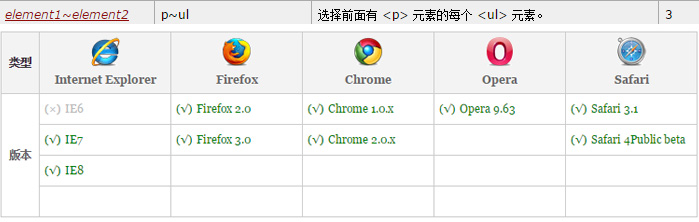
Mainstream browsers are compatible and can be used safely. In this case, "~" association is used to control the image switching and background. Additionally, transition attributes added by the same CSS 3.0 are used to make transition animation to achieve the perfect image switching and the parallax effect caused by background slowing.
This article is purely a learning exchange, part of the picture source network, if there are violations, please contact me in time.
Education Pursuit in Mars Age