Preface
- This article has matching videos, which can be viewed as appropriate.
- The content of this article may be biased due to different understandings. Welcome friends to contact me.
- All the contents in this article are for study and communication only, not for commercial use. If the relevant laws and regulations caused by this are not related to me.
- If the content in this article is inconvenient to you, please contact us. 277511806@qq.com Deal with it. Thank you.
- Reprint trouble to indicate the source, thank you.
- Information: Links: https://pan.baidu.com/s/1b3abwy Password: k8p5
ES5 to ES6
- Regarding ES6 grammar, I suggest you take a look at Mr. Ruan's ECMAScriot 6
- If you know it quickly, you can refer to it. es6 Grammar Quick Start
Project brief introduction
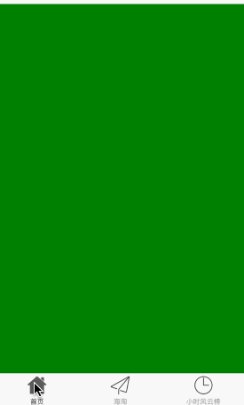
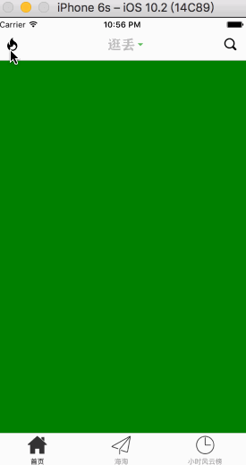
- Let's first look at the effect of this APP we imitated.
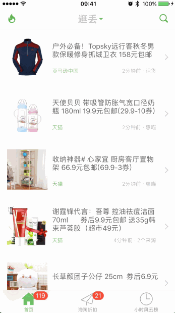
- From the above figure, we can see that the complexity is not very large, but the time relationship we try to complete all the modules and improve the details.
Translation notes:
It is suggested to open the video to cooperate with text learning so as not to mention some details in the text, but the content in the text is the basis (update accordingly according to feedback).
The reason why I choose this APP is related to my personal hobbies, of course, the key is that the whole APP is not complex, including the common APP styles on the market, and it can get all the request parameters and image resources smoothly, which is very suitable for us to experience the rough development process of React-native.
Project analysis
-
Before the development of APP, product managers will generally analyze the requirements, and then hold meetings to discuss the technologies to be used in the development process, the difficulties to be encountered, assign tasks, listen to the developers'opinions and make corresponding modifications, and finally determine the overall prototype diagram, development process, technology, cycle and so on. Of course, UI is also involved. We do not have product managers, UI is also included. There are ready-made ones, so we can roughly divide them into the following parts:
Demand analysis: This APP mainly screens, classifies and finally presents to users by grabbing preferential information of commodities of major e-commerce platforms, so that users can easily, quickly and real-time access to high-quality preferential information.
Development Model: Our side is similar to prototype-based model development.
Technology used: React-Native
Function modules: Mainly divided into the home page, Haitao module, Hourly Wind and Cloud List three major modules and other ancillary modules (increase as appropriate).
- Overall architecture:
- Subject: TabBar is used as the main frame, Home Page, Haitao Module and Hourly Wind and Cloud List as the whole module, and the corresponding jump mode is selected according to the effect of the prototype map.
- Data Display: Choose the appropriate data display mode according to the prototype map
Naming Rules: Refer to Coding Specification Documents (there are differences between different companies, see the documents provided by the company, this side first comply with the rules mentioned below)
Testing: MDZZ, who tests!
Engineering Environment Configuration
All resources needed Click to download.
- First, configure the iOS side.
- Replace the Images.xcassets folder in the compressed package directly with the Images.xcassets folder in our iOS project.
- At this time, we can see that all the image resources have been successfully imported into the iOS project, and then we click on the project file to make some necessary configuration.
- General - App Icons and Launch Images - Modify Launch Images Source to Launch Image in Images.xcassets folder to clear Launch Screen File content.
- General -- Deployment Info -- Device Orientation -- retains only the Portrait option.
- Open the info.plist file, find the Bundle name option, and modify its content to "Lost Learning"
- Open the info.plist file, find the App Transport Security Settings option, add the Allow Arbitrary Loads option to it and set the content to YES (this step can be ignored if using IPV6 standard)
OK, so far the iOS side has been configured.
- Next, configure the Android side.
- Copy and paste the drawable-xxhdpi folder in the compressed package into GD/android/app/src/main/res/.
-
Set the APP icon to enter GD/android/app/sec/Open the Android Manifest file and modify the android:icon entry as follows:
<applicatio> android:icon="@drawable/icon" </application> -
Set the name of APP to go into GD/android/app/src/main/res/values/and open the strings.xml file. Make the following modifications:
    <resources>
        <string name="app_name">Drop in learning</string>
    </resources>
OK, so far Android has been configured.
Directory structure and naming rules
- For ease of understanding, we do not follow the conventional React-native development structure for development, and then slowly change the following chapters.
- Here we divide the files into four parts: main (entry), home (home), HT (Haitao), hourList (hourlist). Put the related files into the corresponding folders, so as to avoid the frequented switching of documents in the process of development, which will bring fretful feelings to novices.
- Naming rules:
- Following React-Native's default way of naming folders, we use lowercase + underscore for naming
- File naming uses prefix (uppercase) and module name (Pascal).
- Use hump naming rules for functions, constants, variables, etc.
Directory structure:
Translation notes:
- Naming rules for humps: lowercase initials, capitalization for subsequent words, click on details Hump naming Check out the reading.
- Pascal Naming Rule: Similar to hump, just capitalize the initials, click on the details Pascal naming Check out the reading.
- Underline Naming Rule: The use of underscores to divide words.
Third-party framework
Here's how to import third-party frameworks in React-Native
- First of all, third-party frameworks must come to GitHub Look for it.
- Search react-native-tab-navigator in the search box.
- In the following instructions, we tell us that using the terminal - enter the project's home directory - copy the command line () - Return - wait for the download to complete and then import into the project.
At this point, the third-party framework import is completed, and the use will be mentioned below.
Main Framework Construction
As mentioned above, TabBar is used as the main framework, but the official only provides the iOS-side TabBarIOS. For the reason of time, in order to speed up the development progress and explain the use of third-party frameworks incidentally, we use <react-native-tab-navigator> for development.
Since you want to use the framework, you must first introduce the framework file.
   // Reference to third-party frameworks
   import TabNavigator from 'react-native-tab-navigator';
- According to the instructions, the method of use is similar to the official TabBarIOS (unclear troublesome reference) TabBarIOS and TabBarIOS.Item of React Native So we add three modules to TabBar, and each module exists in the form of Navigator.
    export default class GD extends Component {

    // ES6
    // structure
      constructor(props) {
        super(props);
        // Initial state
        this.state = {
            selectedTab:'home',
        };
      }

    // Item returning to TabBar
    renderTabBarItem(title, selectedTab, image, selectedImage, component) {
        return(
            <TabNavigator.Item
                selected={this.state.selectedTab === selectedTab}
                title={title}
                selectedTitleStyle={{color:'black'}}
                renderIcon={() => <Image source={{uri:image}} style={styles.tabbarIconStyle} />}
                renderSelectedIcon={() => <Image source={{uri:selectedImage}} style={styles.tabbarIconStyle} />}
                onPress={() => this.setState({ selectedTab: selectedTab })}>
                    // Add Navigation Function
                <Navigator
                        // Route setting
                    initialRoute={{
                        name:selectedTab,
                        component:component
                    }}

                    renderScene={(route, navigator) => {
                        let Component = route.component;
                        return <Component {...route.params} navigator={navigator} />
                    }}
                />
            </TabNavigator.Item>
        );
    }

    render() {
        return (
            <TabNavigator>
                {/* home page */}
                {this.renderTabBarItem("home page", 'home', 'tabbar_home_30x30', 'tabbar_home_selected_30x30', Home)}
                {/* Hai Tao */}
                {this.renderTabBarItem("Hai Tao", 'ht', 'tabbar_abroad_30x30', 'tabbar_abroad_selected_30x30', HT)}
                {/* Hours of Wind and Cloud */}
                {this.renderTabBarItem("Hours of Wind and Cloud", 'hourlist', 'tabbar_rank_30x30', 'tabbar_rank_selected_30x30', HourList)}
            </TabNavigator>
        );
    }
}

const styles = StyleSheet.create({
    container: {
        flex: 1,
        justifyContent: 'center',
        alignItems: 'center',
        backgroundColor: '#F5FCFF',
    },
    tabbarIconStyle: {
        width:Platform.OS === 'ios' ? 30 : 25,
        height:Platform.OS === 'ios' ? 30 : 25,
    }
});
- So far, the main frame has been built.
Custom Navigation Bar Style
As can be seen from the effect diagram, the navigation bar is similar in style, because we have set up Navigator in front of us. In this case, we need to customize the Navigator's style. We can see that all the Navigator styles are similar, so we can pull out here and let all the Navigators share one component.
So first we create the GDCommunal NavBar file in the main folder and initialize the basic contents.
Next, let's look at the navigation bar on the home page. The navigation bar on the home page has three buttons on the left, middle and right. The left side is popular for half an hour. In the middle, the list of platforms supporting screening is displayed by clicking down. On the right side, there is a commodity search. Normally, the Navigator has only three components. In order to make users highly customize, we only set the layout of three components in the current NavBar. Then it provides an interface to get the external incoming values and to determine internally whether the corresponding components need to be created.
    export default class GDCommunalNavBar extends Component {

    static propTypes = {
        leftItem:PropTypes.func,
        titleItem:PropTypes.func,
        rightItem:PropTypes.func,
    };

    // left
    renderLeftItem() {
        if (this.props.leftItem === undefined) return;
        return this.props.leftItem();
    }

    // Middle
    renderTitleItem() {
        if (this.props.titleItem === undefined) return;
        return this.props.titleItem();
    }

    // Right
    renderRightItem() {
        if (this.props.rightItem === undefined) return;
        return this.props.rightItem();
    }

    render() {
        return (
            <View style={styles.container}>
                {/* left */}
                <View>
                    {this.renderLeftItem()}
                </View>
                {/* Middle */}
                <View>
                    {this.renderTitleItem()}
                </View>
                {/* Right */}
                <View>
                    {this.renderRightItem()}
                </View>
            </View>
        );
    }
}

const styles = StyleSheet.create({
    container: {
        width:width,
        height:Platform.OS === 'ios' ? 64 : 44,
        backgroundColor:'white',
        flexDirection:'row',
        justifyContent:'space-between',
        alignItems:'center',
        borderBottomWidth:0.5,
        borderBottomColor:'gray',
        paddingTop:Platform.OS === 'ios' ? 15 : 0,
    },
});
- Here we have completed the Navigator style, we go to the home page to use it, see if it is good to use, use this side will not say (1. refer to external documents; 2.
[Upload custom Navigator style. gif failed. Please try again.]
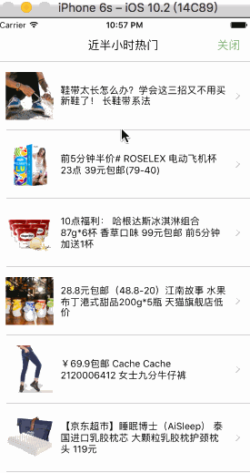
Home page half hour hot
- Here we start with half an hour's popularity. For data display like this, we definitely prefer ListView, where the cell style is as follows: ListView, ListView, ListView, ListView, ListView, ListView, ListView, ListView, ListView, ListView, ListView, ListView, List
Effect:
We first request the data, determine the correct access to the data, and then define the cell style.
Next, let's customize the cell style
    export default class GDCommunalNavBar extends Component {

    static propTypes = {
        image:PropTypes.string,
        title:PropTypes.string,
    };

    render() {
        return (
            <View style={styles.container}>
                {/* Left picture */}
                <Image source={{uri:this.props.image}} style={styles.imageStyle} />
                {/* In the middle of the text */}
                <View>
                    <Text numberOfLines={3} style={styles.titleStyle}>{this.props.title}</Text>
                </View>
                {/* The arrow on the right */}
                <Image source={{uri:'icon_cell_rightArrow'}} style={styles.arrowStyle} />
            </View>
        );
    }
}

const styles = StyleSheet.create({
    container: {
        flexDirection:'row',
        alignItems:'center',
        justifyContent:'space-between',
        backgroundColor:'white',
        height:100,
        width:width,
        borderBottomWidth:0.5,
        borderBottomColor:'gray',
        marginLeft:15

    },

    imageStyle: {
        width:70,
        height:70,
    },
    titleStyle: {
        width:width * 0.65,
    },
    arrowStyle: {
        width:10,
        height:10,
        marginRight:30
    }
});
- Well, here the cell style is also defined and the effect is the same.
    export default class GDHalfHourHot extends Component {

    // structure
      constructor(props) {
        super(props);
        // Initial state
        this.state = {
            dataSource: new ListView.DataSource({rowHasChanged:(r1, r2) => r1 !== r2}),
        };
        // binding
        this.fetchData = this.fetchData.bind(this);
      }

    // Network request
    fetchData() {
        fetch('http://guangdiu.com/api/gethots.php')
            .then((response) => response.json())
            .then((responseData) => {
                this.setState({
                    dataSource: this.state.dataSource.cloneWithRows(responseData.data)
                });
            })
            .done()
    }

    popToHome() {
        this.props.navigator.pop();
    }

    // Return to the middle button
    renderTitleItem() {
        return(
            <Text style={styles.navbarTitleItemStyle}>Nearly half an hour hot</Text>
        );
    }

    // Return to the right button
    renderRightItem() {
        return(
            <TouchableOpacity
                onPress={()=>{this.popToHome()}}
            >
                <Text style={styles.navbarRightItemStyle}>Close</Text>
            </TouchableOpacity>
        );
    }

    // Returns the cell style for each row
    renderRow(rowData) {
        return(
            <CommunalHotCell
                image={rowData.image}
                title={rowData.title}
            />
        );
    }

    componentDidMount() {
        this.fetchData();
    }

    render() {
        return (
            <View style={styles.container}>
                {/* Navigation Bar Style */}
                <CommunalNavBar
                    titleItem = {() => this.renderTitleItem()}
                    rightItem = {() => this.renderRightItem()}
                />

                <ListView
                    dataSource={this.state.dataSource}
                    renderRow={this.renderRow}
                    showsHorizontalScrollIndicator={false}
                    style={styles.listViewStyle}
                />
            </View>
        );
    }
}

const styles = StyleSheet.create({
    container: {
        flex:1,
        alignItems: 'center',
    },

    navbarTitleItemStyle: {
        fontSize:17,
        color:'black',
        marginLeft:50
    },
    navbarRightItemStyle: {
        fontSize:17,
        color:'rgba(123,178,114,1.0)',
        marginRight:15
    },

    listViewStyle: {
        width:width,
    }
});
- As can be seen from the rendering, we still have the title of the above prompt, which is very simple here. Let's finish some quickly.
Effect:
Use of notifications hidden in the display of TabBar
- Configuring TabBar Hiding and Displaying Conditions
    // ES6
    // structure
      constructor(props) {
        super(props);
        // Initial state
        this.state = {
            selectedTab:'home',
            isHiddenTabBar:false,   // Whether to hide tabbar
        };
      }

   <TabNavigator
                tabBarStyle={this.state.isHiddenTabBar !== true ? {} : {height:0, overflow:'hidden'}}
                sceneStyle={this.state.isHiddenTabBar !== true ? {} : {paddingBottom:0}}
            >
                {/* home page */}
                {this.renderTabBarItem("home page", 'home', 'tabbar_home_30x30', 'tabbar_home_selected_30x30', Home)}
                {/* Hai Tao */}
                {this.renderTabBarItem("Hai Tao", 'ht', 'tabbar_abroad_30x30', 'tabbar_abroad_selected_30x30', HT)}
                {/* Hours of Wind and Cloud */}
                {this.renderTabBarItem("Hours of Wind and Cloud", 'hourlist', 'tabbar_rank_30x30', 'tabbar_rank_selected_30x30', HourList)}
            </TabNavigator>
Here we introduce new knowledge - Notification
Use notifications are simple. First, you need to register the notifications and destroy them where appropriate.
    componentDidMount() {
        // Registration notice
        this.subscription = DeviceEventEmitter.addListener('isHiddenTabBar', (data)=>{this.tongZhi(data)});
    }

    componentWillUnmount() {
        // Destruction
        this.subscription.remove();
    }
- Then we send notifications where we need them.
    componentWillMount() {
        // Sending notice
        DeviceEventEmitter.emit('isHiddenTabBar', true);
    }

    componentWillUnmount() {
        // Sending notice
        DeviceEventEmitter.emit('isHiddenTabBar', false);
    }