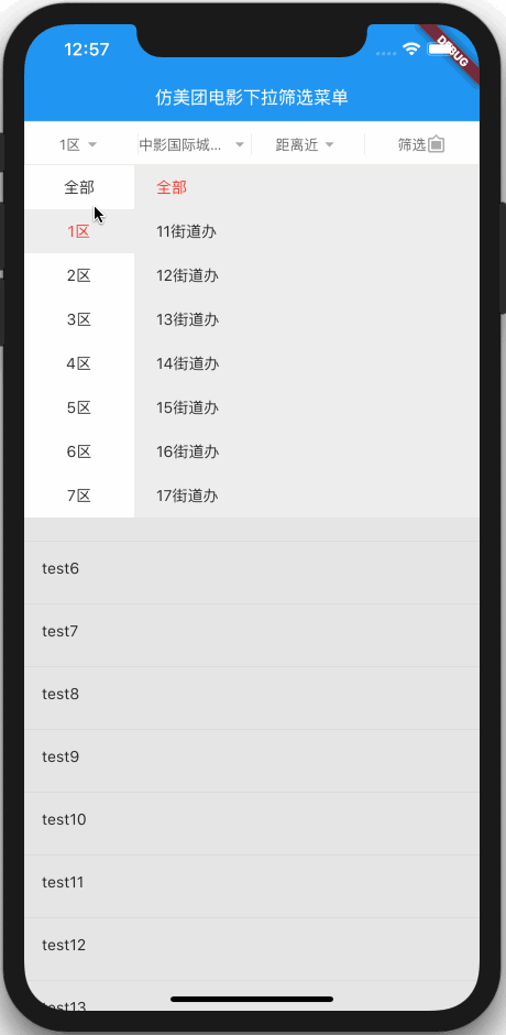
A drop-down Filter menu with powerful customization
Custom dropdown header
Custom dropdown header item
Custom dropdown menu
Custom dropdown menu show animation time
Control dropdown menu show or hide
If it helps you, please pay attention to it. Your support is the driving force for me to keep updating.
Navigation
GIF effect picture
How to use
Gif effect picture
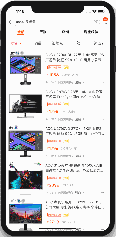
The renderings of imitating meituan and Taobao
Meituan's code is in the example directory of this warehouse

image

How to use
It has not been published to Pub since it was recently published by qiang. It will be published to Pub later.
1. Add GZX? Dropdown? Menu package
Open the pubspec.yaml file
Add the following code
  gzx_dropdown_menu :
    git:
      url: https://github.com/GanZhiXiong/gzx_dropdown_menu.git
Add location as shown in the following figure

After adding, open Terminal and execute fluent packages get
2, use
Open the GZX? Dropdown? Menu? Test? Page.dart file under the example project of this warehouse.
There's no time to edit the text, and it's not as good as saying that you can run it directly to see the effect, and then look at the code to know how to use it.
Forget it or just say it!
You just need to nest GZXDropDownHeader and GZXDropDownMenu into your code.
GZXDropDownHeader
  //Pull down menu header
  GZXDropDownHeader(    //Drop down header items. Currently, only the displayed text, icon and icon size can be customized.
    items: [
      GZXDropDownHeaderItem(_dropDownHeaderItemStrings[0]),
      GZXDropDownHeaderItem(_dropDownHeaderItemStrings[1]),
      GZXDropDownHeaderItem(_dropDownHeaderItemStrings[2]),
      GZXDropDownHeaderItem(_dropDownHeaderItemStrings[3], iconData: Icons.filter_frames, iconSize: 18),
    ],    //GZXDropDownHeader corresponds to the key of the first parent Stack
    stackKey: _stackKey,    //The controller is used to control the display or hide of the menu.
    controller: _dropdownMenuController,    //When you click the event of the header item, you can jump to the page or open end drawer here
    onItemTap: (index) {      if (index == 3) {
        _scaffoldKey.currentState.openEndDrawer();
        _dropdownMenuController.hide();
      }
    },    //Height of head
    height: 40,    //Head background color
    color: Colors.red,    //Head border width
    borderWidth: 1,    //Head border color
    borderColor: Color(0xFFeeede6),    //? height of split line
    dividerHeight: 20,    //? split line color
    dividerColor: Color(0xFFeeede6),    //Text style
    style: TextStyle(color: Color(0xFF666666), fontSize: 13),    //Drop down text style
    dropDownStyle: TextStyle(
      fontSize: 13,
      color: Theme.of(context).primaryColor,
    ),    //Icon size
    iconSize: 20,    //Icon color
    iconColor: Color(0xFFafada7),    //Icon color on dropdown
    iconDropDownColor: Theme.of(context).primaryColor,
  ),
GZXDropDownMenu
  //Pull down menu
  GZXDropDownMenu(    //The controller is used to control the display or hide of the menu.
    controller: _dropdownMenuController,    //Drop down to show or hide animation duration
    animationMilliseconds: 500,    //The drop-down menu is highly customized, and what you want to display is entirely up to you. You only need to call _dropdownMenuController.hide() after selection.
    menus: [
      GZXDropdownMenuBuilder(
          dropDownHeight: 40 * 8.0,
          dropDownWidget: _buildQuanChengWidget((selectValue) {
            _dropDownHeaderItemStrings[0] = selectValue;
            _dropdownMenuController.hide();
            setState(() {});
          })),
      GZXDropdownMenuBuilder(
          dropDownHeight: 40 * 8.0,
          dropDownWidget: _buildConditionListWidget(_brandSortConditions, (value) {
            _selectBrandSortCondition = value;
            _dropDownHeaderItemStrings[1] =
            _selectBrandSortCondition.name == 'whole' ? 'brand' : _selectBrandSortCondition.name;
            _dropdownMenuController.hide();
            setState(() {});
          })),
      GZXDropdownMenuBuilder(
          dropDownHeight: 40.0 * _distanceSortConditions.length,
          dropDownWidget: _buildConditionListWidget(_distanceSortConditions, (value) {
            _dropDownHeaderItemStrings[2] = _selectDistanceSortCondition.name;
            _selectDistanceSortCondition = value;
            _dropdownMenuController.hide();
            setState(() {});
          })),
    ],
  )