Static positioning
1.Static positioning is the default positioning method of labels, that is, each label is located in the HTML The default location in the document flow.
2.In static positioning state, edge offset attribute cannot be used(top,bottom,left,right)Change label position
3.Generally, when we need to convert fixed positioning or absolute positioning and other positioning to elements under the standard flow, we need to set the element to static positioning.
position:static;
Absolute positioning
position:absolute;
left:20px;
top:20px
Characteristic:
1. You can change the position of an element by setting its absolute location.
2. Absolute positioning is to locate the label according to the nearest located parent label (absolute, fixed, relative positioning). If no parent label is located, the label with absolute positioning will be located according to the body root label (browser window).
3. If the parent element of a child element is not set with positioning or static positioning, the absolute positioning child element moves relative to the upper left corner of the browser (body) for reference.
4. The absolute positioning element is the de labeling element (not occupying the position).
5. Absolute positioning can also allow elements to perform mode conversion (caused by de labeling)
Usage scenarios of absolute positioning

Conclusion:
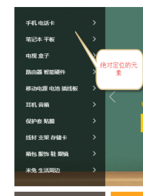
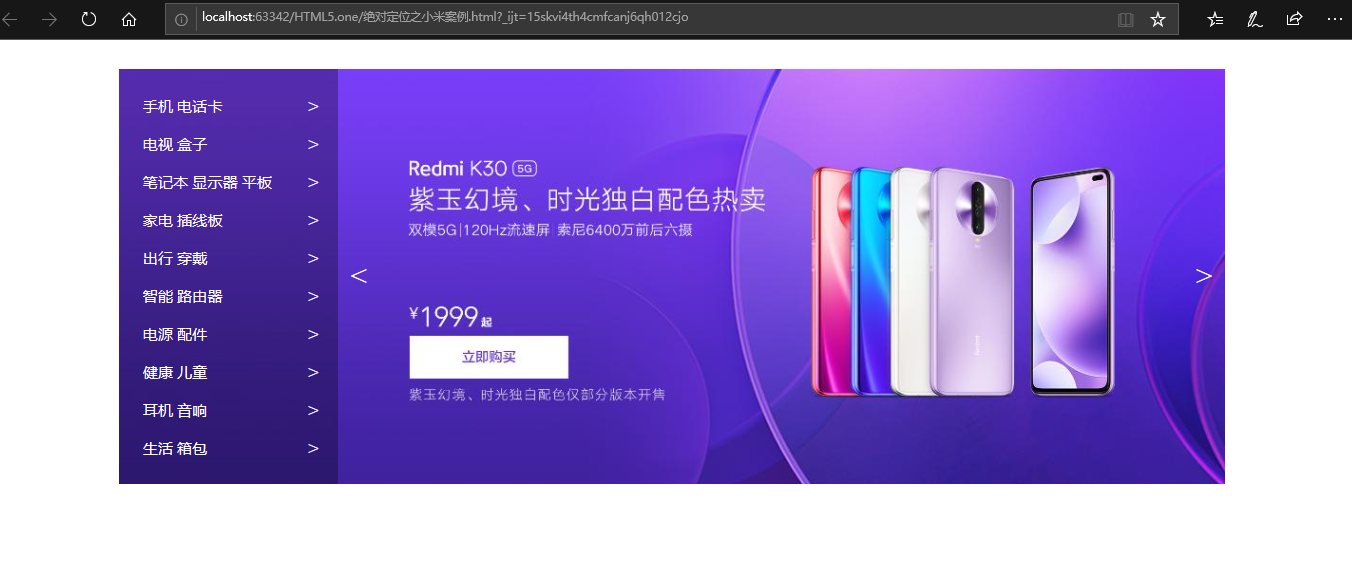
Generally, if there is a container (box) pressing another box in the layout of a web page, we consider absolute positioning.
Absolute positioning (de labeling) elements center display
margin:0 auto; can only center boxes of standard streams
 Recommended method:
position:absolute;
/*Half the width of the relative parent*/
left:50%;
Margin left: - half of its element width;
Xiaomi case (go to the official website to steal the background map)
<!DOCTYPE html>
<html lang="en">
<head>
    <meta charset="UTF-8">
    <title>Title</title>
    <style type="text/css">
        *{
            margin: 0;
            padding: 0;
            list-style: none;
        }
        .banner{
            width: 1164px;
            height: 437px;
            margin: 30px auto;
            position: relative;
        }
        .aside{
            width: 230px;
            height: 437px;
            background-color: rgba(0,0,0,0.3);
            position: absolute;
            left: 0px;
            top: 0px;
        }
        .pages .left{
            height: 80px;
            width: 44px;
            position: absolute;
            left: 230px;
            top: 50%;
            margin-top: -40px;
            color: #fff;
            font-size: 30px;
            line-height: 80px;
            text-align: center;
        }
        .pages .right{
            height: 80px;
            width: 44px;
            position: absolute;
            right: 0px;
            top: 50%;
            margin-top: -40px;
            color: #fff;
            font-size: 30px;
            line-height: 80px;
            text-align: center;
        }
        .pages .right:hover{
            background:rgba(0,0,0,0.3);
        }
        .pages .left:hover{
            background:rgba(0,0,0,0.3);
        }
        .aside ul{
            margin-top: 20px;
            margin-bottom: 20px;
        }
        .aside li{
            height: 40px;
            display: block;
            line-height: 40px;
            padding-left: 25px;
            color: white;
            position: relative;
        }
        .aside li:hover{
            background-color: orange;
        }
        .aside span{
            font-size: 19px;
            position: absolute;
            right: 20px;

        }
    </style>
</head>
<body>
<div class="banner">
    <a href="#">
        <img src="images/1.jpg" alt="Mi phones">
    </a>
    <div class="aside">
        <ul>
            <li>Mobile phone card
                <span>></span>
            </li>
            <li>TV box
                <span>></span>
            </li>
            <li>Notebook display panel
                <span>></span>
            </li>
            <li>Appliance patch panel
                <span>></span>
            </li>
            <li>Travel wear
                <span>></span>
            </li>
            <li>Intelligent router
                <span>></span>
            </li>
            <li>Power accessories
                <span>></span>
            </li>
            <li>Healthy children
                <span>></span>
            </li>
            <li>Earphone sound
                <span>></span>
            </li>
            <li>Living bags
                <span>></span>
            </li>
        </ul>
    </div>
    <div class="pages">
        <span class="left"><</span>
        <span class="right">></span>
    </div>
</div>
</body>
</html>
Relative positioning
1. Relative positioning is to locate the label relative to its position in the standard document flow.
2. The relative positioning elements are not de labeled (occupying the position), so the mode conversion cannot be realized.
Usage scenario:
◆ if absolute positioning is set for an element, it is recommended to directly set relative positioning for its parent element (child absolute parent phase)
Fixed location
position:fixed;
left:20px;
top:23px;
Characteristic:
1. Fixed positioning elements always refer to the upper left corner of the browser (body) label for reference to change the position (regardless of whether the parent element is positioned or not).
2. The fixed positioning element is also the de labeling element (not occupying the position).
3. Mode conversion is possible.
4. How to move the physical page? The position of this element in the page will never change.


Published 30 original articles, won praise 3, visited 437