Getting Started tutorial (I): get started quickly
Introductory tutorial (2): scatter chart and line chart
Introductory tutorial (3): line chart
Introductory tutorial (IV) - histogram
Drawing pie charts using plot Express
In px.pie, the visual value of the pie chart is specified by the values parameter, and the sector label is specified by the names parameter.
from plotly import express as px

df = px.data.gapminder().query("year == 2007").query("continent == 'Europe'")
# Only countries with large population (more than 2 million) are shown
df.loc[df['pop'] < 2e6, 'country'] = 'Other countries'
fig = px.pie(df, values='pop', names='country', title='Population of European continent')
fig.show()

Pie chart with duplicate labels
The data row of DataFrame will aggregate the specified label columns into the same sector according to the same label value (the default value is summation).
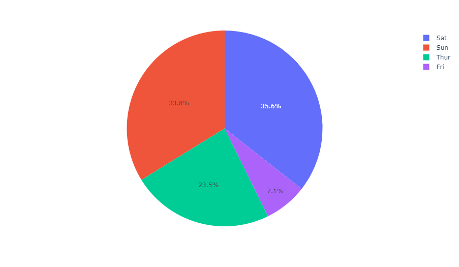
# This dataset has 244 rows, but only four different 'day' values
df = px.data.tips()
fig = px.pie(df, values='tip', names='day')
fig.show()
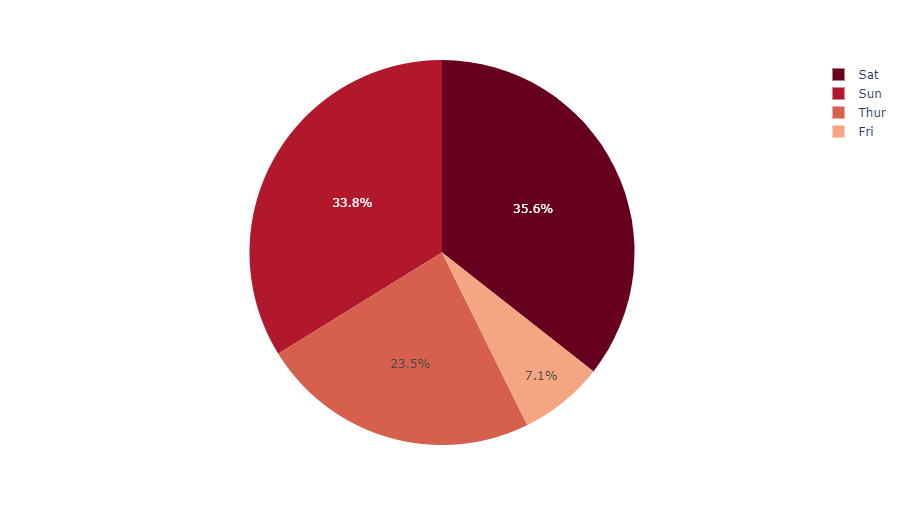
Sets the color of the pie chart sector
fig = px.pie(df, values='tip', names='day',
             color_discrete_sequence=px.colors.sequential.RdBu)
fig.show()
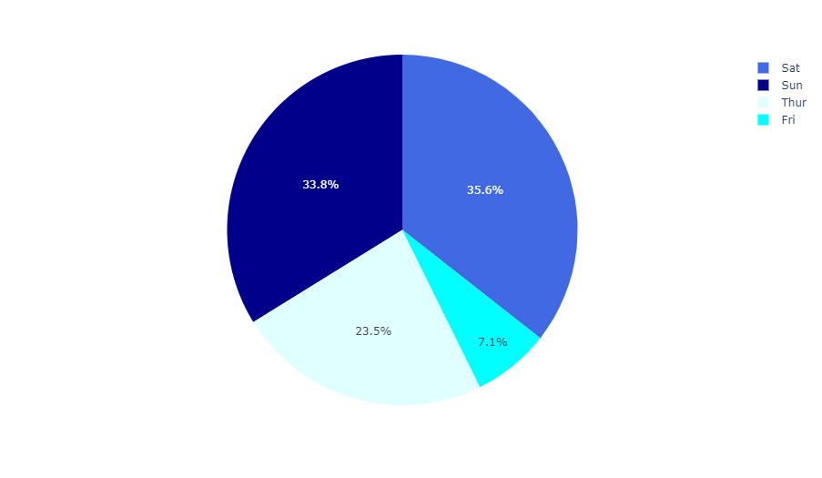
Use explicit mapping for discrete colors
For more information on discrete colors, see This page.
fig = px.pie(df, values='tip', names='day', color='day',
             color_discrete_map={
               'Thur':'lightcyan', 'Fri':'cyan',
               'Sat':'royalblue', 'Sun':'darkblue'
             })
fig.show()
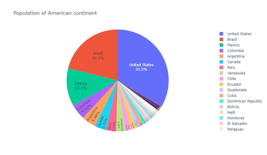
Customize pie charts created using px.pie
In the following example, we first create a pie chart with px.pie, using such as hover_data (the data column that should be displayed in the suspended state) and labels (rename column) options. For subsequent adjustments, we call fig.update_traces to set other parameters about the chart (you can also use fig.update_layout to change the layout).
df = px.data.gapminder().query("year == 2007").query("continent == 'Americas'")
fig = px.pie(df, values='pop', names='country
             # Chart title
             title='Population of American continent',
             # Floating data columns, renaming data columns
             hover_data=['lifeExp'], labels={'lifeExp':'life expectancy'})
fig.update_traces(
  textposition='inside',        # Data label location
  textinfo='percent+label'      # Percentage + label display mode
)
fig.show()
Control text font size
If you want all text labels to have the same size, you can use the uniformtext layout parameter. The minsize property sets the font size, and the mode parameter sets the behavior when the label cannot adapt to the specified font size: hide or show them in the form of overflow boundary. In the following example, we also use textposition to force the text to be displayed inside the sector, otherwise the text labels that cannot adapt to the sector size will be displayed outside the sector.
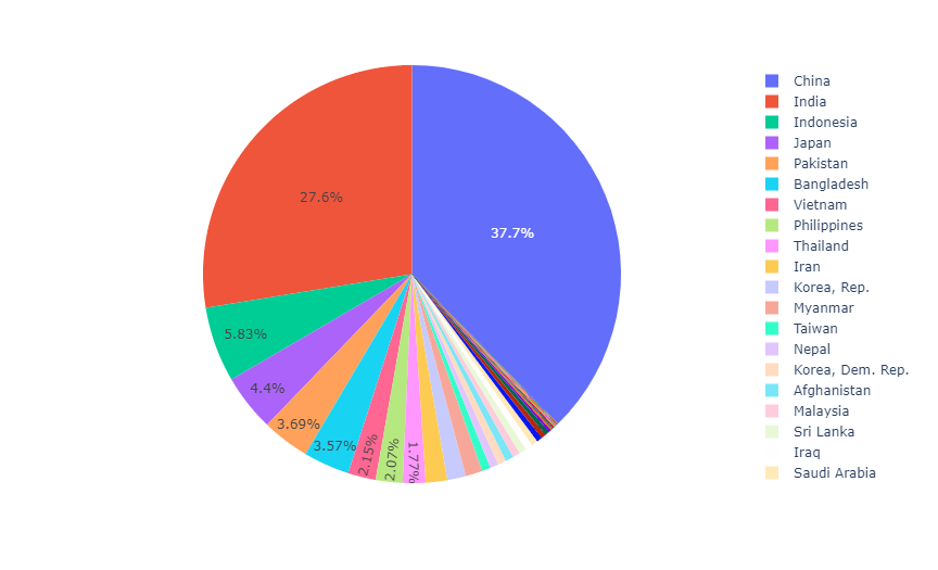
df = px.data.gapminder().query("continent == 'Asia'")
fig = px.pie(df, values='pop', names='country')
fig.update_traces(textposition='inside')
fig.update_layout(uniformtext_minsize=12, uniformtext_mode='hide')
fig.show()
Drawing pie charts using Graph Objects
If plot express is not very good, you can also choose plotly.graph_objects The more general go.Pie class in.
In go.Pie, the sectors during data visualization are set with the help of the values parameter, the label of each sector is set by the labels parameter, and the color of each sector is set by marker.colors.
If you are looking for a multi-level hierarchical pie chart, please go to Sunrise chart tutorial.
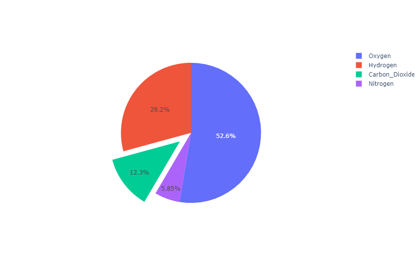
Basic pie chart
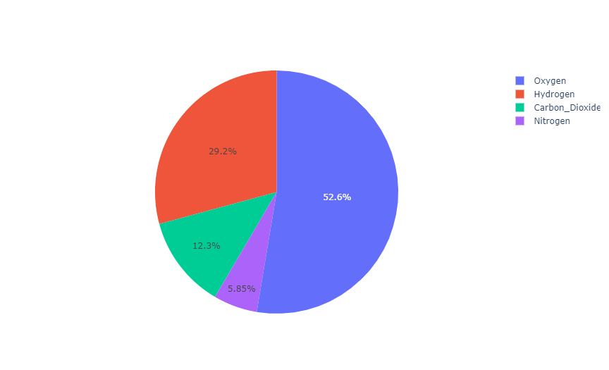
from plotly import graph_objects as go

labels = ['Oxygen','Hydrogen','Carbon_Dioxide','Nitrogen']
values = [4500, 2500, 1053, 500]

fig = go.Figure(data=[go.Pie(labels=labels, values=values)])
fig.show()
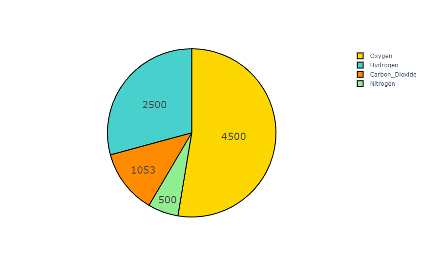
Custom style pie chart
The color of the pie chart can be specified using RGB triples or hexadecimal strings, or it can be used as follows CSS color name.
colors = ['gold', 'mediumturquoise', 'darkorange', 'lightgreen']

fig = go.Figure(data=[go.Pie(labels=['Oxygen','Hydrogen','Carbon_Dioxide','Nitrogen'],
                             values=[4500,2500,1053,500])])
fig.update_traces(hoverinfo='label+percent', textinfo='value', textfont_size=20,
                  marker=dict(colors=colors, line=dict(color='#000000', width=2)))
fig.show()
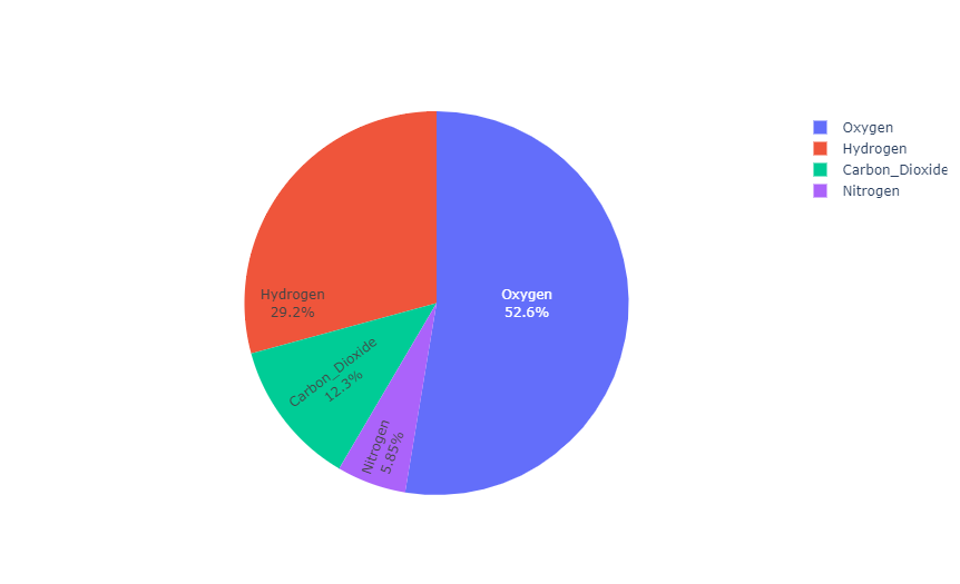
Controls the text direction within the sector
The insidetextorientation property controls the orientation of the text in the sector. When set to auto, the text is automatically rotated to the angle of the largest available font size. Use horizontal (or radial, tangent) to force the specified direction.
For charts created using plot express, use fig.update_ Trace (inside text orientation = '...') to change the text direction.
labels = ['Oxygen','Hydrogen','Carbon_Dioxide','Nitrogen']
values = [4500, 2500, 1053, 500]

fig = go.Figure(data=[go.Pie(
    labels=labels, values=values,
    textinfo='label+percent',
    insidetextorientation='radial'
)])
fig.show()
Pull out the sector from the center of the pie chart
For a pie chart with a "pull" or "spread" layout, please use the pull parameter. It can be a scalar value that pulls all sectors outward, or an array that pulls specific sectors apart.
labels = ['Oxygen','Hydrogen','Carbon_Dioxide','Nitrogen']
values = [4500, 2500, 1053, 500]

fig = go.Figure(data=[
    # The 'pull' parameter is expressed as a percentage of the pie chart radius
    go.Pie(labels=labels, values=values, pull=[0, 0, 0.2, 0])
])
fig.show()
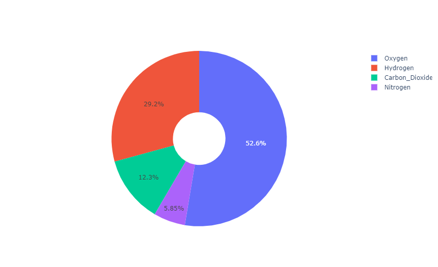
Torus
labels = ['Oxygen','Hydrogen','Carbon_Dioxide','Nitrogen']
values = [4500, 2500, 1053, 500]

# Use the 'hole' parameter to create a doughnut, and the 30% radius near the center of the circle is left blank
fig = go.Figure(data=[go.Pie(labels=labels, values=values, hole=0.3)])
fig.show()
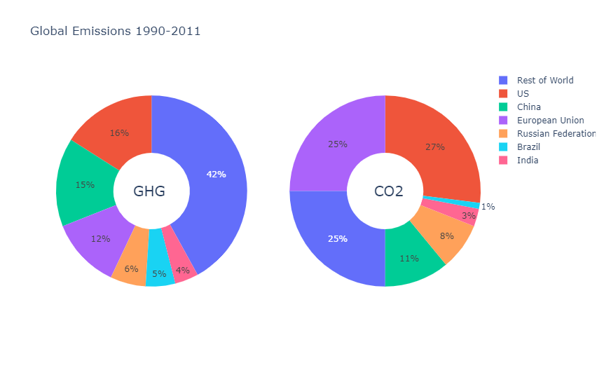
Pie chart in subgraph
from plotly.subplots import make_subplots

labels = ["US", "China", "European Union",
          "Russian Federation", "Brazil",
          "India", "Rest of World"]
# Create subgraph
fig = make_subplots(
    rows=1, cols=2,
    # Use the 'domain' type for subgraphs that contain pie charts
    specs=[[{'type': 'domain'}, {'type': 'domain'}]]
)
fig.add_trace(go.Pie(
    labels=labels, name="GHG Emissions",
    values=[16, 15, 12, 6, 5, 4, 42]
), 1, 1)      # Specify subgraph location (row / column)
fig.add_trace(go.Pie(
    labels=labels, name="CO2 Emissions",
    values=[27, 11, 25, 8, 1, 3, 25]
), 1, 2)
# Update line
fig.update_traces(
    hole=0.4,                           # Use the 'hole' parameter to create a doughnut
    hoverinfo="label+percent+name"      # Specifies the information in the floating label
)
# Update layout
fig.update_layout(
    title_text="Global Emissions 1990-2011",
    # Add a child icon in the center of the doughnut
    annotations=[
        # Set 'showarrow' to 'False' to turn off the label indicator
        dict(text='GHG', x=0.18, y=0.5, font_size=20, showarrow=False),
        dict(text='CO2', x=0.82, y=0.5, font_size=20, showarrow=False)
    ]
)
fig.show()
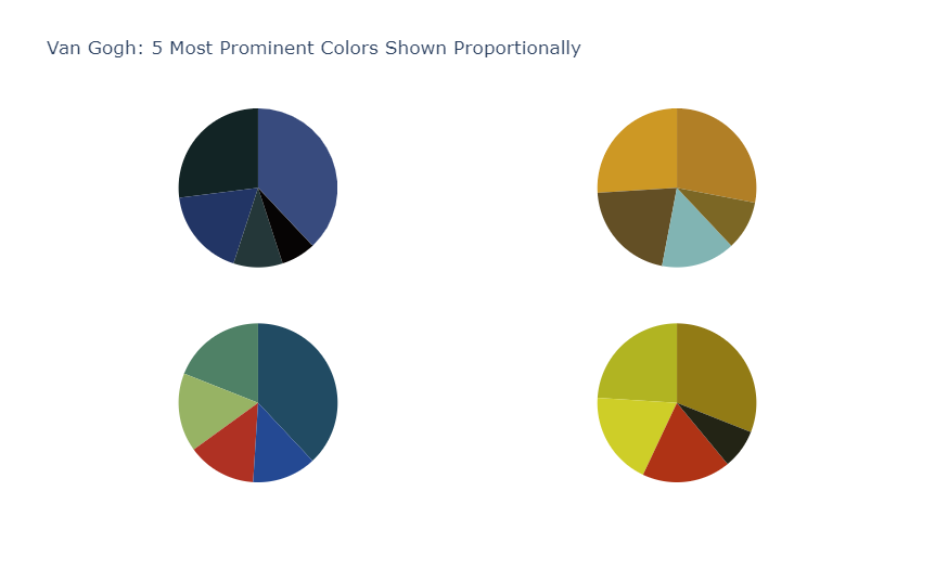
labels = ['1st', '2nd', '3rd', '4th', '5th']
# Define the color group of the subgraph
night_colors = ['rgb(56, 75, 126)', 'rgb(18, 36, 37)', 'rgb(34, 53, 101)',
                'rgb(36, 55, 57)', 'rgb(6, 4, 4)']
sunflowers_colors = ['rgb(177, 127, 38)', 'rgb(205, 152, 36)',
                     'rgb(99, 79, 37)', 'rgb(129, 180, 179)',
                     'rgb(124, 103, 37)']
irises_colors = ['rgb(33, 75, 99)', 'rgb(79, 129, 102)',
                 'rgb(151, 179, 100)', 'rgb(175, 49, 35)',
                 'rgb(36, 73, 147)']
cafe_colors =  ['rgb(146, 123, 21)', 'rgb(177, 180, 34)',
                'rgb(206, 206, 40)', 'rgb(175, 51, 21)',
                'rgb(35, 36, 21)']
# Create subgraph
specs = [[{'type':'domain'}, {'type':'domain'}],
         [{'type':'domain'}, {'type':'domain'}]]
fig = make_subplots(rows=2, cols=2, specs=specs)
# Define pie chart
fig.add_trace(go.Pie(
    labels=labels, values=[38, 27, 18, 10, 7],
    name='Starry Night', marker_colors=night_colors
), 1, 1)
fig.add_trace(go.Pie(
    labels=labels, values=[28, 26, 21, 15, 10],
    name='Sunflowers', marker_colors=sunflowers_colors
), 1, 2)
fig.add_trace(go.Pie(
    labels=labels, values=[38, 19, 16, 14, 13],
    name='Irises', marker_colors=irises_colors
), 2, 1)
fig.add_trace(go.Pie(
    labels=labels, values=[31, 24, 19, 18, 8],
    name='The Night Café', marker_colors=cafe_colors
), 2, 2)

# Adjust layout and suspension information
fig.update_traces(hoverinfo='label+percent+name', textinfo='none')
fig.update(
    layout_title_text='Van Gogh: 5 Most Prominent' +
                      'Colors Shown Proportionally',
    layout_showlegend=False
)
fig = go.Figure(fig)
fig.show()
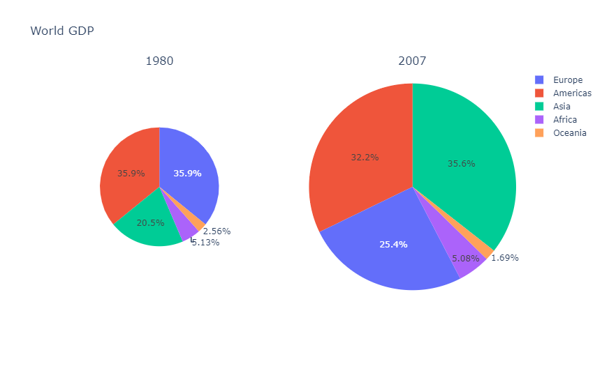
Draw a chart in which the area is proportional to the total
Graphs in the same scalegroup are represented by areas proportional to their total size.
labels = ["Asia", "Europe", "Africa", "Americas", "Oceania"]
fig = make_subplots(
    specs=[[{'type':'domain'}, {'type':'domain'}]],
    subplot_titles=['1980', '2007'], rows=1, cols=2
)
fig.add_trace(go.Pie(
    labels=labels, values=[4, 7, 1, 7, 0.5],
    scalegroup='one', name="World GDP 1980"
), 1, 1)
fig.add_trace(go.Pie(
    labels=labels, values=[21, 15, 3, 19, 1],
    scalegroup='one', name="World GDP 2007"
), 1, 2)
fig.update_layout(title_text='World GDP')
fig.show()
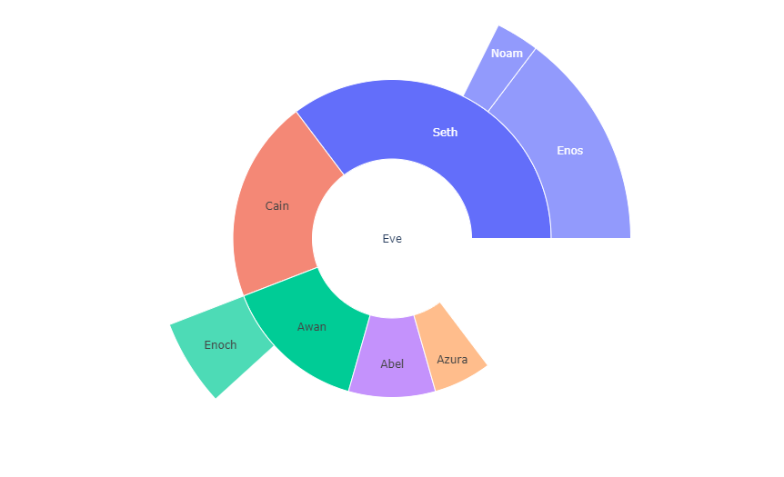
See also: rising sun chart
For a multi-level pie chart representing hierarchical data, you can use the sunrise chart. A simple example is given below. For more information, see Sunrise chart tutorial.
fig =go.Figure(go.Sunburst(
    labels=["Eve", "Cain", "Seth", "Enos", "Noam",
            "Abel", "Awan", "Enoch", "Azura"],
    parents=["", "Eve", "Eve", "Seth", "Seth",
             "Eve", "Eve", "Awan", "Eve" ],
    values=[10, 14, 12, 10, 2, 6, 6, 4, 4],
))
fig.update_layout(margin = dict(t=0, l=0, r=0, b=0))
fig.show()
reference resources
For more information and chart attribute options, see: