Page Layout Solution
Centralized layout
horizontally
The child element is in the middle relative to the parent element and the width of the child element is variable.
In addition to other declarations, the HTML structure is as follows:
<div class="parent">
    <div class="child">Demo</div>
</div>
inline-block + text-align
.parent {
    text-align: center;
}

.child {
    display: inline-block;
    width: 300px; /*Variable width*/
    background: #ffff00;
}
Advantage
- Good compatibility (even IE6 and IE7)
table + margin
<div class="parent">
    <div class="child">Demo</div>
</div>

.parent {
    text-align: center;
}

.child {
    display: table;
    margin: 0 auto;
    width: 200px; /*Variable width*/
    background: #ffff00;
}
NOTE: display: table is similar to block element in performance, but its width is content width.
Advantage
- There is no need to set the parent element style (IE8 or above is supported)
NOTE: Compatibility with IE8 versions below needs to be adjusted to <table> results.
absolute + transform
.parent {
    position: relative;
    text-align: center;
}

.child {
    position: absolute;
    left: 50%;
    transform: translateX(-50%);
    width: 200px; /*Variable width*/
    background: #ffff00;
}
Advantage
- Absolute positioning is separated from the document flow and will not affect the layout of subsequent elements.
- The absolute positioning position of the child element is absolute; the relative positioning position of the parent element is relative; it is a typical positioning method, which is mostly used to set reference points for the positioning of the child element.
shortcoming
- Transf is a CSS3 attribute and has compatibility issues.
NOTE: The translateX and translateY of the transform attribute rotate, zoom, move, or tilt elements, where the mobility function can be used for positioning.
flex + justify-content
.parent {
    display: flex;
    justify-content: center;
    text-align: center;
}

.child {
    width: 200px; /*Variable width*/
    background: #ffff00;
}

/* The following methods can achieve the same effect */
.parent {
    display: flex;
    text-align: center;
}

.child {
    margin: 0 auto;
    width: 200px; /*Variable width*/
    background: #ffff00;
}
Advantage
- You only need to set the parent element attributes, not the child elements.
Advantage
- flex has compatibility issues.
Vertical Centralization
The child element is in the middle relative to the parent element and the height of the child element is variable.
table-cell + vertical-align
.parent {
    display: table-cell;
    vertical-align: middle;
    height: 200px;
    background: #ffff00;
}
Advantage
- Good compatibility (support IE8, the following version needs to adjust the page structure to table)
absolute + transform
.parent {
    position: relative;
    width: 200px;
    height: 200px;
    background: #ffff00;
}

.child {
    position: absolute;
    top: 50%;
    left: 50%;
    transform: translate(-50%, -50%);
}
Advantage
- Absolute positioning is separated from the document flow and will not affect the layout of subsequent elements. But if the absolute positioning element is the only element, the parent element will lose height.
shortcoming
- Transf is a CSS3 attribute and has compatibility issues.
flex + align-items
.parent {
    display: flex;
    align-items: center; /*Vertical Centralization*/
    justify-content: center; /*horizontally*/
    width: 200px;
    height: 200px;
    background: #ffff00;
}
Advantage
- You only need to set the parent node properties without setting the child elements.
shortcoming
- Compatibility issues
Horizontal and vertical centering
The general layout of horizontal and vertical residence is Another article It can be used as a reference for learning.
The child elements are horizontally and vertically centered relative to the parent elements, and their height and width are variable.
inline-block + text-align + table-cell + vertical-align
.parent {
    text-align: center;
    display: table-cell;
    vertical-align: middle;
    width: 300px; /*Variable width and height*/
    height: 300px;
    background: #ffff00;
}

.child {
    display: inline-block;
}
Advantage
- Good compatibility
absolute + transform
.parent {
    position: relative;
    width: 300px; /*Variable width and height*/
    height: 300px;
    background: #ffff00;
}

.child {
    position: absolute;
    top: 50%;
    left: 50%;
    transform: translate(-50%, -50%);

}
Advantage
- Absolute positioning is separated from the document flow and will not affect the layout of subsequent elements.
shortcoming
- Transf is a CSS3 attribute and has compatibility issues.
flex + justify-content + align-items
.parent {
    display: flex;
    justify-content: center;
    align-items: center;
    width: 300px; /*Variable width and height*/
    height: 300px;
    background: #ffff00;
}
Advantage
- You only need to set the parent node properties without setting the child elements.
Multiple Column Layout
Multi-column layout is very common in web pages (for example, two-column layout). Multi-column layout can be two-column fixed-width, one-column adaptive, or multi-column variable-width one-column adaptive, as well as equal-level layout.
A column of fixed width, a column of adaptive
In addition to other declarations, the HTML structure is as follows:
<div class="parent">
    <div class="left">
        <p>left</p>
    </div>
    <div class="right">
        <p>right</p>
        <p>right</p>
    </div>
</div>
float + margin
p {
    margin: 0; /*Remove the default margin of the p tag*/
}

.left {
    float: left;
    width: 100px;
    background: #ffff00;
}

.right {
    margin-left: 100px;
    background: #c7254e;
}
float + margin + (fix)Modified version<div class="parent"> <div class="left"> <p>left</p> </div> <div class="right-fix"> <div class="right"> <p>right</p> <p>right</p> </div> </div> </div> p { margin: 0; /*Remove the default margin of the p tag*/ } .left { float: left; width: 100px; background: #ffff00; position: relative; } .right-fix { float: right; width: 100%; margin-left: -100px; } .right { margin-left: 100px; background: #c7254e; }
NOTE: This method will not have a 3-pixel BUG in IE6, but. left is not optional. It needs to set. left {position: relative} to improve the level. This method can be applied to multi-version browsers (including IE6). The disadvantage is the redundant HTML text structure.
float + overflow
p {
    margin: 0; /*Remove the default margin of the p tag*/
}

.left {
    float: left;
    width: 100px;
    background: #ffff00;
}

.right {
    overflow: hidden;
    background: #c7254e;
}
Setting overflow: hidden triggers block-level formatted text in BFC mode (Block Formatting Context). Content in BFC is isolated from external elements.
overflow: hidden;In addition to hiding the overflow content, it also has the function of clearing floating. The specific implementation is triggering.BFCperhapsIFC,This is also a very common method.overflow: hidden;Cut the overlap with the parent element display area, only inBFCArea display to achieve floating clearance.
clear: both;It's a classic method to remove floats, but it works withoverflow: hidden;There is a big difference.clear: both;It is to clear the floating elements on the same side of the parent element, that is, no other floating contents are allowed on the same side, and the child elements need to be displayed in a new line. If the layout objective is to have other floating elements on the same side, you can chooseoverflow: hidden;. This feature is calledFloating element closure. If you have friends who are interested in this feature or who have studied it thoroughly, please give more advice. This is a solution.Height collapse,triggerBFCIt is widely used and very practical.
table
.parent {
    display: table;
    width: 100%;
    table-layout: fixed;
}

.left {
    display: table-cell;
    width: 100px;
    background: #ffff00;
}

.right {
    display: table-cell;
    /*Width is Residual Width*/
    background: #c7254e;
}
tableThe display characteristics are that the cell width of each column and the table width must be equal.table-layout: fixed;Accelerate rendering and set layout priority.NOTE:
table-cellCan not be set inmarginBut throughpaddingTo set the spacing.
flex
.parent {
    display: flex;
}

.left {
    width: 100px;
    background: #ffff00;
}

.right {
    flex: 1;
    background: #c7254e;
}
NOTE: flex-item defaults to content width.
shortcoming
- Compatibility issues with low-version browsers.
- Performance issues, only suitable for small-scale layout.
Two columns of fixed width, one column of adaptive
In addition to other declarations, the HTML structure is as follows:
<div class="parent">
    <div class="left">
        <p>left</p>
    </div>
    <div class="center">
        <p>center</p>
    </div>
    <div class="right">
        <p>right</p>
        <p>right</p>
    </div>
</div>
p {
    margin: 0; /*Remove the default margin of the p tag*/
}

.left, .center {
    float: left;
    width: 100px;
    background: #ffff00;
}

.right {
    overflow: hidden;
    /*Equivalent to*/
    /*flex: 1 1 0;*/
    background: #c7254e;
}
The implementation of multi-column width determination can be modified and implemented according to the example of single-column width determination.
One Rank of Indefinite Width + One Rank of Adaptation
The width of the indefinite width is determined by the content. The following are the ways to achieve this effect:
- float + overflow, this method has compatibility problems in IE6
- table, this method has compatibility problems in IE6
- flex, this method has compatibility problems with IE9 and its following versions
Multi-column Indefinite Width+One-column Adaptation
Its solution is similar to that of one column of indefinite broadening and one column of adaptive.
Multi-column and equal layout
In addition to other declarations, the HTML structure is as follows:
<div class="parent">
    <div class="column">
        <p>1</p>
    </div>
    <div class="column">
        <p>2</p>
    </div>
    <div class="column">
        <p>3</p>
    </div>
    <div class="column">
        <p>4</p>
    </div>
</div>
float
.parent {
    /*margin-left: -20px;*/
}

.column {
    float: left;
    width: 25%;
    box-sizing: border-box;
    /*padding-left: 20px;*/
    background: #c7254e;
}
NOTE: This method can be perfectly compatible with IE8 versions or more. NOTE+: The structure and style of this method are coupled.
table
<div class='parent-fix'>
    <div class="parent">
        <div class="column">
            <p>1</p>
        </div>
        <div class="column">
            <p>2</p>
        </div>
        <div class="column">
            <p>3</p>
        </div>
        <div class="column">
            <p>4</p>
        </div>
    </div>
</div>

.parent-fix {
    /*margin-left: -20px;*/
}

.parent {
    display: table;
    width: 100%;
    /*You can have layout first, or you can divide the cell width equally without setting it up.*/
    table-layout: fixed;
}

.column {
    display: table-cell;
    /*padding-left: 20px;*/
    background: #c7254e;
}
NOTE: The disadvantage is that there are more text results.
flex
.parent {
    display: flex;
}

.column {
    flex: 1;
    background: #c7254e;
}
NOTE: flex is characterized by allocating the remaining space. NOTE+: Compatibility issues.
Two-column contour layout
In addition to other declarations, the HTML structure is as follows:
<div class="parent">
    <div class="left">
        <p>left</p>
    </div>
    <div class="right">
        <p>right</p>
        <p>right</p>
    </div>
</div>
table
tableThe feature is equal width per column, and equal height per row can be used to address this requirement..parent { display: table; width: 100%; table-layout: fixed; } .left { display: table-cell; background: #ffff00; } .right { display: table-cell; background: #c7254e; }
flex
Two-column layout, one fixed-width column and one adaptive column
.parent {
    display: flex;
}

.left {
    width: 100px;
    background: #ffff00;
}

.right {
    flex: 1;
    background: #c7254e;
}
float
.parent {
    overflow: hidden;
}

.left, .right {
    padding-bottom: 99px;
    /*Set a large value of 9999px here, which actually meets a certain size.*/
    margin-bottom: -99px;
}

.left {
    float: left;
    width: 100px;
    background: #ffff00;
}

.right {
    overflow: hidden;
    background: #c7254e;
}
NOTE: This method is pseudo-contour (only the height of background display is equal), and the true height of left and right is actually different. NOTE+: This method has good compatibility.
Full screen layout
In addition to other declarations, the HTML structure is as follows:
<div class="parent">
    <div class="top"></div>
    <div class="middle">
        <div class="left"></div>
        <div class="right"></div>
    </div>
    <div class="bottom"></div>
</div>
Fixed Widening Demand
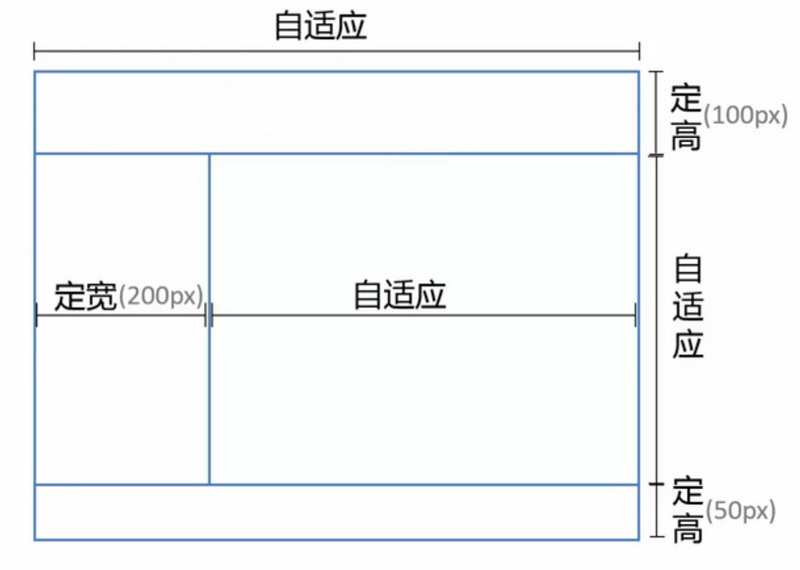
Implementation scheme
- position routine scheme
- New Implementation of flex CSS3
position
<div class="parent">
    <div class="top"></div>
    <div class="left"></div>
    <div class="right"></div>
    <div class="bottom"></div>
</div>

html, body, .parent {
    height: 100%;
    /*Used to hide scrollbars*/
    overflow: hidden;
}

.top {
    /*Location relative to body*/
    position: absolute;
    top: 0;
    left: 0;
    right: 0;
    height: 100px;
    background: #ffff00;
}

.left {
    position: absolute;
    top: 100px;
    left: 0;
    bottom: 50px;
    width: 200px;
    background: #c7254e;
}

.right {
    position: absolute;
    left: 200px;
    top: 100px;
    right: 0;
    bottom: 50px;
    overflow: auto;
    background: #5cb85c;
}

.bottom {
    position: absolute;
    left: 0;
    right: 0;
    bottom: 0;
    height: 50px;
    background: #2a6496;
}
Flex
html, body, .parent {
    height: 100%;
    /*Used to hide scrollbars*/
    overflow: hidden;
    margin: 0;
    padding: 0;
}

.parent {
    display: flex;
    flex-direction: column;
}

.top {
    height: 100px;
    background: #ffff00;
}

.bottom {
    height: 50px;
    background: #2a6496;
}

.middle {
    /*Centralized adaptive*/
    display: flex;
    flex: 1;
    /*flex-direction: row Default value*/
}

.left {
    width: 200px;
    background: #c7254e;
}

.right {
    flex: 1;
    overflow: auto;
    background: #5cb85c;
}
Percentage Width Requirements
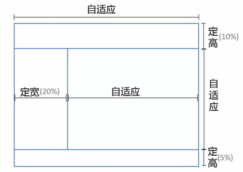
It is only necessary to change the implementation of fixed width height (px as the unit value) to percentage (%).
Content adaptation
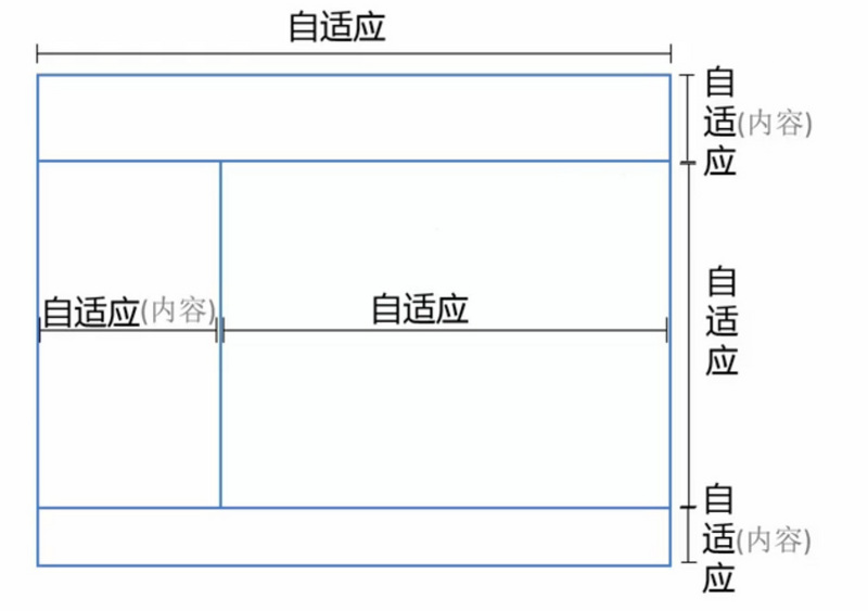
Only the right column occupies the remaining position, and the rest of the space needs to be changed according to the content. So the positioning method of postion is not suitable for this scheme. Two layout schemes are listed below:
- flex
- grid, W3C draft is not stable, browser support is not ideal.
flex
Only if the width and height are not limited, the content can be adaptively arranged. Remove the width and height set in the implementation of fixed width.