This article will introduce how to use HTML/CSS to create various basic progress bars and fancy progress bars and their animation. Through this article, you may learn:
- Create progress bar with HTML tag < meter >
- Create progress bar with HTML tag < progress >
- Limitations of HTML implementation progress bar
- Create a normal progress bar and its animation using CSS percentages and gradients
- Creating a doughnut progress bar using CSS
- Create a spherical progress bar using CSS
- Create a 3D progress bar using CSS
Progress bar is one of the most commonly used in our daily interface. Let's take a look. How can we achieve the progress bar today.
HTML tags -- meter & progress
This may not be clear to some students. HTML5 native provides two tags < meter > and < progress > to implement the progress bar.
- < meter >: used to display scalar value or fractional value of known range
- < progress >: used to display the completion progress of a task. Usually, this element is displayed as a progress bar
Let's take a look at the < meter > tag:
<p>
    <span>Degree of completion:</span>
    <meter min="0" max="500" value="350">350 degrees</meter>
</p>
meter {
    width: 200px;
}
The style is as follows:

Where min, max and value respectively represent the maximum value, and the minimum value and the current value.
Coincidentally, let's look at the usage of the < progress > tag:
<p>
    <label for="file">Degree of completion:</label>
    <progress max="100" value="70"> 70% </progress>
</p>
progress {
    width: 200px;
}
The style is as follows:

The max attribute describes the total workload of the task represented by the progress element, and the value attribute is used to specify the completed workload of the progress bar.
Difference between meter & progress
As like as two peas of the two labels, what are the differences between the Demo and the tag? Why are there two labels that look the same?
The biggest difference between the two elements lies in the semantic difference.
- < meter >: indicates the scalar measured value or fractional value within the known range
- < progress >: indicates the completion progress of the task
For example, < progress > should be used for the current completion degree of a demand, and meter should be used to display the current speed value of the car dashboard.
Limitations of meter & progress
Of course, you will hardly see the < meter > and < progress > tags in the actual business requirements or production environment.
And we in this article-- Implementation of filterable drop-down boxes using datalist The reasons mentioned are similar in that:
- We cannot effectively modify the styles of < meter > and < progress > labels, such as background color, progress foreground, etc. Moreover, the most fatal thing is that the performance of browser default style is inconsistent between different browsers. This is a disastrous disadvantage for businesses that pursue stability and consistent UI performance!
- We can't add some animation effects and interactive effects to it, because in some actual application scenarios, it's certainly not a simple display of a progress bar, that's all
Using CSS to realize progress bar
Therefore, at this stage, we still use some CSS to realize the progress bar.
Use percentage to achieve progress bar
The most common way is to use the background color to match the percentage to make the progress bar.
The simplest DEMO:
<div class="g-container">
    <div class="g-progress"></div>
</div>
.g-container {
    width: 240px;
    height: 25px;
    border-radius: 25px;
    background: #eee;
}
.g-progress {
    width: 50%;
    height: inherit;
    border-radius: 25px 0 0 25px;
    background: #0f0;
}
The effects are as follows:

The advantage of this method is that it is easy to use, and the actual progress can be easily passed into CSS
- Use the HTML style attribute to fill in the complete width value, such as < div class = "g-progress" style = "width: 50%" > < / div >
- Or use the CSS custom attribute < div class = "g-progress" style = "-- progress: 50%" > < / div > to match the width: var(--progress) in the actual CSS
- Complete custom style, and can easily add auxiliary rich animation and interactive effects
For example, add a transition effect to g-progress:
.g-progress {
    // ...
    transition: width .2s linear;
}
In this way, each progress change is a dynamic transition process:

Or, for gradient foreground, change background: #0f0 to background: linear gradient (90DEG, #0f0, #0ff):

Single label implementation using gradient
Of course, we can see that we use the structure of two labels:
<div class="g-container">
    <div class="g-progress"></div>
</div>
Stingy, we can also use only one label to complete this task, mainly with the help of gradient:
<div class="g-progress"></div>
.g-progress {
    width: 240px;
    height: 25px;
    border-radius: 25px;
    background: linear-gradient(90deg, #0f0, #0ff 70%, transparent 0);
    border: 1px solid #eee;
}
The results are as follows:

Similarly, we can use the HTML style attribute to fill in the complete background value to pass the actual percentage. Of course, it is more recommended to use CSS custom attribute to pass the value:
<div class="g-progress" style="--progress: 50%"></div>
.g-progress {
    background: linear-gradient(90deg, #0f0, #0ff var(--progress), transparent 0);
}
Students familiar with CSS will find a disadvantage of this method at present. When modifying the value of -- progress, even if transition is added to. g-progress, there will be no transition animation effect.
The reason is that in CSS, gradients (such as linear gradient, radial gradient and conic gradient) do not support transition transformation.
Therefore, in order to achieve animation effect, we can use CSS @property to transform our code:
<div class="g-progress" style="--progress: 70%"></div>
@property --progress {
  syntax: '<percentage>';
  inherits: false;
  initial-value: 0%;
}

.g-progress {
    margin: auto;
    width: 240px;
    height: 25px;
    border-radius: 25px;
    background: linear-gradient(90deg, #0f0, #0ff var(--progress), transparent 0);
    border: 1px solid #eee;
    transition: .3s --progress;
}
With the help of CSS @property, we can also achieve animation effect under single label:

CodePen Demo -- progress bar effect of single label
If you don't know about CSS @property, you can take a look at my article-- CSS @property, making the impossible possible
Of course, not only the percentage, and gradient methods mentioned above can realize the most common progress bar, but all the methods that can realize length change can actually be used to realize the progress bar, including but not limited to:
- Width (width in percentage is more direct)
- Ramp (value that controls the percentage of transition points for the ramp)
- Gradient background size
- transfrom: scale() (scaling can also change the width)
- Clip path for clipping
- ... (wait, wait)
It doesn't continue here.
Arc progress bar
Of course, the progress bar cannot be only linear. There are many other types. Let's first look at the arc progress bar.
Today, we can use CSS to quickly create progress bars in arc form, similar to this:

The core is to use the angular gradient background: conic gradient ():
<div class="g-progress"></div>
.g-progress {
    width: 160px;
    height: 160px;
    border-radius: 50%;
    background: conic-gradient(#FFCDB2 0, #FFCDB2 25%, #B5838D 25%, #B5838D);
}
Using the angular gradient background: conic gradient (), we can easily implement such a pie chart:
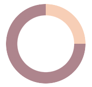
Next is the hollowed out middle part.
The traditional idea is to superimpose a circle in the middle. However, a great disadvantage of this is that it is not applicable if our background is not a solid color but a gradient color. For example:
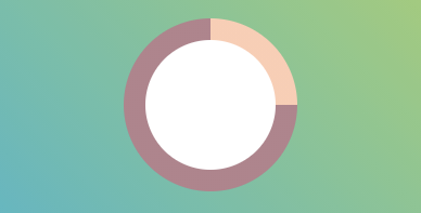
So how to hollow out the middle and make the middle part transparent? Here we can skillfully achieve the goal through the mask attribute, hollowing out the middle:
.g-progress {
    background: conic-gradient(#FFCDB2 0, #FFCDB2 25%, #B5838D 25%, #B5838D);
  + mask: radial-gradient(transparent, transparent 50%, #000 50%, #000 0);
}
In this way, we can easily hollow out the middle, even if the background is not a solid color.
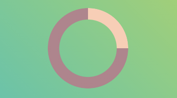
CodePen Demo - arc progress bar with angular gradient
Based on this expansion, multi-color arc progress bar can also be realized:
.g-progress {
    width: 160px;
    height: 160px;
    border-radius: 50%;
    mask: radial-gradient(transparent, transparent 50%, #000 51%, #000 0);
    background:
        conic-gradient(
            #FFCDB2 0, #FFCDB2 25%,
            #B5838D 25%, #B5838D 50%,
            #673ab7 50%, #673ab7 90%,
            #ff5722 90.2%, #ff5722 100%
        );
}
Of course, this may not be like a progress bar, but more like a pie chart?
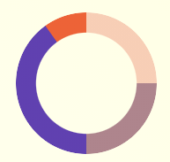
Limitations of realizing arc progress bar with angular gradient
Of course, this method has two disadvantages.
- Of course, when the progress percentage is not similar to 0 °, 90 °, 180 °, 270 ° and 360 °, there will be obvious sawtooth at the junction between different colors when using angular gradient.
For example, conic gradient (#ffcdb2 0, #ffcdb2 27%, #b5838d 27%, #b5838d):
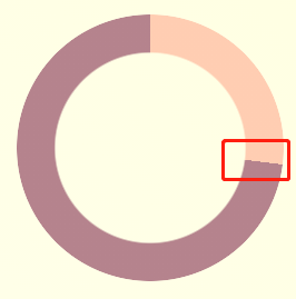
The solution to this problem is to leave some gradient space at the junction. Let's simply transform the above angular gradient code:
{
  - background: conic-gradient(#FFCDB2 0, #FFCDB2 27%, #B5838D 27%, #B5838D)`
  + background: conic-gradient(#FFCDB2 0, #FFCDB2 27%, #B5838D 27.2%, #B5838D)`
}
Look at the above code carefully. Change the change from 27% to 27% to 27.2%. The extra 0.2% is to eliminate aliasing. The actual effect after the change is as follows:
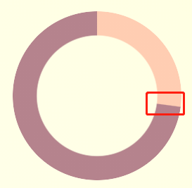
For specific use, you can debug and select more than one range that will not see blur and can eliminate sawtooth as much as possible.
- It is troublesome to realize the circular arc progress bar at the beginning and end
In another case, in actual use, circular arc progress bars with circles at the beginning and end are required, as shown in the following figure:

Of course, this situation can be solved if the progress bar color is solid. We can achieve this effect by superimposing two small circles at the beginning and end.
If the progress bar is gradient, this progress bar needs to be realized with the help of SVG/Canvas.
The above complete circular arc progress bar with rounded corners, you can poke here to see the complete source code-- CodePen Demo -- arc progress bar with circular head and tail
Spherical progress bar
Spherical progress bars are also common, similar to the following:
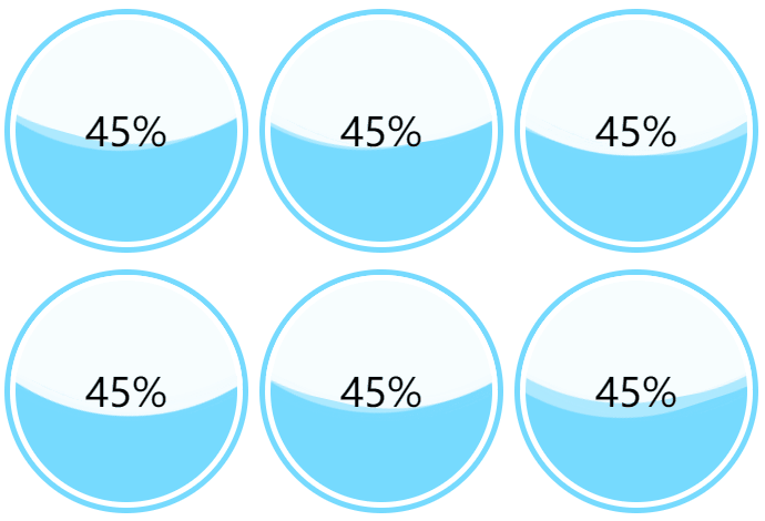
For the spherical progress bar, the core is to use CSS to realize the wave effect in the middle.
This technique should be well known to everyone today. Just repeat it. One picture is worth a thousand words. You can use the way of rolling the big circle, similar to this:
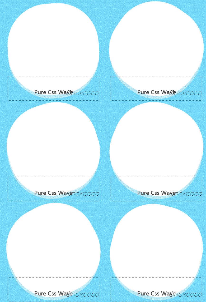
This effect can be obtained by applying overflow: hidden to the container:

If you don't understand this technique, you can hit this article: Pure CSS to achieve wave effect!
To apply this technique, you only need to simply package and control the height of the wave when the spherical container represents 0% - 100% of the progress. We can get animation effects from 0% - 100%.
The complete code is as follows:
<div class="container">
    <div class="wave-change"></div>
    <div class="wave"></div>
</div>
.container {
    width: 200px;
    height: 200px;
    border: 5px solid rgb(118, 218, 255);
    border-radius: 50%;
    overflow: hidden;
}
.wave-change {
    position: absolute;
    width: 200px;
    height: 200px;
    left: 0;
    top: 0;
    animation: change 12s infinite linear;

    &::before,
    &::after{
        content: "";
        position: absolute;
        width: 400px;
        height: 400px;
        top: 0;
        left: 50%;
        background-color: rgba(255, 255, 255, .6);
        border-radius: 45% 47% 43% 46%;
        transform: translate(-50%, -70%) rotate(0);
        animation: rotate 7s linear infinite;
        z-index: 1;
    }

    &::after {
        border-radius: 47% 42% 46% 44%;
        background-color: rgba(255, 255, 255, .8);
        transform: translate(-50%, -70%) rotate(0);
        animation: rotate 9s linear -4s infinite;
        z-index: 2;
    }
}
.wave {
    position: relative;
    width: 200px;
    height: 200px;
    background-color: rgb(118, 218, 255);
    border-radius: 50%;
}

p {
    position: absolute;
    top: 50%;
    left: 50%;
    transform: translate(-50%, -50%);
    font-size: 36px;
    color: #000;
    z-index: 10;
}

@keyframes rotate {
   to {
        transform: translate(-50%, -70%) rotate(360deg);
    }
}
@keyframes change {
    from {
        top: 80px;
    }
    to {
        top: -120px;
    }
}
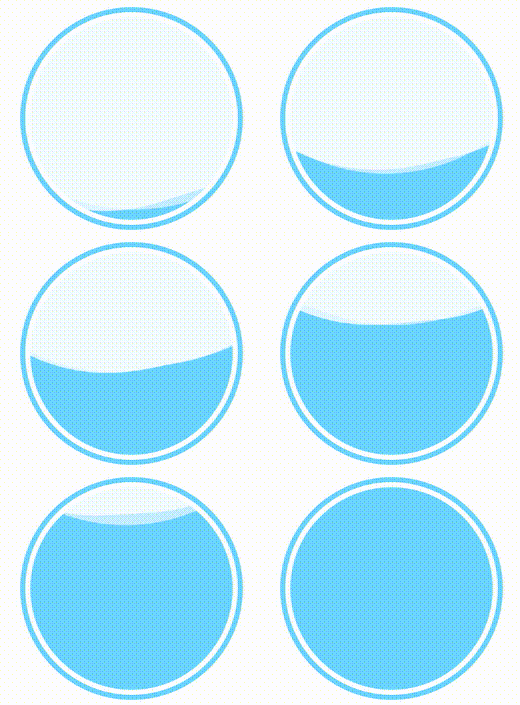
For the complete code example, you can stamp here:
3D progress bar
Well, the following 3D progress bar needs to have a basic grasp of CSS 3D.
You can read this article first-- Fancy CSS 3D animation | what amazing animation can you make with CSS alone?
It mainly uses a 3D cube. Next, let's implement a cube progress bar~
First, implement a cube with the following structure:
<div class="demo-cube perspective">
  <ul class="cube">
    <li class="top"></li>
    <li class="bottom"></li>
    <li class="front"></li>
    <li class="back"></li>
    <li class="right"></li>
    <li class="left"></li>
  </ul>
</div>
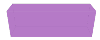
We can imagine this cube as a three-dimensional progress bar container. By controlling the color of 6 sides, we can skillfully get a 3D progress bar effect.
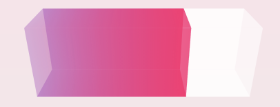
Of course, in fact, we don't need so many faces, just four faces, remove the left and right, and then use the gradient to modify the color of each face of the cube and remove the border. The core CSS code is as follows:
.demo-cube {
  position: relative;

  .cube {
    position: absolute;
    top: 50%;
    left: 50%;
    width: 300px;
    height: 100px;
    transform-style: preserve-3d;
    transform: translate(-50%, -50%) rotateX(-33.5deg);

    li {
      position: absolute;
      width: 300px;
      height: 100px;
      background: linear-gradient(90deg, rgba(156, 39, 176, .3), rgba(255, 34, 109, .8) 70%, rgba(255, 255, 255, .6) 70%, rgba(255, 255, 255, .6));
    }
    .top {
      transform: rotateX(90deg) translateZ(50px);
    }
    .bottom {
      transform: rotateX(-90deg) translateZ(50px);
    }
    .front {
      transform: translateZ(50px);
    }
    .back {
      transform: rotateX(-180deg) translateZ(50px);
    }
  }
}
We can get a very cool 3D progress bar effect:
Use CSS Property to animate the 3D progress bar
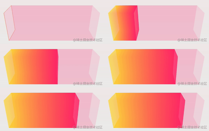
Of course, the progress bar needs a fill animation. Because we use a gradient to achieve the progress of the progress bar, we need to control the color percentage change.
Normally, CSS does not support gradient animation, but it is not difficult for us, because we can use CSS @Property.
Simply modify the code:
@property --per {
  syntax: '<percentage>';
  inherits: false;
  initial-value: 0%;
}

.demo-cube .cube {
  .top,
  .front,
  .bottom,
  .back {
    background: linear-gradient(90deg, rgba(255, 217, 34, .6), rgba(255, 34, 109, .8) var(--per), rgba(255, 34, 109, .1) var(--per), rgba(255, 34, 109, .1));
    animation: perChange 6s infinite;
  }
}

@keyframes perChange {
  0% {
    --per: 0%;
  }
  90%,
  to {
    --per: 80%;
  }
}
In this way, we have realized a moving 3D progress bar. We only need to control the -- per CSS custom attribute. The effect is as follows:
If you don't know much about CSS @Property, you can see the author's article-- CSS @property, making the impossible possible , the emergence of CSS has greatly improved the ability of making various animations.
For the complete code above, you can click here: CSS inspiration - 3D cube progress bar
Extension extension
From simple to complex, this paper introduces the way to gradually build a progress bar using HTML/CSS, and gradually deepens the difficulty.
Of course, as the difficulty increases, you get a more cool progress bar.
Based on the above methods, we can basically evolve various progress bars we need. For example, based on the above method, a simple battery charging animation can be realized:
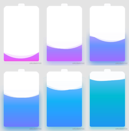
Of course, CSS is ever-changing, and the types of progress bars are certainly not limited to the above categories. For example, we can use the filter to realize the charging animation imitating Huawei mobile phone, which is also a presentation method of progress bar, and can also be realized using pure CSS:
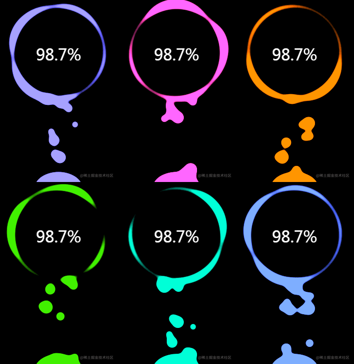
The complete realization of the above effect can be realized-- Clever use of CSS to achieve cool charging animation
Alternatively, we can write on the texture of the progress bar:

The effect comes from CodePen -- Bars By Lucagaz.
In a word, the beautiful world of CSS is worth exploring.
last
Well, this article ends here. I hope this article will help you 😃
More wonderful CSS technical articles are summarized in my Github -- iCSS , continuously updated. Welcome to a star subscription collection.
If you have any questions or suggestions, you can communicate more. The original articles have limited writing style and shallow talents. If there is anything wrong in the article, please let me know.