
Hi Wen Ledao's large TV series "when is davinci updated" finally came to an end in the early autumn of 21 years, followed by the official release of the popular new product datart (Digital Art). This year, we can see that there are many such people in the group

So..

And so on..

What else?

What I haven't seen is that a young and old team is running more than ever. The all-around update of the generation of agile big data is in the product without much to say! We will continue to welcome the time of coexistence and progress with you in the future with our evergreen heart and new art, move forward in your examination and rejoice in your support.
「datart 1.0 alpha」
review
Back in the early autumn of 2017, davinci officially opened its source in github. The first and second editions of davinci focused on how to quickly make the data into the required charts through configuration, so as to meet the needs of configuration visualization. At that time, we learned from excellent open-source projects such as superset, hoping to develop an open-source visualization platform suitable for Chinese people's use habits to help enterprises quickly complete the "last mile of big data".
In the early autumn of 2018, the third edition of davinci was born. Basically, the second edition of davinci was completely knocked down and redone, because our ideas have gradually changed in the process of platform iteration and community polishing. We hope davinci can support enterprises to complete the "last ten kilometers of big data", not only for making visual reports, but also for making large data screens Support mobile terminal, support light data processing, support integration into other systems, support collaborative work of different teams, etc. Based on this understanding, we push down and start again.

The third edition of davinci has achieved great success in the community. Hundreds of enterprises have used davinci in production, or Erkai has provided products and services to its customers. At the same time, we are constantly thinking, where is the next stop of the data visualization platform?
expectation
In the game of different world adventurers, each adventurer has his own positioning and skill tree development route, as well as HP (physical strength) and MP (Magic). As a platform product, the data visualization platform also has its own product positioning and development blueprint, as well as its own HP (Engineering force) and MP (intellectual ability). The next step in upgrading the engineering force of the data visualization platform is to be open, and each possible expansion point should be pluggable (source, view, chart, viz, etc.). The next step in upgrading the intelligent ability of the data visualization platform is to enhance analysis. Visualization is not limited to seeing the current situation of data, but also the trend of data.
Therefore, we pushed down and started again. In the early autumn of 2021, datart was born:
Datart is completely rewritten from product design to kernel code, carrying its new product mission with a new cognitive abstraction. At the initial stage, datart will iterate and fill in the engineering force, and at the later stage, it will explore and move forward in intellectual ability, continuously enhance its openness, intelligence and plasticity, and become the first choice for building an open-source visualization platform.
On the road of tool platform commercialization, we believe in the "power of repetition". In order to continuously improve the reusability of platform products, we are willing to push it down and start again. In the future, datart will find the best balance between data and art and become a legendary weapon for data adventurers to conquer the data world.
Highlights
visualization
-
It supports single data chart editing, style, setting, calculation field, filter, publishing, sharing, downloading, etc
-
Support dashboard / large screen editing, style, auxiliary plug-ins, tabs, linkage, jump, controller, publishing, sharing, downloading, etc
-
Support storyboard editing, setting, publishing, etc
-
Support expandable pluggable new graph table group
Data view
-
Support view SQL development, testing, modeling, etc
-
Support configuration variables, column permissions, and concurrency policies
data source
-
Supports JDBC, FILE and HTTP data sources
-
Support datart server data aggregation
-
Support scalable pluggable new data sources
Timed task
-
Support regular mail sending chart
-
Support regular wechat sending charts
Tenant permissions
-
Support organization based tenant management
-
Support member invitation and role management
-
Support fine-grained permission management of members / roles based on all resources (visualization / data view / data source / scheduled task)
experience
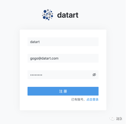
After deployment, enter the system. You need to register for the first time. Click "registered account" in the lower right corner:
After clicking Register, you will receive a confirmation email:
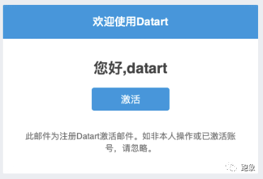
After confirming the email and activating it, you can log in to the system for use

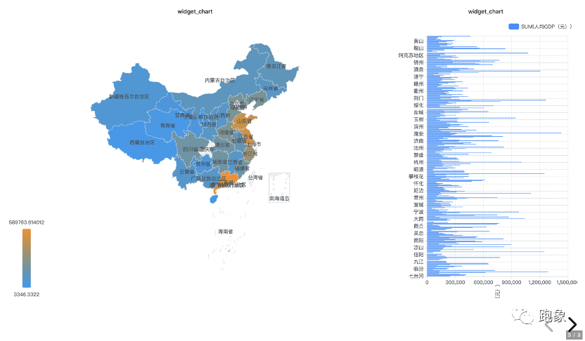
The main navigation bar is on the left. The home page is the display page of the visual directory. There is no content yet. Let's quickly create some visualizations.
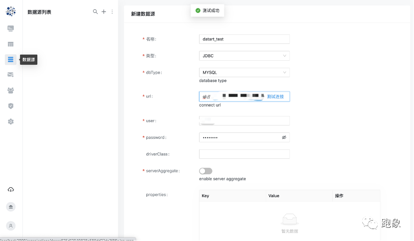
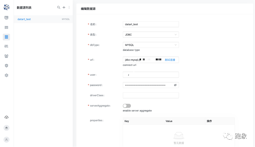
Click the "data source" menu on the main navigation bar to create a mysql data source. Enter the name, select the data source type and fill in the required parameters. Click "test connection". After the test is successful, you can save it:
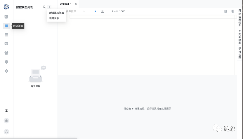
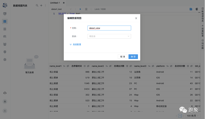
Then click the "data view" menu on the main navigation bar to edit a data view. Click the plus sign in the upper right corner of the data view and select "new data view", and a new tab will be created in the middle editor:
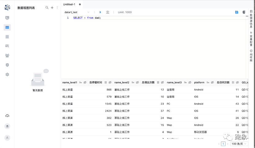
Select the data source just created in the editor toolbar, write SQL, and then click execute on the toolbar to see the execution results below:
You can click the button in the header of the execution result column to edit the field type and permission. After editing, click the Save button in the upper right corner to save the data view:
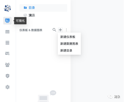
Next, start creating data charts and dashboards, click the "visualization" menu in the main navigation bar to enter the visualization directory, and click the plus sign in the upper right corner of the directory to create it.
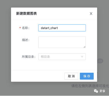
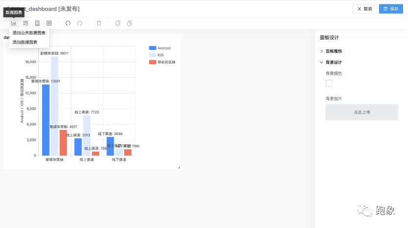
Let's create a public data chart first:
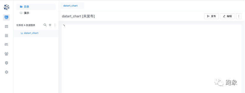
After creation, select the newly created data chart in the directory, and the chart will be displayed in the right area. Because there is no content just created, click the Edit button in the upper right corner to edit :
After entering the editing interface, select the data view just created in the upper left corner. After the field appears, drag the field to the "data" column in the middle to make the chart:
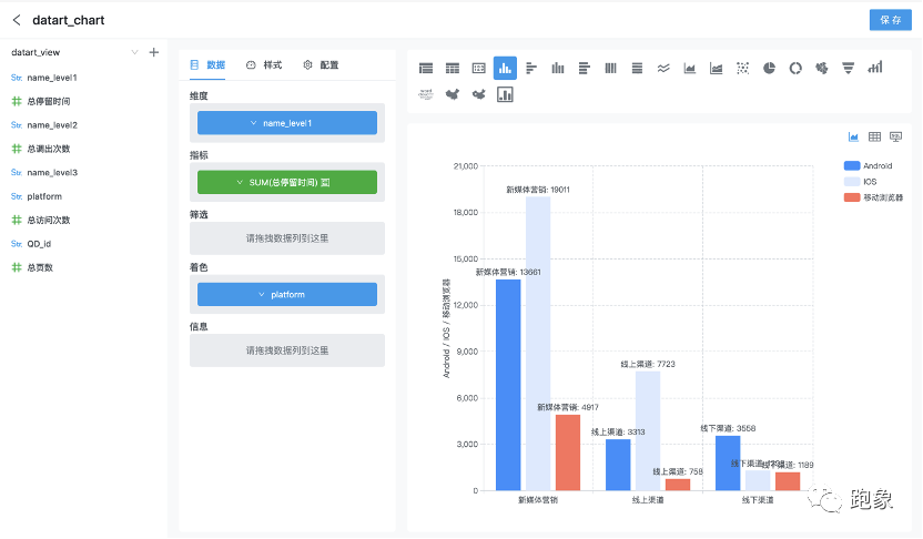
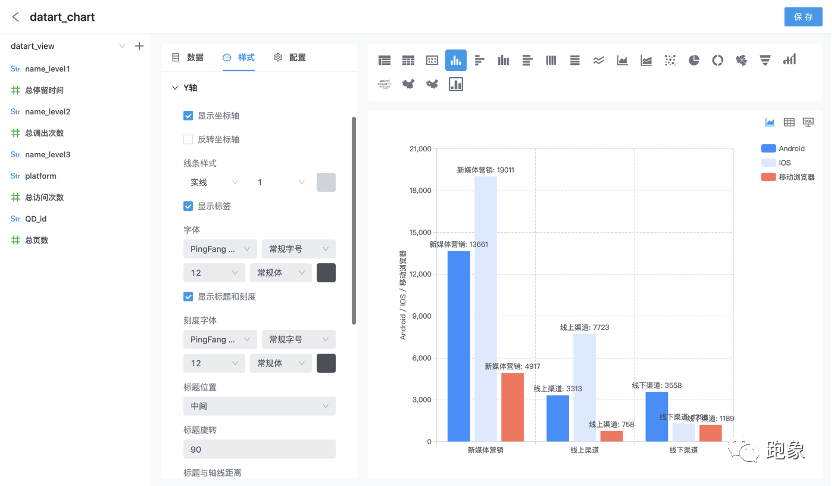
In the "style" column in the middle, you can edit the display style of the chart:
Click save in the upper right corner to create a simple public data chart.
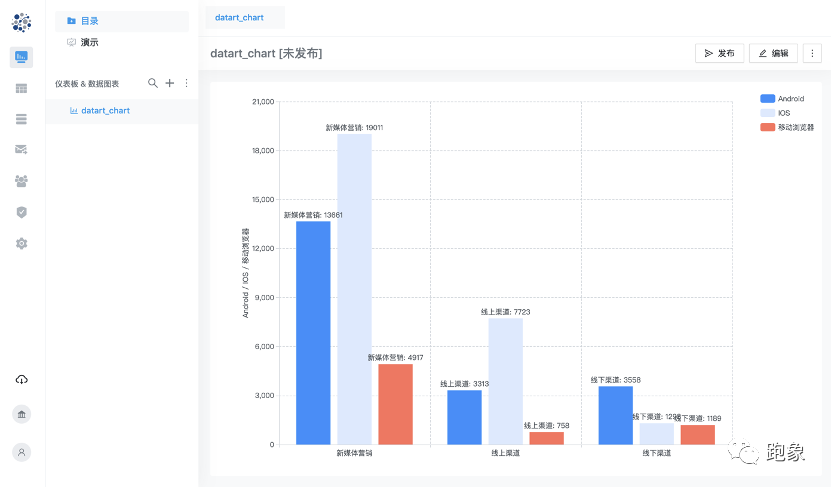
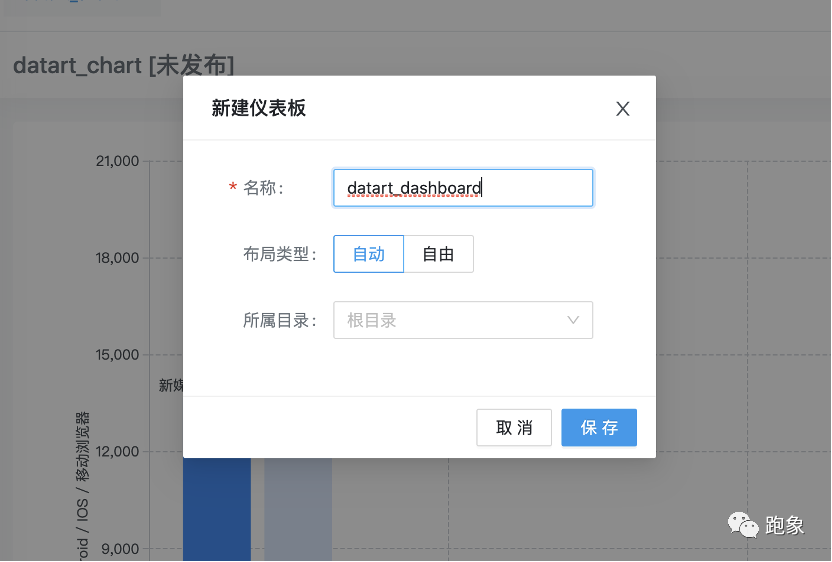
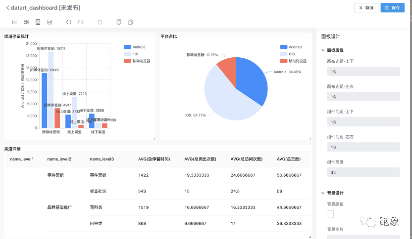
Next, let's create a dashboard. Like the steps of data chart, first click the plus sign in the upper right corner of the directory to create a dashboard on the directory. The dashboard can select "automatic" and "free" layout modes. Different layout modes are suitable for different use scenarios; We first create an automatic layout dashboard. Similarly, after creation, select it in the directory, and then click the Edit button in the right area to edit:
In the editing interface, we can add the public data chart just created to the dashboard, or directly create the data chart in the dashboard:
After some operation, a simple dashboard is made:
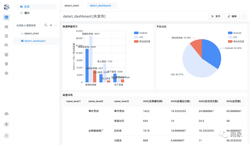
We can select the newly created data chart and dashboard in the left directory to preview, and click the tab at the top of the right area to quickly switch:
Next, we create a storyboard to demonstrate the visual work we just created. Click the "presentation" menu in the upper left corner, and the directory will switch to the storyboard list. Click the plus sign to create a storyboard. Like the dashboard, click the Edit button on the right to create the storyboard:
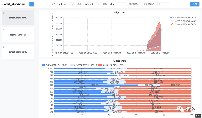
Click the plus button in the upper left corner to add the dashboard just created, and set the transition animation. A story board is ready. Click the play button to play the story version just made:
The above is a simple demonstration of creating visual works by datart. As an open source project, the most important thing is its openness. Datart supports user-defined chart plug-ins, which can be integrated into the system for use without recompiling the front-end code. The following describes how to simply create a user-defined chart plug-in:
First, we start by selecting a drawing engine. For example, EChartJS is a chart drawing engine, while D3JS is a more pure drawing engine. Many datart charts are encapsulated based on EChartJS. Of course, there are many other excellent drawing engines to choose from. Inclusiveness is the core concept of datart plug-in.
A basic plug-in is mainly composed of the following parts:
-
Chart setting configuration items (optional, customized graphics rendering configuration and data view based configuration items)
-
Chart meta information (including chart name, icon information, etc.)
-
Chart dependent class library (third-party resource class library or CSS style)
-
Chart life cycle function (datart callback function, which contains Dom Document and current chart width and height information)
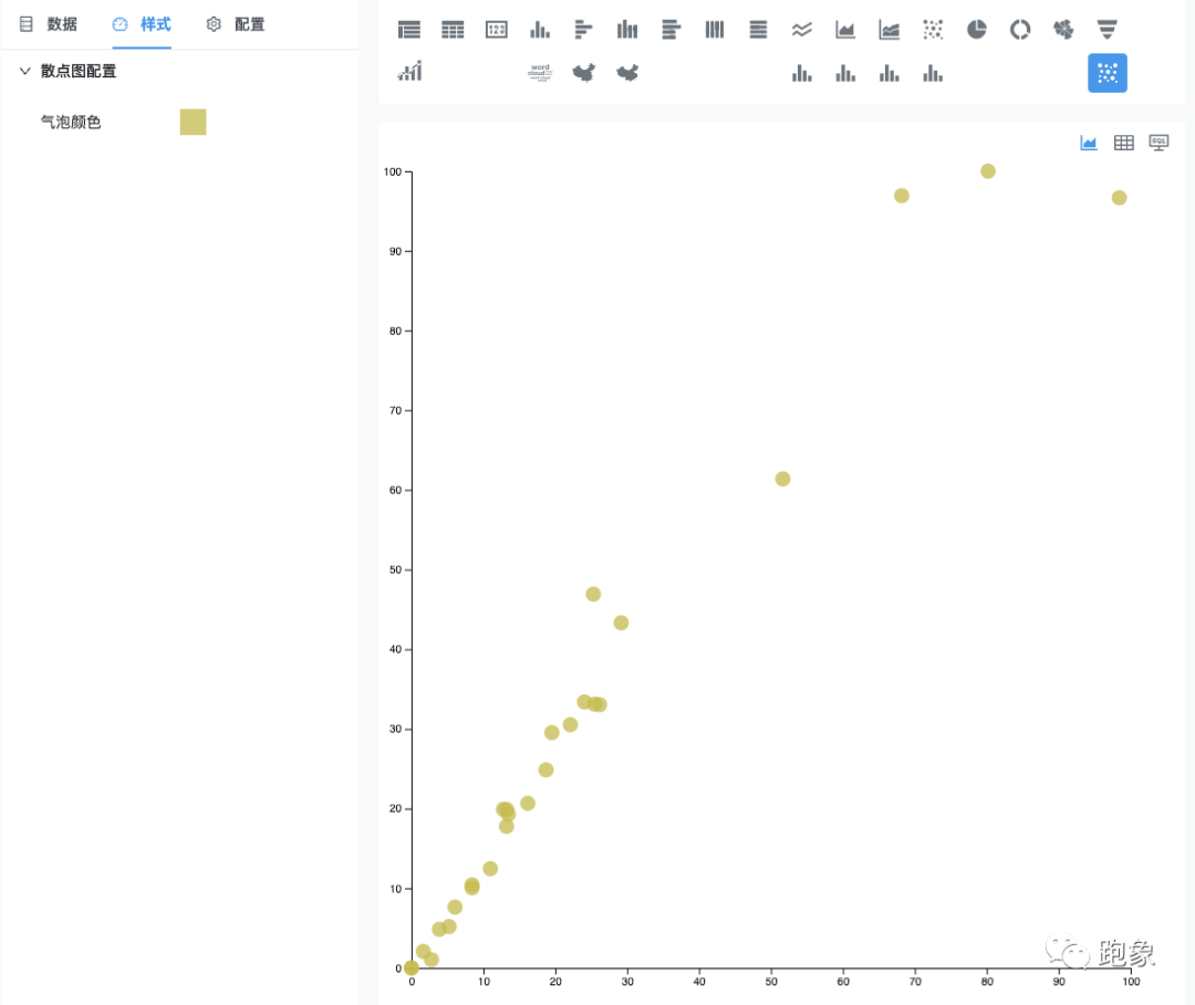
Next, let's take D3JS as an example to draw a scatter diagram:
-
function D3JSScatterChart() {
    //[optional] expand the function of configuration chart to process data in combination with data view
    config: {},

    //[required] load the D3JS drawing engine. Here you only need to give the link of CDN, and Datart will be responsible for loading dependencies.
    dependency: ['https://d3js.org/d3.v5.min.js'],

    //[required] set the basic information of the chart. The icon can be selected from the Datart Icon icon. Customization is not supported temporarily
    meta: {
      id: 'demo-d3js-scatter-chart',
      name: '[Plugin Demo] D3JS Scatter diagram',
      icon: 'star',
    },

    //[required] the life cycle function provided by Datart. Other cycles include onUpdated, onResize and onUnMount
    onMount(options, context) {
      // Get the current Dom object through Datart context
      const host = context.document.getElementById(options.containerId);
      var margin = { top: 10, right: 40, bottom: 30, left: 30 },
        width = context.width - margin.left - margin.right,
        height = context.height - margin.top - margin.bottom;

      //[the following contents can be ignored] drawing method based on D3JS
      this.chart = context.window.d3
        .select(host)
        .append('svg')
        .attr('width', width + margin.left + margin.right)
        .attr('height', height + margin.top + margin.bottom)
        .append('g')
        .attr('transform', 'translate(' + margin.left + ',' + margin.top + ')');

     // ... scatter plot code has been omitted. Please refer to D3JS manual for specific parameters and use
  };
}
With these basic configurations, we can display and use a "static" scatter chart in the chart editor interface of datart. If you want to realize more advanced functions, customize rich chart styles, customize data configuration based on data view, and customize server request parameters, you need to understand the chart setting configuration item (Chart Config), datart tool class (DHelper) and datart Context introduced next, Refer to the datart user manual for more configuration information.
Comments and complete code are given here:
/**
 * Datart
 *
 * Copyright 2021
 *
 * Licensed under the Apache License, Version 2.0 (the "License");
 * you may not use this file except in compliance with the License.
 * You may obtain a copy of the License at
 *
 *     http://www.apache.org/licenses/LICENSE-2.0
 *
 * Unless required by applicable law or agreed to in writing, software
 * distributed under the License is distributed on an "AS IS" BASIS,
 * WITHOUT WARRANTIES OR CONDITIONS OF ANY KIND, either express or implied.
 * See the License for the specific language governing permissions and
 * limitations under the License.
 */

function D3JSScatterChart({ dHelper }) {
  return {
    config: {
      datas: [
        {
          label: 'metrics',
          key: 'metrics',
          required: true,
          type: 'group',
        },
        {
          label: 'deminsion',
          key: 'deminsion',
          required: true,
          type: 'aggregate',
        },
      ],
      styles: [
        {
          label: 'common.title',
          key: 'scatter',
          comType: 'group',
          rows: [
            {
              label: 'common.color',
              key: 'color',
              comType: 'fontColor',
            },
          ],
        },
      ],
      i18ns: [
        {
          lang: 'zh-CN',
          translation: {
            common: {
              title: 'Scatter plot configuration',
              color: 'Bubble color',
            },
          },
        },
        {
          lang: 'en',
          translation: {
            common: {
              title: 'Scatter Setting',
              color: 'Bubble Color',
            },
          },
        },
      ],
    },

    isISOContainer: 'demo-d3js-scatter-chart',
    dependency: ['https://d3js.org/d3.v5.min.js'],
    meta: {
      id: 'demo-d3js-scatter-chart',
      name: '[Plugin Demo] D3JS Scatter diagram',
      icon: 'sandiantu',
      requirements: [
        {
          group: [0, 999],
          aggregate: 2,
        },
      ],
    },

    onMount(options, context) {
      if (!context.document) {
        return;
      }

      const host = context.document.getElementById(options.containerId);
      var margin = { top: 10, right: 40, bottom: 30, left: 30 },
        width = context.width - margin.left - margin.right,
        height = context.height - margin.top - margin.bottom;

      // Initialize D3JS drawing area
      this.chart = context.window.d3
        .select(host)
        .append('svg')
        .attr('width', width + margin.left + margin.right)
        .attr('height', height + margin.top + margin.bottom)
        .append('g')
        .attr('transform', 'translate(' + margin.left + ',' + margin.top + ')');
    },

    onUpdated(options, context) {
      if (!options.dataset || !options.dataset.columns || !options.config) {
        return;
      }

      // Gets the width and height of the current drawing area
      const clientWidth = context.window.innerWidth;
      const clientHeight = context.window.innerHeight;
      const margin = { top: 40, right: 40, bottom: 40, left: 40 };
      const width = clientWidth - margin.left - margin.right;
      const height = clientHeight - margin.top - margin.bottom;

      // Obtain scatter chart data and configuration
      const { data, style } = this.getOptions(options.dataset, options.config);

      // Draw the scatter diagram of abscissa and ordinate axis based on percentage. The following is the D3JS drawing logic
      var x = context.window.d3
        .scaleLinear()
        .domain([0, 100]) // This is the min and the max of the data: 0 to 100 if percentages
        .range([0, width]); // This is the corresponding value I want in Pixel

      this.chart
        .append('g')
        .attr('transform', 'translate(0,' + height + ')')
        .call(context.window.d3.axisBottom(x));

      // X scale and Axis
      var y = context.window.d3
        .scaleLinear()
        .domain([0, 100]) // This is the min and the max of the data: 0 to 100 if percentages
        .range([height, 0]); // This is the corresponding value I want in Pixel

      this.chart.append('g').call(context.window.d3.axisLeft(y));

      // Add 3 dots for 0, 50 and 100%
      this.chart
        .selectAll('whatever')
        .data(data)
        .enter()
        .append('circle')
        .attr('cx', function (d) {
          return x(d.x);
        })
        .attr('cy', function (d) {
          return y(d.y);
        })
        .style('fill', style.color)
        .attr('r', 7);

      this.chart.selectAll('whatever').style('color', 'blue');
    },

    getOptions(dataset, config) {
      // The data set returned by the current server
      const dataConfigs = config.datas || [];

      // Get style configuration information
      const styleConfigs = config.styles;
      const groupConfigs = dataConfigs
        .filter(c => c.type === 'group')
        .flatMap(config => config.rows || []);

      // Get indicator type configuration information
      const aggregateConfigs = dataConfigs
        .filter(c => c.type === 'aggregate')
        .flatMap(config => config.rows || []);

      // For data conversion, a Helper conversion tool is provided according to Datart
      const objDataColumns = dHelper.transfromToObjectArray(
        dataset.rows,
        dataset.columns,
      );

      const data = objDataColumns.map(dc => {
        return {
          x: dc[dHelper.getValueByColumnKey(aggregateConfigs[0])],
          y: dc[dHelper.getValueByColumnKey(aggregateConfigs[1])],
        };
      });

      var xMinValue = Math.min(...data.map(o => o.x));
      var xMaxValue = Math.max(...data.map(o => o.y));

      var yMinValue = Math.min(...data.map(o => o.y));
      var yMaWidthe = Math.max(...data.map(o => o.y));

      // Get user configuration
      const color = dHelper.getStyleValueByGroup(
        styleConfigs,
        'scatter',
        'color',
      );

      return {
        style: {
          color,
        },
        data: data.map(d => {
          return {
            x: ((d.x || xMinValue - xMinValue) * 100) / (xMaxValue - xMinValue),
            y: ((d.y || yMinValue - yMinValue) * 100) / (yMaxValue - yMinValue),
          };
        }),
      };
    },
  };
}
The final effect drawing is as follows:
get along well with
datart github download address:
https://github.com/running-elephant/datart.git
git@github.com:running-elephant/datart.git
https://github.com/running-elephant/datart/releases/tag/1.0.0-alpha.0
Baidu online disk:
Link: https://pan.baidu.com/s/1zW_jsTJk4lYxM6VZDoKGJg
Extraction code: bzuc
More running image technology information:
36 krypton launch | starting from real-time data processing services, "running image technology" completed nearly ten million yuan Angel round financing
https://36kr.com/p/1218126964609668
Egg, datart main creative team:

From elephant Technology
Agile big data asks for small stars~
If you like our platform
Please move to Github
Please order Star for us~
Your efforts to encourage us
It's big!
At the same time, you are also welcome to join the wechat group and communicate point-to-point with the great gods of technology~

Long press the QR code to follow the new trend