Flex layout
Today I have sorted out some Flex layouts and consulted many great Gods'masterpieces.
Flex is the abbreviation of Flexible Box, meaning "flexible layout", which is used to provide maximum flexibility for box models.
Any container can be specified as a Flex layout.
.box{
  display: flex;
}
In-line elements can also be laid out using Flex.
.box{
  display: inline-flex;
}
Webkit kernel browsers must be prefixed with - webkit.
.box{
  display: -webkit-flex; /* Safari */
  display: flex;
}
Note that the float, clear, and vertical-align attributes of child elements will fail when set to Flex layout.
Basic concepts
The elements that adopt Flex layout are called flex container, or "container" for short. All its sub-elements automatically become container members, called Flex items, or "projects" for short.
[External Link Picture Transfer Failure (img-RRTXDeW1-1564145870108) (E: Word JACK Notes flex. assets E575;c48b98be6a94ae1dbff79d.png)]
By default, there are two axes in the container: the horizontal main axis and the vertical cross axis. The starting position (the intersection point with the border) of the spindle is called main start, and the ending position is called main end; the starting position of the cross-axis is called cross start, and the ending position is called cross end.
Projects are arranged along the main axis by default. The main axis space occupied by a single project is called main size, and the intersection axis space occupied is called cross size.
III. Attributes of Containers
| Container attributes // The following six attributes are set on the container. | |
|---|---|
| flex-direction | Attributes specify the direction of flexible projects |
| flex-wrap | Property specifies that flex containers are single or multiple rows, and the direction of the horizontal axis determines the direction of stacking new rows. |
| flex-flow | flex-direction flex-wrap |
| justify-content | Used to set or retrieve alignment of elastic box elements in the direction of the main axis (horizontal axis) |
| align-items | Property defines how flex subitems align in the current line of the flex container's side (longitudinal) axis. |
| align-content | The items in the elastic container are aligned (vertical) when they do not occupy all available space on the cross axis. |
| The attributes of the project // The following six attributes are set on the project. | |
|---|---|
| align-self | Property defines how flex subitems are aligned individually in the lateral (longitudinal) direction. |
| flex-grow | Property defines the enlargement ratio of an item, which defaults to 0, i.e. if there is any remaining space, it will not be enlarged. |
| order | Property defines the order in which items are arranged. The smaller the value, the higher the ranking, the default is 0. |
| flex-shrink | Property defines the reduction ratio of the project, defaulting to 1, that is, if space is insufficient, the project will be reduced. |
| flex-basis | Property defines the main size that the project occupies before allocating redundant space. According to this property, the browser calculates whether the spindle has extra space. Its default value is auto, which is the original size of the project. |
| flex | Attributes are short for flex-growth, flex-shrink and flex-base, with default values of 0.1 auto. The last two properties are optional. |
Flexible-direction//attribute specifies the direction of flexible projects
| flex-direction | Attributes specify the direction of flexible projects | |
|---|---|---|
| row | Default value. Flexible projects will be displayed horizontally, just like a row. | 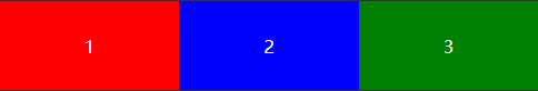 |
| row-reverse | Same as row, but in reverse order. | 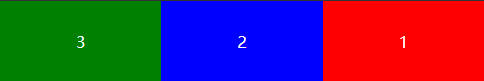 |
| column | Flexible items will be displayed vertically, just like a column. | 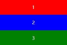 |
| column-reverse | It's the same as column, but in reverse order. | 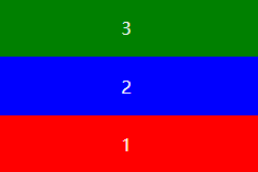 |
| initial | Set this property to its default value. See initial. | |
| inherit | Inherit this property from the parent element. See inherit. |
The flex-wrap // attribute specifies that the flex container is single or multiple rows, and the direction of the horizontal axis determines the direction of stacking new rows.
| flex-wrap | Property specifies that flex containers are single or multiple rows, and the direction of the horizontal axis determines the direction of stacking new rows. | |
|---|---|---|
| nowrap | Default value. It stipulates that flexible projects are not divided into rows or columns. | 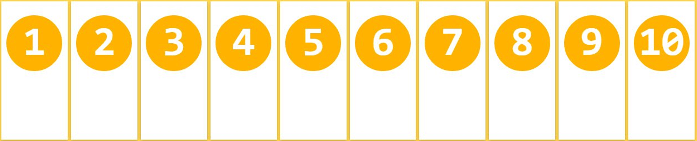 |
| wrap | Provide flexible items to be disassembled or disassembled when necessary. | 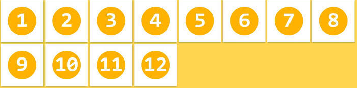 |
| wrap-reverse | Provide flexible items to be disassembled or disassembled when necessary, but in reverse order. | 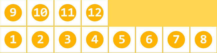 |
| initial | Set this property to its default value. see also initial. | |
| inherit | Inherit this property from the parent element. see also inherit. |
justify-content// Used to set or retrieve alignment of elastic box elements in the direction of the main axis (horizontal axis)
| justify-content | Used to set or retrieve alignment of elastic box elements in the direction of the main axis (horizontal axis) | ||
|---|---|---|---|
| flex-start | Default value. The project is located at the beginning of the container. |  |
Testing |
| flex-end | The project is at the end of the container. |  |
Testing |
| center | The project is located in the center of the container. |  |
Testing |
| space-between | The project is located in a container with a blank space between rows. |  |
Testing |
| space-around | The project is located in a container with blank space before, between and after each line. |  |
Testing |
| initial | Set this property to its default value. see also initial. | Testing | |
| inherit | Inherit this property from the parent element. see also inherit. |
align-items // attribute defines how flex subitems align in the current line of the lateral (longitudinal) axis of the flex container.
| align-items | Property defines how flex subitems align in the current line of the flex container's side (longitudinal) axis. | ||
|---|---|---|---|
| stretch | Default value. Elements are stretched to fit the container. If the attribute value of the specified side axis size is'auto', its value will make the size of the project's margin box as close as possible to the size of the row, but at the same time it will follow the restriction of the'min/max-width/height'attribute. |  |
Testing |
| center | Elements are located in the center of the container. Elastic box elements are centered on the side axis (longitudinal axis) of the row. If the row is smaller than the size of the elastic box element, the same length will spill over in both directions. |  |
Testing |
| flex-start | The element is at the beginning of the container. The boundary of the starting position of the side axis (longitudinal axis) of the elastic box element is close to the starting boundary of the side axis of the line. |  |
Testing |
| flex-end | The element is at the end of the container. The boundary of the starting position of the side axis (longitudinal axis) of the elastic box element is close to the end boundary of the side axis of the line. |  |
Testing |
| baseline | Elements are located on the baseline of the container. If the inner and lateral axes of the elastic box element are the same, the value is equivalent to'flex-start'. In other cases, this value will participate in baseline alignment. | 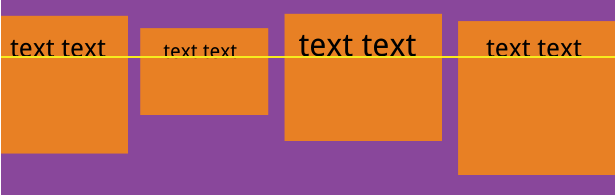 |
Testing |
| initial | Set this property to its default value. see also initial. | Testing | |
| inherit | Inherit this property from the parent element. see also inherit. |
The align-content//attribute items in the elastic container align the items in the container (vertical) when they do not occupy all available space on the cross axis.
| align-content | The items in the elastic container are aligned (vertical) when they do not occupy all available space on the cross axis. | ||
|---|---|---|---|
| stretch | Default value. Elements are stretched to fit the container. The rows will stretch to occupy the remaining space. If the remaining space is negative, the value is equivalent to'flex-start'. In other cases, the remaining space is divided equally by all rows to enlarge their lateral axis size. |  |
Testing |
| center | Elements are located in the center of the container. The elastic box containers in each direction are stacked in the middle position. The two sides of each row are closely aligned in the elastic box container at the same time, keeping the distance between the initial content boundary of the side axis and the first line of the elastic box container equal to the distance between the end content boundary of the side axis and the last line of the container. (If the remaining space is negative, the rows will overflow the same distance in both directions.) |  |
Testing |
| flex-start | The element is at the beginning of the container. The starting positions of elastic box containers in each direction are stacked. The starting boundary of the side axle of the first row in the elastic box container is close to the starting boundary of the side axle of the elastic box container, and each row after the elastic box container is close to the front row. |  |
Testing |
| flex-end | The element is at the end of the container. The end positions of elastic box containers in each direction are stacked. The end boundary of the last line of the elastic box container is close to the end boundary of the side axis of the elastic box container, and each line after that is close to the front row. |  |
Testing |
| space-between | Elements are located in containers with blanks between rows. The rows are evenly distributed in elastic box containers. If the remaining space is negative or there is only one line in the elastic container, the value is equivalent to'flex-start'. In other cases, the initial boundary of the side axis of the first row is close to the initial content boundary of the side axis of the elastic box container, the end boundary of the side axis of the last row is close to the end content boundary of the side axis of the elastic box container, and the remaining rows are arranged in a certain way in the elastic box window to keep the space between the two equal. |  |
Testing |
| space-around | Elements are located in containers with blanks before, between and after rows. The rows are evenly distributed in the elastic box container, and half of the distance between the sub-elements and the sub-elements is reserved at both ends. If the remaining space is negative or there is only one line in the elastic container, the value is equivalent to'center'. In other cases, the rows are arranged in a certain way in the elastic box container to keep the space between the two equal, while the space in front of the first line and behind the last line is half of the space in the other. |  |
Testing |
| initial | Set this property to its default value. see also initial. | Testing | |
| inherit | Inherit this property from the parent element. see also inherit. |
align-self // attribute defines how flex subitems align independently in the lateral (longitudinal) direction.
| align-self | Property defines how flex subitems are aligned individually in the lateral (longitudinal) direction. | |
|---|---|---|
| auto | Default value. The element inherits the align-items attribute of its parent container. If there is no parent container, it is "stretch". | Testing |
| stretch | Elements are stretched to fit the container. If the attribute value of the specified side axis size is'auto', its value will make the size of the project's margin box as close as possible to the size of the row, but at the same time it will follow the restriction of the'min/max-width/height'attribute. | Testing |
| center | Elements are located in the center of the container. Elastic box elements are centered on the side axis (longitudinal axis) of the row. If the row is smaller than the size of the elastic box element, the same length will spill over in both directions. | Testing |
| flex-start | The element is at the beginning of the container. The boundary of the starting position of the side axis (longitudinal axis) of the elastic box element is close to the starting boundary of the side axis of the line. | Testing |
| flex-end | The element is at the end of the container. The boundary of the starting position of the side axis (longitudinal axis) of the elastic box element is close to the end boundary of the side axis of the line. | Testing |
| baseline | Elements are located on the baseline of the container. If the inner and lateral axes of the elastic box element are the same, the value is equivalent to'flex-start'. In other cases, this value will participate in baseline alignment. | Testing |
| initial | Set this property to its default value. see also initial. | Testing |
| inherit | Inherit this property from the parent element. see also inherit. |
The flex-grow th// attribute is used to set or retrieve the expansion ratio of the elastic box.
| flex-grow | Property is used to set or retrieve the expansion ratio of the elastic box. |
|---|---|
| number | A number that specifies how much the project will expand relative to other flexible projects. The default value is 0. |
| initial | Set this property to its default value. see also initial. |
| inherit | Inherit this property from the parent element. see also inherit. |
The order attribute sets or retrieves the order in which the child elements of the elastic box model object appear.
| order | Property sets or retrieves the order in which the child elements of the elastic box model object appear. |
|---|---|
| number | The default value is 0. Set the order of flexible projects. |
| initial | Set this property to its default value. see also initial. |
| inherit | Inherit this property from the parent element. see also inherit. |
Example:
<!doctype html>
<html lang="en">
<head>
<meta charset="UTF-8">
<title>Web Of Flex Elastic Box Model</title>
<style>
	body{
		font-family: 'Microsoft YaHei';
		/*font-family: cursive, 'Microsoft Yahei';*/
		padding: 0;
		margin: 20px 0 40px;

		font-size: 16px;
		background-color: #F9F9F9;
	}
	h1{
		color: #0BF;
		text-indent: 15px;
	}
	h3{
		color: #6D7273;
		text-indent: 15px;
		padding: 10px 0;
		background-color: #fff;
	}
	p{
		margin: 0;
		padding: 0;
		color: #666;
		margin-bottom: 5px;
	}

	.boxes{
		padding: 0 10px;
		overflow: hidden;
		display: -webkit-flex;
		flex-wrap: wrap;
		align-content:flex-start
	}
	.box{
		width: 400px;
		padding: 8px;
		margin-right: 20px;
		margin-bottom: 10px;
		display: inline-block;
		box-shadow: 2px 2px 3px 1px #E0E0E0;
	}

	.boxstyle{
		padding: 8px 0;
	}
	.boxborder{
		border: 1px dashed #B6B6B6;
	}
	.demo{
		color: #fff;
		display: -webkit-flex;
		text-align: center;
	}
	.demo .item{
		line-height: 40px;
		background-color: #ddd;
	}
	.demo .item:nth-child(1){
		background-color: #E46C49;
	}
	.demo .item:nth-child(2){
		background-color: #37B0D3;
	}
	.demo .item:nth-child(3){
		background-color: #68B33D;
	}
	.demo .item:nth-child(4){
		background-color: #E46775;
	}
	.demo .item:nth-child(5){
		background-color: #CFC731;
	}
	.demo .item:nth-child(6){
		background-color: #8370F4;
	}

	.demo .item span{
		display: block;
	}

	.demo2 .item{
		height: 60px;
		width: 150px;
		word-wrap: break-word;
		line-height: 1.5;
	}

	.demo-row{
		flex-direction: row;
	}
	.demo-row-reverse{
		flex-direction: row-reverse;
	}
	.demo-column{
		height: 200px;
		flex-direction: column;
	}
	.demo-column-reverse{
		height: 200px;
		flex-direction: column-reverse;
	}

	.demo-nowrap{
		-webkit-flex-wrap: nowrap;
		width: 400px;
	}
	.demo-wrap{
		-webkit-flex-wrap: wrap;
		width: 400px;
	}
	.demo-wrap-reverse{
		-webkit-flex-wrap: wrap-reverse;
		width: 400px;
	}
	.demo-align-content{
		width: 400px;
		flex-wrap: wrap;
		height:200px;
		border: 1px dashed #B6B6B6;
	}
	.demo-align-content .item:nth-child(1), .demo-align-content .item:nth-child(2), .demo-align-content .item:nth-child(3),
	.demo-align-content .item:nth-child(4), .demo-align-content .item:nth-child(5), .demo-align-content .item:nth-child(6){
		background-color: #717171;
		width: 80px;
		margin: 2px 10px;
	}

</style>
</head>
<body>
	<h1>Web Of Flex Elastic Box Model</h1>
	<section class="content">

		<h3>[ flex ]</h3>
		<div class="boxes">
			<div class="box">
				<div class="boxstyle">
					<p>display: -webkit-flex;</p>
				</div>
				<div class="demo demo1">
					<div class="item" style="width:100px">width:100px;</div>
					<div class="item" style="flex:2">flex: 2;</div>
					<div class="item" style="flex:1">flex: 1;</div>
				</div>
			</div>

			<div class="box">
				<div class="boxstyle">
					<p>display: -webkit-flex; </p>
				</div>
				<div class="demo demo2 boxborder">
					<div class="item" style="margin-right:10px;">
						<span>width:150px;</span> <span>margin-right:10px;</span></div>
					<div class="item" style="flex:1">flex: 1;</div>
					<div class="item" style="margin-left:10px;">
						<span>width:150px;</span> <span>margin-left:10px;</span></div>
				</div>
			</div>
		</div>

		<h3>[ flex-direction ]</h3>
		<div class="boxes" style="width:900px">
			<div class="box">
				<div class="boxstyle">
					<p>flex-direction: row; /*default*/</p>
					<p>display: -webkit-flex;</p>
				</div>
				<div class="demo demo-row">
					<div class="item" style="flex:1">flex: 1;</div>
					<div class="item" style="flex:2">flex: 2;</div>
					<div class="item" style="flex:3">flex: 3;</div>
				</div>
			</div>

			<div class="box">
				<div class="boxstyle">
					<p>flex-direction: row-reverse;</p>
					<p>display: -webkit-flex; </p>
				</div>
				<div class="demo demo-row-reverse">
					<div class="item" style="flex:1">flex: 1;</div>
					<div class="item" style="flex:2">flex: 2;</div>
					<div class="item" style="flex:3">flex: 3;</div>
				</div>
			</div>

			<div class="box">
				<div class="boxstyle">
					<p>flex-direction: column;</p>
					<p>display: -webkit-flex; </p>
				</div>
				<div class="demo demo-column">
					<div class="item" style="flex:1">flex: 1;</div>
					<div class="item" style="flex:2">flex: 2;</div>
					<div class="item" style="flex:3">flex: 3;</div>
				</div>
			</div>

			<div class="box">
				<div class="boxstyle">
					<p>flex-direction: column-reverse;</p>
					<p>display: -webkit-flex; </p>
				</div>
				<div class="demo demo-column-reverse">
					<div class="item" style="flex:1">flex: 1;</div>
					<div class="item" style="flex:2">flex: 2;</div>
					<div class="item" style="flex:3">flex: 3;</div>
				</div>
			</div>
		</div>

		<h3>[ flex-wrap ]</h3>
		<div class="boxes" style="width:1310px">
			<div class="box">
				<div class="boxstyle">
					<p>-webkit-flex-wrap: nowrap; /* default */</p>
					<p>display: -webkit-flex; </p>
					<p>width: 400px</p>
				</div>
				<div class="demo demo-nowrap">
					<div class="item" style="width: 100px">100px;</div>
					<div class="item" style="width: 200px">width: 200px;</div>
					<div class="item" style="width: 300px">width: 300px;</div>
				</div>
			</div>
			<div class="box">
				<div class="boxstyle">
					<p>-webkit-flex-wrap: wrap</p>
					<p>display: -webkit-flex; </p>
					<p>width: 400px</p>
				</div>
				<div class="demo demo-wrap boxborder">
					<div class="item" style="width: 100px">100px;</div>
					<div class="item" style="width: 200px">width: 200px;</div>
					<div class="item" style="width: 300px">width: 300px;</div>
				</div>
			</div>
			<div class="box">
				<div class="boxstyle">
					<p>-webkit-flex-wrap: wrap-reverse</p>
					<p>display: -webkit-flex; </p>
					<p>width: 400px</p>
				</div>
				<div class="demo demo-wrap-reverse boxborder">
					<div class="item" style="width: 100px">100px;</div>
					<div class="item" style="width: 200px">width: 200px;</div>
					<div class="item" style="width: 300px">width: 300px;</div>
				</div>
			</div>
		</div>

		<h3>[ flex-flow ]: flex-direction flex-wrap; /* Do it for yourself */</h3>

		<h3>[ justify-content ]</h3>
		<div class="boxes" style="width:1310px;">
			<div class="box">
				<div class="boxstyle">
					<p>/* The effect is like float:left; */</p>
					<p>justify-content: flex-start; /* default */</p>
					<p>display: -webkit-flex;</p>
				</div>
				<div class="demo boxborder" style="justify-content: flex-start;">
					<div class="item" style="width:100px">width:100px;</div>
					<div class="item" style="width:100px">width:100px;</div>
				</div>
			</div>

			<div class="box">
				<div class="boxstyle">
					<p><p>/* The effect is like float:right; */</p></p>
					<p>justify-content: flex-end;</p>
					<p>display: -webkit-flex;</p>
				</div>
				<div class="demo demo-justify boxborder"  style="justify-content: flex-end;">
					<div class="item" style="width:100px">width:100px;</div>
					<div class="item" style="width:100px">width:100px;</div>
				</div>
			</div>

			<div class="box">
				<div class="boxstyle">
					<p>/* Third Generation Horizontal Medium Program */</p>
					<p>justify-content: center;</p>
					<p>display: -webkit-flex;</p>
				</div>
				<div class="demo demo-justify-end boxborder" style="justify-content: center;">
					<div class="item" style="width:100px">width:100px;</div>
					<div class="item" style="width:100px">width:100px;</div>
				</div>
			</div>

			<div class="box">
				<div class="boxstyle">
					<p>justify-content: space-between; </p>
					<p>display: -webkit-flex;</p>
				</div>
				<div class="demo demo-justify boxborder" style="justify-content: space-between;">
					<div class="item" style="width:100px">width:100px;</div>
					<div class="item" style="width:100px">width:100px;</div>
				</div>
			</div>

			<div class="box">
				<div class="boxstyle">
					<p>justify-content: space-around; </p>
					<p>display: -webkit-flex;</p>
				</div>
				<div class="demo demo-justify-end boxborder" style="justify-content: space-around;">
					<div class="item" style="width:100px">width:100px;</div>
					<div class="item" style="width:100px">width:100px;</div>
				</div>
			</div>
		</div>

		<h3>[ align-self ]</h3>
		<div class="boxes">
			<div class="box" style="width:1000px;">
				<div class="boxstyle">
					<p>display: -webkit-flex;</p>
				</div>
				<div class="demo boxborder" style="width: 1000px; height:200px;">
					<div class="item" style="width:200px; align-self:flex-start;">align-self:flex-start;</div>
					<div class="item" style="width:200px; align-self:flex-end;">align-self:flex-end;</div>
					<div class="item" style="width:200px; align-self:center;">align-self:center;</div>
					<div class="item" style="width:200px; align-self:auto;">
						<span>align-self:auto;</span>
						<span>/*default */</span>
					</div>

					<div class="item" style="width:200px; align-self:baseline;">align-self:baseline;</div>
					<div class="item" style="width:200px; align-self:stretch;">align-self:stretch;</div>
				</div>
			</div>
		</div>

		<h3>[ align-items ]</h3>
		<div class="boxes">
			<div class="box">
				<div class="boxstyle">
					<p>align-items: flex-start; /* default */</p>
					<p>display: -webkit-flex;</p>
				</div>
				<div class="demo boxborder" style="align-items: flex-start;height:200px;">
					<div class="item" style="width:100px">width:100px;</div>
					<div class="item" style="width:100px">width:100px;</div>
				</div>
			</div>

			<div class="box">
				<div class="boxstyle">
					<p>align-items: flex-end; </p>
					<p>display: -webkit-flex;</p>
				</div>
				<div class="demo boxborder" style="align-items: flex-end;height:200px;">
					<div class="item" style="width:100px">width:100px;</div>
					<div class="item" style="width:100px">width:100px;</div>
				</div>
			</div>

			<div class="box">
				<div class="boxstyle">
					<p>/* Third Generation Vertical Centralization */</p>
					<p>align-items: center; </p>
					<p>display: -webkit-flex;</p>
				</div>
				<div class="demo boxborder" style="align-items: center;height:200px;">
					<div class="item" style="width:100px">width:100px;</div>
					<div class="item" style="width:100px">width:100px;</div>
				</div>
			</div>

			<div class="box">
				<div class="boxstyle">
					<p>align-items: baseline; </p>
					<p>display: -webkit-flex;</p>
				</div>
				<div class="demo boxborder" style="align-items: baseline;height:200px;">
					<div class="item" style="width:100px">width:100px;</div>
					<div class="item" style="width:100px">width:100px;</div>
				</div>
			</div>

			<div class="box">
				<div class="boxstyle">
					<p>align-items: stretch; </p>
					<p>display: -webkit-flex;</p>
				</div>
				<div class="demo boxborder" style="align-items: stretch;height:200px;">
					<div class="item" style="width:100px; height:100px;">height:100px;</div>
					<div class="item" style="width:150px; min-height:20px;">min-height:20px;</div>
					<div class="item" style="width:150px; max-height:60px;">max-height:60px;</div>
				</div>
			</div>
		</div>


		<h3>[ align-content ]</h3>
		<div class="boxes">
			<div class="box">
				<div class="boxstyle">
					<p>/* <span style="color:red"> Contrast align-items</span>*/</p>
					<p>align-items: flex-start</p>
					<p>display: -webkit-flex;</p>
				</div>
				<div class="demo demo-align-content" style="align-items: flex-start">
					<div class="item" >a</div>
					<div class="item" >b</div>
					<div class="item" >c</div>
					<div class="item" >d</div>
					<div class="item" >e</div>
					<div class="item" >f</div>

				</div>
			</div>

			<div class="box">
				<div class="boxstyle">
					<p>align-content: flex-start; </p>
					<p>display: -webkit-flex;</p>
				</div>
				<div class="demo demo-align-content" style="align-content: flex-start;">
					<div class="item" >a</div>
					<div class="item" >b</div>
					<div class="item" >c</div>
					<div class="item" >d</div>
					<div class="item" >e</div>
					<div class="item" >f</div>

				</div>
			</div>

			<div class="box">
				<div class="boxstyle">
					<p>align-content: flex-end; </p>
					<p>display: -webkit-flex;</p>
				</div>
				<div class="demo demo-align-content" style="align-content: flex-end;">
					<div class="item" >a</div>
					<div class="item" >b</div>
					<div class="item" >c</div>
					<div class="item" >d</div>
					<div class="item" >e</div>
					<div class="item" >f</div>

				</div>
			</div>
			<div class="box">
				<div class="boxstyle">
					<p>align-content: center; </p>
					<p>display: -webkit-flex;</p>
				</div>
				<div class="demo demo-align-content" style="align-content: center;">
					<div class="item" >a</div>
					<div class="item" >b</div>
					<div class="item" >c</div>
					<div class="item" >d</div>
					<div class="item" >e</div>
					<div class="item" >f</div>

				</div>
			</div>
			<div class="box">
				<div class="boxstyle">
					<p>align-content: space-between; </p>
					<p>display: -webkit-flex;</p>
				</div>
				<div class="demo demo-align-content" style="align-content: space-between;">
					<div class="item" >a</div>
					<div class="item" >b</div>
					<div class="item" >c</div>
					<div class="item" >d</div>
					<div class="item" >e</div>
					<div class="item" >f</div>
				</div>
			</div>
			<div class="box">
				<div class="boxstyle">
					<p>align-content: space-around; </p>
					<p>display: -webkit-flex;</p>
				</div>
				<div class="demo demo-align-content" style="align-content: space-around;">
					<div class="item" >a</div>
					<div class="item" >b</div>
					<div class="item" >c</div>
					<div class="item" >d</div>
					<div class="item" >e</div>
					<div class="item" >f</div>

				</div>
			</div>

			<div class="box">
				<div class="boxstyle">
					<p>align-content: stretch; /*default*/ </p>
					<p>display: -webkit-flex;</p>
				</div>
				<div class="demo demo-align-content" style="align-content: stretch;">
					<div class="item" >a</div>
					<div class="item" >b</div>
					<div class="item" >c</div>
					<div class="item" >d</div>
					<div class="item" >e</div>
					<div class="item" >f</div>

				</div>
			</div>

		</div>

		<h3>[ order ]</h3>
		<div class="boxes">
			<div class="box" style="width:1000px;">
				<div class="boxstyle">
					<p>display: -webkit-flex;</p>
				</div>
				<div class="demo demo-align-content" style="width: 1000px;height:40px;">
					<div class="item" >a</div>
					<div class="item" >b</div>
					<div class="item" >c</div>
					<div class="item" style="order:-1; width:120px"> d (order:-1) </div>
					<div class="item" >e</div>
					<div class="item" >f</div>
				</div>
			</div>
		</div>

	</section>


</body>
</html>