Or this design draft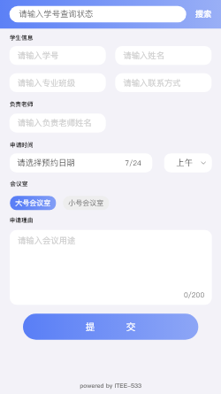
The results are as follows.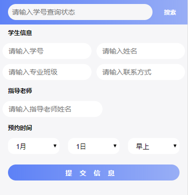
html
Flexible layout, also known as flex ible layout, is very easy to get started.
In flex layout, padding is added to the outermost div of the search bar, but there is no horizontal scroll bar because in flex layout, he automatically fills the whole div with the div width equal to the total width of the container, that is 16+359=375px.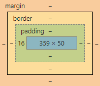
At the same time, flex's vertical alignment is very easy to implement, adding an align-item: center to the parent element.
Furthermore, in flex layout, the layout of two columns and three columns can be easily implemented with justify-content, left alignment, right alignment, average distribution and so on.
There are a lot of good blogs on the internet. I will not repeat them here.
However, his browser compatibility is poor, and it is recommended that float layout be learned at the same time.
Defects of flex layout
<div class="top-outer">
        <input placeholder="Please enter the status of student number query">
        <button>search</button>
    </div>
    <form>
        <div class="title">
            Student information
        </div>
        <div class="input-outer">
            <div style="display: flex">
                <input placeholder="Please enter your student number." class="input-inline" name="userNumber">
                <input placeholder="Please input your name." class="input-inline" name="userName">
            </div>
            <div style="display: flex">
                <input placeholder="Please enter the professional class" class="input-inline" name="userClass onclick="emptyData(3)" onblur="fillData(3)">
                <input placeholder="Please enter your contact information." class="input-inline" name="userPhone">
            </div>
        </div>
        <div class="title">
            Guidance teacher
        </div>
        <div class="input-outer">
            <div style="display: flex">
                <input placeholder="Please input the name of the instructor." class="input-inline" name="userTeacher" onclick="emptyData(5)" onblur="fillData(5)">
            </div>
        </div>
        <div class="title">
            Time of appointment
        </div>
        <div class="select-outer">
            <select name="month">
                <option value="1">1 month</option>
                <option value="2">2 month</option>
                <option value="3">3 month</option>
            </select>
            <select name="date">
                <option value="1">1 day</option>
                <option value="2">2 day</option>
                <option value="3">3 day</option>
            </select>
            <select name="time">
                <option value="0">Morning</option>
                <option value="1">Noon</option>
                <option value="2">Night</option>
            </select>
        </div>
        <div style="display: flex;padding: 0.32rem">
            <input class="submit-btn" type="submit" value="Submission of information">
        </div>
    </form>
css Style
*{
    margin: 0;
    padding: 0;
    background-color: #f6f6f8;
}
input{
    border: 0;
}
button{
    border: 0;
}
.top-outer{
    background: linear-gradient(to right,#5D81F6,#98AEF6);
    height: 1rem;
    align-items: center;
    display: flex;
    padding-left: 0.32rem;
}

.top-outer input{
    height: 0.64rem;
    line-height: 0.64rem;
    border-radius: 0.32rem;
    color: #5e5e5e;
    font-size: 14px;
    padding-left: 0.16rem;
    width: 5.84rem;
}

.top-outer button{
    background-color: rgba(00,00,00,0);
    font-size: 12px;
    color: white;
    font-weight: bold;
    width: 1.18rem;
}

.title{
    font-size: 0.2rem;
    margin: 0.16rem 0.32rem;
    font-weight: bold;
}

.input-outer{
    width: 100%;
    align-items: center;
}

.input-inline{
    font-size: 0.28rem;
    color: #5e5e5e;
    height: 0.64rem;
    background-color: white;
    border: rgba(00,00,00,0);
    border-radius: 0.32rem;
    width: 50%;
    padding-left: 0.24rem;
    margin: 0.1rem;
}

.select-outer{
    display: flex;
    padding: 0 0.32rem;
    justify-content: space-between;
    font-size: 14px;
    color: #5e5e5e;
    line-height: 0.64rem;
}

.select-outer select{
    width: 30%;
    text-align: center;
    border: 0;
    border-radius: 0.24rem;
    background-color: white;
    height: 0.64rem;
    padding-left: 0.24rem;
    margin: 0.1rem 0;
}

.submit-btn{
    background:linear-gradient(to right,#5D81F6,#98AEF6);
    height: 0.64rem;
    width: 100%;
    border-radius: 0.35rem;
    color: white;
    font-weight: bold;
    letter-spacing:0.3rem
}