The following code is based on REM experience, I wrote a rem.js, found very useful, can be applied to all mobile h5 pages of adaptive requirements:
Code 1:
window.onload = function(){
    getRem(720,100)
};
window.onresize = function(){
    getRem(720,100)
};
function getRem(pwidth,prem){
    var html = document.getElementsByTagName("html")[0];
    var oWidth = document.body.clientWidth || document.documentElement.clientWidth;
    html.style.fontSize = oWidth/pwidth*prem + "px";
}
The second code below is the mobile h5 page adaptive code I saw on Millet. The effect is the same as mine. It can also be used:
Code 2: Writing of millet official website
!function(n){
    var  e=n.document,
         t=e.documentElement,
         i=720,
         d=i/100,
         o="orientationchange"in n?"orientationchange":"resize",
         a=function(){
             var n=t.clientWidth||320;n>720&&(n=720);
             t.style.fontSize=n/d+"px"
         };
         e.addEventListener&&(n.addEventListener(o,a,!1),e.addEventListener("DOMContentLoaded",a,!1))
}(window);
Look at these two functions, put these codes in js, the rule is to call the function, put two parameters, the first parameter is the width of the design draft, the second parameter is the conversion ratio of px and rem, usually write 100 (because it's good); of course, it's better to encapsulate this JS code in a separate JS file, and load it before all the css files are introduced.
In practice, box 1 {height: 100px;} and calling rem is box 1 {height: 1rem;} and so on. 100px = 1rem. 1px = 0.01rem. In a page, any padding, margin, width, height and so on related to size can be written in rem, so that when different resolution mobile phones look at the same page, the effect is almost the same.
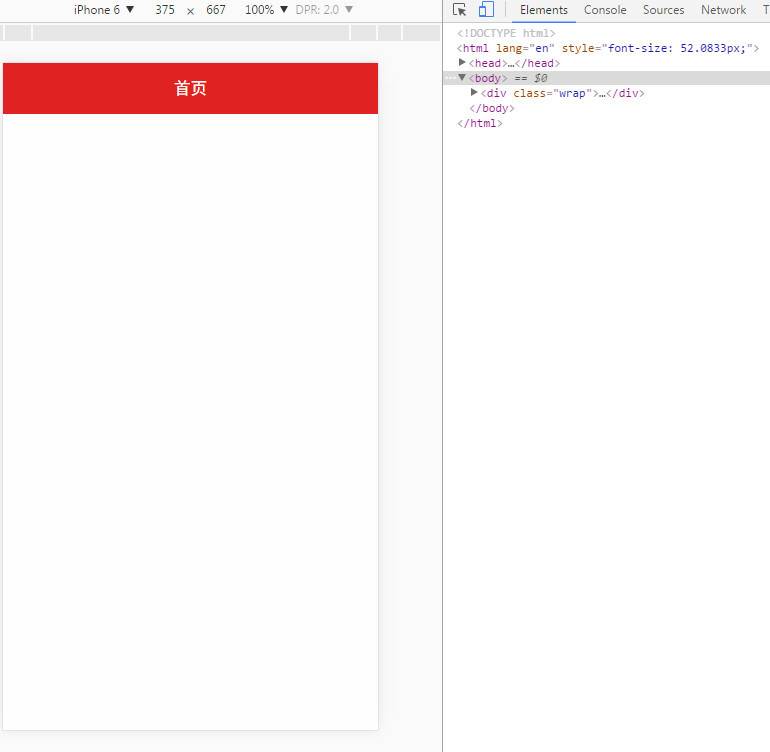
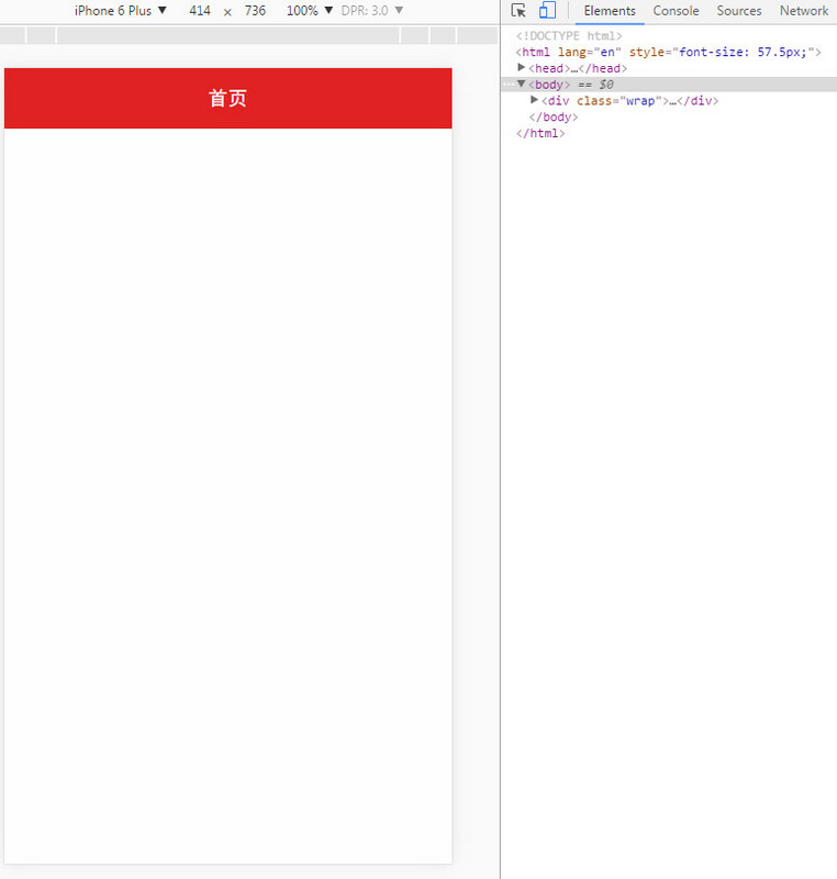
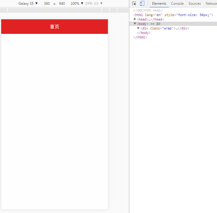
The following drawings show the effect: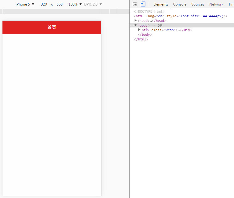
Code:
<!doctype html>
<html lang="en">
<head>
    <meta charset="UTF-8">
    <title>Document</title>
    <meta name="viewport" content="width=device-width,initial-scale=1,minimum-scale=1,maximum-scale=1,user-scalable=no" />
    <link rel="stylesheet" href="../css/reset-min.css"/>
    <script>
        window.onload = function(){
            getRem(720,100)
        };
        window.onresize = function(){
            getRem(720,100)
        };
        function getRem(pwidth,prem){
            var html = document.getElementsByTagName("html")[0];
            var oWidth = document.body.clientWidth || document.documentElement.clientWidth;
            html.style.fontSize = oWidth/pwidth*prem + "px";
        }
        /*
        //The Writing of Xiaomi's Official Website
        !function(n){
            var  e=n.document,
                 t=e.documentElement,
                 i=720,
                 d=i/100,
                 o="orientationchange"in n?"orientationchange":"resize",
                 a=function(){
                     var n=t.clientWidth||320;n>720&&(n=720);
                     t.style.fontSize=n/d+"px"
                 };
                 e.addEventListener&&(n.addEventListener(o,a,!1),e.addEventListener("DOMContentLoaded",a,!1))
        }(window);*/
    </script>
    <style>
        .wrap{position:absolute;top:0;left:0;bottom:0;right:0;background:#fefefe;}
        .title{width:100%;height:0.98rem;line-height:0.98rem;color:#fff;background:#e02222;text-align: center;font-size:0.32rem;}
    </style>
</head>
<body>
    <div class="wrap">
        <div class="title">home page</div>
    </div>
</body>

</html>
The demo here only does rem conversion for font size, and the others don't. It just shows you an effect. That's it. I hope you can give me some praise.