matplotlib of data analysis
Introduction to matplotlib
Data analysis: make statistics and sort out a large number of data to draw conclusions and provide data support for subsequent decision-making
Learn matplotlib?
- It can visualize the data and present it more intuitively
- Make the data more objective and persuasive
matplotlib: the most popular python bottom drawing library, which mainly makes data visualization charts. Its name is taken from MATLIB and built by imitating it.
matplotlib Foundation
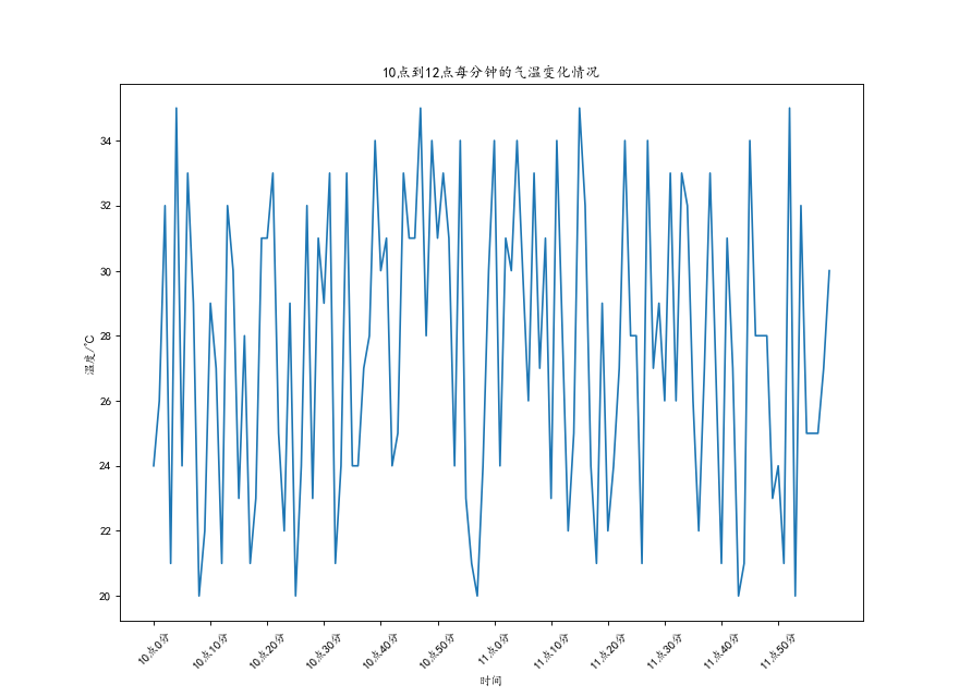
Simple example
from matplotlib import pyplot as plt
import random

#Solve the problem of Chinese display
plt.rcParams['font.sans-serif'] = ['KaiTi'] # Specifies the default font

x = range(0, 120)
y = [random.randint(20, 35) for i in range(0, 120)]

#Set the picture size (when the image is blurred, you can pass in the dpi parameter to make the picture clearer)
fig = plt.figure(figsize=(11, 8), dpi=80)

#mapping
plt.plot(x, y)

#Adjust the scale of x
_xtick_labels = ["10 spot{}branch".format(i * 10) for i in range(6)]
_xtick_labels += ["11 spot{}branch".format(i * 10) for i in range(6)]

#rotation the number of degrees the scale font is rotated
plt.xticks(list(x)[::10], _xtick_labels, rotation=45)

#Add description information
plt.xlabel("time")
plt.ylabel("temperature/℃")
plt.title("10 Temperature change per minute from 0:00 to 12:00")

#preservation
plt.savefig("./Simple example t1.png")
plt.show()
The illustration is as follows
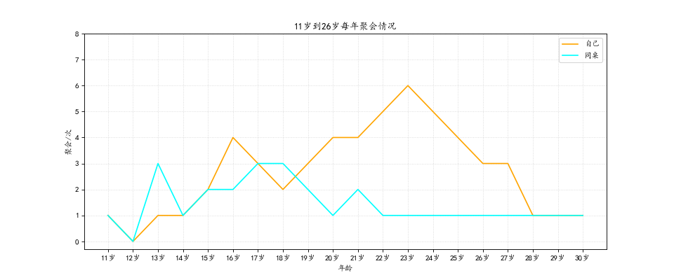
Draw multiple figures and different difference figures
Suppose you draw a party with your friends between the ages of 11 and 31 on the same map
from matplotlib import pyplot as plt
import random

#Solve the problem of Chinese display
plt.rcParams['font.sans-serif'] = ['KaiTi'] # Specifies the default font

y_1 = [1, 0, 1, 1, 2, 4, 3, 2, 3, 4, 4, 5, 6, 5, 4, 3, 3, 1, 1, 1]
y_2 = [1, 0, 3, 1, 2, 2, 3, 3, 2, 1, 2, 1, 1, 1, 1, 1, 1, 1, 1, 1]
x = range(11, 31)

#Set picture size
fig = plt.figure(figsize=(12, 5), dpi=80)

#mapping
"""
Can be specified when drawing
color = 'r' line color
linestyle = '--' Line style
linewidth = 5 Line thickness
alpha = 0.5 transparency
"""
plt.plot(x, y_1, label="own", color="orange")
plt.plot(x, y_2, label="deskmate", color="cyan")

#Set scale
_xtick_labels = ["{}year".format(i) for i in x]
plt.xticks(x, _xtick_labels)
plt.yticks(range(0, 9))

#Draw mesh
plt.grid(alpha=0.5, linestyle=":")
#Add legend
plt.legend(loc="upper right")

#Add description information
plt.xlabel("Age")
plt.ylabel("party/second")
plt.title("11 Annual gatherings between the ages of and 26")

plt.show()
The illustration is as follows
Comparison of common statistical charts
-
Line chart: a statistical chart showing the increase or decrease of statistical quantity with the rise or fall of line
Features: it can display the change trend of data and reflect the change of things (change)
-
Histogram: a series of longitudinal stripes or line segments with different heights represent the data distribution.
Generally, the horizontal axis represents the data range and the vertical axis represents the distribution
Features: draw continuous data to show the distribution of one or more groups of data (Statistics)
-
Bar chart: data arranged in rows or columns of a worksheet can be drawn into a bar chart.
Features: draw discrete data, be able to see the size of each data at a glance, and compare the differences between data (Statistics)
-
Scatter diagram: use two groups of data to form multiple coordinate points to investigate the distribution of coordinate points,
Judge whether there is some correlation between the two variables or summarize the distribution pattern of coordinate points.
Features: judge whether there is a quantitative relationship trend between variables and display outliers (distribution law)
Scatter plot
Code example
from matplotlib import pyplot as plt

#Solve the problem of Chinese display
plt.rcParams['font.sans-serif'] = ['KaiTi'] # Specifies the default font

y_3 = [11,17,16,11,12,11,12,6,6,7,8,9,12,15,14,17,18,
     21,16,17,20,14,15,15,15,19,21,22,22,22,23]
y_10 = [26,26,28,19,21,17,16,19,18,20,20,19,22,23,17,
     20,21,20,22,15,11,15,5,13,17,10,11,13,12,13,6]

x_3 = range(1, 32)
x_10 = range(51, 82)

#Set drawing size
plt.figure(figsize=(11, 7), dpi=80)

#Using scatter method to draw scatter chart is the only difference from drawing line chart before
plt.scatter(x_3, y_3, label='3 month')
plt.scatter(x_10, y_10, label='10 month')

#Adjust the scale of x
_x = list(x_3) + list(x_10)
_xtick_labels = ["3 month{}day".format(i) for i in x_3]
_xtick_labels += ["10 month{}day".format(i - 50) for i in x_10]
plt.xticks(_x[::5], _xtick_labels[::5], rotation=45)

#Add legend
plt.legend(loc="upper right")

#Add description information
plt.xlabel("time")
plt.ylabel("temperature")
plt.title("title")

#Exhibition
plt.show()
The illustration is as follows

Draw bar chart
Draw basic bar chart
Code example
#Draw a horizontal bar chart
from matplotlib import pyplot as plt
#Solve the problem of Chinese display
plt.rcParams['font.sans-serif'] = ['KaiTi'] # Specifies the default font

a = ["Vulgar novel", "Speed and passion 8", "Burning years", "Schindler's list", "Brave heart", "Gone with the wind",
     "Brilliant life", "Beautiful life", "How beautiful life is", "godfather", "The Hobbit", "Titanic"]
b = [36.01, 25.90, 17.53, 29.60, 42.40, 33.53, 37.80, 40.52, 60.43, 57.33, 43.90, 50.99]

#Set drawing size
plt.figure(figsize=(10, 7), dpi=80)
#Draw bar chart
plt.barh(range(len(a)), b, height=0.4, color='cyan')
#Set string to x axis
plt.yticks(range(len(a)), a)

#If a vertical bar chart is drawn, the corresponding code is as follows
#plt.bar(range(len(a)), b, width=0.3)
#plt.xticks(range(len(a)), a, rotation=40)

plt.grid(alpha=0.4, color='pink')

#Add description information
plt.ylabel("film")
plt.xlabel("box office/Hundred million")
plt.title("xxx Box office statistics of films in")

plt.show()
The diagram is as follows:

Draw multiple bar graphs
Code example
from matplotlib import pyplot as plt

#Solve the problem of Chinese display
plt.rcParams['font.sans-serif'] = ['KaiTi'] # Specifies the default font

a = ["Pride and Prejudice", "Camellia woman", "Gone with the wind", "Reason and emotion"]
b_16 = [1746, 324, 4466, 389]
b_15 = [1247, 158, 2039, 189]
b_14 = [2490, 389, 3900, 289]

bar_width = 0.2

x_14 = list(range(len(a)))
x_15 = [i + bar_width for i in x_14]
x_16 = [i + bar_width * 2 for i in x_14]

#Set drawing size
plt.figure(figsize=(10, 7), dpi=80)

plt.bar(x_14, b_14, width=bar_width, label="9 May 14")
plt.bar(x_15, b_15, width=bar_width, label="9 May 15")
plt.bar(x_16, b_16, width=bar_width, label="9 June 16")

#Set legend
plt.legend(loc="upper right")

#Set the scale of x
plt.xticks(x_15, a)

plt.show()
The diagram is as follows:

Draw histogram
Simple example
#180 department film duration
from matplotlib import pyplot as plt
import random
#Solve the problem of Chinese display
plt.rcParams['font.sans-serif'] = ['KaiTi'] # Specifies the default font
a = [random.randint(0, 100) + 90 for i in range(1, 181)]
#Number of calculation groups
d = 5  #Group distance
num_bins = (max(a) - min(a)) // d

#Set drawing size
plt.figure(figsize=(11, 6 ), dpi=80)

plt.hist(a, num_bins, normed=True)

#Sets the scale of the x-axis
plt.xticks(range(min(a), max(a) + d, d))

plt.grid(alpha=0.4, color='cyan')
plt.show()
The diagram is as follows:

Property settings
1. Location loc
loc='center left 'is equivalent to loc=6
             'best':         0,
             'upper right':  1,
             'upper left':   2,
             'lower left':   3,
             'lower right':  4,
             'right':        5,
             'center left':  6,
             'center right': 7,
             'lower center': 8,
             'upper center': 9,
             'center':       10,
2. Linetype
-	Solid line
--	Dotted line
-.	The form is-.
:	Small dotted line
3. Broken line point marker
s--square
h--hexagon
H--hexagon
*--*shape
+--plus
x--x shape
d--diamond
D--diamond
p--Pentagonal
Other graphic drawing
Example of matplotlib official website
As shown in the figure below

Click any icon you are interested in, which has a complete drawing code, and its data can be changed, such as
import matplotlib.pyplot as plt
import numpy as np
from matplotlib.patches import Ellipse

# Fixing random state for reproducibility
np.random.seed(19680801)

NUM = 200

ells = [Ellipse(xy=np.random.rand(3) * 10,
                width=np.random.rand(), height=np.random.rand(),
                angle=np.random.rand() * 360)
        for i in range(NUM)]

fig, ax = plt.subplots(subplot_kw={'aspect': 'equal'})
for e in ells:
    ax.add_artist(e)
    e.set_clip_box(ax.bbox)
    e.set_alpha(np.random.rand())
    e.set_facecolor(np.random.rand(3))

ax.set_xlim(0, 10)
ax.set_ylim(0, 10)

plt.show()
The renderings are as follows

Drawing website recommendation
reference material
https://matplotlib.org/
[python tutorial] data analysis -- numpy, pandas, matplotlib
matplotlib can easily solve the problem of Chinese garbled code
legend setting of python drawing.
Python data analysis: drawing of line chart and scatter chart