Catalog
- 1. Figure:
- 2 axis / subgraph (axes):
- 3. Basic connection function:
- 4 axis:
- 4.1 set coordinate axis Name: (label)
- 4.2 set the upper and lower limits of the coordinate axis:
- 4.3 custom scale:
- 4.4 boundary operation:
- 4.5 slice: (maybe it's what I call...)
- 4.6 double Y axis: (secondary axis)
- 5 legend:
- 6 annotation:
- 7 axis visibility:
- 8 scatter:
- 9 bar:
- 10 histogram (hist):
- 10.1 basic demonstration:
- 10.2 demonstration of various parameters:
- 10.3 draw line on histogram:
- 10.4 demonstration of frequency distribution histogram of some basic distributions:
- 11 Pie:
- 12 contour map (contour / contour):
- 13 image:
- 14 3D image (axes3d):
- 15 Animation:
- 16 base map:
0.1 pilot conditions:
import numpy as np
import matplotlib.pyplot as plt
0.2 foreword: matplotlib font installation
It is convenient for matplotlib to display Chinese. You can ignore the unnecessary ones. Refer to:
https://blog.csdn.net/u014465934/article/details/80377470
1. Figure:
plt.figure(
    figsize=None,     #Figure size in inches

    dpi=None,        #Resolution (dots per inch)

    facecolor=None,     #Decorated color

    edgecolor=None,     #Border color

    linewidth=0.0,     #Line width

    figtext:         # text

    frameon=None,     #Boolean, frame drawn

    subplotpars=None,     #Parameters of subgraphs

    tight_layout=None,     #The value is Boolean or dictionary. The default is auto layout. If False uses the subplotpars parameter, True uses tight'layout. If it is a dictionary, it contains the following fields: pad, w'pad, h'pad, and rect

    constrained_layout=None     #True will automatically adjust the location of the plot by using constrained layout.
)
1.1 basic demonstration:
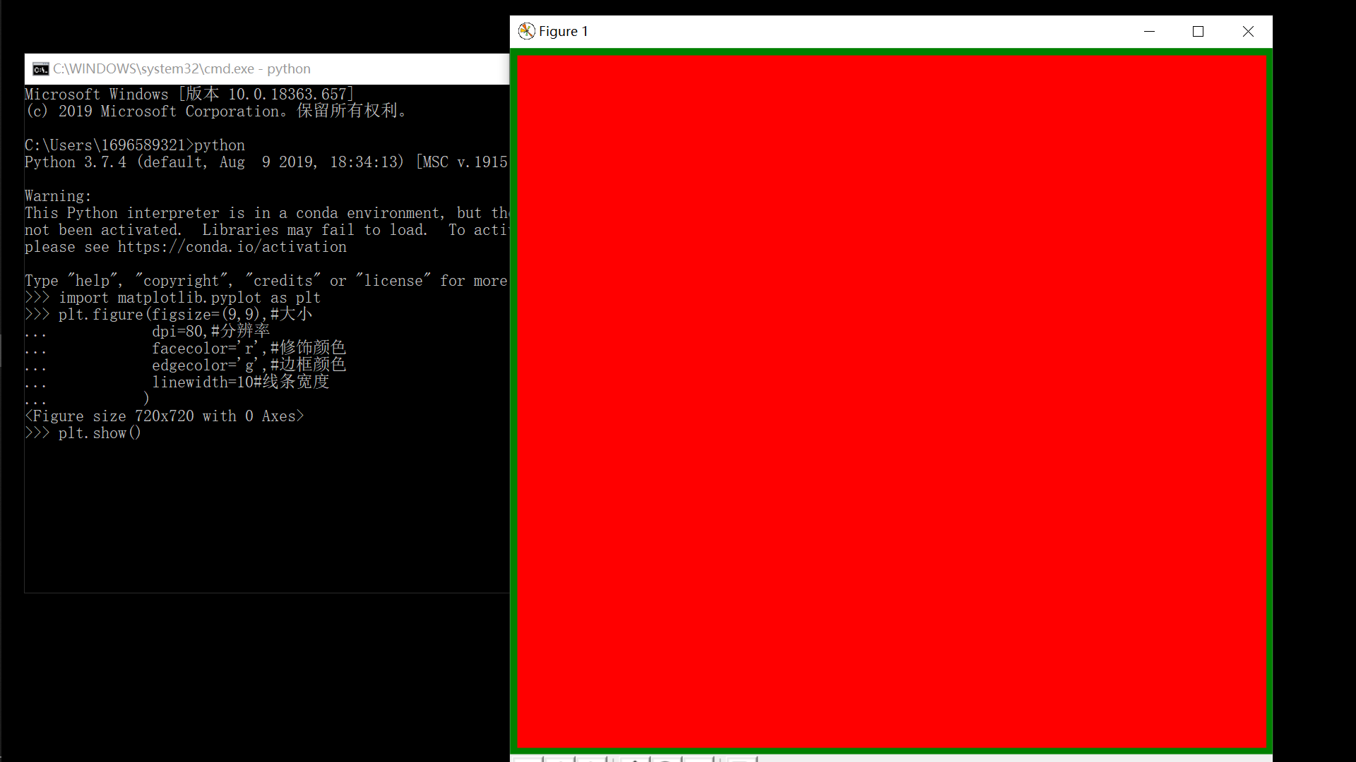
plt.figure(figsize=(9, 9),  # Size
           dpi=80,  # Resolving power
           facecolor='r',  # Color modification
           edgecolor='g',  # Border color
           linewidth=10,  # Line width
           )
plt.show()
1.2 multiple canvases:
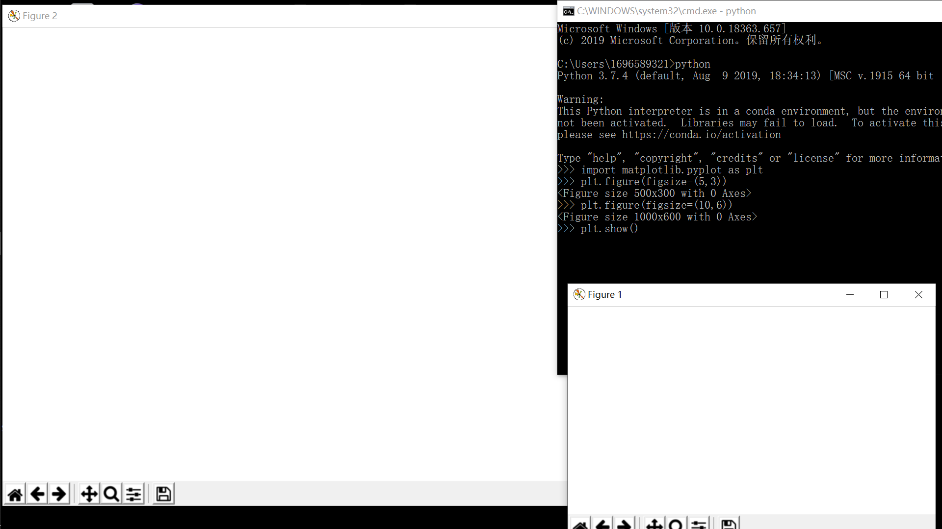
plt.figure(figsize=(5, 3))
# Do what you want on the first canvas
plt.figure(figsize=(10, 6))
# Do what you want on the second canvas
plt.show()
1.3 multiple subgraphs of a canvas:
1.3.1 basic method:
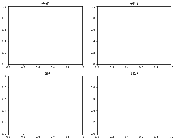
fig = plt.figure(figsize=(10, 8))

plt.subplot(221)  # It is divided into 4 subgraphs with 2 × 2 = and here is the first one
plt.title("Subgraph 1")
plt.subplot(222)
plt.title("Subgraph 2")

# Another way:
fig.add_subplot(223)
plt.title("Subgraph 3")
fig.add_subplot(224)
plt.title("Subgraph 4")

plt.show()
We can also design such a layout:
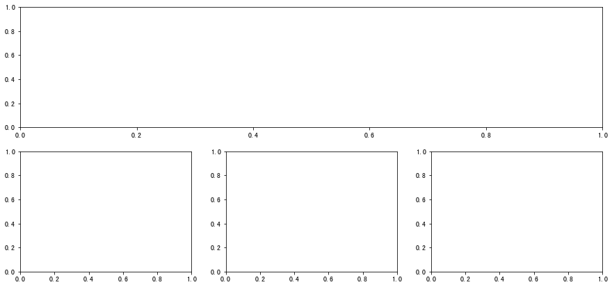
plt.figure(figsize=(15, 7))
plt.subplot(211)  # There are two lines. The first line is only one piece
plt.subplot(234)  # The second line is divided into three parts, but since one part of the first line corresponds to the position of the second line and three parts, the second line starts from 4
plt.subplot(235)
plt.subplot(236)
plt.show()
1.3.2 advanced method:
1.3.2.1 method 1:
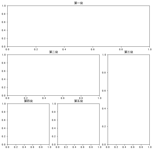
plt.figure(figsize=(10, 10))
ax1 = plt.subplot2grid((3, 3),  # Overall effect: three rows and three columns (9 × 9)
                       (0, 0),  # From origin (0 row 0 column)
                       colspan=3,  # The first one is three squares wide
                       rowspan=1,  # 1 grid high
                       )
ax1.set(title=("First block"))
# Be modeled on
ax2 = plt.subplot2grid((3, 3), (1, 0), colspan=2, rowspan=1)
ax2.set(title=("Second pieces"))
ax3 = plt.subplot2grid((3, 3), (1, 2), colspan=1, rowspan=2)
ax3.set(title=("Third pieces"))
ax4 = plt.subplot2grid((3, 3), (2, 0), colspan=1, rowspan=1)
ax4.set(title=("Fourth pieces"))
ax5 = plt.subplot2grid((3, 3), (2, 1), colspan=1, rowspan=1)
ax5.set(title=("Fifth pieces"))
plt.show()
1.3.2.2 method 2:
import matplotlib.gridspec as gridspec

plt.figure(figsize=(10, 10))
gs = gridspec.GridSpec(3, 3)  # Three rows and three columns
ax1 = plt.subplot(gs[0, :])  # The first block occupies the first (0) line
ax1.set(title=("First block"))
ax2 = plt.subplot(gs[1, :2])  # The second block occupies the first two lines of the second (1)
ax2.set(title=("Second pieces"))
ax3 = plt.subplot(gs[1:, 2])  # The third block occupies the second (1) row and the last two columns
ax3.set(title=("Third pieces"))
ax4 = plt.subplot(gs[-1, 0])  # The fourth is the first in the last line
ax4.set(title=("Fourth pieces"))
ax5 = plt.subplot(gs[-1, -2])  # The fifth block takes the second last (- 2) of the last row, because the first last (- 1) is taken away by the third block
ax5.set(title=("Fifth pieces"))
plt.show()

2 axis / subgraph (axes):
It can also be understood as the real mapping area
Although there is an adaptive default axis in general drawing, this kind of axis is only suitable for simple and fast drawing. If you want to make a fine drawing, you need axes
2.1 basic demonstration:
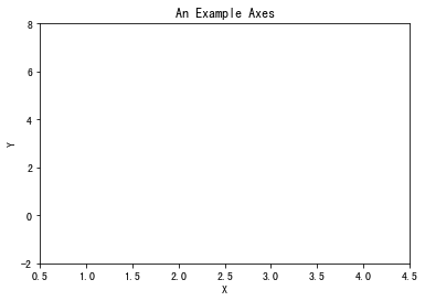
fig = plt.figure()
ax = fig.add_subplot(111)
ax.set(xlim=[0.5, 4.5], ylim=[-2, 8],
       title='An Example Axes', ylabel='Y', xlabel='X')
plt.show()
2.2 add shaft Subgraph:
2.2.1 basic methods:
fig = plt.figure()
ax1 = fig.add_subplot(331)
ax2 = fig.add_subplot(335)
ax3 = fig.add_subplot(339)

Is this method too troublesome to add one by one, and it also looks stupid
2.2.2 shortcut:
One word is enough
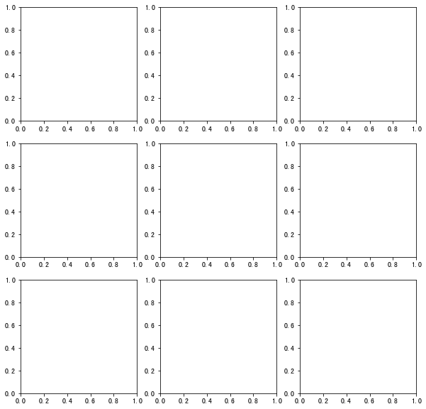
fig, axes = plt.subplots(nrows=3, ncols=3, figsize=(10, 10))
If you want to operate on one of these graphs
fig, axes = plt.subplots(nrows=3, ncols=3, figsize=(10, 10))
axes[2, 1].set(title="I want to operate you")
axes[1, 2].plot([1, 2, 3, 4], [5, 6, 1, 2])
axes[2, 2].scatter([9, 0, 3, 4], [5, 1, 5, 2])
plt.show()
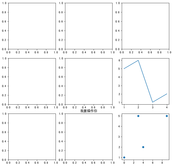
Is it convenient
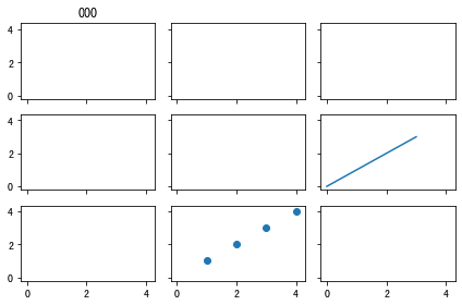
2.3 shared shaft sub diagram:
fig, ax = plt.subplots(3, 3, sharex=True, sharey=True)
# Give an example
ax[1, 2].plot([_ for _ in range(4)], [_ for _ in range(4)])
ax[2, 1].scatter([1, 2, 3, 4], [1, 2, 3, 4])
ax[0, 0].set(title="000")

plt.tight_layout()  # Automatic layout
plt.show()
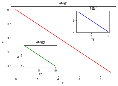
2.4 in the figure:
fig = plt.figure()
x = [1, 2, 3, 4, 5, 6, 7]
y = [7, 6, 5, 4, 3, 2, 1]
# The first big picture
ax1 = fig.add_axes([0.1,  # Left 10% to the left of the canvas
                    0.1,  # bottom is 10% below the canvas
                    0.8,  # Width accounts for 80% of canvas width
                    0.8,  # height accounts for 80% of the canvas
                    ]
                   )
# Draw on the first big picture
ax1.plot([_ for _ in range(10)], [_ for _ in range(10, 0, -1)], 'r')
ax1.set_xlabel("X1")
ax1.set_ylabel("Y1")
ax1.set_title("Subgraph 1")

# Others follow suit
ax2 = fig.add_axes([0.2,  0.2, 0.25, 0.25])
ax2.plot([_ for _ in range(10, 0, -1)], [_ for _ in range(10)], 'g')
ax2.set_xlabel("X2")
ax2.set_ylabel("Y2")
ax2.set_title("Subgraph 2")

# Another way
plt.axes([0.6,  0.6, 0.25, 0.25])
plt.plot([_ for _ in range(10, 0, -1)], [_ for _ in range(10)], 'b')
plt.xlabel("X3")
plt.xlabel("Y3")
plt.title("Subgraph 3")
plt.show()
3. Basic connection function:
plt.plot(x, y, 'xxx', label=, linewidth=)
Parameter 1: position parameter, abscissa of point, iterative object
Parameter 2: position parameter, ordinate of point, object that can be iterated
Parameter 3: position parameter, style of point and line, string
Parameter 4: label keyword parameter, set legend, need to call the legend method of plt or subgraph
Parameter 5: linewidth keyword parameter, set the thickness of the line
General call form:
plot([x], y, [fmt], data=None, **kwargs) ා single line
plot([x], y, [fmt], [x2], y2, [fmt2], … , * * kwargs) ා multiple lines
The optional parameter [fmt] is a string to define the basic attributes of a graph, such as: color, marker, linetype,
Specific form fmt = '[color][marker][line]'
fmt receives a single acronym for each attribute, for example:
plot(x, y, 'bo -) blue dot solid line
If the attribute uses the full name, the fmt parameter cannot be used for combination assignment. The keyword parameter should be used for single attribute assignment, such as:
plot(x,y2,color='green', marker='o', linestyle='dashed', linewidth=1, markersize=6)
plot(x,y3,color='#900302',marker='+',linestyle='-')
Common color parameters:
=============    ===============================
character        color
=============    ===============================
``'b'``          blue blue
``'g'``          green green
``'r'``          red red
``'c'``          cyan Blue-green
``'m'``          magenta Magenta
``'y'``          yellow yellow
``'k'``          black black
``'w'``          white white
=============    ===============================
Common point type parameters:
=============    ===============================
character        description
=============    ===============================
``'.'``          point marker
``','``          pixel marker
``'o'``          circle marker
``'v'``          triangle_down marker
``'^'``          triangle_up marker
``'<'``          triangle_left marker
``'>'``          triangle_right marker
``'1'``          tri_down marker
``'2'``          tri_up marker
``'3'``          tri_left marker
``'4'``          tri_right marker
``'s'``          square marker
``'p'``          pentagon marker
``'*'``          star marker
``'h'``          hexagon1 marker
``'H'``          hexagon2 marker
``'+'``          plus marker
``'x'``          x marker
``'D'``          diamond marker
``'d'``          thin_diamond marker
``'|'``          vline marker
``'_'``          hline marker
=============    ===============================
Common linetype parameters:
=============    ===============================
character        description
=============    ===============================
``'-'``          solid line style Solid line
``'--'``         dashed line style Dotted line
``'-.'``         dash-dot line style Dotted line
``':'``          dotted line style Point line
=============    ===============================
3.1 basic demonstration:
plt.plot([1, 2, 3, 4],
         [9, 1, 7, 3], 'm*-.')
plt.plot([9, 1, 7, 3],
         [1, 2, 3, 4], 'g^--')
plt.show()
3.2 demonstration of common functions:
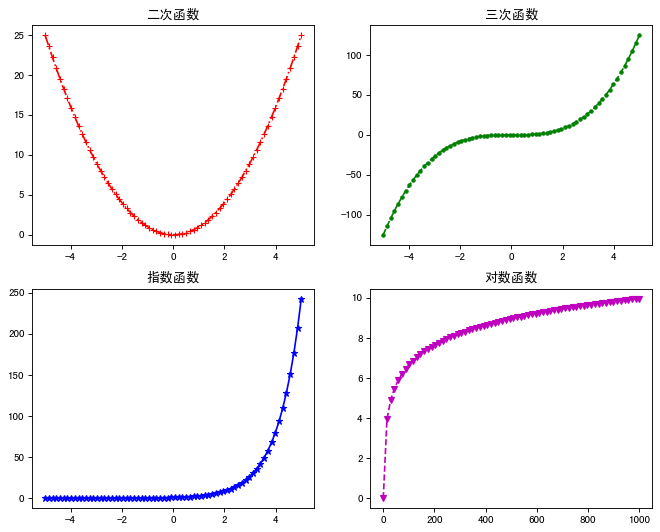
plt.figure(figsize=(10, 8), dpi=80)

plt.subplot(221)
x = np.linspace(-5, 5, 70)
plt.plot(x, x**2, 'r-.+')
plt.title("Quadratic function")

plt.subplot(222)
x = np.linspace(-5, 5, 70)
plt.plot(x, x**3, 'g--.')
plt.title("Three order function")

plt.subplot(223)
x = np.linspace(-5, 5, 70)
plt.plot(x, 3**x, 'b-*')
plt.title("exponential function")

plt.subplot(224)
x = np.linspace(1, 1000, 70)
plt.plot(x, [np.log2(_) for _ in list(x)], 'm--v')
plt.title("Logarithmic function")

plt.show()
4 axis:
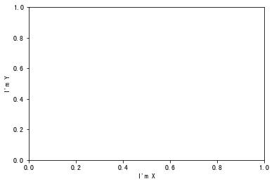
4.1 set coordinate axis Name: (label)
plt.xlabel("I'm X")
plt.ylabel("I'm Y")
plt.show()
# Note that if x and y are unlimited, 0 ~ 1 will be the default
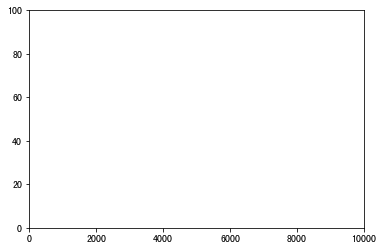
4.2 set the upper and lower limits of the coordinate axis:
Note that, compared with other examples, the origin here closely fits
plt.xlim(0, 10000)
plt.ylim(0, 100)
plt.show()
4.3 custom scale:
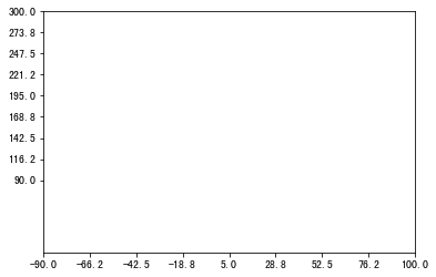
4.3.1 user defined grid quantity:
xticks = np.linspace(-90, 100, 9)
plt.xticks(xticks)
yticks = np.linspace(90, 300, 9)
plt.yticks(yticks)
plt.show()
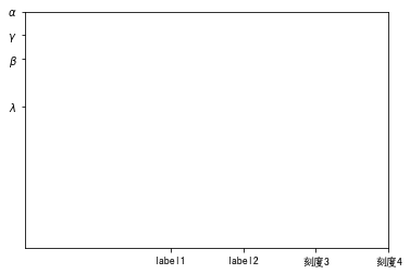
4.3.2 custom scale label:
Support for lateX syntax
plt.xticks([40, 60, 80, 100],
           ['label1', 'label2', 'Scale 3', 'Scale 4'])
plt.yticks([60, 80, 90, 100],
           ['$\lambda$', r'$\beta$', '$\gamma$', '$\\alpha$'])
# Note that keywords such as \ a and \ b can be escaped with two backslashes (like alpha)
#                       You can also add an r regular escape (like beta) before it
plt.show()
4.3.3 hide axis scale:
plt.xticks(())
plt.yticks(())
plt.show()
4.4 boundary operation:
ax = plt.gca()
ax.spines['right'].set_color('none')  # Set the right border to transparent, (hide the right border)
ax.spines['top'].set_color('red')  # Set the top border to red
plt.show()
4.5 slice: (maybe it's what I call...)
Notice that in all the above examples, no matter what the range of xy is, there is only one piece shown (similar to the first quadrant)
But sometimes it's not what we want
Sometimes we want to:
plt.xlim(-100, 100)
plt.ylim(-100, 100)
ax = plt.gca()
ax.spines['right'].set_color('none')
ax.spines['top'].set_color('none')
ax.xaxis.set_ticks_position('bottom')  # Scale position
ax.yaxis.set_ticks_position('left')
ax.spines['bottom'].set_position(('data', 0))  # A point of x corresponds to a point of y (here is the origin)
ax.spines['left'].set_position(('data', 0))  # A point of y corresponds to a point of x (here is the origin)
plt.show()
Or as follows:
plt.xlim(-100, 100)
plt.ylim(-100, 100)
ax = plt.gca()
ax.spines['left'].set_color('none')
ax.spines['bottom'].set_color('none')
ax.xaxis.set_ticks_position('top')
ax.yaxis.set_ticks_position('right')
ax.spines['top'].set_position(('data', 100))
ax.spines['right'].set_position(('data', 100))
plt.show()
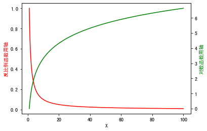
4.6 double Y axis: (secondary axis)
fig, ax1 = plt.subplots()
x = np.linspace(1, 100, 1000)
ax2 = ax1.twinx()
ax1.plot(x, 1/x, 'r')
ax1.set_xlabel("X",color='black')
ax1.set_ylabel("Axis for inverse scale function",color='r')

ax2.plot(x, np.log2(x), 'g')
ax2.set_ylabel("Axis for logarithmic function",color='g')

plt.show()
5 legend:
plt.legend(
    loc: Legend location. The default is' best '(' best ',' upper right ',' upper left ',' lower left ',' lower right ',' right ',' center left ',' center, right ',' lower center ',' upper center ',' center '); (if bbox \

    Font size: font size

    Frame on: display legend frame or not

    ncol: number of columns of legend, generally 1

    Title: add a title to the legend

    Shadow: add shadow to legend border

    markerfirst: True indicates that the legend label is on the right side of the handle, false indicates otherwise

    Marker scale: how many times the size of the legend mark in the original mark

    numpoints: indicates the number of marked points on the handle in the legend, generally set to 1

    fancybox: whether to set the corner of legend box to circle

    framealpha: control the transparency of the legend box

    borderpad: inside margin of legend box

    labelspacing: distance between entries in legend

    handlelength: length of legend handle

    Bbox [to] anchor: if you want to customize the location of the legend or draw the legend outside the coordinates, use it, such as bbox [to] anchor = (1.4,0.8). This is generally matched with ax. Get [position(), set [box. X0, box. Y0, box. Width * 0.8, box. Height])

   )
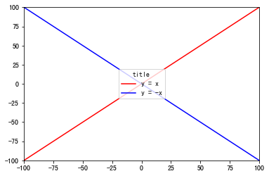
plt.xlim(-100, 100)
plt.ylim(-100, 100)
x = np.linspace(-100, 100, 100)
plt.plot(x, x, 'r', label="y = x")
plt.plot(x, -x, 'b', label="y = -x")
plt.legend(loc="center", title="title")
plt.show()
6 annotation:
plt.annptation(
s For comment text content

xy Is the annotated coordinate point

xytext Is the coordinate location of the annotation text

xycoords The parameters are as follows:

    figure points: Points in the lower left corner of the figure
    figure pixels: Pixels in the lower left corner of the image
    figure fraction: Bottom left
    axes points: Point at the lower left corner of the axis
    axes pixels: Pixels in the lower left corner of the axis
    axes fraction: Fraction of lower left axis
    data: Use the coordinate system of the annotated object(default)
    polar(theta,r): if not native 'data' coordinates t

weight Set font Linetype {'ultralight', 'light', 'normal', 'regular', 'book', 'medium', 'roman', 'semibold', 'demibold', 'demi', 'bold', 'heavy', 'extra bold', 'black'}

color Set font color
    {'b', 'g', 'r', 'c', 'm', 'y', 'k', 'w'}
    'black','red'etc.
    [0,1]Floating point data between
    RGB perhaps RGBA, as: (0.1, 0.2, 0.5),(0.1, 0.2, 0.5, 0.3)etc.

arrowprops  #Arrow parameter, parameter type is dictionary dict

    width: Width of arrow(In points)
    headwidth: Width in dots at the bottom of the arrow
    headlength: Length of arrow(In points)
    shrink: Part of the total length "shrunk" from both ends
    facecolor: Arrow color

bbox Add a frame to the title. Common parameters are as follows:

    boxstyle: Square shape
    facecolor: (Abbreviation fc)background color
    edgecolor: (Abbreviation ec)Border line color
    edgewidth: Border line size
)
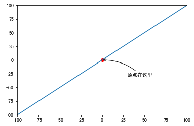
plt.xlim(-100, 100)
plt.ylim(-100, 100)
x = np.linspace(-100, 100, 100)
plt.plot(x, x)
plt.scatter(0, 0, color='r')
plt.annotate("The origin is here",  # Tagged text
             xy=(0, 0),  # initial position
             xytext=(+30, -30),  # Move (30 right, 30 down)
             arrowprops=dict(arrowstyle='->',  # Arrow
                             connectionstyle='arc3,rad=.2'  # Style, angle radians
                             )
             )
plt.show()
7 axis visibility:
Sometimes the line is too thick or the axis scale is too dense, it will be covered by the line, so
plt.xlim(-10, 10)
plt.ylim(-10, 10)
plt.plot(x, x, linewidth=40,
         zorder=0
         # zorder sets the line, coordinate axis scale and coordinate axis order
         # zorder=0 or 1, line at the bottom
         # zorder=2, the line is above the scale below the coordinate axis
         # zorder ≥ 3, line at the top
         )
ax = plt.gca()
ax.spines['right'].set_color('none')
ax.spines['top'].set_color('none')
ax.xaxis.set_ticks_position('bottom')
ax.yaxis.set_ticks_position('left')
ax.spines['bottom'].set_position(('data', 0))
ax.spines['left'].set_position(('data', 0))
for label in ax.get_xticklabels()+ax.get_yticklabels():
    label.set_bbox(dict(facecolor='white',  # White background
                        edgecolor='none',  # Don't show borders
                        alpha=0.7)  # transparency
                   )

plt.show()
8 scatter:
plt.scatter(
x,y: array_like,shape(n,)
    Input data

s: Scalar or array like, shape (n,), optional
    Size in points ^ 2. The default is rcparams ['lines. Marker size '] * * 2.

c: Color, order or color order, optional, default: 'b'
    c can be a string in a single color format or a series of colors
    The length of the specification is n, or a series of N numbers
    Map to color using cmap and norm specified through kwargs
    (see below). Note that c should not be a single number RGB or
    RGBA sequence because it cannot be distinguished from array
    Values will be colored mapped. c can be a two-dimensional array, where
    Rows are RGB or RGBA, but include individual cases
    Behavior all points are assigned the same color.

marker: matplotlib.markers.MarkerStyle, optional, default: 'o'
    See matplotlib.markers for more information on the differences
    Mark styles supported by scatter. marker can be
    An instance of this class or a shorthand for specific text
    Mark.

cmap: matplotlib.colors.Colormap, optional, default: None
    An instance or registered name of matplotlib.colors.Colormap.
    cmap is only used when c is a floating-point array. without,
    The default is rcimage.cmap.

norm: matplotlib.colors.Normalize, optional, default: None
    matplotlib.colors.Normalize instance for scaling
    Luminance data is 0,1. norm is only used when c is an array
    Float. If 'None', the default value is: func: normalize.

vmin, vmax: scalar, optional, default: None
    vmin and vmax are used in combination with norm to standardize
    Brightness data. If any of them are 'none', then the smallest and largest
    Use an array of colors. Please note that if you pass a specification instance, your
    vmin and vmax settings will be ignored.

alpha: scalar, optional, default: None
    alpha blend value, between 0 (transparent) and 1 (opaque),

linewidths: scalar or array "like, optional, default: None
    If not, the default is (lines.linewidth,).

verts: (x, y) sequence, optional
    If 'marker' is None, these vertices will be used for
    Build tags. The center of the tag is at
    At (0,0) is the standardized unit. Overall mark readjustment
    By s.

 edgecolors: color or color order, optional, default: None
    If none, the default is' face '

    If 'face', the edge color will always be the same
    Look.

    If it is' none ', the patch boundary will not
    Be painted.

    For unfilled tags, "edgecolors" kwarg
    Ignored and forced to "face" internally.
)
8.1 basic demonstration:
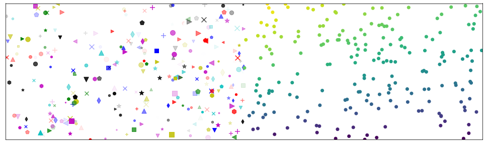
plt.figure(figsize=(17, 5))
plt.xlim(0, 1000)
plt.ylim(0, 1000)
marks = ['o', '*', '^', '+', 'x', 's', '.',
         'd', 'v', '<', '>', 'p', 'h']  # Basic point type
colors = ['r', 'g', 'b', 'y', 'm', 'c', 'w', 'k']  # Basic colors
for i in range(300):  # Randomly select color, size, shape, transparency
    x = np.random.randint(500)
    y = np.random.randint(1000)
    plt.scatter(x, y, c=np.random.choice(colors), s=np.random.randint(20, 100),
                marker=np.random.choice(marks), alpha=np.random.random())
x = np.random.randint(500, 1000, size=200)
y = np.random.randint(1000, size=200)
plt.scatter(x, y, c=np.arctan2(y, x))  # Arctangent system
plt.xticks(())
plt.yticks(())  # Hidden scale
plt.show()
8.1.1 basic graphics can also be drawn:
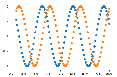
x = np.linspace(1, 20, 100)
plt.scatter(x, np.cos(x))
plt.scatter(x, np.sin(x))
plt.show()
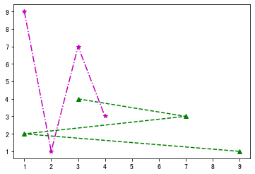
8.2 scatter diagram connection:
plt.xlim(0, 100)
plt.ylim(0, 100)
lists = []
for i in range(50):
    slist = []
    x = np.random.randint(100)
    y = np.random.randint(100)
    plt.scatter(x, y, c='b')
    slist.append(x)
    slist.append(y)
    lists.append(slist)
for i in range(10):  # Take the first 10 pairs of wires
    a1, a2 = lists[i]
    b1, b2 = lists[i+1]
    plt.plot([a1, b1], [a2, b2])
plt.show()
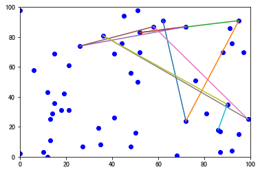
A more mature example of scatter connection:
Python divide and conquer to solve convex hull problem and realize visualization with matplotlib
9 bar:
plt.bar(
    Left left each column x axis left boundary

    bottom the lower boundary of y axis of each column

    Height column height (Y direction)

    Width column width (X-axis direction)

    The above parameters can be set to numerical value or list
    But make sure that if it is a list, len(list) should be consistent
    The drawn square is:
        X: left   --- left+width
        Y: bottom --- bottom+height
    Return value:
        matplotlib.patches.Rectangle

    Histogram can be transformed into Gantt Chart by using bottom extension

    Color bar color

    Edgecolor bar boundary line color

    Linewidth (LW) bar

    align optional ['left '(default) |'center']
                Determine the entire bar chart distribution
                The default left indicates that the drawing starts from the left boundary by default, and the center will draw the drawing in the middle position

    Xerr X direction error bar

    error bar in YeRr Y direction

    Ecolor error bar color

    Capsize error bar horizontal line width (default 3)
)
9.1 basic demonstration:
9.1.1 the normal histogram is upward:
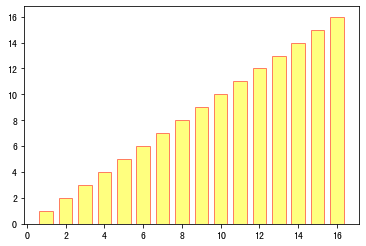
plt.bar(range(1, 17), range(1, 17), alpha=0.5, width=0.7,
        color='yellow', edgecolor='red',  linewidth=1)
plt.show()
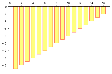
9.1.2 we can also make it downward:
ax = plt.gca()
ax.xaxis.set_ticks_position('top')
plt.bar(range(1, 17), [-_ for _ in range(17, 1, -1)], alpha=0.5, width=0.7,
        color='yellow', edgecolor='red',  linewidth=1)
plt.show()
9.2 other forms:
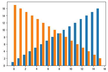
9.2.1 parallel histogram:
bar_width = 0.4
plt.bar(np.arange(16)-bar_width/2, range(1, 17), width=bar_width)
plt.bar(np.arange(16)+bar_width/2, range(17, 1, -1),   width=bar_width)
plt.show()
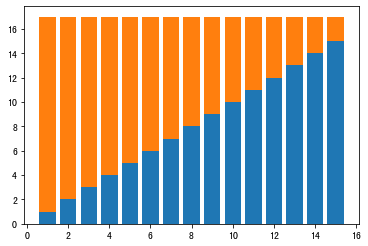
9.2.2 stacking histogram:
plt.bar(range(1, 16), range(1, 16))
plt.bar(range(1, 16), range(16, 1, -1), bottom=range(1, 16))

plt.show()
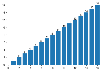
9.2.3 values displayed on the histogram:
items = plt.bar(range(1, 17), range(1, 17))


def add_labels(items):
    for item in items:
        height = item.get_height()
        plt.text(x=item.get_x()+item.get_width()/5, y=height*1.01, s=height)
        item.set_edge_color = "none"


add_labels(items)
plt.show()
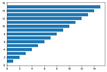
9.2.4 horizontal histogram:
plt.barh(range(1, 16), range(1, 16))
plt.show()
10 histogram (hist):
Histogram is similar to histogram in appearance, which is used to show the statistical graph of continuous data distribution characteristics (histogram mainly shows discrete data distribution)
plt.hist(
    x: Data set, the final histogram will count the data set

    bins: interval distribution of Statistics

    range: tuple, display range

    Width: width

    rwidth: width (1 maximum)

    density: bool, the default is false, which shows the frequency statistics result. If it is True, it shows the frequency statistics result. Here, it should be noted that the frequency statistics result = the number of intervals / (total number * interval width), which is consistent with the effect of normed. The official recommendation is to use density

    histtype: one of {'bar', 'barred', 'step', 'stepfilled'} can be selected. The default is bar. The default configuration is recommended. Step uses ladder shape. Stepfilled will fill the ladder shape. The effect is similar to bar

    align: one of {'left', 'mid', 'right'} can be selected. The default value is' mid '. It controls the horizontal distribution of the histogram. If left or right, there will be some blank areas. The default value is recommended

    log: bool, the default is False, i.e. whether index scale is selected for y axis

    stacked: bool, False by default, stacked
)
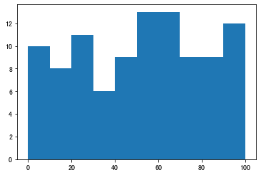
10.1 basic demonstration:
# The histogram will count the values of each interval
plt.hist(x=np.random.randint(0, 100, 100),  # Generate 100 data between 0 and 100, i.e. data set
         bins=np.arange(0, 101, 10),  # Set the continuous boundary value, that is, the distribution interval of histogram [0,10], [10,20]
         )
plt.show()
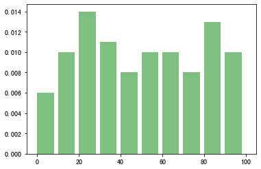
10.2 demonstration of various parameters:
plt.hist(x=np.random.randint(0, 100, 100),
         bins=np.arange(0, 101, 10),
         alpha=0.5,  # transparency
         density=True,  # frequency
         color='green',  # colour
         width=8  # Width < = > rwidth = 0.8
         )
plt.show()
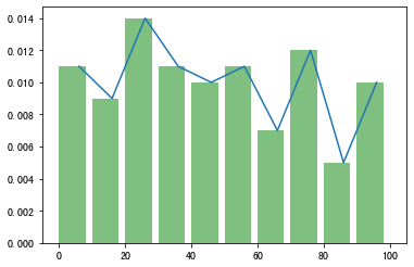
10.3 draw line on histogram:
bins = np.arange(0, 101, 10)
width = 8
s1 = plt.hist(x=np.random.randint(0, 100, 100),
              bins=bins,
              alpha=0.5,  # transparency
              density=True,  # frequency
              color='green',  # colour
              width=width
              )
plt.plot(bins[1:]-width/2, s1[0])
plt.show()
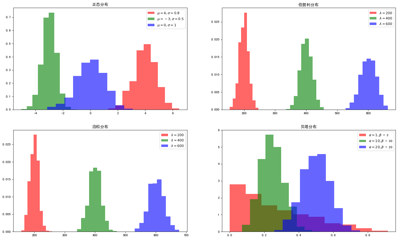
10.4 demonstration of frequency distribution histogram of some basic distributions:
def normal(mu, sigma, color):
    plt.hist(np.random.normal(mu, sigma, 1000), alpha=0.6, color=color,
             density=True, label='$\mu = {},\sigma = {}$'.format(mu, sigma))


def binomial(n, p, color):
    plt.hist(np.random.binomial(n, p, 1000), color=color,
             density=True, alpha=0.6, label="n = {},p = {}".format(n, p))


def poisson(lam, color):
    plt.hist(np.random.poisson(lam, 1000), color=color,
             label="$\lambda = {}$".format(lam), alpha=0.6, density=True)


def beta(alpha, beta_, color):
    plt.hist(np.random.beta(alpha, beta_, 1000), color=color,
             label="$\\alpha = {},\\beta $ = {}".format(alpha, beta_), alpha=0.6, density=True)


plt.figure(figsize=(20, 12), dpi=80)

plt.subplot(221)
normal(4, 0.8, 'r')
normal(-3, 0.5, 'g')
normal(0, 1, 'b')
plt.legend()
plt.title("Normal distribution")

plt.subplot(222)
poisson(200, 'r')
poisson(400, 'g')
poisson(600, 'b')
plt.legend()
plt.title("Bernoulli distribution")

plt.subplot(223)
poisson(200, 'r')
poisson(400, 'g')
poisson(600, 'b')
plt.legend()
plt.title("Poisson distribution")

plt.subplot(224)
beta(1, 3, 'r')
beta(10, 30, 'g')
beta(20, 20, 'b')
plt.legend()
plt.title("Berta distribution")

plt.show()
11 Pie:
plt.pie(
    X: (for each block), if sum(x) > 1, sum(x) normalization will be used;

    labels: (each piece) the explanatory text displayed on the outside of the pie chart;

    Expand: (each piece) distance from the center;

    startangle: the starting drawing angle. By default, the drawing starts from the positive direction of x axis and anticlockwise. If the setting = 90, the drawing starts from the positive direction of y axis;

    Shadow: draw a shadow under the pie. Default value: False, i.e. no shadow;

    Label distance: the drawing position of label mark, relative to the scale of radius, default value is 1.1, if < 1, it will be drawn on the inside of pie chart;

    autopct: controls the percentage setting in the pie chart. You can use format string or format function
            '% 1.1f' refers to the number of decimal places before and after the decimal point (without spaces);

    pctdistance: similar to labeltistance, it specifies the position scale of autopct, and the default value is 0.6;

    Radius: controls the radius of pie chart. The default value is 1;

    Counter clock: Specifies the pointer direction; Boolean value; optional parameter; default value: True, that is, counter clockwise. Change the value to False to clockwise.

    wedgeprops: dictionary type, optional parameter, default value: None. The parameter dictionary is passed to the wedge object to draw a pie chart. For example: widget props = {'linewidth': 3} sets the widget line width to 3.

    textprops: format labels and scale text; dictionary type, optional parameter, default value: None. Dictionary parameter passed to the text object.

    Center: list of floating-point types, optional parameters, default value: (0,0). Icon center position.

    Frame: Boolean type, optional parameter, default value: False. If true, draw the axis frame with the table.

    rotatelabels: Boolean type, optional parameter, default: False. If True, rotate each label to the specified angle.
)
11.1 basic demonstration:
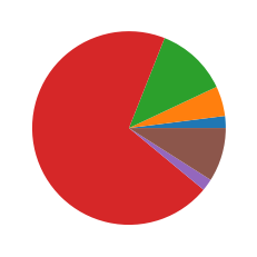
plt.pie([2, 5, 12, 70, 2, 9])
plt.show()
11.2 demonstration of various parameters:
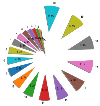
plt.pie(x=[_ for _ in range(1, 21)],
        explode=[_*0.05 for _ in [_ for _ in range(1, 21)]],  # Highlight each other
        startangle=100,  # Starting angle
        shadow=True,  # shadow
        labels=[_ for _ in range(1, 21)],
        autopct='%1.1f%%',  # display scale
        )
plt.show()
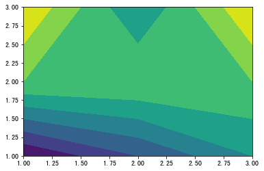
12 contour map (contour / contour):
Contour and contour draw three-dimensional contour map. The difference is that contour fills the area between contour lines
plt.contour([X, Y,] Z, [levels], ** kwargs)
plt.contourf([X, Y,] Z, [levels], ** kwargs)
10. Y: array like, coordinate of optional value Z.
X and Y must both be 2-D and have the same shape as Z, or they must both be 1-d, so len (x) = = M is the number of columns in Z, len (Y) = = N is the number of rows in Z.
Z : array-like(N,M)
The height value of the sketch profile.
levels: int or similar array, optional
Determine the number and location of contour lines / areas.
If int Ñ, use the Ñ data interval; that is, draw n + 1 contours. Automatic selection of horizontal height.
If it is an array, the outline is drawn at the specified level. Values must be in ascending order.
12.1 basic demonstration:
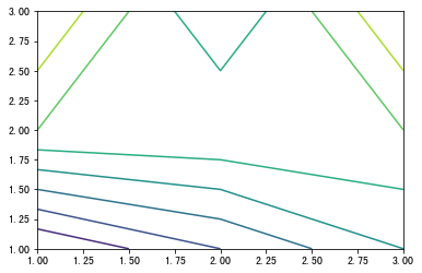
12.1.1 contour:
x = np.array([1, 2, 3])
y = np.array([1, 2, 3])
z = np.array([[-3, -2, -1], [0, 0, 0], [1, -1, 1]])
plt.contour(x, y, z)
plt.show()
12.1.2 contourf:
plt.contourf(x, y, z)
plt.show()
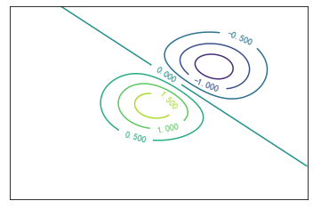
12.2 contour advanced presentation:
Reference resources: https://blog.csdn.net/qq_42505705/article/details/88771942
delta = 0.025
x = np.arange(-3.0, 3.0, delta)
y = np.arange(-3.0, 3.0, delta)
X, Y = np.meshgrid(x, y)
Z1 = np.exp(-X**2 - Y**2)
Z2 = np.exp(-(X - 1)**2 - (Y - 1)**2)
Z = (Z1 - Z2) * 2
fig, ax = plt.subplots()
CS = ax.contour(X, Y, Z)
ax.clabel(CS, inline=1, fontsize=10)
plt.xticks(())
plt.yticks(())
plt.show()
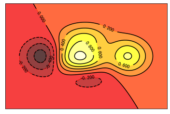
12.3 contour advanced presentation:
Reference resources: https://www.bilibili.com/video/av16378354?p=12
def f(x, y):
    # the height function
    return (1 - x / 2 + x**5 + y**3) * np.exp(-x**2 - y**2)


n = 256
x = np.linspace(-3, 3, n)
y = np.linspace(-3, 3, n)
X, Y = np.meshgrid(x, y)
plt.contourf(X, Y, f(X, Y), 8, alpha=.75, cmap=plt.cm.hot)
C = plt.contour(X, Y, f(X, Y), 8, colors='black')
plt.clabel(C, inline=True, fontsize=10)
plt.xticks(())
plt.yticks(())
plt.show()
13 image:
plt.imshow(
    X, # Storage image can be floating-point array, unit8 array and PIL image. If it is an array, the following shapes need to be met:
        (1) M*N   In this case, the array must be of floating-point type, where the value is the gray level of the coordinate;
        (2) M*N*3  RGB(Floating point or unit8 Type)
        (3) M*N*4  RGBA(Floating point or unit8 Type)


    cmap=None, # Colormap for setting up the heat map
            hot Transition from black smoothing to red, orange, and yellow background colors, then to white.
            cool Contains shades of turquoise and magenta. From turquoise to magenta.
            gray Returns a linear grayscale.
            bone A grayscale image with a higher blue component. The color map is used to add electronic views to the gray scale map.
            white All white monochrome.
            spring Contains shades of magenta and yellow.
            summer Contains the shadow color of green and yellow.
            autumn Change smoothly from red to orange, then to yellow.
            winter A shade containing blue and green.

    norm=None,    # Default "None", can be set to Normalize
                "Normalize(Standardization) ", 2-D Of X Floating point values converted to[0, 1]Interval, as cmap The input value of;
                 //If norm is "None", use the default function: normalize
                 //If norm is such as "no norm", X must be an integer array of query tables directly pointing to camp

    aspect=None,    # Controls the aspect ratio of the axis. This parameter may distort the image, i.e. the pixels are not square.
                'equal': Make sure the aspect ratio is 1,The pixels will be square.
                   (Unless the pixel size explicitly becomes non square in the data,Coordinate use extent ).
                'auto': Change the aspect ratio of the image to match the aspect ratio of the axis. Typically, this results in non square pixels.

    interpolation=None,  #Default "None", which can be set with string type command
                    //The string commands that can be set are:
                    'none','nearest','bilinear','bicubic',
                    'spline16', 'spline36', 'hanning', 'hamming',
                    'hermite', 'kaiser','quadric','catrom',
                    'gaussian','bessel','mitchell', 'sinc','lanczos'

    alpha=None,    # transparency

    vmin=None,

    vmax=None,

    origin=None,

    extent=None,

    shape=None,

    filternorm=1,

    filterrad=4.0,

    imlim=None,

    resample=None,

    url=None,

    hold=None,

    data=None,

    **kwargs
)
13.1 basic usage:
import matplotlib.image as mpimg

# Open a picture
img= mpimg.imread('C:\\Users\\1696589321\\Desktop\\cat.jpg')
imgplot=plt.imshow(img)
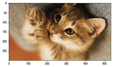
Next let's print this picture for a try;
print(img)
[[[141 123  99]
  [152 136 113]
  [148 133 112]
  ...
  [173 165 152]
  [176 168 155]
  [177 169 156]]

 [[167 149 125]
  [150 134 109]
  [126 111  88]
  ...
  [175 167 154]
  [176 168 155]
  [175 167 154]]

 [[162 142 117]
  [123 105  81]
  [ 90  74  51]
  ...
  [170 162 149]
  [170 162 149]
  [168 160 147]]

 ...

 [[181  98  48]
  [181  98  48]
  [181  98  48]
  ...
  [190 174 148]
  [191 175 149]
  [191 175 149]]

 [[181  98  48]
  [181  98  48]
  [181  98  48]
  ...
  [190 174 148]
  [191 175 149]
  [191 175 149]]

 [[181  98  48]
  [181  98  48]
  [181  98  48]
  ...
  [190 174 148]
  [191 175 149]
  [191 175 149]]]
We can see that this is a multidimensional array, and this is how it works. Each number represents a pixel, so we can DIY our own pictures
PS: although it's DIY, it really can't be called picture ha ha Real pictures, even if the picture quality is poor, there are thousands of pixels, and each value represents a different color So we're just messing around here )
13.2 DIY:
13.2.1 the simplest follow the cat and draw the tiger and cmap demonstration:
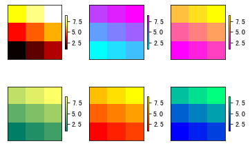
X = np.array([1, 2, 3, 4, 5, 6, 7, 8, 9]).reshape(3, 3)

fig = plt.figure()

ax = fig.add_subplot(231)
im = ax.imshow(X, cmap=plt.cm.hot, origin='urpper')  # c fever
plt.colorbar(im, cax=None, ax=None,
             shrink=0.5  # Proportion of Bar on the right
             )
plt.xticks(())
plt.yticks(())

ax = fig.add_subplot(232)
im = ax.imshow(X, cmap=plt.cm.cool, origin='urpper')  # cold
plt.colorbar(im, cax=None, ax=None, shrink=0.5)
plt.xticks(())
plt.yticks(())

ax = fig.add_subplot(233)
im = ax.imshow(X, cmap=plt.cm.spring, origin='urpper')  # spring
plt.colorbar(im, cax=None, ax=None, shrink=0.5)
plt.xticks(())
plt.yticks(())

ax = fig.add_subplot(234)
im = ax.imshow(X, cmap=plt.cm.summer, origin='urpper')  # summer
plt.colorbar(im, cax=None, ax=None, shrink=0.5)
plt.xticks(())
plt.yticks(())

ax = fig.add_subplot(235)
im = ax.imshow(X, cmap=plt.cm.autumn, origin='urpper')  # autumn
plt.colorbar(im, cax=None, ax=None, shrink=0.5)
plt.xticks(())
plt.yticks(())

ax = fig.add_subplot(236)
im = ax.imshow(X, cmap=plt.cm.winter, origin='urpper')  # winter
plt.colorbar(im, cax=None, ax=None, shrink=0.5)

plt.xticks(())
plt.yticks(())
plt.show()
13.2.2 continuous images:
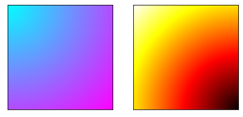
points = np.arange(0, 10, 0.01)
xs, ys = np.meshgrid(points, points)

fig = plt.figure()

ax = fig.add_subplot(121)
ax.imshow(np.sqrt(xs**2 + ys**2), cmap=plt.cm.cool)
plt.xticks(())
plt.yticks(())

points = np.arange(-10, 0, 0.01)
xs, ys = np.meshgrid(points, points)
ax = fig.add_subplot(122)
ax.imshow(np.sqrt(xs**2 + ys**2), cmap=plt.cm.hot)
plt.xticks(())
plt.yticks(())

plt.show()
14 3D image (axes3d):
Premise: from MPL toolkits.mplot3d import Axes3D
14.1 3D scatter diagram:
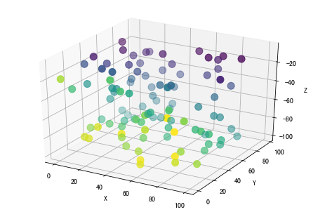
from mpl_toolkits.mplot3d.axes3d import Axes3D
x = np.random.randint(0, 100, size=100)
y = np.random.randint(0, 100, size=100)
z = np.random.randint(-100, 0, size=100)
fig = plt.figure(figsize=(6, 4))
ax = Axes3D(fig)
ax.scatter3D(x, y, z, s=100, c=np.arctan2(y, z))
ax.set_xlabel("X")
ax.set_ylabel("Y")
ax.set_zlabel("Z")
plt.show()
14.2 3D curve:
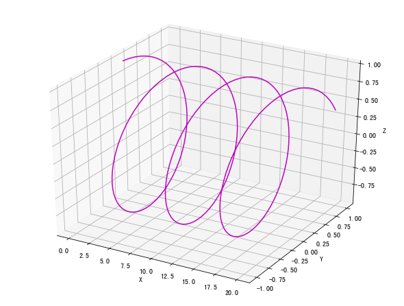
x = np.linspace(0, 20, 200)
y = np.sin(x)
z = np.cos(x)
fig = plt.figure(figsize=(8, 6))
ax = Axes3D(fig)
ax.plot(x, y, z, color='m')
ax.set_xlabel("X")
ax.set_ylabel("Y")
ax.set_zlabel("Z")
plt.show()
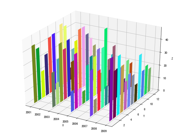
14.3 3D histogram:
x = np.array([2001, 2003, 2005, 2007, 2009])
y = np.arange(1, 13)
fig = plt.figure(figsize=(8, 6))
ax = Axes3D(fig)
for year in x:
    z = np.random.randint(10, 50, size=12)
    ax.bar(y, z, zs=year, zdir='x', color=np.random.rand(12, 3))
ax.set_xlabel("X")
ax.set_ylabel("Y")
ax.set_zlabel("Z")
plt.show()
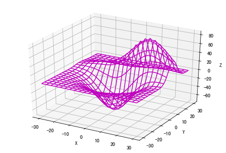
14.4 3D wireframe:
from mpl_toolkits.mplot3d import axes3d
fig = plt.figure()
ax = Axes3D(fig)
X, Y, Z = axes3d.get_test_data(0.03)
ax.plot_wireframe(X, Y, Z,
                  rstride=10,  # rstride (row) specifies the span of the row
                  cstride=10,  # cstride(column) specifies the span of the column
                  color='m'
                  )
ax.set_xlabel("X")
ax.set_ylabel("Y")
ax.set_zlabel("Z")
plt.show()
14.5 3D surface:
3D surface graph can help us understand some abstract 3D mathematical functions
fig = plt.figure(figsize=(12, 8))
ax = Axes3D(fig)
delta = 0.125
x = np.arange(-3.0, 3.0, delta)
y = np.arange(-2.0, 2.0, delta)
X, Y = np.meshgrid(x, y)
Z = X**2+Y**2
ax.plot_surface(X, Y, Z,
                rstride=1,
                cstride=1,
                cmap=plt.get_cmap('rainbow')  # Set color mapping
                )
ax.set_xlabel("X")
ax.set_ylabel("Y")
ax.set_zlabel("Z")
plt.title("$y=x^2+y^2$")
plt.show()
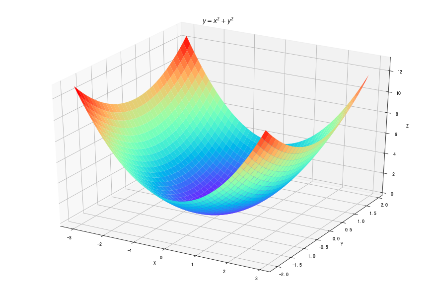
fig = plt.figure(figsize=(12, 8))
ax = Axes3D(fig)
delta = 0.125
x = np.arange(-3.0, 3.0, delta)
y = np.arange(-2.0, 2.0, delta)
X, Y = np.meshgrid(x, y)
Z = np.sqrt(X**2+Y**2)
ax.plot_surface(X, Y, Z,
                rstride=1,
                cstride=1,
                cmap=plt.get_cmap('rainbow')
                )
ax.set_xlabel("X")
ax.set_ylabel("Y")
ax.set_zlabel("Z")
plt.title("$y=\sqrt{x^2+y^2}$")
plt.show()
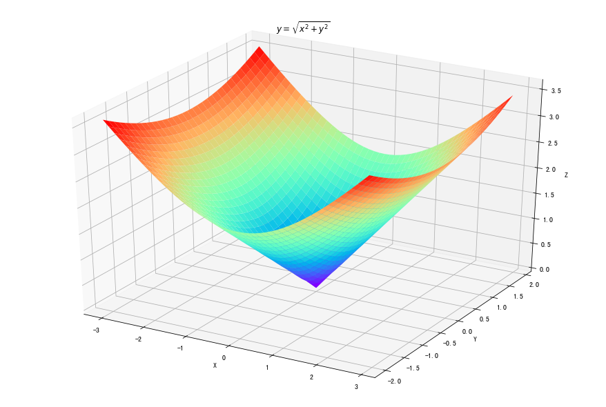
fig = plt.figure(figsize=(12, 8))
ax = Axes3D(fig)
delta = 0.125
x = np.arange(-3.0, 3.0, delta)
y = np.arange(-2.0, 2.0, delta)
X, Y = np.meshgrid(x, y)
Z = np.sin(np.sqrt(X**2+Y**2))
ax.plot_surface(X, Y, Z,
                rstride=1,
                cstride=1,
                cmap=plt.get_cmap('rainbow')
                )
ax.set_xlabel("X")
ax.set_ylabel("Y")
ax.set_zlabel("Z")
plt.title("$y=sin(x^2+y^2)$")
plt.show()
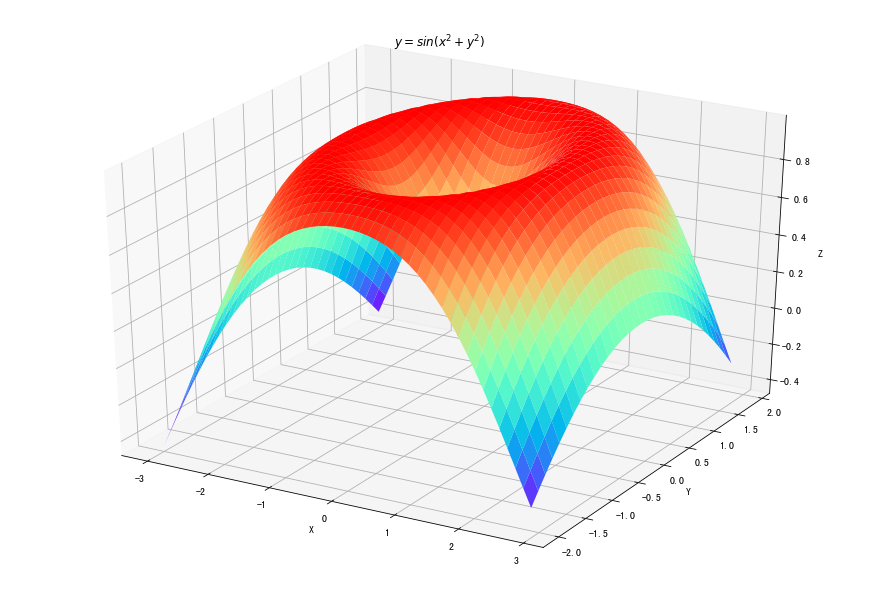
fig = plt.figure(figsize=(12, 8))
ax = Axes3D(fig)
delta = 0.125
x = np.arange(-3.0, 3.0, delta)
y = np.arange(-2.0, 2.0, delta)
X, Y = np.meshgrid(x, y)
Z = np.cos(np.sqrt(X**2+Y**2))
ax.plot_surface(X, Y, Z,
                rstride=1,
                cstride=1,
                cmap=plt.get_cmap('rainbow')
                )
ax.set_xlabel("X")
ax.set_ylabel("Y")
ax.set_zlabel("Z")
plt.title("$y=cos(x^2+y^2)$")
plt.show()
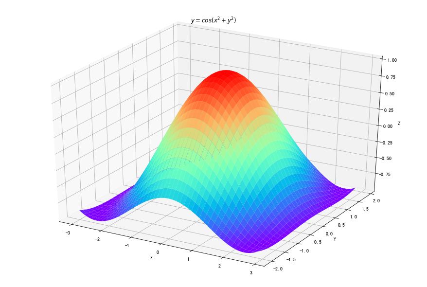
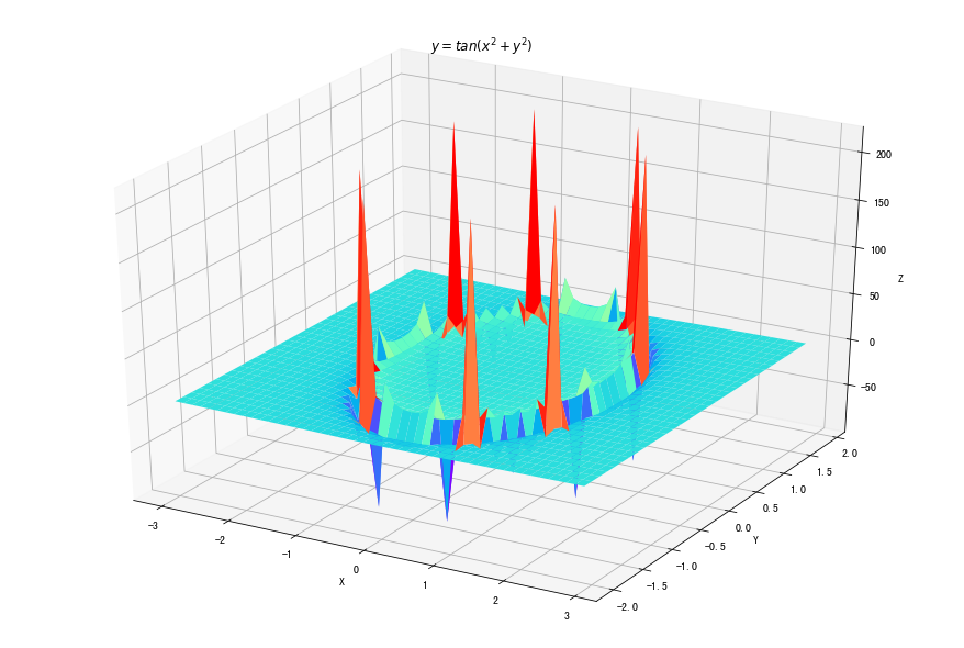
fig = plt.figure(figsize=(12, 8))
ax = Axes3D(fig)
delta = 0.125
x = np.arange(-3.0, 3.0, delta)
y = np.arange(-2.0, 2.0, delta)
X, Y = np.meshgrid(x, y)
Z = np.tan(np.sqrt(X**2+Y**2))
ax.plot_surface(X, Y, Z,
                rstride=1,
                cstride=1,
                cmap=plt.get_cmap('rainbow')
                )
ax.set_xlabel("X")
ax.set_ylabel("Y")
ax.set_zlabel("Z")
plt.title("$y=tan(x^2+y^2)$")
plt.show()
15 Animation:
Premise: from matplotlib import animation
FuncAnimationnc: Makes an animation by repeatedly calling a function fun.
(implement an animation by calling functions repeatedly)
ArtistAnimation: Animation using a fixed set of Artist objects.
(animate with a set of fixed Artist objects. )
15.1 FuncAnimation:
animation.FuncAnimation(
    fig,     # The picture of the animation

    func,    # Animation function, the first parameter is the value of the next frame, and other parameters are passed by fargs

    frames=None,      # Animation frames

    init_func=None,    # Initialization function, used to empty the figure, if not set, use the first frame of image in func

    fargs=None,         # Data of a dictionary type will be used as the parameter of func function

    save_count=None,     # Number of animation frames buffered

    *,
    cache_frame_data=True,
    **kwargs
       |- interval: Interval time; unit milliseconds Millisecond 1/1000
       |- repeat: Repeat or not;
       |- Refer to the documentation for other parameters.
)
from matplotlib import animation

fig, ax = plt.subplots()
x = np.arange(0, 2*np.pi, 0.01)
line, = ax.plot(x, np.sin(x))


def funcs(i):
    line.set_ydata(np.sin(x+i/10))
    return line,


def inits():
    line.set_ydata(np.sin(x))
    return line,


ani = animation.FuncAnimation(fig=fig, func=funcs, frames=100, interval=20)
plt.show()
ani.save('FuncAnamiation.gif', writer='pillow', fps=10)  # Save to local
A more mature and perfect application example:
15.2 ArtistAnimation:
animation.ArtistAnimation(
      fig, # Used to show figure, generated with plt.figure()

      ims,           # list format, each element is a collection completely composed of artists class, representing a frame, and only displayed in this frame (after this frame will be erased)

      interval=200,  # Update frequency in ms

      repeat_delay=None,   # How often does the animation repeat after each display

      repeat = True,     # Repeat animation or not

      blit=False      # # Choose whether to update all points or only those that change. True should be selected, but the mac user should select False, otherwise it cannot be displayed
)
a = np.random.rand(10, 10)

fig, ax = plt.subplots()
container = []

for i in range(a.shape[1]):
    line, = ax.plot(a[:, i])
    title = ax.text(0.5, 1.05, "Title {}".format(i),
                    size=plt.rcParams["axes.titlesize"],
                    ha="center", transform=ax.transAxes)
    container.append([line, title])

ani = animation.ArtistAnimation(fig, container, interval=200, blit=False)
ani.save('ArtistAnamiation.gif', writer='pillow', fps=10)  # Save to local
plt.show()
16 base map:
This is too much. It's not for beginners. If you want to play, go here to watch it:
https://basemaptutorial.readthedocs.io/en/latest/
To be honest, it's because I didn't use it
I use pyecharts to draw maps A kind of For example:
pyecharts-Map3D to realize novel coronavirus pneumonia data nationwide visualization)

