You can draw a line chart into a scatter chart. Scatter diagram can reflect the correlation between two variables, that is, if there is a correlation, is it a positive linear relationship or a negative linear relationship? Even nonlinear?
plt.scatter()
plt.scatter(x, y, s=20,
            c=None, marker='o',
            cmap=None, norm=None,
            vmin=None, vmax=None,
            alpha=None, linewidths=None,
            edgecolors=None)
X: specify the x-axis data of the scatter diagram;
Y: specify the y-axis data of scatter diagram;
s: specify the point size of the scatter chart, which is 20 by default. The bubble chart can be drawn by passing in new variables;
c: Specifies the color of scatter plot points, which is blue by default;
marker: Specifies the shape of scatter points, which is circular by default;
cmap: Specifies the color chart. It works only when the c parameter is a floating-point array;
norm: set the data brightness, standardize to 0 ~ 1, use this parameter still need c as floating-point array;
vmin, vmax: brightness setting, similar to norm. If norm is used, this parameter is invalid;
alpha: sets the transparency of the scatter;
linewidths: sets the width of the scatter boundary line;
edgecolors: sets the color of the scatter boundary line;
#Import module
import pandas as pd
import matplotlib.pyplot as plt

#Set drawing style
plt.style.use('ggplot')
#Set the normal display of Chinese code and minus sign
plt.rcParams['font.sans-serif']=['Microsoft YaHei']
plt.rcParams['axes.unicode_minus']=False
#Set warning elimination
import warnings
warnings.filterwarnings('ignore')

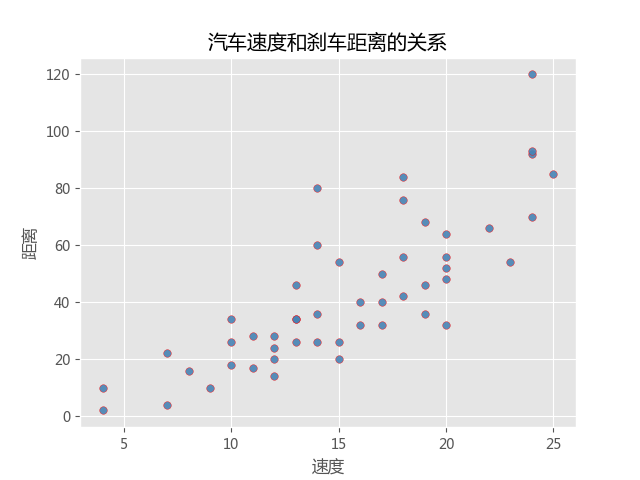
#####1)Simple scatter diagram############
#read in data
file=open(r'E:\Zhihu document preservation\python_scatter\cars.csv')
cars=pd.read_csv(file)
#Mapping
plt.scatter(
    cars.speed,#x-axis is the vehicle speed
    cars.dist,#y-axis is the braking distance
    s=30,#Set point size
    c='steelblue',#Dot color
    marker='s',#Shape of points
    alpha=0.9,#Transparency of points
    linewidths=0.3,#Set the thickness of the scatter boundary
    edgecolors='red'#Set the color of the scatter boundary
)
#Add axis labels and titles
plt.title('Relationship between vehicle speed and braking distance')
plt.xlabel('speed')
plt.ylabel('distance')

#Remove the top and right scale of the border
plt.tick_params(top='off',right='off')

#display graphics
plt.show()

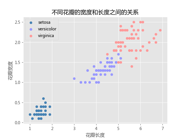
#####2) group scatter drawing
#Case: petal dataset
#Read data
file1=open(r'E:\Zhihu document preservation\python_scatter\iris.csv')
iris=pd.read_csv(file1)

#Mapping
#First of all, the data set is analyzed. There are several kinds of spice. The length and width of these petals need to be drawn with dots. Different kinds need different colors
#Because it is a grouping, it can be processed with a for loop

#Custom colors
colors=['steelblue','#9999ff','#ff9999']
#Three different kinds of decors
Species=iris.Species.unique()
#for loop to complete the drawing of group scatter
for i in range(len(Species)):
    plt.scatter(iris.loc[iris.Species==Species[i],'Petal.Length'],
                iris.loc[iris.Species==Species[i],'Petal.Width'],
                s=35,
                c=colors[i],
                label=Species[i])

#Add title and axis labels
plt.title('The relationship between the width and length of different petals')
plt.xlabel('Petal length')
plt.ylabel('petal width')

#Remove top and right border scale from borders
plt.tick_params(top='off',right='off')
plt.legend(loc='upper left')
plt.show()

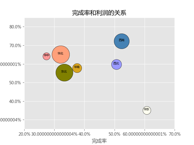
#####3) bubble chart
import numpy as np

#Read data
sales=pd.read_excel('E:\Zhihu document preservation\python_scatter\sales.xlsx')

#Draw bubble chart
colors=['steelblue','#9999ff','#ff9999','#DAA520','#FFFFF0','#FFA07A','#808000']
region=sales.region.unique()
texts=['Southwest','Northwest','Central China','south China','East China','North China','Northeast']
for i in range(len(region)):
    plt.scatter(sales.finish_ratio[i],
                sales.profit_ratio[i],
                c=colors[i],
                s=sales.tot_target[ i]/30,
                edgecolors='black')
    plt.text(sales.finish_ratio[i],
             sales.profit_ratio[i]+0.0001,
             texts[i],
             size=7,
             ha='center')

#Change the display mode of scale (percentage form)
plt.xticks(np.arange(0,1,0.1),[str(i*100)+'%' for i in np.arange(0,1,0.1)])
plt.yticks(np.arange(0,1,0.1),[str(i*100)+'%' for i in np.arange(0,1,0.1)])
#Set the value range of the axis
plt.xlim(0.20,0.70)
plt.ylim(0.25,0.85)

#Add title and axis
plt.title('Relationship between completion rate and profit')
plt.xlabel('Completion rate')
plt.ylabel('Profit margin')

#Remove the top and right scale of the border
plt.tick_params(top='off',right='off')

plt.show()
