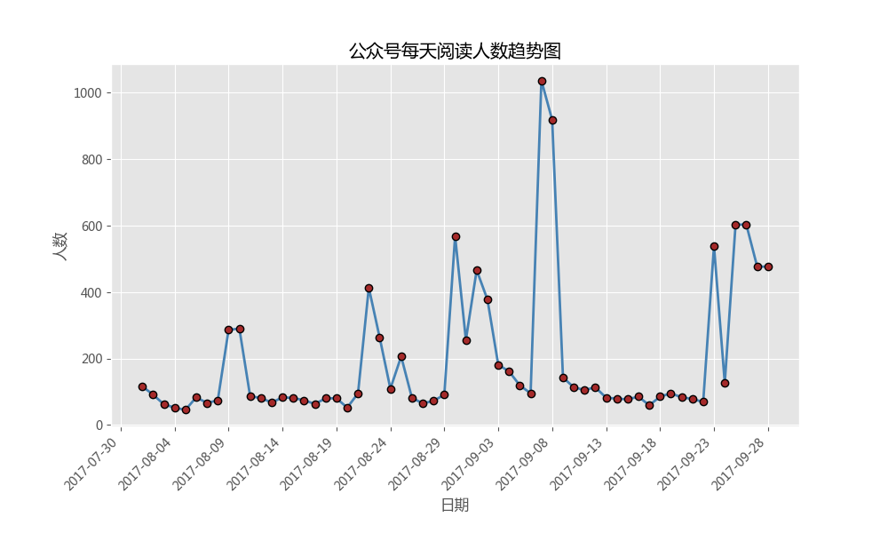
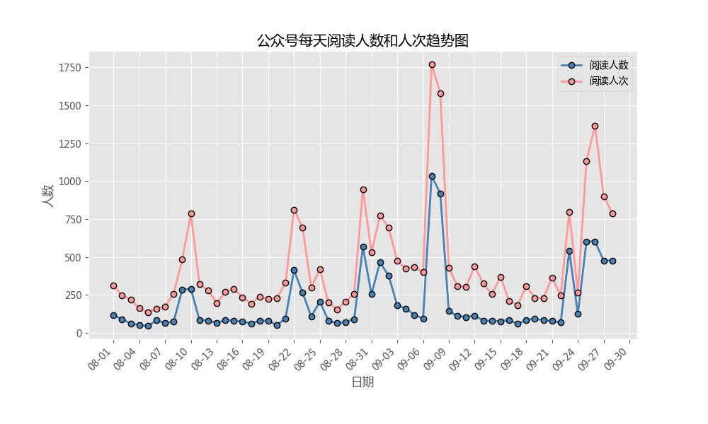
Line chart for economic trend chart, sales fluctuation chart and PV monitoring chart
plt.hist()
But it seems that we will always use the plt.plot() function to apply
plt.hist(x,y,linestyle,
        linewidth,color,marker,
        markersize,markeredgecolor,
        markerfactcolor,label,alpha)
X: Specifies the x-axis data of the line chart;
Y: specify the y-axis data of the line chart;
linestyle: Specifies the type of polyline, which can be solid line, dotted line, dotted line, etc. the default is solid line;
linewidth: Specifies the width of the polyline
marker: you can add points to a line chart. This parameter is the shape of the set point;
Marker size: set the size of the point;
Marked gecolor: set the border color of the point;
markerfactcolor: sets the fill color of the point;
Label: label a line chart, similar to the function of a legend;
#Line chart for economic trend chart, sales fluctuation chart and PV monitoring chart

#Drawing of line chart of one element
#Case: daily progress a little 2015 public number article reading number

#Import module
import pandas as pd
import matplotlib.pyplot as plt

#Set drawing style
plt.style.use('ggplot')
#Set Chinese code and negative sign to display normally
plt.rcParams['font.sans-serif']=['Microsoft YaHei']
plt.rcParams['axes.unicode_minus']=False
#Ignore warning
import warnings
warnings.filterwarnings('ignore')

#Read the data that needs to be drawn
# file=open('E: \ know how to save the file \ Python \ curveplot \ wechart. Xlsx ','rb')
article_reading=pd.read_excel('E:\Zhihu document preservation\python_curveplot\wechart.xlsx')
#Access: access data from August to September 28
sub_data=article_reading.loc[article_reading.date>='2017-08-01',:]
#Data can be read directly by data function, and date data has operation

#Set border size
fig=plt.figure(figsize=(10,6))

#Mapping
plt.plot(
    sub_data.date,#x axis data
    sub_data.article_reading_cnts,#y axis data
    linestyle='-',#Broken line type
    linewidth=2,#Broken line width
    color='steelblue',#Broken line color
    marker='o',#Shape of points
    markersize=6,#Size of points
    markeredgecolor='black',#Border color of point
    markerfacecolor='brown'#Point fill color
)

#Add title and axis labels
plt.title('Public figure reading trend chart per day')
plt.xlabel('date')
plt.ylabel('Number')

#Remove the scale of the upper and right borders of the border
plt.tick_params(top='off',right='off')


#This step is to further optimize the image. For example, the scale label is displayed in the form of "yyyy MM DD", and the fixed interval is a few days
#Just add a few lines of code based on the above

import matplotlib as mpl
#Get the coordinate information of the graph
ax=plt.gca()
#Format date
date_format=mpl.dates.DateFormatter('%Y-%m-%d')
ax.xaxis.set_major_formatter(date_format)

#Set how many Date scales are displayed on the x-axis
#xlocator=mpl.ticker.LinearleLocator(10)
#Set the number of days between each scale on the x axis
xlocator=mpl.ticker.MultipleLocator(5)
ax.xaxis.set_major_locator(xlocator)

#In order to avoid the overlap of x-axis date scale labels, set the x-axis scale to display automatically and tilt 45 degrees
fig.autofmt_xdate(rotation=45)

plt.show()

######Multi line drawing############
#If you need to draw two line graphs on a graph, it is also very simple. You only need to write the plot function twice in the code, and no other changes are needed.
#Import module
import pandas as pd
import matplotlib.pyplot as plt

#Set drawing style
plt.style.use('ggplot')
#Set Chinese code and negative sign to display normally
plt.rcParams['font.sans-serif']=['Microsoft YaHei']
plt.rcParams['axes.unicode_minus']=False
#Ignore warning
import warnings
warnings.filterwarnings('ignore')

#Read the data that needs to be drawn
# file=open('E: \ know how to save the file \ Python \ curveplot \ wechart. Xlsx ','rb')
article_reading=pd.read_excel('E:\Zhihu document preservation\python_curveplot\wechart.xlsx')
#Access: access data from August to September 28
sub_data=article_reading.loc[article_reading.date>='2017-08-01',:]
#Data can be read directly with data function, and date data has operation

#Set border size
fig=plt.figure(figsize=(10,6))

#Mapping - trends in the number of readers
plt.plot(
    sub_data.date,#x axis data
    sub_data.article_reading_cnts,#y axis data
    linestyle='-',#Broken line type
    linewidth=2,#Broken line width
    color='steelblue',#Broken line color
    marker='o',#Shape of points
    markersize=6,#Case of points
    markeredgecolor='black',#Border color of point
    markerfacecolor='steelblue',#Point fill color
    label='Number of readers'#Add tags

)

#Mapping - trends in number of readers
plt.plot(
    sub_data.date,#x axis label
    sub_data.article_reading_times,#y axis data
    linestyle='-',#Broken line type
    linewidth=2,#Broken line width
    color='#ff9999',#Broken line color
    marker='o',#Shape of points
    markersize=6,#Size of points
    markeredgecolor='black',#Border color of point
    markerfacecolor='#ff9999',#Point fill color
     label='Reading times'
)

#Add title and axis labels
plt.title('Daily number and trend chart of public number')
plt.xlabel('date')
plt.ylabel('Number')

#Remove the scale of the upper and right borders of the border
plt.tick_params(top='off',right='off')

#Get the coordinate information of the graph
ax=plt.gca()
#Format date
date_format=mpl.dates.DateFormatter('%m-%d')
ax.xaxis.set_major_formatter(date_format)

#Set how many Date scales are displayed on the x-axis
#xlocator=mpl.ticker.LinearLocator(10)
#Set the number of days between each scale on the x axis
xlocator=mpl.ticker.MultipleLocator(3)
ax.xaxis.set_major_locator(xlocator)

#In order to avoid the overlap of x-axis date scale labels, set the x-axis scale to display automatically and tilt 45 degrees
fig.autofmt_xdate(rotation=45)

plt.legend()
plt.show()
