In recent work, we need to develop the H5 page on the mobile terminal. Instead of using the familiar react + antd mobile, react + taro UI and Vue + uview, we used react + material UI to make a new attempt. And just recently, react router / react router DOM forcibly iterated a large version with hooks mode @6;
Purpose: after getting tired of the midrange style of antd, experience the Material's dark mode and configurable palette.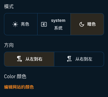
Version information related to React:
  "react": "^17.0.2",
  "react-dom": "^17.0.2",
  "react-redux": "^7.2.6",
  "react-router": "^6.0.2",
  "react-router-dom": "^6.0.2",
Material UI version information:
  "@emotion/react": "^11.6.0",
  "@emotion/styled": "^11.6.0",
  "@material-ui/core": "^5.0.0-beta.5",
  "@material-ui/styles": "^4.11.4",
  "@mui/icons-material": "^5.1.1",
  "@mui/lab": "^5.0.0-alpha.56",
  "@mui/material": "^5.1.1",
The components used are:
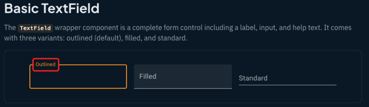
Typography Button Radio Select Switch TextField Badge List Table Tooltip Alert Dialog Progress Accordion Card Paper Menu Pagination Grid Modal Date Range Picker...
Problems encountered:
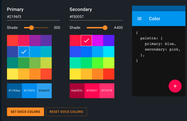
1. You need to define the color matching configuration of the preferred theme primary and secondary themes
2. Components are not Chinese and need to be Chinese by themselves [e.g. calendar, etc.]
3. Components need secondary packaging to make them more in line with Chinese aesthetics
Access material UI
Material UI official website
Note: it is recommended to import a single component, for example:
    import { Button, Tabs, Modal, Box} from '@material-ui/core/index';
    And
    import Button from '@material-ui/core/Button';
    difference
    In the above introduction method, the volume of the packaged package is about 10 times that of the following package...
Configuration of topics
In the Color, several colors are simply selected to match
Note: primary's dark is 800 color value, main is 600 color value, and light is 400 color value; secondary dark is 700 color value, main is 500 color value and light is 200 color value; Look at personal aesthetics, you can use different colors to match.
themeConfig.js file

const theme = {
    pink: {
        palette: {
            primary: {
                light: '#ec407a',
                main: '#d81b60',
                dark: '#ad1457',
                contrastText: '#000',
            },
            secondary: {
                light: '#f48fb1',
                main: '#e91e63',
                dark: '#c2185b',
                contrastText: '#000',
            },
        },
    },
    purple: {
        palette: {
            primary: {
                light: '#ab47bc',
                main: '#8e24aa',
                dark: '#6a1b9a',
            },
            secondary: {
                light: '#ce93d8',
                main: '#9c27b0',
                dark: '#7b1fa2',
            },
        },
    },
    deepPurple: {
        palette: {
            primary: {
                light: '#7e57c2',
                main: '#5e35b1',
                dark: '#4527a0',
                contrastText: '#000',
            },
            secondary: {
                light: '#b39ddb',
                main: '#673ab7',
                dark: '#512da8',
                contrastText: '#000',
            },
        },
    },
    blue: {
        palette: {
            primary: {
                light: '#42a5f5',
                main: '#1e88e5',
                dark: '#1565c0',
                contrastText: '#000',
            },
            secondary: {
                light: '#90caf9',
                main: '#2196f3',
                dark: '#1976d2',
                contrastText: '#000',
            },
        },
    },
    teal: {
        palette: {
            primary: {
                light: '#26a69a',
                main: '#00897b',
                dark: '#00695c',
                contrastText: '#000',
            },
            secondary: {
                light: '#80cbc4',
                main: '#009688',
                dark: '#00796b',
                contrastText: '#000',
            },
        },
    },
    green: {
        palette: {
            primary: {
                light: '#66bb6a',
                main: '#43a047',
                dark: '#2e7d32',
                contrastText: '#000',
            },
            secondary: {
                light: '#a5d6a7',
                main: '#4caf50',
                dark: '#388e3c',
                contrastText: '#000',
            },
        },
    },
    amber: {
        palette: {
            primary: {
                light: '#ffca28',
                main: '#ffb300',
                dark: '#ff8f00',
                contrastText: '#000',
            },
            secondary: {
                light: '#ffe082',
                main: '#ffc107',
                dark: '#ffa000',
                contrastText: '#000',
            },
        },
    },
    blueGrey: {
        palette: {
            primary: {
                light: '#ECEFF1',
                main: '#90A4AE',
                dark: '#455A64',
                contrastText: '#000',
            },
            secondary: {
                light: '#E0E0E0',
                main: '#757575',
                dark: '#424242',
                contrastText: '#000',
            },
        },
    },
    cyan: {
        palette: {
            primary: {
                light: '#E0F7FA',
                main: '#00BCD4',
                dark: '#00838F',
                contrastText: '#000',
            },
            secondary: {
                light: '#E1F5FE',
                main: '#039BE5',
                dark: '#01579B',
                contrastText: '#000',
            },
        },
    },
};
export default theme;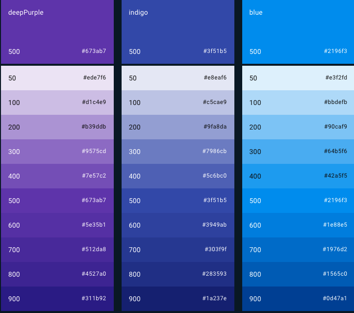
Global basic CSS style configuration
import themePalette from './themePaletteMode';
import { colorToRgba } from './../../utils/colorToRgba';
const applicationTheme = (color, mode, direction) => ({
direction,
palette: {
type: mode,
primary: themePalette(color, mode).palette.primary,
secondary: themePalette(color, mode).palette.secondary,
action: {
hover: mode === 'dark' ? 'rgba(80,80,80, 0.9)' : 'rgba(80,80,80, 0.05)',
hoverOpacity: 0.05,
},
},
typography: {
useNextVariants: true,
fontFamily: ['Open Sans', 'sans-serif'].join(','),
title: {
fontWeight: 600,
},
body2: {
fontWeight: 500,
},
fontWeightMedium: 600,
},
shade: {
light: '0 10px 15px -5px rgba(62, 57, 107, .07)',
},
glow: {
light: `0 2px 20px -5px ${themePalette(color, mode).palette.primary.main}`,
medium: `0 2px 40px -5px ${themePalette(color, mode).palette.primary.main}`,
dark: `0 2px 40px 0px ${themePalette(color, mode).palette.primary.main}`,
},
rounded: {
small: '8px',
medium: '12px',
big: '20px',
},
shadows:
mode === 'dark'
? [
'none',
`0px 1px 3px 0px rgba(100,100,100, 0.6),0px 1px 1px 0px rgba(100,100,100, 0.4),0px 2px 1px -1px rgba(100,100,100, 0.2)`,
'0px 1px 5px 0px rgba(100,100,100, 0.6),0px 2px 2px 0px rgba(100,100,100, 0.4),0px 3px 1px -2px rgba(100,100,100, 0.2)',
'0px 1px 8px 0px rgba(100,100,100, 0.6),0px 3px 4px 0px rgba(100,100,100, 0.4),0px 3px 3px -2px rgba(100,100,100, 0.2)',
'0px 2px 4px -1px rgba(100,100,100, 0.6),0px 4px 5px 0px rgba(100,100,100, 0.4),0px 1px 10px 0px rgba(100,100,100, 0.2)',
'0px 3px 5px -1px rgba(100,100,100, 0.6),0px 5px 8px 0px rgba(100,100,100, 0.4),0px 1px 14px 0px rgba(100,100,100, 0.2)',
'0px 3px 5px -1px rgba(100,100,100, 0.6),0px 6px 10px 0px rgba(100,100,100, 0.4),0px 1px 18px 0px rgba(100,100,100, 0.2)',
'0px 4px 5px -2px rgba(100,100,100, 0.6),0px 7px 10px 1px rgba(100,100,100, 0.4),0px 2px 16px 1px rgba(100,100,100, 0.2)',
'0px 5px 5px -3px rgba(100,100,100, 0.6),0px 8px 10px 1px rgba(100,100,100, 0.4),0px 3px 14px 2px rgba(100,100,100, 0.2)',
'0px 5px 6px -3px rgba(100,100,100, 0.6),0px 9px 12px 1px rgba(100,100,100, 0.4),0px 3px 16px 2px rgba(100,100,100, 0.2)',
'0px 6px 6px -3px rgba(100,100,100, 0.6),0px 10px 14px 1px rgba(100,100,100, 0.4),0px 4px 18px 3px rgba(100,100,100, 0.2)',
'0px 6px 7px -4px rgba(100,100,100, 0.6),0px 11px 15px 1px rgba(100,100,100, 0.4),0px 4px 20px 3px rgba(100,100,100, 0.2)',
'0px 7px 8px -4px rgba(100,100,100, 0.6),0px 12px 17px 2px rgba(100,100,100, 0.4),0px 5px 22px 4px rgba(100,100,100, 0.2)',
'0px 7px 8px -4px rgba(100,100,100, 0.6),0px 13px 19px 2px rgba(100,100,100, 0.4),0px 5px 24px 4px rgba(100,100,100, 0.2)',
'0px 7px 9px -4px rgba(100,100,100, 0.6),0px 14px 21px 2px rgba(100,100,100, 0.4),0px 5px 26px 4px rgba(100,100,100, 0.2)',
'0px 8px 9px -5px rgba(100,100,100, 0.6),0px 15px 22px 2px rgba(100,100,100, 0.4),0px 6px 28px 5px rgba(100,100,100, 0.2)',
'0px 8px 10px -5px rgba(100,100,100, 0.6),0px 16px 24px 2px rgba(100,100,100, 0.4),0px 6px 30px 5px rgba(100,100,100, 0.2)',
'0px 8px 11px -5px rgba(100,100,100, 0.6),0px 17px 26px 2px rgba(100,100,100, 0.4),0px 6px 32px 5px rgba(100,100,100, 0.2)',
'0px 9px 11px -5px rgba(100,100,100, 0.6),0px 18px 28px 2px rgba(100,100,100, 0.4),0px 7px 34px 6px rgba(100,100,100, 0.2)',
'0px 9px 12px -6px rgba(100,100,100, 0.6),0px 19px 29px 2px rgba(100,100,100, 0.4),0px 7px 36px 6px rgba(100,100,100, 0.2)',
'0px 10px 13px -6px rgba(100,100,100, 0.6),0px 20px 31px 3px rgba(100,100,100, 0.4),0px 8px 38px 7px rgba(100,100,100, 0.2)',
'0px 10px 13px -6px rgba(100,100,100, 0.6),0px 21px 33px 3px rgba(100,100,100, 0.4),0px 8px 40px 7px rgba(100,100,100, 0.2)',
'0px 10px 14px -6px rgba(100,100,100, 0.6),0px 22px 35px 3px rgba(100,100,100, 0.4),0px 8px 42px 7px rgba(100,100,100, 0.2)',
'0px 11px 14px -7px rgba(100,100,100, 0.6),0px 23px 36px 3px rgba(100,100,100, 0.4),0px 9px 44px 8px rgba(100,100,100, 0.2)',
'0px 11px 15px -7px rgba(100,100,100, 0.6),0px 24px 38px 3px rgba(100,100,100 0.14),0px 9px 46px 8px rgba(100,100,100, 0.2)',
]
: [
'none',
`0px 1px 3px 0px ${colorToRgba(
themePalette(color, mode).palette.primary.light,
0.2,
)},0px 1px 1px 0px ${colorToRgba(
themePalette(color, mode).palette.primary.light,
0.14,
)},0px 2px 1px -1px ${colorToRgba(
themePalette(color, mode).palette.primary.light,
0.12,
)}`,
`0px 1px 5px 0px ${colorToRgba(
themePalette(color, mode).palette.primary.light,
0.2,
)},0px 2px 2px 0px ${colorToRgba(
themePalette(color, mode).palette.primary.light,
0.14,
)},0px 3px 1px -2px ${colorToRgba(
themePalette(color, mode).palette.primary.light,
0.12,
)}`,
`0px 1px 8px 0px ${colorToRgba(
themePalette(color, mode).palette.primary.light,
0.2,
)},0px 3px 4px 0px ${colorToRgba(
themePalette(color, mode).palette.primary.light,
0.14,
)},0px 3px 3px -2px ${colorToRgba(
themePalette(color, mode).palette.primary.light,
0.12,
)}`,
`0px 2px 4px -1px ${colorToRgba(
themePalette(color, mode).palette.primary.light,
0.2,
)},0px 4px 5px 0px ${colorToRgba(
themePalette(color, mode).palette.primary.light,
0.14,
)},0px 1px 10px 0px ${colorToRgba(
themePalette(color, mode).palette.primary.light,
0.12,
)}`,
`0px 3px 5px -1px ${colorToRgba(
themePalette(color, mode).palette.primary.light,
0.2,
)},0px 5px 8px 0px ${colorToRgba(
themePalette(color, mode).palette.primary.light,
0.14,
)},0px 1px 14px 0px ${colorToRgba(
themePalette(color, mode).palette.primary.light,
0.12,
)}`,
`0px 3px 5px -1px ${colorToRgba(
themePalette(color, mode).palette.primary.light,
0.2,
)},0px 6px 10px 0px ${colorToRgba(
themePalette(color, mode).palette.primary.light,
0.14,
)},0px 1px 18px 0px ${colorToRgba(
themePalette(color, mode).palette.primary.light,
0.12,
)}`,
`0px 4px 5px -2px ${colorToRgba(
themePalette(color, mode).palette.primary.light,
0.2,
)},0px 7px 10px 1px ${colorToRgba(
themePalette(color, mode).palette.primary.light,
0.14,
)},0px 2px 16px 1px ${colorToRgba(
themePalette(color, mode).palette.primary.light,
0.12,
)}`,
`0px 5px 5px -3px ${colorToRgba(
themePalette(color, mode).palette.primary.light,
0.2,
)},0px 8px 10px 1px ${colorToRgba(
themePalette(color, mode).palette.primary.light,
0.14,
)},0px 3px 14px 2px ${colorToRgba(
themePalette(color, mode).palette.primary.light,
0.12,
)}`,
`0px 5px 6px -3px ${colorToRgba(
themePalette(color, mode).palette.primary.light,
0.2,
)},0px 9px 12px 1px ${colorToRgba(
themePalette(color, mode).palette.primary.light,
0.14,
)},0px 3px 16px 2px ${colorToRgba(
themePalette(color, mode).palette.primary.light,
0.12,
)}`,
`0px 6px 6px -3px ${colorToRgba(
themePalette(color, mode).palette.primary.light,
0.2,
)},0px 10px 14px 1px ${colorToRgba(
themePalette(color, mode).palette.primary.light,
0.14,
)},0px 4px 18px 3px ${colorToRgba(
themePalette(color, mode).palette.primary.light,
0.12,
)}`,
`0px 6px 7px -4px ${colorToRgba(
themePalette(color, mode).palette.primary.light,
0.2,
)},0px 11px 15px 1px ${colorToRgba(
themePalette(color, mode).palette.primary.light,
0.14,
)},0px 4px 20px 3px ${colorToRgba(
themePalette(color, mode).palette.primary.light,
0.12,
)}`,
`0px 7px 8px -4px ${colorToRgba(
themePalette(color, mode).palette.primary.light,
0.2,
)},0px 12px 17px 2px ${colorToRgba(
themePalette(color, mode).palette.primary.light,
0.14,
)},0px 5px 22px 4px ${colorToRgba(
themePalette(color, mode).palette.primary.light,
0.12,
)}`,
`0px 7px 8px -4px ${colorToRgba(
themePalette(color, mode).palette.primary.light,
0.2,
)},0px 13px 19px 2px ${colorToRgba(
themePalette(color, mode).palette.primary.light,
0.14,
)},0px 5px 24px 4px ${colorToRgba(
themePalette(color, mode).palette.primary.light,
0.12,
)}`,
`0px 7px 9px -4px ${colorToRgba(
themePalette(color, mode).palette.primary.light,
0.2,
)},0px 14px 21px 2px ${colorToRgba(
themePalette(color, mode).palette.primary.light,
0.14,
)},0px 5px 26px 4px ${colorToRgba(
themePalette(color, mode).palette.primary.light,
0.12,
)}`,
`0px 8px 9px -5px ${colorToRgba(
themePalette(color, mode).palette.primary.light,
0.2,
)},0px 15px 22px 2px ${colorToRgba(
themePalette(color, mode).palette.primary.light,
0.14,
)},0px 6px 28px 5px ${colorToRgba(
themePalette(color, mode).palette.primary.light,
0.12,
)}`,
`0px 8px 10px -5px ${colorToRgba(
themePalette(color, mode).palette.primary.light,
0.2,
)},0px 16px 24px 2px ${colorToRgba(
themePalette(color, mode).palette.primary.light,
0.14,
)},0px 6px 30px 5px ${colorToRgba(
themePalette(color, mode).palette.primary.light,
0.12,
)}`,
`0px 8px 11px -5px ${colorToRgba(
themePalette(color, mode).palette.primary.light,
0.2,
)},0px 17px 26px 2px ${colorToRgba(
themePalette(color, mode).palette.primary.light,
0.14,
)},0px 6px 32px 5px ${colorToRgba(
themePalette(color, mode).palette.primary.light,
0.12,
)}`,
`0px 9px 11px -5px ${colorToRgba(
themePalette(color, mode).palette.primary.light,
0.2,
)},0px 18px 28px 2px ${colorToRgba(
themePalette(color, mode).palette.primary.light,
0.14,
)},0px 7px 34px 6px ${colorToRgba(
themePalette(color, mode).palette.primary.light,
0.12,
)}`,
`0px 9px 12px -6px ${colorToRgba(
themePalette(color, mode).palette.primary.light,
0.2,
)},0px 19px 29px 2px ${colorToRgba(
themePalette(color, mode).palette.primary.light,
0.14,
)},0px 7px 36px 6px ${colorToRgba(
themePalette(color, mode).palette.primary.light,
0.12,
)}`,
`0px 10px 13px -6px ${colorToRgba(
themePalette(color, mode).palette.primary.light,
0.2,
)},0px 20px 31px 3px ${colorToRgba(
themePalette(color, mode).palette.primary.light,
0.14,
)},0px 8px 38px 7px ${colorToRgba(
themePalette(color, mode).palette.primary.light,
0.12,
)}`,
`0px 10px 13px -6px ${colorToRgba(
themePalette(color, mode).palette.primary.light,
0.2,
)},0px 21px 33px 3px ${colorToRgba(
themePalette(color, mode).palette.primary.light,
0.14,
)},0px 8px 40px 7px ${colorToRgba(
themePalette(color, mode).palette.primary.light,
0.12,
)}`,
`0px 10px 14px -6px ${colorToRgba(
themePalette(color, mode).palette.primary.light,
0.2,
)},0px 22px 35px 3px ${colorToRgba(
themePalette(color, mode).palette.primary.light,
0.14,
)},0px 8px 42px 7px ${colorToRgba(
themePalette(color, mode).palette.primary.light,
0.12,
)}`,
`0px 11px 14px -7px ${colorToRgba(
themePalette(color, mode).palette.primary.light,
0.2,
)},0px 23px 36px 3px ${colorToRgba(
themePalette(color, mode).palette.primary.light,
0.14,
)},0px 9px 44px 8px ${colorToRgba(
themePalette(color, mode).palette.primary.light,
0.12,
)}`,
`0px 11px 15px -7px ${colorToRgba(
themePalette(color, mode).palette.primary.light,
0.2,
)},0px 24px 38px 3px ${colorToRgba(
themePalette(color, mode).palette.primary.light,
0.14,
)},0px 9px 46px 8px ${colorToRgba(
themePalette(color, mode).palette.primary.light,
0.12,
)}`,
],
components: {
MuiButton: {
contained: {
boxShadow: 'none',
},
root: {
borderRadius: 20,
fontWeight: 600,
},
sizeSmall: {
padding: '7px 12px',
},
},
},
});
export default applicationTheme;Note: shadows content is long For complete api configuration items, please refer to the official website
Configure theme day / night mode
    import { useTheme } from '@mui/material/styles';
    const theme = useTheme();
    const { children } = props;
    ...
    <Box
      sx={{
          minHeight: '100vh',
          bgcolor: theme.palette.mode === 'dark' ? '#000' : '#fff',
          color: theme.palette.mode === 'dark' ? '#fff' : '#000',
      }}>
      {children}
    </Box>
Note: the background configuration item is included in the theme configuration api. You can use custom configuration
Configure palette
The themePalette(color, mode).palette has been merged in the applicationTheme function. Here, you only need to customize the theme color in the themePalette function,
  import themeConfig from './themeConfig'

  const themePalette = (color, mode) => {
    return themeConfig[color];
  };
  export default themePalette;
Note: the themeConfig file has been pasted above. I do not use the mode parameter here. You can configure different theme colors of dark/light according to the actual situation of the project. For example: subdivide dark - palette / light - palette under pink;
Localization of components
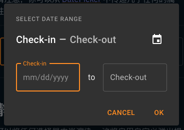
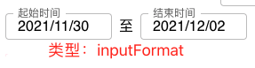
Take date range pick as an example:
Original time interval selector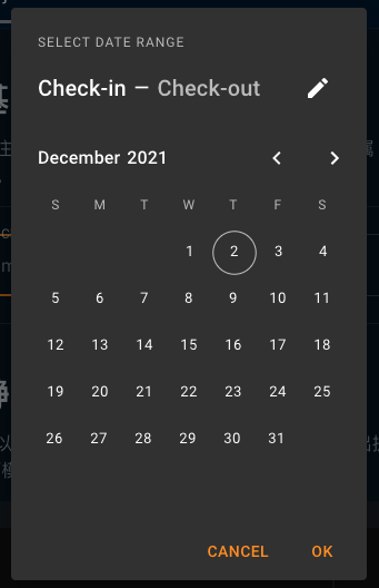
After Sinicization:
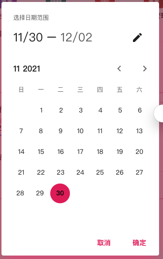
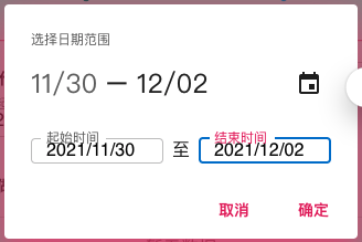
Some APIs are available on the official website 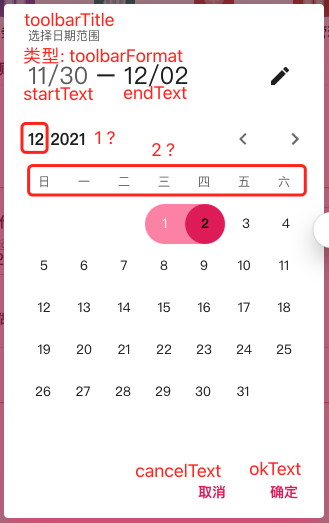
Note: there is one note: 1? And 2? The two departments searched the api documents and api source code, but did not find the corresponding api. They can only modify the source code of the corresponding component and locate it according to the component source code
 1? The location of exists in the component@mui/lab/CalendarPicker/PickersCalendarHeader.js in
    Amend as follows:
    transKey: month.getMonth() + 1, // Here, change utils.format(month, 'month') to month.getMonth() + 1
    children: month.getMonth() + 1 // Here, change utils.format(month, 'month') to month.getMonth() + 1
 2? The location of exists in the component@mui/lab/CalendarPicker/PickersCalendar.js in
     Amend as follows:
    children: ['day','one','two','three','four','five','six'].map((day, i) => /*#__PURE__*/_jsx(PickersCalendarWeekDayLabel, {
    // Here, modify utils.getWeekdays() to ['Day', 'one', 'two', 'three', 'four', 'five', 'six']

    use patch-package Package the modified as patches Bag.
Note: after inputFormat="yyyy/MM/dd" is set, a warning will pop up on the console
The mask "__/__/____" you passed is not valid for the format used yyyy/MM/dd. Falling down to uncontrolled not-masked input.
Here, check the mask related configuration items according to the source code. There is no good solution.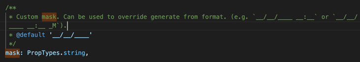
Secondary packaging of components
Among them, Input Select Modal is commonly used. Here is a brief introduction
1. Input component TextField InputBase
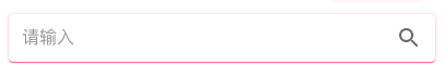
    <Paper sx={{ p: '2px 4px', display: 'flex', alignItems: 'center', width: '100%' }}>
        <InputBase
            sx={{ ml: 1, flex: 1 }}
            placeholder="Please enter"
            inputProps={{ 'aria-label': 'Please enter' }}
            onKeyUp={(e) => {
               ...
            }}
        />
        <IconButton
            type="search"
            onClick={() => {
                ...
            }}
            sx={{ p: 1 }}
            aria-label="search">
            <SearchIcon />
        </IconButton>
    </Paper>
2. Select component TextField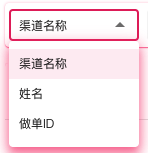
  <TextField
    id="search_select"
    select
    sx={{ width: 130, bgcolor: 'transparent' }}
    value={currency}
    onChange={(e) => ...}>
    {selectArr.map((option) => (
        <MenuItem className="search_item" key={option.value} value={option.value}>
            <span style={{ fontSize: 12 }}>{option.label}</span>
        </MenuItem>
    ))}
  </TextField>
Note: more attention is paid to the style adjustment here
    #search_select {
        min-height: 30px !important;
        padding: 0 0 0 10px !important;
        line-height: 30px !important;
    }
    .search_item {
        min-height: 30px;
        line-height: 30px;
        padding: 0 0 0 10px;
    }
Modal component
   const style = {
        position: 'absolute',
        top: '50%',
        left: '50%',
        borderRadius: 2,
        transform: 'translate(-50%, -50%)',
        width: '60vw',
        bgcolor: 'background.paper',
        pt: 2,
        pb: 2,
    };
    <Modal
        open={open}
        onClose={handleClose}
        hideBackdrop
        aria-labelledby="modal-modal-title"
        aria-describedby="modal-modal-description">
        <Box sx={style}>
            <Typography
                sx={{ fontSize: 16, mb: 2, pl: 2, pb: 0.5 }}
                variant="h6"
                gutterBottom
                component="div">
                {title}
            </Typography>
            <Box
                sx={{
                    display: 'flex',
                    alignItem: 'center',
                    justifyContent: 'center',
                    flexWrap: 'wrap',
                }}>
                ...
            </Box>
        </Box>
    </Modal>
summary
The playability of Material UI is still relatively large, and there are many demo s on the official website. However, after the version is upgraded to 5.X, many APIs are abandoned, and the matching needs to be studied by yourself. Generally speaking, the Material style is still good. In the follow-up process, update the document while summarizing...