I. Brief Introduction
TabLayout is a new control of the Android Support Design library, which can be used to achieve the effect of the open source framework ViewPage Indicator (which was basically used before Material Design came out). TabLayout is simpler to use than TabLayout and does not necessarily need to be used with ViewPager. After all, Google has made it stable. Needless to say, in addition, this article will also carefully list the process of my exploration of the control, so as to achieve some control itself can not achieve the custom effect, let's see what it has to operate.
II. Use
1. Create Tab and Tab Click Events
To use TabLayout, you usually put it in the layout file first, such as:
<?xml version="1.0" encoding="utf-8"?>
<LinearLayout xmlns:android="http://schemas.android.com/apk/res/android"
              xmlns:app="http://schemas.android.com/apk/res-auto"
              android:layout_width="match_parent"
              android:layout_height="match_parent"
              android:orientation="vertical">

    <android.support.design.widget.TabLayout
        android:id="@+id/tabLayout"
        android:layout_width="match_parent"
        android:layout_height="wrap_content" />
</LinearLayout>
Then find it in Activity and set it up. If you don't use it with ViewPager, you can manually add multiple tab s to TabLayout and set its click events, such as:
@Override
protected void onCreate(@Nullable Bundle savedInstanceState) {
super.onCreate(savedInstanceState);
setContentView(R.layout.activity_tab_layout);
mTabLayout = (TabLayout) findViewById(R.id.tabLayout);
// Add multiple tab s
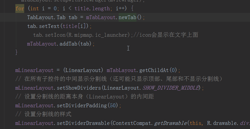
for (int i = 0; i < title.length; i++) {
TabLayout.Tab tab = mTabLayout.newTab();
tab.setText(title[i]);
// tab.setIcon(R.mipmap.ic_launcher);//icon will be displayed on the text
mTabLayout.addTab(tab);
}
// Set the click event for tab
mTabLayout.setOnTabSelectedListener(new TabLayout.OnTabSelectedListener() {
@Override
public void onTabSelected(TabLayout.Tab tab) {
Toast.makeText(getApplicationContext(), title[tab.getPosition()], Toast.LENGTH_SHORT).show();
}
@Override
public void onTabUnselected(TabLayout.Tab tab) {
}
@Override
public void onTabReselected(TabLayout.Tab tab) {
}
});
}
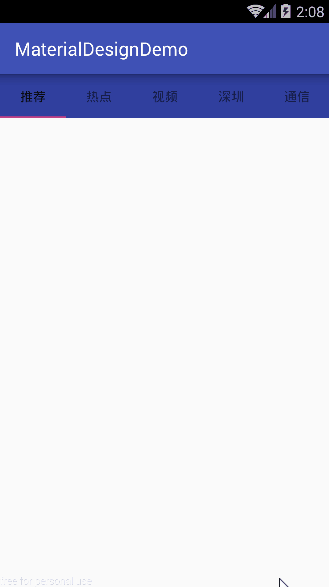
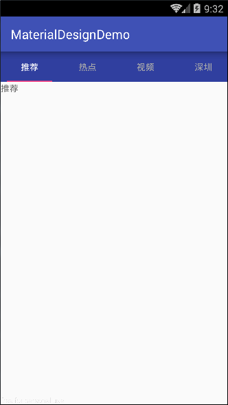
What's interesting here is that the creation of a Tab requires calling the new Tab () method of the TabLayout object, rather than directly generating a Tab. In addition to setting text, Tab can also set Icon, or even customize View. It calls setIcon() and setCustomView(), respectively. If you are interested, you can try it. The above code has the following effect:
2. Custom TabLayout Style
This TabLayout is still good-looking, but it is inevitable to customize the style of TabLayout in development, such as setting the default or selecting the color and size of Chinese characters. Fortunately, TabLayout provides as many custom attributes as possible, so that developers can easily modify the style. Let's see what control attributes are available below. Set up:
<!--Set up Tab indicator-->
app:tabIndicatorColor=""
app:tabIndicatorHeight=""

<!--Set up Tab Location and display mode-->
app:tabGravity=""
app:tabMode=""

<!--Set up Tab Text Style-->
app:tabSelectedTextColor=""
app:tabTextAppearance=""
app:tabTextColor=""

<!--Set up Tab Width, Background, Interior Spacing-->
app:tabMaxWidth=""
app:tabMinWidth=""
app:tabBackground=""
app:tabPadding=""
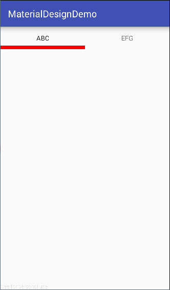
1) Setting Tab Indicator
The default color of TabLayout's indicator is color Accent in color.xml. Through the custom attribute provided by TabLayout, you can set the height and color of the indicator. If you don't want to display the indicator, you can set its height to 0dp or its color to be transparent. For demonstration, I will show the indicator.( Indicator's height is improved, and the color is changed to a red eye, which is dazzling, as follows:
<android.support.design.widget.TabLayout
    android:id="@+id/tabLayout"
    android:layout_width="match_parent"
    android:layout_height="wrap_content"
    app:tabIndicatorColor="@color/red"
    app:tabIndicatorHeight="8dp"/>
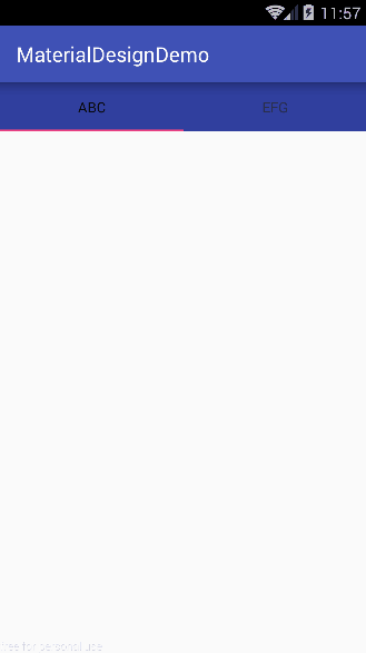
2) Setting Tab Position and Display Mode
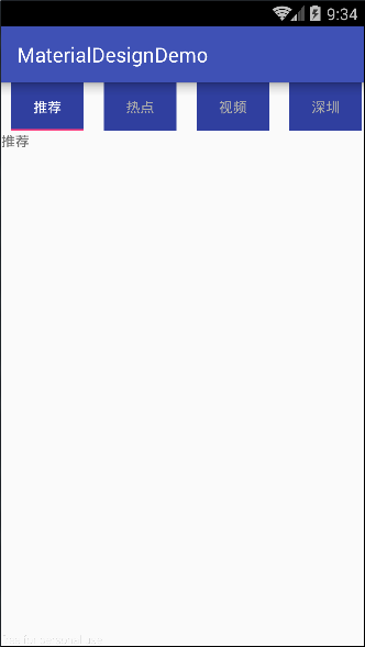
TabLayout's tab mode is fixed by default, and its location is filled by default. First, we keep app: tab mode= "fixed" and change the value of tab Gravity to fill and center. For convenience of comparison, I also set the background.
<android.support.design.widget.TabLayout
    android:id="@+id/tabLayout"
    android:layout_width="match_parent"
    android:layout_height="wrap_content"
    app:tabBackground="@color/colorPrimaryDark"
    app:tabGravity="fill" // Change to center
    app:tabMode="fixed"/>
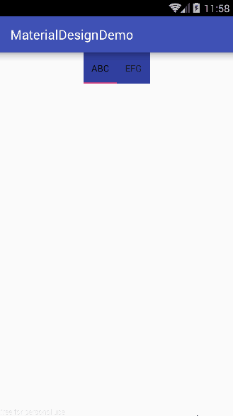
When there are more tabs, the width of a screen can't be accommodated, so you need to make TabLayout scroll horizontally, just modify app:tabMode= "scrollable". Note that when app:tabMode="scrollable", app:tabGravity="whatever value it takes will not take effect.
<android.support.design.widget.TabLayout
    android:id="@+id/tabLayout"
    android:layout_width="match_parent"
    android:layout_height="wrap_content"
    app:tabBackground="@color/colorPrimaryDark"
    app:tabGravity="center"
    app:tabMode="scrollable"/>
3) Setting Tab Text Style
The above effect is not good. I want to make it default text color is gray. When selected, the text is white and the text size is 16sp. But TabLayout does not provide the attribute of setting the text size directly. app:tabTextAppearance="is needed at this time. The operation is as follows:
Declare text styles in Style.xml
<style name="TabLayout.TabText" parent="TextAppearance.Design.Tab">
    <item name="android:textSize">16sp</item>
    <item name="textAllCaps">false</item>
</style>
In addition to setting font size, you can also set whether all capitals are displayed in English. The default value of textAllCaps is true, i.e. all capitals in English.
Setting TabLayout's text-related properties in the layout file
<android.support.design.widget.TabLayout
    android:id="@+id/tabLayout"
    android:layout_width="match_parent"
    android:layout_height="wrap_content"
    app:tabBackground="@color/colorPrimaryDark"
    app:tabGravity="center"
    app:tabMode="scrollable"
    ...
    app:tabSelectedTextColor="@android:color/white"
    app:tabTextAppearance="@style/TabLayout.TabText"
    app:tabTextColor="@android:color/darker_gray"/>
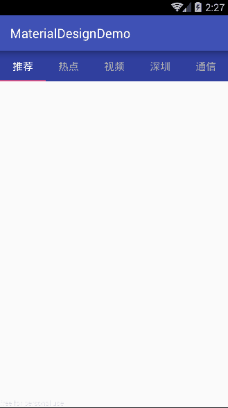
Okay, let's see how it works.
Okay, the setting of Tab's width, internal spacing and so on is relatively simple, try it when you need it, and there is no demonstration.
3. Combining with ViewPager
By using TabLayout individually, we have learned how to customize TabLayout's style, create Tab and set Tab's click events. We can say that's what we usually use. Now let's see how TabLayout can be used in conjunction with ViewPager. This requirement is also very common. There is a label bar at the top of the interface. The content corresponding to the label at the middle and bottom of the interface can slide left and right. At the same time, the label also follows its switch. On the contrary, when switching the label, the content will change. If you don't understand, you can refer to the front page interface of "Today's Headline" APP. This effect can be achieved with TabLayout+ViewPager+Fragment.
1) Place TabLayout and ViewPager in the layout file first:
<?xml version="1.0" encoding="utf-8"?>
<LinearLayout xmlns:android="http://schemas.android.com/apk/res/android"
              xmlns:app="http://schemas.android.com/apk/res-auto"
              android:layout_width="match_parent"
              android:layout_height="match_parent"
              android:orientation="vertical">

    <android.support.design.widget.TabLayout
        android:id="@+id/tabLayout"
        android:layout_width="match_parent"
        android:layout_height="wrap_content"
        app:tabBackground="@color/colorPrimaryDark"
        app:tabMode="scrollable"
        app:tabSelectedTextColor="@android:color/white"
        app:tabTextColor="@android:color/darker_gray"/>

    <android.support.v4.view.ViewPager
        android:id="@+id/viewPager"
        android:layout_width="match_parent"
        android:layout_height="match_parent" />
</LinearLayout>
2) Setting TabLayout and ViewPager interrelated in the code:
@Override
protected void onCreate(@Nullable Bundle savedInstanceState) {
    super.onCreate(savedInstanceState);
    setContentView(R.layout.activity_tab_layout);
    mTabLayout = (TabLayout) findViewById(R.id.tabLayout);
    mViewPager = (ViewPager) findViewById(R.id.viewPager);
    MyViewPagerAdapter adapter = new MyViewPagerAdapter(getSupportFragmentManager());
    mViewPager.setAdapter(adapter);

    // The adapter must override the getPageTitle() method
    mTabLayout.setTabsFromPagerAdapter(adapter);
    // Monitor TabLayout's tag selection and view Pager switch when the tag is selected
    mTabLayout.setOnTabSelectedListener(new TabLayout.ViewPagerOnTabSelectedListener(mViewPager));
    // Monitor the page switching of ViewPager, and TabLayout's label switches when the page is switched
    mViewPager.setOnPageChangeListener(new TabLayout.TabLayoutOnPageChangeListener(mTabLayout));
}
These three sentences of code are not difficult to understand, literally meaning, but they are outdated, because it seems a bit cumbersome to write three sentences of code to associate TabLayout with ViewPager (actually I think it's okay), so TabLayout provides a way to make the connection between the two by one code: setupWithVi. EwPager (), so the above code can be simplified as follows:
@Override
protected void onCreate(@Nullable Bundle savedInstanceState) {
    super.onCreate(savedInstanceState);
    setContentView(R.layout.activity_tab_layout);
    mTabLayout = (TabLayout) findViewById(R.id.tabLayout);
    mViewPager = (ViewPager) findViewById(R.id.viewPager);
    MyViewPagerAdapter adapter = new MyViewPagerAdapter(getSupportFragmentManager());
    mViewPager.setAdapter(adapter);

    // Associate TabLayout with ViewPager, and the adapter must override the getPageTitle() method
    mTabLayout.setupWithViewPager(mViewPager);
}
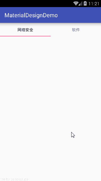
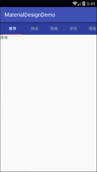
See the effect:
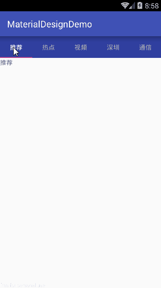
Associating TabLayout with ViewPager is fairly simple. Just notice that the ViewPager adapter needs to rewrite the getPageTitle() method, and here's the code for the adapter in Demo by the way:
class MyViewPagerAdapter extends FragmentPagerAdapter {

    private final String[] title = new String[]{
            "Recommend", "Hotspot", "video", "Shenzhen", "Signal communication",
            "Internet", "Questions and answers", "picture", "Film",
            "network security", "Software"};

    public MyViewPagerAdapter(FragmentManager fm) {
        super(fm);
    }

    @Override
    public Fragment getItem(int i) {
        Fragment fragment = new TextFragment();
        Bundle bundle = new Bundle();
        bundle.putString("title", title[i]);
        fragment.setArguments(bundle);
        return fragment;
    }

    @Override
    public int getCount() {
        return title.length;
    }

    @Override
    public CharSequence getPageTitle(int position) {
        return title[position];
    }
}
3. Expansion
The above part is a description of the normal use of TabLayout, and this part is a further exploration of TabLayout. At the same time, I will list my exploration ideas in this process, which can be said to be a further customization of TabLayout. Without much nonsense, I'll drive straight down.
What if there are three requirements in your draft of APP design as follows:
- Add a partitioning line for TabLayout, and there is a distance between the upper and lower partitioning lines.
- The tab font becomes larger when checked and smaller when unchecked.
- Indicator s should not be filled with the entire tag (Tab)
Simply put, adding splitting lines to TabLayout, setting font sizes in different states and the "length" of the indicator do not provide a direct way to modify TabLayout. You might think, then we do source code analysis for TabLayout, and then get the control to set it by reflection and other means? No Sometimes, instead of following the rules, we should change our thinking appropriately. Maybe the way to solve the problem doesn't need to look at the source code so hard (if you're God, when I don't say so), let's see what I do next.
1. Analyzing the structure of TabLayout
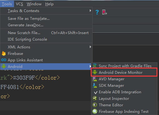
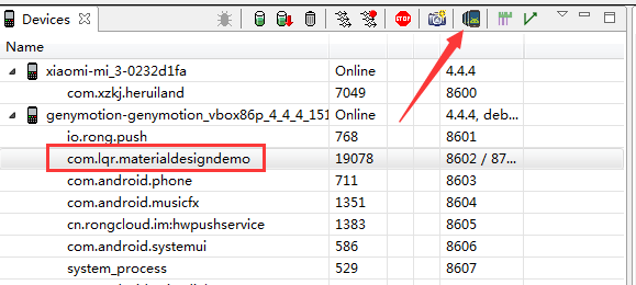
Run APP, then go back to AS, and find Tools -> Android -> Android Device Monitor in the menu bar. Android programmers who have used Eclipse to develop Android devices should know the long-lost old man, Android Device Monitor.
Select the running APP and click Dump View Hierarchy for UI Automator.
You may click on it and it will automatically display the control structure of the current interface.
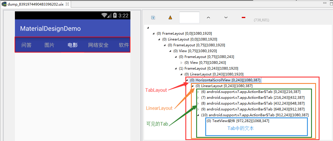
From this structure, we can see that Tab Layout (Horizontal ScrollView) does not wrap these Tabs directly, but wraps a Linear Layout, and then these Tabs are placed in the Linear Layout. In addition, we can find that Tab contains a TextView, so do you have some ideas about the first two requirements here? What about it?
2. Add a partition line for TabLayout
Linear Layout has its own method of setting partitioning lines. We can add partitioning lines through it. There's nothing to say, just code it:
mLinearLayout = (LinearLayout) mTabLayout.getChildAt(0);
// Show partitioning lines in the middle of all child controls (and possibly only the top, tail, and no partitioning lines)
mLinearLayout.setShowDividers(LinearLayout.SHOW_DIVIDER_MIDDLE);
// Set the inner distance of the line itself (Linear Layout)
mLinearLayout.setDividerPadding(20);
// Setting the style of the partition line
mLinearLayout.setDividerDrawable(ContextCompat.getDrawable(this, R.drawable.divider_vertical));
divider_vertical.xml:
<?xml version="1.0" encoding="utf-8"?>
<shape xmlns:android="http://schemas.android.com/apk/res/android">
    <solid android:color="#ccc"/>
    <size android:width="1dp" />
</shape>
In this way, there is a dividing line.
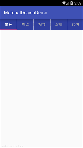
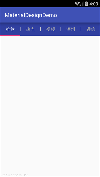
It seems a little strange, because the app we set up earlier: tabBackground="@color/color PrimaryDark" only sets the background color for Tab, not for its parent control LinearLayout, which defaults to white background color, so that's what it looks like. The solution is to give Lin the background color. The earLayout setting is the same background color as Tab.
mLinearLayout = (LinearLayout) mTabLayout.getChildAt(0);
...
mLinearLayout.setBackgroundColor(getResources().getColor(R.color.colorPrimaryDark));
This perfectly sets the splitting line for TabLayout.
3. Setting font sizes for TabLayout in different states (unsuccessful)
Get the text control in Tab in the same way, judge whether it is currently selected, and then set the font size of the text control. With the help of Linear Layout (mLinear Layout), which is used to wrap Tab, we traverse the child controls in Linear Layout, get each child view (Tab), and then get the text control from Tab to set the text size.
// By default, all unselected Tab text is set to small font
for (int i = 0; i < mTabLayout.getTabCount(); i++) {
    ((TextView) ((LinearLayout) mLinearLayout.getChildAt(i)).getChildAt(1)).setTextSize(10);
    // It can also be written like this, the same.
    // ((TextView) ((LinearLayout) ((LinearLayout) mTabLayout.getChildAt(0)).getChildAt(i)).getChildAt(0)).setTextSize(12);
}
// Set the currently selected Tab text to a large font
((TextView) ((LinearLayout) mLinearLayout.getChildAt(mTabLayout.getSelectedTabPosition())).getChildAt(1)).setTextSize(30);

// When the selected Tab switches, adjust the font size of the Tab
mTabLayout.setOnTabSelectedListener(new TabLayout.OnTabSelectedListener() {
    @Override
    public void onTabSelected(TabLayout.Tab tab) {
        ((TextView) ((LinearLayout) mLinearLayout.getChildAt(tab.getPosition())).getChildAt(1)).setTextSize(30);
    }

    @Override
    public void onTabUnselected(TabLayout.Tab tab) {
        ((TextView) ((LinearLayout) mLinearLayout.getChildAt(tab.getPosition())).getChildAt(1)).setTextSize(12);
    }

    @Override
    public void onTabReselected(TabLayout.Tab tab) {

    }
});
In the above code, the resulting Tab is strongly converted to LinearLayout, because Tab is actually TabView, and TabView inherits from LinearLayout, so you can do this conversion. We can see the new Tab () method of TabLayout:
However, the fact is unsatisfactory and completely ineffective. Looking at the source code, I am not sure. My guess is that when we set the font size of the text control in Tab, the onMeasuer() method of TabView will be re-invoked, and this method will re-assign the text size, resulting in the text size. It can't be modified in the way mentioned above.
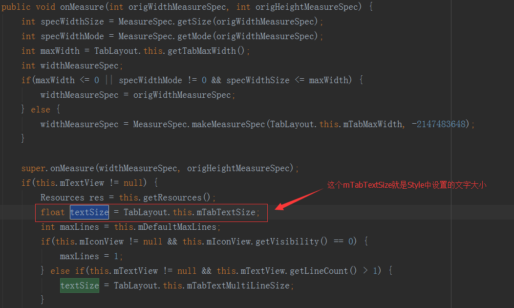
Therefore, the size of text can only be modified by Style method, and can only set the size of selected and unselected text uniformly, so this requirement can not be completed.
4. Custom Indicator Length
In fact, this is a bit of the party's meaning. The length of Tab Layout's indicator can not be specified. How long is it originally, but it can be set by setting the distance outside Tab, so that the indicator seems to keep a certain distance from Tab. Here I found a way on the Internet, as follows:
// Set TabLayout's "Length"
setIndicator(mTabLayout,10,10);

// Specific methods (through reflection)
public void setIndicator(TabLayout tabs, int leftDip, int rightDip) {
    Class<?> tabLayout = tabs.getClass();
    Field tabStrip = null;
    try {
        tabStrip = tabLayout.getDeclaredField("mTabStrip");
    } catch (NoSuchFieldException e) {
        e.printStackTrace();
    }

    tabStrip.setAccessible(true);
    LinearLayout llTab = null;
    try {
        llTab = (LinearLayout) tabStrip.get(tabs);
    } catch (IllegalAccessException e) {
        e.printStackTrace();
    }

    int left = (int) TypedValue.applyDimension(TypedValue.COMPLEX_UNIT_DIP, leftDip, Resources.getSystem().getDisplayMetrics());
    int right = (int) TypedValue.applyDimension(TypedValue.COMPLEX_UNIT_DIP, rightDip, Resources.getSystem().getDisplayMetrics());

    for (int i = 0; i < llTab.getChildCount(); i++) {
        View child = llTab.getChildAt(i);
        child.setPadding(0, 0, 0, 0);
        LinearLayout.LayoutParams params = new LinearLayout.LayoutParams(0, LinearLayout.LayoutParams.MATCH_PARENT, 1);
        params.leftMargin = left;
        params.rightMargin = right;
        child.setLayoutParams(params);
        child.invalidate();
    }
}
This setIndicator() method is mainly through reflection. First, we get mTabStrip (actually, the Linar Layout wrapped directly by TabLayout), then traverse the sub-control Tab in mTabStrip, and then set the outer distance of Tab. In order to prove that the outer distance of Tab is set, here I set the background color and no for mTabStrip respectively. Set its background color to see the contrast:
Setting the background color may seem like a sloppy way, but this way can not make the length of the indicator shorter than the length of the text (helpless ~). Well, regardless of this, since the mTabStrip is actually a Linar Layout wrapped directly by TabLayout, it is also possible to set it up through this Linear Layout, to prove that:
// Get the Linar Layout of the TabLayout package and set the background color
mLinearLayout = (LinearLayout) mTabLayout.getChildAt(0);
mLinearLayout.setBackgroundColor(getResources().getColor(R.color.colorPrimaryDark));
...
// Setting the Outer Spacing of Linear Layout Neutron View(Tab)
int left = (int) TypedValue.applyDimension(TypedValue.COMPLEX_UNIT_DIP, 10, Resources.getSystem().getDisplayMetrics());
int right = (int) TypedValue.applyDimension(TypedValue.COMPLEX_UNIT_DIP, 10, Resources.getSystem().getDisplayMetrics());
for (int i = 0; i < mLinearLayout.getChildCount(); i++) {
    View tabView = mLinearLayout.getChildAt(0);
    LinearLayout.LayoutParams params = new LinearLayout.LayoutParams(0, LinearLayout.LayoutParams.MATCH_PARENT, 1);
    params.leftMargin = left;
    params.rightMargin = right;
    tabView.setLayoutParams(params);
}
Well, my exploration of TabLayout is over here. This article aims to customize the style effects that TabLayout itself can't set directly by looking directly for the controls in TabLayout, so as to meet the needs of our project. This is just my personal understanding of TabLayout, there may be some flaws, please forgive me. If there are other practical ways to "set different font sizes for TabLayout" and "customize indicator length", please leave a message to me, and give me more advice, thank you.