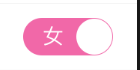
Demand Background: The company has a Wechat widget project, which requires a large number of unique switch buttons. Like the switch button, the widget widget can't fill in the text. Therefore, directly, and the framework of the widget is based on the mpvue of vue. The time of mpvue coming out is also short. It is estimated that there are very few such wheels, so we can only use one of them by ourselves, because the widget widget widget widget widget widget can't fill in the It's a Wechat applet, so the pixel unit is rpx. If it's a normal Vue project, you can use this component directly. Modifying the pixel unit is the unit.

<template>
<div id="myswitchBox" @click="handleClick" :style="bg">
<span :class="{swText:isTrues,swTexts:isTrue}" :style="inOutText">{{valueText}}</span>
<i :class="{circle:isTrues,circles:isTrue}"></i>
</div>
</template>
<script>
export default{
props: ["mode"],
data () {
return {
isTrue:false,
isTrues:true
}
},
computed: {
bg(){
if(this.mode=="Whether"||this.mode=="Generally serious"||this.mode=="have or not have"){
if(this.isTrues){
return "background: #cccccc;"
}else{
return "background: #F168A8;"
}
}else if(this.mode=="Interior wall exterior wall"){
if(this.isTrues){
return "background: #648FF3"
}else{
return "background: #F168A8;"
}
}
},
inOutText(){
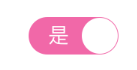
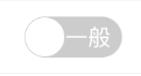
if(this.mode=="Interior wall exterior wall"||this.mode=="Generally serious"){
if(this.valueText=="Interior wall"||this.valueText=="commonly"){
return "transform:translate(12px,0)"
}else{
return "transform:translate(-12px,0)"
}
}else{
return ""
}
},
valueText(){
if(this.mode=="Whether"){
if(this.isTrue){
return "yes"
}else{
return "no"
}
}else if(this.mode=="Interior wall exterior wall"){
if(this.isTrue){
return "exterior wall"
}else{
return "Interior wall"
}
}else if(this.mode=="Generally serious"){
if(this.isTrue){
return "serious"
}else{
return "commonly"
}
}else if(this.mode=="have or not have"){
if(this.isTrue){
return "Yes"
}else{
return "nothing"
}
}
}
},
methods: {
handleClick(){
if(this.isTrue){
this.isTrue = false;
this.isTrues = true;
this.$emit("myClick",this.valueText);
}else{
this.isTrue = true;
this.isTrues = false;
this.$emit("myClick",this.valueText);
}
}
}
}
</script>
<style scoped>
#myswitchBox{
width: 120px;
height: 50px;
line-height: 50px;
border-radius: 25px;
position: relative;
display: flex;
align-items: center;
}
#myswitchBox .circle{
width: 46px;
height: 46px;
border-radius: 50%;
background: white;
position: absolute;
left: 0;
top: 2px;
}
#myswitchBox .circles{
width: 46px;
height: 46px;
border-radius: 50%;
background: white;
position: absolute;
right: 0;
top: 2px;
}
#myswitchBox .swText{
display: inline-block;
position: absolute;
right: 28px;
color: white;
}
#myswitchBox .swTexts{
display: inline-block;
position: absolute;
left: 28px;
color: white;
}
</style>Note: This is a separate vue component, which can be directly introduced into use, can be imported into the mode l parameters, can be modified by itself.