In normal development, we often have the requirement that each Item layout should be distinguished by using a split line in the layout, as shown in the following code: 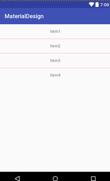
The effect is shown in Figure 1-1
<?xml version="1.0" encoding="utf-8"?>
<LinearLayout xmlns:android="http://schemas.android.com/apk/res/android"
    android:layout_width="match_parent"
    android:layout_height="match_parent"
    android:orientation="vertical">

    <TextView
        android:layout_width="match_parent"
        android:layout_height="50dp"
        android:gravity="center"
        android:text="Item1" />

    <View
        android:layout_width="match_parent"
        android:layout_height="0.5dp"
        android:background="@color/colorAccent" />

    <TextView
        android:layout_width="match_parent"
        android:layout_height="50dp"
        android:gravity="center"
        android:text="Item2" />

    <View
        android:layout_width="match_parent"
        android:layout_height="0.5dp"
        android:background="@color/colorAccent" />

    <TextView
        android:layout_width="match_parent"
        android:layout_height="50dp"
        android:gravity="center"
        android:text="Item3" />

    <View
        android:layout_width="match_parent"
        android:layout_height="0.5dp"
        android:background="@color/colorAccent" />

    <TextView
        android:layout_width="match_parent"
        android:layout_height="50dp"
        android:gravity="center"
        android:text="Item4" />
</LinearLayout>
However, you will find that Google provides an implementation of LinearLayoutCompat Item layout split line after you understand and understand the contents of v7 report.
1, Use of LinearLayoutCompat
We know that support-v7 is a compatible package. Because LinearLayoutCompat is under support-v7, it includes the properties of LinearLayout
Several attributes have been added:
 app:divider="@drawable/bootom_line"
 app:dividerPadding="10dp" //Line spacing
app:showDividers="middle|end"| Label | Attribute content |
|---|---|
| app:divider | Set the style of split line to support custom drawable |
| app:dividerPadding | Set the distance between the two ends of the split line |
| app:showDividers | Set the position of the split line display [beginning middle end none] |
After understanding the properties provided by Google, we can modify our layout file and show the effect as shown in Figure 1-1
<?xml version="1.0" encoding="utf-8"?>
<android.support.v7.widget.LinearLayoutCompat xmlns:android="http://schemas.android.com/apk/res/android"
    xmlns:app="http://schemas.android.com/apk/res-auto"
    android:layout_width="match_parent"
    android:layout_height="match_parent"
    android:orientation="vertical"
    app:divider="@drawable/bootom_line"
    app:dividerPadding="10dp"
    app:showDividers="middle|end">

    <TextView
        android:layout_width="match_parent"
        android:layout_height="50dp"
        android:gravity="center"
        android:text="Hello World!" />

    <TextView
        android:layout_width="match_parent"
        android:layout_height="50dp"
        android:gravity="center"
        android:text="Hello World!" />
    <TextView
        android:layout_width="match_parent"
        android:layout_height="50dp"
        android:gravity="center"
        android:text="Hello World!" />

</android.support.v7.widget.LinearLayoutCompat>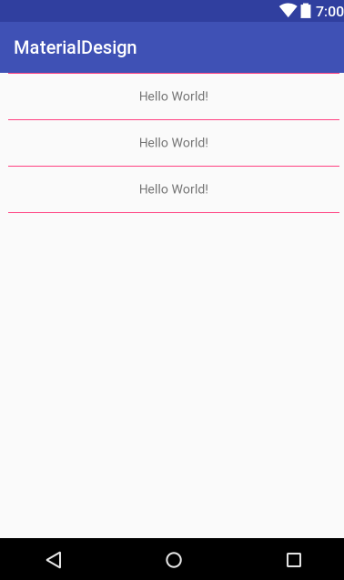
Is it very simple? Such an implementation also reduces the rendering of View. So Google provides a control like LinearLayoutCompat in support.v7. What's its specific implementation method.