origin
Yesterday, the WeChat team released an artifact, a data assistant for applets. Remembering that he had previously written a demo drawn by a very crude pie chart, do something else and draw a line chart.
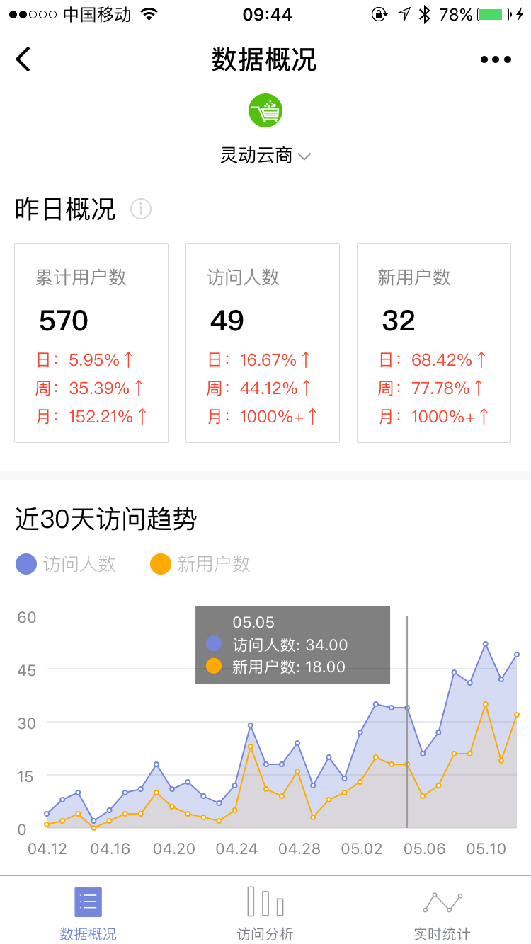
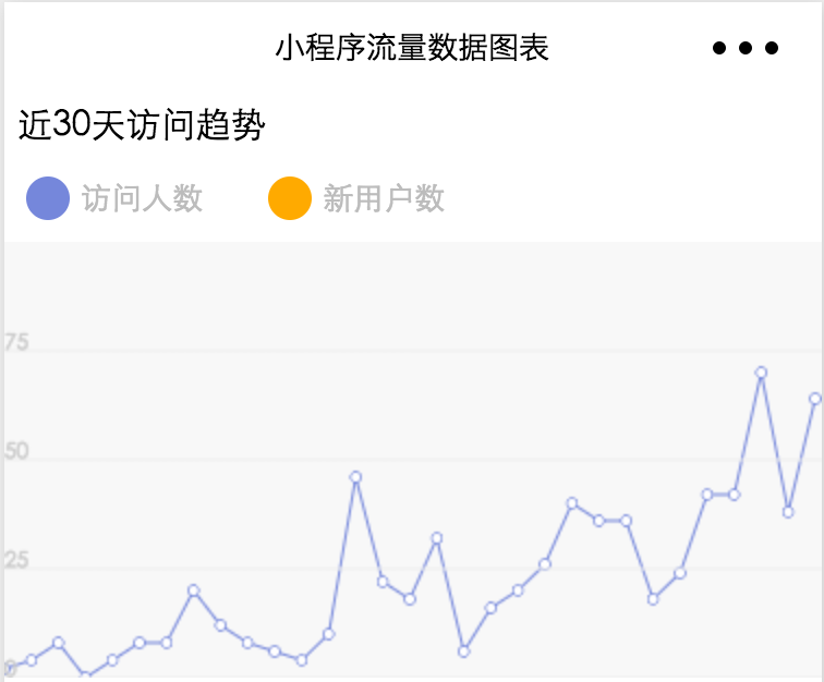
Target Page
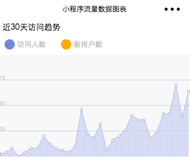
Current results
Line Diagram Ideas
1.Line connection, drawing hollow circle 2. Draw a circle 3. Fill Background Color 4. Monitor touch gestures 5. Read data and display as you slide
Explain
Points 1-4 should not be difficult to understand. Point 5 deals with the step of gesture sliding, moving day by day; the floating layer moves with the current date, and its position is in the opposite half-screen area, such as near the edge of the right screen, to the left of the floating layer.
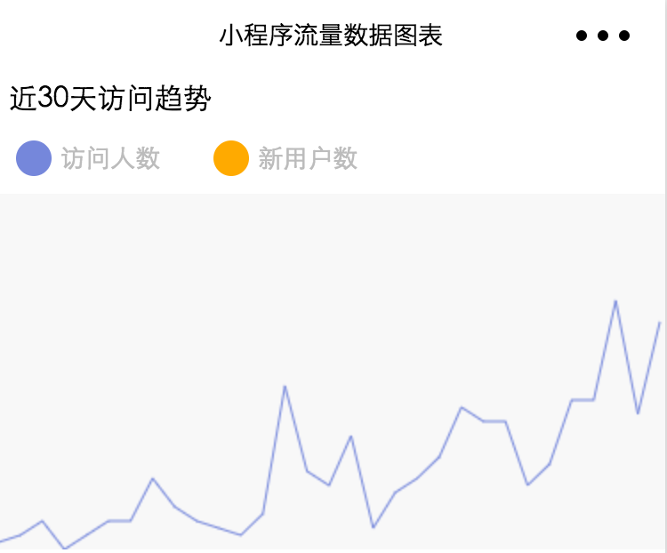
Achieving results
step
1. Get data
The widget has opened the statistical interface to take the real data directly and do it.
Increasing trend at https://mp.weixin.qq.com/debug/wxadoc/dev/api/analysis.html#
Take the trend data as an example. According to the document, first fetch access_token, then go to https://api.weixin.qq.com/datacube/getweanalysisappiddailysummarytrend?access_token=ACCESS_TOKEN Request data with the incoming start date as a parameter.There is a huge pit where you can only start incoming on the same day, otherwise you will get a range crossover error when you return.
An example of the sorted array data is as follows
[
    {
        "ref_date": "20170412",
        "session_cnt": 8,
        "visit_pv": 49,
        "visit_uv": 4,
        "visit_uv_new": 1,
        "stay_time_uv": 73.75,
        "stay_time_session": 36.875,
        "visit_depth": 3.25
    },
    {
        "ref_date": "20170413",
        "session_cnt": 10,
        "visit_pv": 81,
        "visit_uv": 8,
        "visit_uv_new": 2,
        "stay_time_uv": 351.25,
        "stay_time_session": 281,
        "visit_depth": 3.5
    }
    ...
]
2. Draw polylines
var data = require('../../data/daily.js');
Page({
  data: {
  },
  //Event Handler
  onLoad: function () {
    // Canvas height, equal to defined in CSS
    var canvasHeight = 100;
    // x-axis magnification
    var ratioX = 10;
    // y-axis magnification
    var ratioY = 2;
    const context = wx.createCanvasContext('line-canvas');
    data.daily.forEach(function(daily, i, array) {
      // Current Point Coordinates
      var currentPoint = {
        x: i * ratioX,
        y: canvasHeight - daily.visit_uv_new * ratioY
      };
      /* Draw polyline */
      if (i < array.length - 1) {
        // start
        context.beginPath();
        // Move to current point
        context.moveTo(currentPoint.x, currentPoint.y);
        // Draw a line to the next point
        context.lineTo((i + 1) * ratioX, canvasHeight - array[i + 1].visit_uv_new * ratioY);
        // set a property
        context.setLineWidth(1);
        // Set Colors
        context.setStrokeStyle('#7587db');
        // Tracing
        context.stroke();
      }
      /* circle */

    });
    context.draw();
  }
})
In the process of writing the code, an error is made, context.draw(); the method is placed in the forEach loop, so only the last polyline appears, and all previous drawings are overwritten.
The effect is shown in the diagram
3. Draw a circle
The essence of drawing a circle is to draw an arc with the current point as the center and a radius of 3. Filled with a white background, it covers the inflection point of the polyline.fill() and stroke() fill the background and stroke, respectively.
/* circle */
context.beginPath();
context.arc(currentPoint.x, currentPoint.y, 2, 0, 2 * Math.PI);
context.setStrokeStyle(purple);
context.setFillStyle('white');
context.stroke();
context.fill();
The effect is shown in the diagram
4. Draw reference lines
Draw the horizontal line and label the values.
    /* Draw horizontal reference lines */
    var lineCount = 4;
    var estimateRatio = 3;
    var ratio = canvasHeight / lineCount;
    for (var i = 0; i < lineCount; i++) {
      context.beginPath();
      var currentPoint = {
        x: 0,
        y: canvasHeight - i * ratio
      };
      // Move to Origin
      context.moveTo(currentPoint.x, currentPoint.y);
      // Draw a line in the Y-direction
      context.lineTo(canvasWidth, canvasHeight - i * ratio);
      // set a property
      context.setLineWidth(1);
      // Set Colors
      context.setStrokeStyle(gray);
      context.stroke();
      // Label Value
      context.setFillStyle(gray);
      context.fillText((i * ratio / estimateRatio).toFixed(0), currentPoint.x, currentPoint.y);
    }
The estimateRatio in the code above is an estimate, because so far, the maximum Y value in the report data has not been calculated.
The effect is shown in the diagram
Fill Purple Background
Now it looks like it's all white, and it's monotonous to be bare with a polyline, so fill in the area from the polyline to the area before the x-axis.
The idea is that each section is drawn, the free falling head is downward, the negative direction from left to x-axis returns to the previous position, and closes with the previous point, thus forming a trapezoidal structure, which achieves the effect of area map after filling () method for many times.
// Vertical down to x-axis
context.lineTo(nextPoint.x, canvasHeight);
// Vertical point on the x-axis from horizontal to left to the last point
context.lineTo(currentPoint.x, canvasHeight);
// Set Lavender
context.setFillStyle(lightPurple);
// Closure and area before x-axis
context.fill();
Place the above code at the end of the line drawing forEach loop.
The final results are obtained.
Corresponding source download address: http://git.oschina.net/dotton/demo-wx
Write here today and keep updating later.