See it:

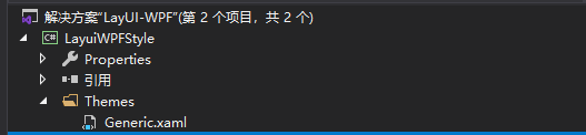
1. Create a custom control and call it layuiwpfstype

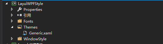
2. Create Fonts and WindowStyle files in the current directory to store font files and custom forms. Use fontawesome Fonts, of course, you can use your own
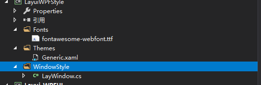
3. Create a custom control and call it LayWindow. Remember that WPF is wrong

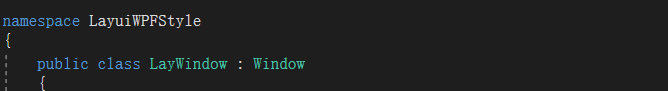
4. Double click LayWindow to make the current class file inherit Window
5. Because our form is divided into header and content, and the header is composed of form name, form icon and form button

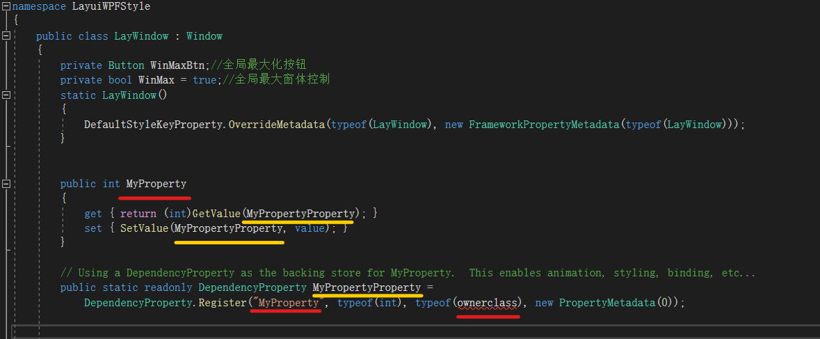
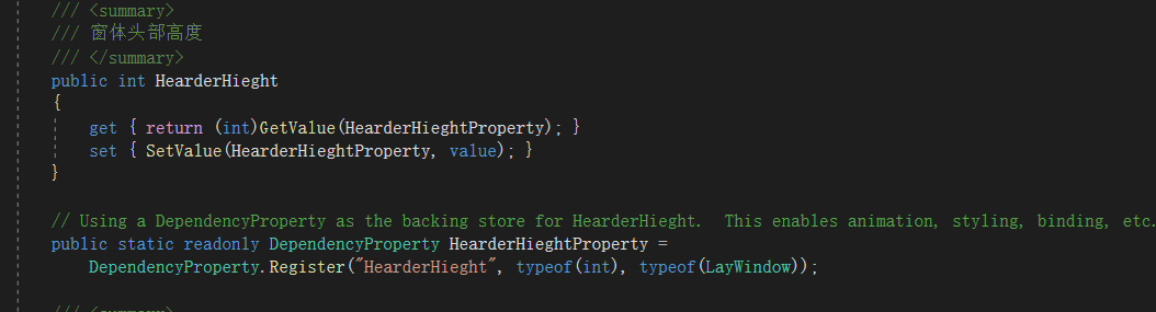
6. At this time, we need to redraw the form and add necessary additional properties. The shortcut key is Propdp + double-click Tab. MyProperty is the name of the extended property, which we can define at will. For example, we need to define the height of the form's header bar, which we can define as headerhieght, whose type is int, and the owner class is replaced by the name of the current custom form: LayWindow,
As shown in Figure 2
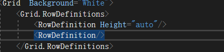
7. In the Generic.xaml file, we will find that when we create a custom control, the system will help me create a simple Style by default, but the Style at this time does not work, it just gives us a friendly prompt. At this time, we need to start from writing the form Style. We can divide the form into two parts, one is the head and the other is the body (that is, the content). We can use RowDefinitions to branch, and the head height is set to the adaptive class height, as shown in the figure Height="auto"
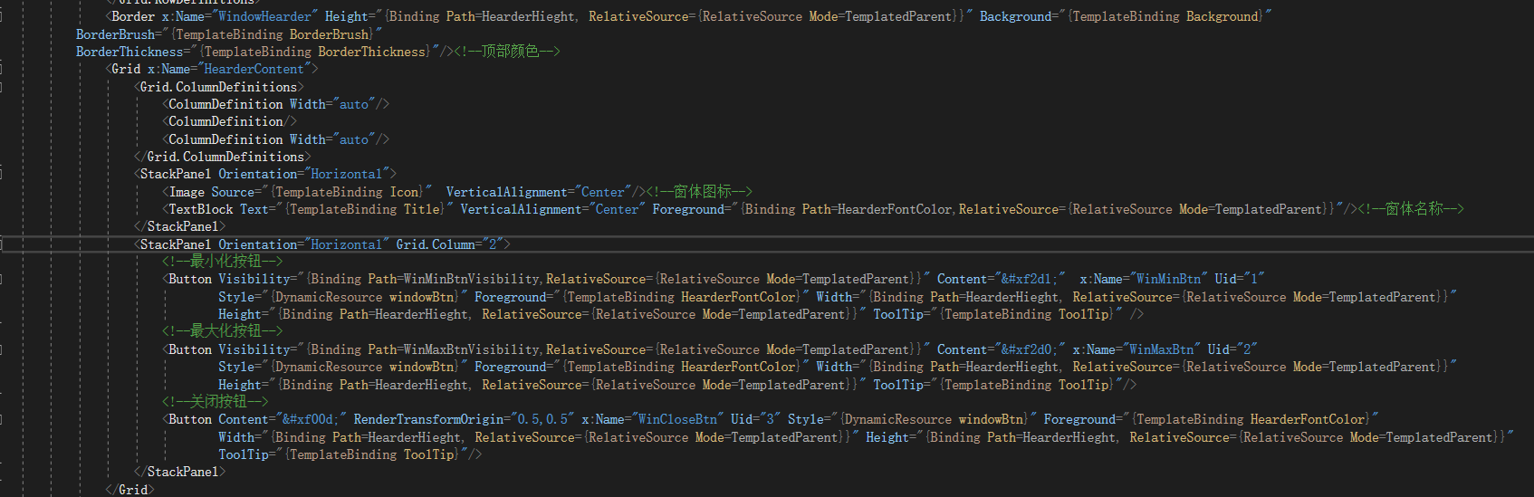
8. Create a header bar: at this time, we can start to use our custom property headerhieght. Remember that if our custom property wants to take effect and cannot be bound with TemplateBinding, it must be bound with Binding (data source Binding), such as: height = "{Binding path = headerhieght, relativesource = {relativesource mode = templatedparent}}"

9. We use ContentPresenter to combine form content

10. Customize the form header. The header is divided into three columns. The left side is divided into the form icon and the form name. The middle part is reserved. The right side is divided into the maximize, minimize and close buttons. In order to facilitate our unified color, I will separate the background color


<Style TargetType="{x:Type local:LayWindow}" > <Setter Property="Background" Value="{StaticResource WindowBackground}"/> <Setter Property="HearderHieght" Value="35"/> <Setter Property="AllowsTransparency" Value="True"/> <Setter Property="WindowStyle" Value="None"/> <Setter Property="HearderFontColor" Value="White"/> <Setter Property="Margin" Value="7"/> <Setter Property="WindowChrome.WindowChrome" > <Setter.Value> <WindowChrome CaptionHeight="0" ResizeBorderThickness="10"/> </Setter.Value> </Setter> <Setter Property="Template"> <Setter.Value> <ControlTemplate TargetType="{x:Type local:LayWindow}"> <Border Padding="{TemplateBinding Margin}"> <Grid> <Grid Background="#ccc" > <Grid.Effect> <DropShadowEffect ShadowDepth="0" Direction="0" BlurRadius="5" Color="#ccc"> </DropShadowEffect> </Grid.Effect> </Grid> <Grid Background="White"> <Grid.RowDefinitions> <RowDefinition Height="auto"/> <RowDefinition/> </Grid.RowDefinitions> <Border x:Name="WindowHearder" Height="{Binding Path=HearderHieght, RelativeSource={RelativeSource Mode=TemplatedParent}}" Background="{TemplateBinding Background}" BorderBrush="{TemplateBinding BorderBrush}" BorderThickness="{TemplateBinding BorderThickness}"/><!--Top color--> <Grid x:Name="HearderContent"> <Grid.ColumnDefinitions> <ColumnDefinition Width="auto"/> <ColumnDefinition/> <ColumnDefinition Width="auto"/> </Grid.ColumnDefinitions> <StackPanel Orientation="Horizontal"> <Image Source="{TemplateBinding Icon}" VerticalAlignment="Center"/><!--Form icon--> <TextBlock Text="{TemplateBinding Title}" VerticalAlignment="Center" Foreground="{Binding Path=HearderFontColor,RelativeSource={RelativeSource Mode=TemplatedParent}}"/><!--Form name--> </StackPanel> <StackPanel Orientation="Horizontal" Grid.Column="2"> <!--Minimize button--> <Button Visibility="{Binding Path=WinMinBtnVisibility,RelativeSource={RelativeSource Mode=TemplatedParent}}" Content="" x:Name="WinMinBtn" Uid="1" Style="{DynamicResource windowBtn}" Foreground="{TemplateBinding HearderFontColor}" Width="{Binding Path=HearderHieght, RelativeSource={RelativeSource Mode=TemplatedParent}}" Height="{Binding Path=HearderHieght, RelativeSource={RelativeSource Mode=TemplatedParent}}" ToolTip="{TemplateBinding ToolTip}" /> <!--Maximize button--> <Button Visibility="{Binding Path=WinMaxBtnVisibility,RelativeSource={RelativeSource Mode=TemplatedParent}}" Content="" x:Name="WinMaxBtn" Uid="2" Style="{DynamicResource windowBtn}" Foreground="{TemplateBinding HearderFontColor}" Width="{Binding Path=HearderHieght, RelativeSource={RelativeSource Mode=TemplatedParent}}" Height="{Binding Path=HearderHieght, RelativeSource={RelativeSource Mode=TemplatedParent}}" ToolTip="{TemplateBinding ToolTip}"/> <!--close button--> <Button Content="" RenderTransformOrigin="0.5,0.5" x:Name="WinCloseBtn" Uid="3" Style="{DynamicResource windowBtn}" Foreground="{TemplateBinding HearderFontColor}" Width="{Binding Path=HearderHieght, RelativeSource={RelativeSource Mode=TemplatedParent}}" Height="{Binding Path=HearderHieght, RelativeSource={RelativeSource Mode=TemplatedParent}}" ToolTip="{TemplateBinding ToolTip}"/> </StackPanel> </Grid> <ContentPresenter Grid.Row="1"/> </Grid> </Grid> </Border> <ControlTemplate.Triggers> <Trigger Property="WinMinBtnVisibility" Value="False"> <Setter Property="Visibility" TargetName="WinMinBtn" Value="Collapsed"/> </Trigger> <Trigger Property="WinMaxBtnVisibility" Value="False"> <Setter Property="Visibility" TargetName="WinMaxBtn" Value="Collapsed"/> </Trigger> <DataTrigger Binding="{Binding RelativeSource={RelativeSource Mode=Self},Path=WindowHearderVisibility}" Value="False"> <Setter Property="Visibility" TargetName="HearderContent" Value="Collapsed"/> <Setter Property="Visibility" TargetName="WindowHearder" Value="Collapsed"/> </DataTrigger> </ControlTemplate.Triggers> </ControlTemplate> </Setter.Value> </Setter> </Style>
11. Now that our Style is finished, we can start to implement the function. At this time, we return to the LayWindow.CS file to implement the public override void OnApplyTemplate method, which is convenient for us to find some controls in our template, such as form buttons
public class LayWindow : Window
    {
        private Button WinMaxBtn;//Global maximize button
        private bool WinMax = true;//Global maximum form control
        static LayWindow()
        {
            DefaultStyleKeyProperty.OverrideMetadata(typeof(LayWindow), new FrameworkPropertyMetadata(typeof(LayWindow)));
        }
        public override void OnApplyTemplate()
        {
            base.OnApplyTemplate();
            SizeChanged += new SizeChangedEventHandler(WindowSizeChanged);//How to change the size of form
            Border  WindowHearder = this.Template.FindName("WindowHearder",this) as Border;
            WindowHearder.MouseLeftButtonDown += new MouseButtonEventHandler(WindowDisplacement);//Register form move event
            Button WinMinBtn = this.Template.FindName("WinMinBtn", this) as Button;//Find minimize button
            WinMinBtn.ToolTip = "minimize";//Set button prompt name
            WinMinBtn.Click += new RoutedEventHandler(WinBtn_Click);//Implementation of button click method
            WinMaxBtn = this.Template.FindName("WinMaxBtn", this) as Button;//Find maximize button
            WinMaxBtn.ToolTip = "Maximize";//Set button prompt name
            if (WinMaxBtn.Visibility != Visibility.Visible) WinMax = false;
            WinMaxBtn.Click += new RoutedEventHandler(WinBtn_Click);//Implementation of button click method
            Button WinCloseBtn = this.Template.FindName("WinCloseBtn", this) as Button;//Find close button
            WinCloseBtn.ToolTip = "close";//Set button prompt name
            WinCloseBtn.Click += new RoutedEventHandler(WinBtn_Click);//Implementation of button click method
        }
        /// <summary>
        /// Form change event
        /// </summary>
        /// <param name="sender"></param>
        /// <param name="e"></param>
        private void WindowSizeChanged(object sender, SizeChangedEventArgs e)
        {
            Window window= sender as Window;
            if (window.WindowState == WindowState.Maximized)
            {
                WinMaxBtn.Content = "\xf2d2";
            }
            else if(window.WindowState == WindowState.Normal)
            {
                WinMaxBtn.Content = "\xf2d0";
            }
        }
        /// <summary>
        /// Form button event
        /// </summary>
        /// <param name="sender"></param>
        /// <param name="e"></param>
        private void WinBtn_Click(object sender, RoutedEventArgs e)
        {
            WindowStyleChange(Convert.ToInt32((sender as Button).Uid), (sender as Button).TemplatedParent as Window);
        }
        /// <summary>
        /// Form state change
        /// </summary>
        /// <param name="styleCode"></param>
        /// <param name="window"></param>
        private void WindowStyleChange(int styleCode ,Window window) {
            switch (styleCode)
            {
                case 1:
                    window.WindowState = WindowState.Minimized;
                    break;
                case 2:
                    if (window.WindowState == WindowState.Maximized)
                    {
                        WinMaxBtn.Content = "\xf2d0";
                        WinMaxBtn.ToolTip = "Maximize";
                        window.WindowState = WindowState.Normal;
                    }
                    else
                    {
                        WinMaxBtn.Content = "\xf2d2";
                        WinMaxBtn.ToolTip = "reduction";
                        window.WindowState = WindowState.Maximized;
                    }
                    break;
                case 3:
                    window.Close();
                    break;
            }
        }
        /// <summary>
        /// Form move event
        /// </summary>
        /// <param name="sender">Form header</param>
        /// <param name="e"></param>
        private void WindowDisplacement(object sender, MouseButtonEventArgs e)
        {
            if ((sender as Border).TemplatedParent is Window) {

                Window window = (sender as Border).TemplatedParent as Window;
                switch (e.ClickCount)
                {
                    case 1://Left click effect
                        window.DragMove();
                        break;
                    case 2://Double left click effect
                        if(WinMax)
                        if (window.WindowState == WindowState.Maximized)
                        {
                            WinMaxBtn.Content = "\xf2d0";
                            window.WindowState = WindowState.Normal;
                        }
                        else
                        {
                            WinMaxBtn.Content = "\xf2d2";
                            window.WindowState = WindowState.Maximized;
                        }
                        break;
                }
            }

        }
        /// <summary>
        /// Form head height
        /// </summary>
        public int HearderHieght
        {
            get { return (int)GetValue(HearderHieghtProperty); }
            set { SetValue(HearderHieghtProperty, value); }
        }

        // Using a DependencyProperty as the backing store for HearderHieght.  This enables animation, styling, binding, etc...
        public static readonly DependencyProperty HearderHieghtProperty =
            DependencyProperty.Register("HearderHieght", typeof(int), typeof(LayWindow));

        /// <summary>
        /// Form head font style
        /// </summary>
        public Brush HearderFontColor
        {
            get { return (Brush)GetValue(HearderFontColorProperty); }
            set { SetValue(HearderFontColorProperty, value); }
        }

        // Using a DependencyProperty as the backing store for HearderFontColor.  This enables animation, styling, binding, etc...
        public static readonly DependencyProperty HearderFontColorProperty =
            DependencyProperty.Register("HearderFontColor", typeof(Brush), typeof(LayWindow));


        /// <summary>
        /// Form header status
        /// </summary>
        public bool WindowHearderVisibility
        {
            get { return (bool)GetValue(WindowHearderVisibilityProperty); }
            set { SetValue(WindowHearderVisibilityProperty, value); }
        }

        // Using a DependencyProperty as the backing store for WindowHearderVisibility.  This enables animation, styling, binding, etc...
        public static readonly DependencyProperty WindowHearderVisibilityProperty =
            DependencyProperty.Register("WindowHearderVisibility", typeof(bool), typeof(LayWindow), new PropertyMetadata(true));


        #region Form header control
        public bool WinMinBtnVisibility
        {
            get { return (bool)GetValue(WinMinBtnVisibilityProperty); }
            set { SetValue(WinMinBtnVisibilityProperty, value); }
        }

        // Using a DependencyProperty as the backing store for WinMinBtnVisibility.  This enables animation, styling, binding, etc...
        public static readonly DependencyProperty WinMinBtnVisibilityProperty =
            DependencyProperty.Register("WinMinBtnVisibility", typeof(bool), typeof(LayWindow), new PropertyMetadata(true));

        public bool WinMaxBtnVisibility
        {
            get { return (bool)GetValue(WinMaxBtnVisibilityProperty); }
            set { SetValue(WinMaxBtnVisibilityProperty, value); }
        }

        // Using a DependencyProperty as the backing store for WinMinBtnVisibility.  This enables animation, styling, binding, etc...
        public static readonly DependencyProperty WinMaxBtnVisibilityProperty =
            DependencyProperty.Register("WinMaxBtnVisibility", typeof(bool), typeof(LayWindow), new PropertyMetadata(true));
        #endregion

    }
<FontFamily x:Key="FontFamilyStyle">/LayuiWPFStyle;component/Fonts/#FontAwesome</FontFamily>
<Style TargetType="TextBlock" >
        <Setter Property="FontFamily" Value="{StaticResource FontFamilyStyle}"/>
        <Setter Property="FontSize" Value="16"/>
    </Style>
    <Style x:Key="btnBase" TargetType="Button" >
        <Setter Property="Cursor" Value="Hand"/>
    </Style>
    <Style x:Key="windowBtn" TargetType="Button" BasedOn="{StaticResource btnBase}">
        <Setter Property="Background" Value="Transparent"/>
        <Setter Property="BorderThickness" Value="0"/>
        <Setter Property="Template">
            <Setter.Value>
                <ControlTemplate TargetType="Button">
                    <Grid>
                        <Border x:Name="WindowHearder" Height="{Binding Path=HearderHieght, RelativeSource={RelativeSource Mode=TemplatedParent}}" Background="{TemplateBinding Background}"
                            BorderBrush="{TemplateBinding BorderBrush}"
                            BorderThickness="{TemplateBinding BorderThickness}"/>
                        <ContentPresenter HorizontalAlignment="Center" VerticalAlignment="Center"/>
                    </Grid>
                </ControlTemplate>
            </Setter.Value>
        </Setter>
    </Style>
12. At this time, all business codes of our custom form have been completed. Create a WPF project. We call it layui wpfui and reference the form we just made

13. Add the related style file of custom control to App.xaml file in WPF project of window machine
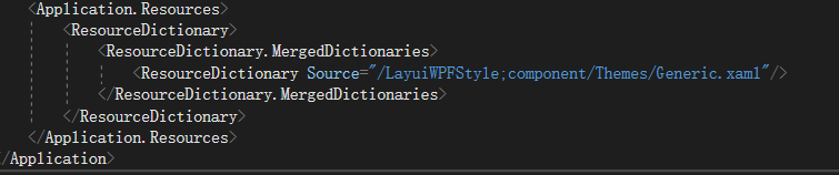
<Application.Resources>
        <ResourceDictionary>
            <ResourceDictionary.MergedDictionaries>
                <ResourceDictionary Source="/LayuiWPFStyle;component/Themes/Generic.xaml"/>
            </ResourceDictionary.MergedDictionaries>
        </ResourceDictionary>
    </Application.Resources>
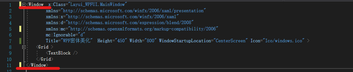
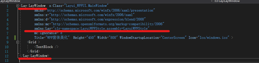
14. Click MainWindow to replace the original upper left Window with layer: laywindow, and reference xmlns: layer = "CLR namespace: layuiwpfstype; assembly = layuiwpfstype" as shown in the figure below
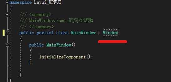
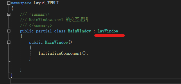
16. Press F7 to enter the background code and let MainWindow inherit our LayWindow
17. At this time, our custom form is finished. Click Run to get our beautified form (Ico icon on the top left can be ignored or an Ico icon can be added)
